
UX CASE STUDY
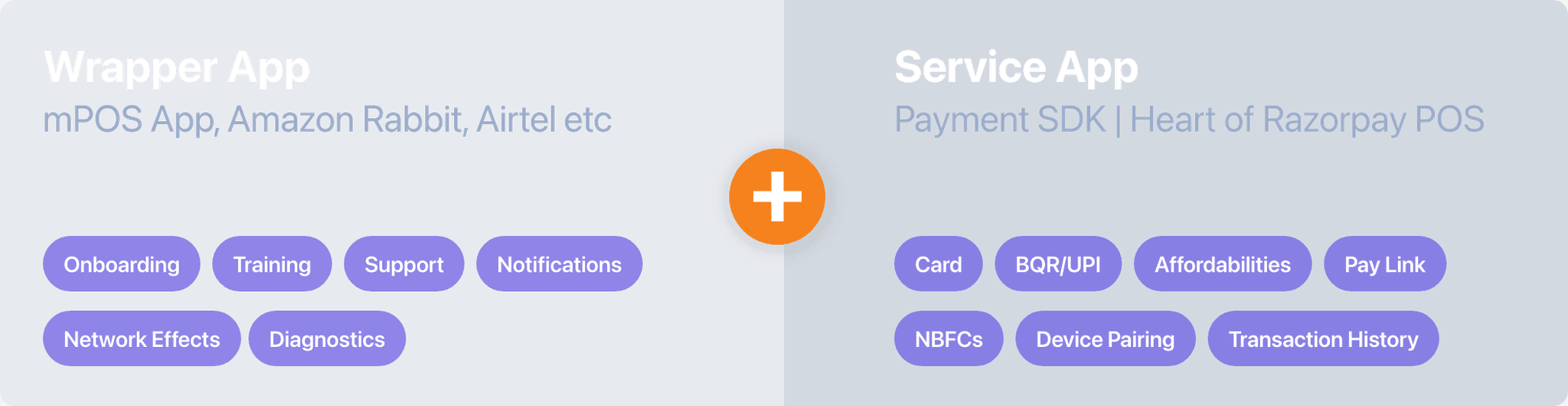
Payment SDK
Transforming the Payment Acceptance SDK Framework for a Seamless Merchant Experience
Introduction
A Voyage of
Transformation
Ezetap, a prominent omni-channel payment solution provider, embarked on a comprehensive redesign of its Payment SDK (Service App) to address user experience challenges and anticipate future advancements in payment technologies.
This case study explores the motivations, design goals, and outcomes of the Ezetap Payment SDK redesign, incorporating additional objectives for a holistic approach.
Client:
Ezetap (Now Razorpay POS)
Duration:
2019
|
3 Months
Platform:
Android Mobile SDK
Team Members:
Sachin Thumbarathy
(Sole Designer)
Industry
Fin-Tech | Payments | PoS
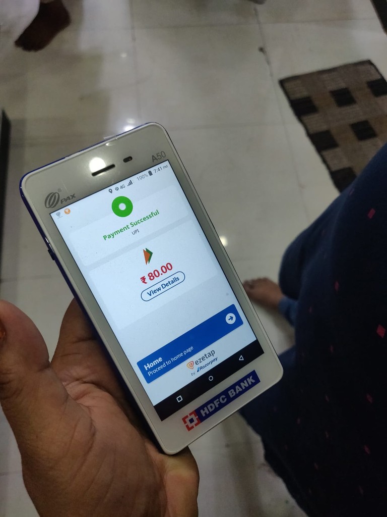
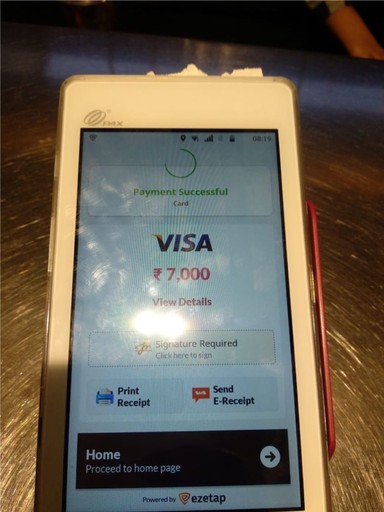
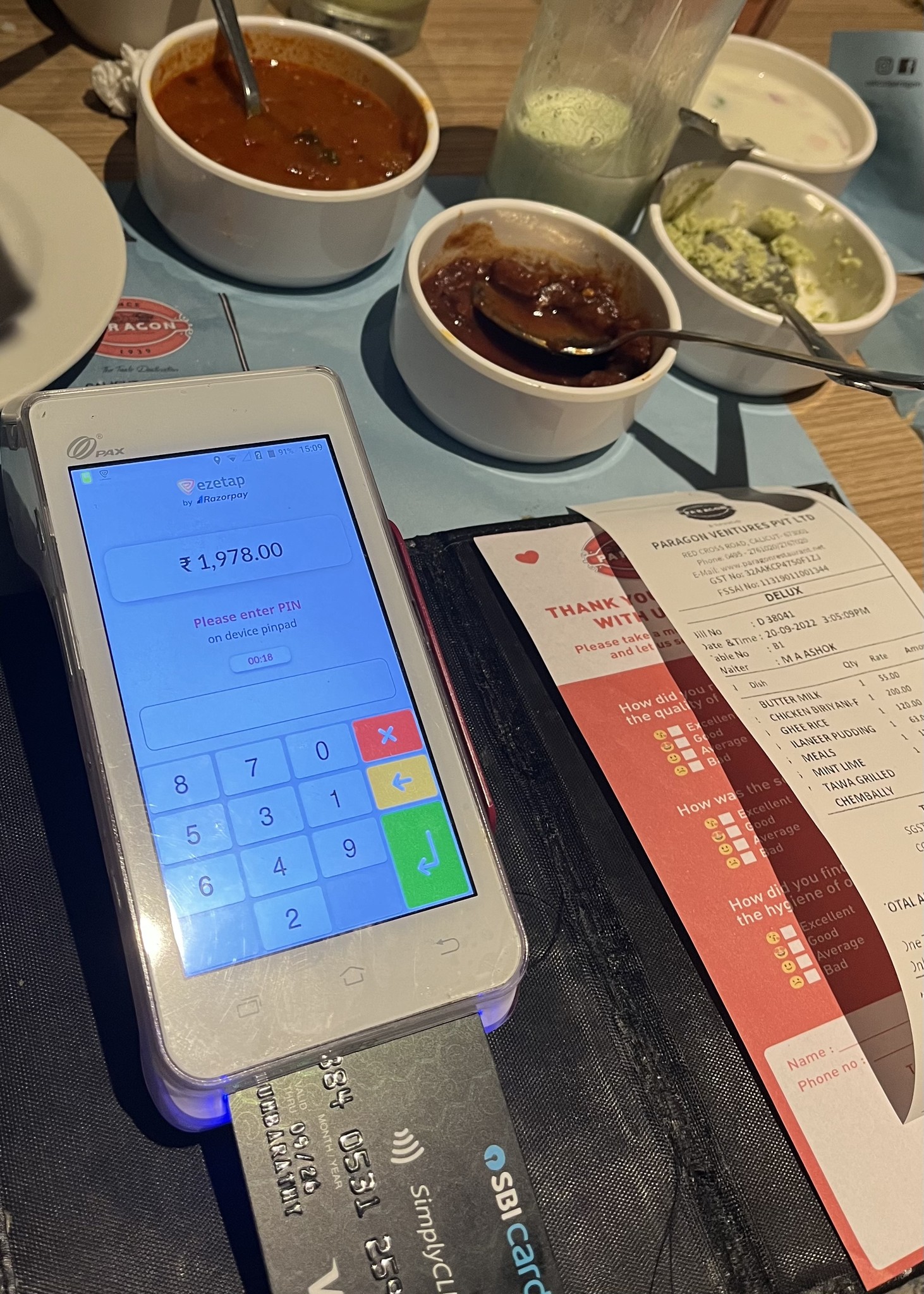
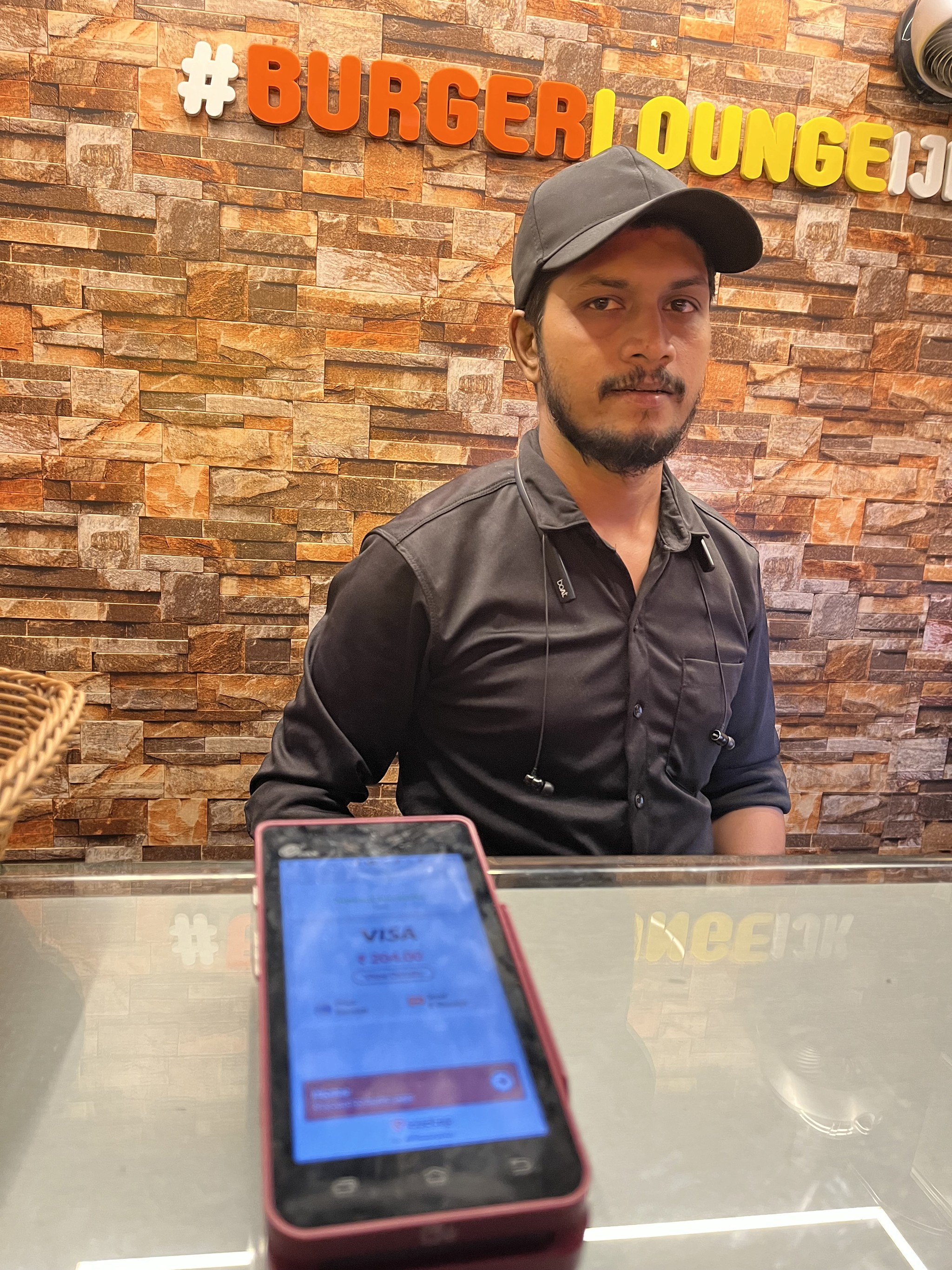
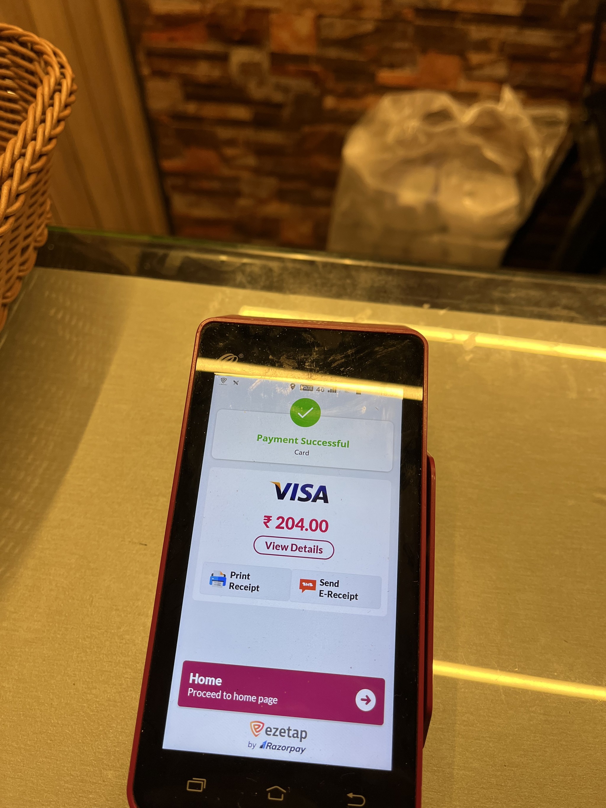
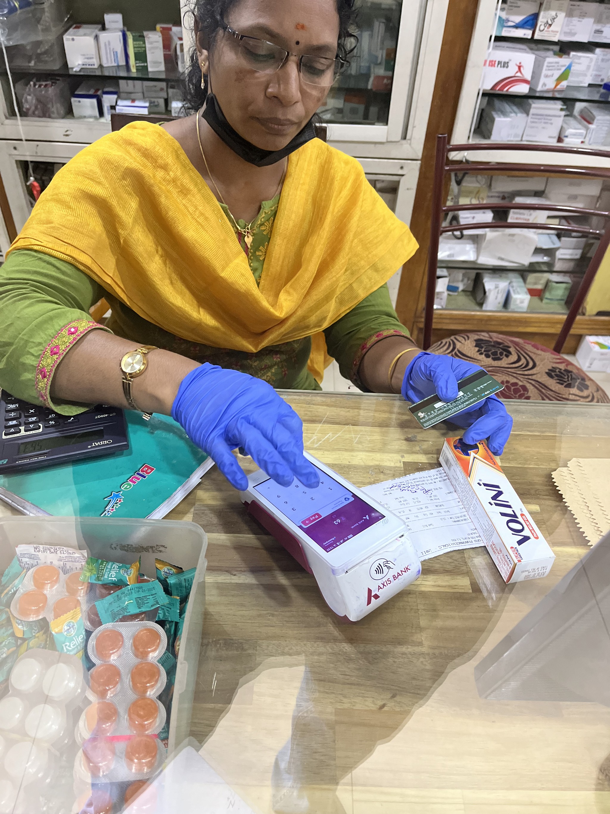
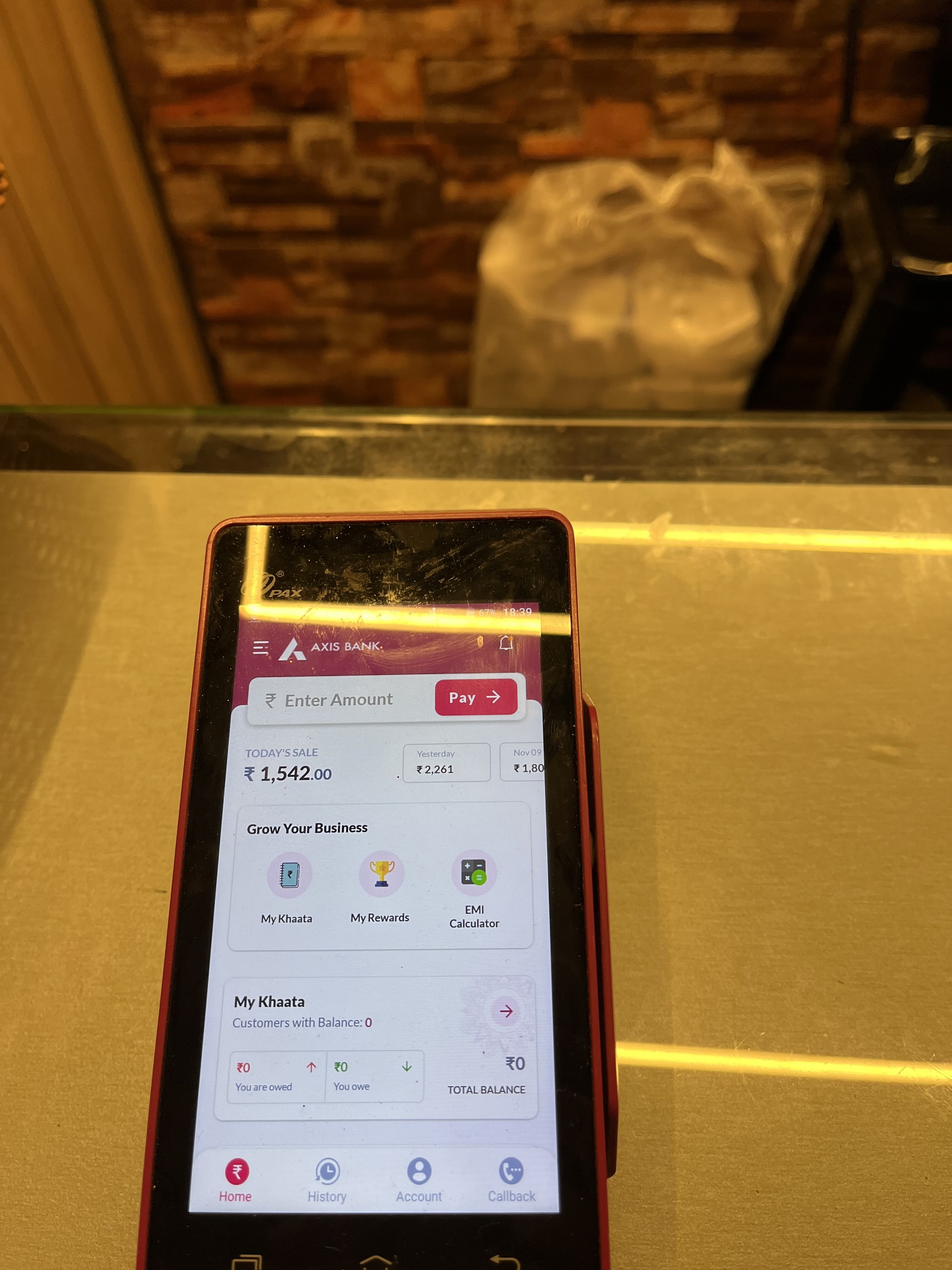
What is Ezetap?
A Glimpse of
Ezetap's Symphony
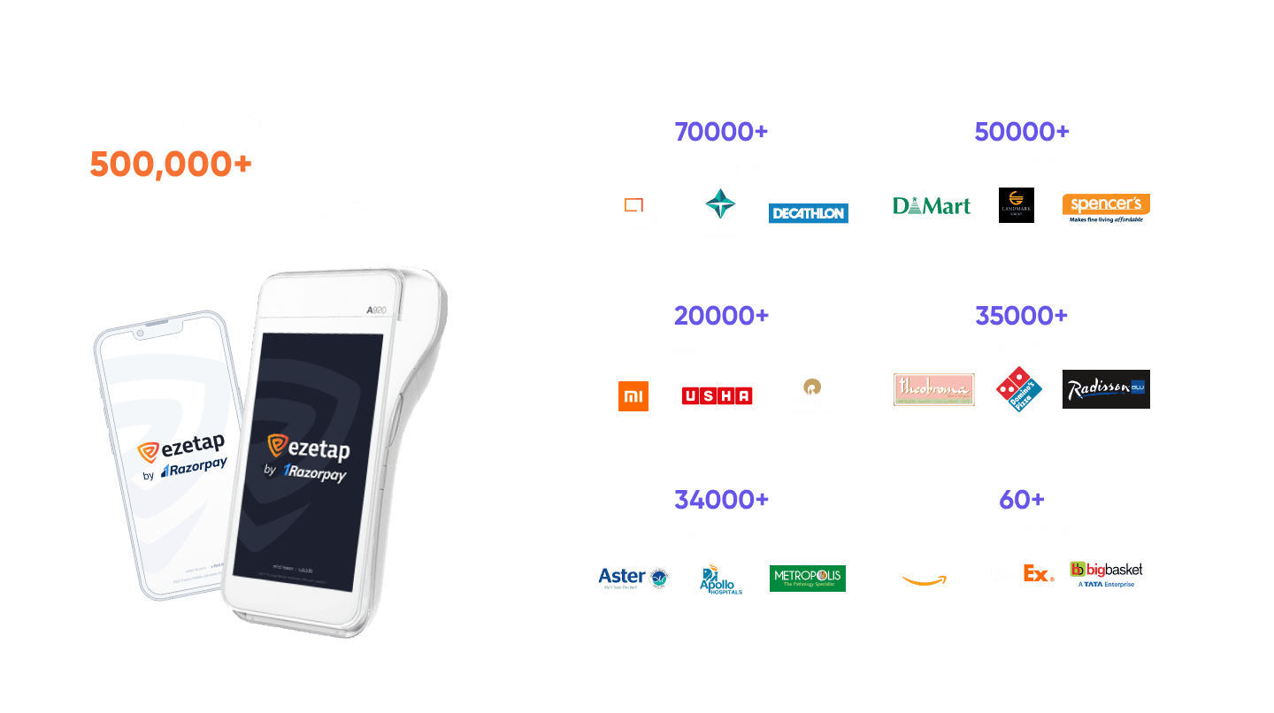
Imagine a stage where 500,000 POS terminals across India and the Middle East create a symphony of smart payments. Ezetap by Razorpay is a smart payment platform designed exclusively for businesses.
Enter the mPOS app, an avant-garde creation redefining merchant solution on top of offline payment acceptance for merchants.
With a kaleidoscope of payment solutions, ezetap empowers merchants to orchestrate seamless transactions across various channels.
Lets get into the action
Why the Encore?
The Calling of Redesign
The decision to revamp the mPOS-X app stemmed from a crucial realization:
The original version lacked dedicated UX design input, resulting in an unsatisfactory user experience.

The redesign aimed to rectify this by incorporating best UX practices and ensuring user needs and workflows were at the forefront.
It aimed to create a cohesive and user-centered design that enhances every aspect of the app's functionality, ensuring a seamless and enjoyable payment experience.
The decision was clear:
A redesign that would harmonize UX practices, elevate user experience, and weave merchant needs into every pixel.
Design Goals & Objectives
The redesign aimed to achieve the following objectives

Streamlined User Flow
Reimagine the user flow to simplify the payment acceptance process, ensuring a seamless journey for both merchants and customers.
Future-Ready Framework
Creating a framework adaptable to emerging payment technologies and future features
Bank Branding Elegance
Introduce a customisable branding solution for partners to align the app’s appearance with their unique brand identity.
Modernized Identity
Enhance the app’s identity to reflect growth, attract engagement, and entice potential users.
Constraints & Design Considerations
Roadblocks we faced along the way
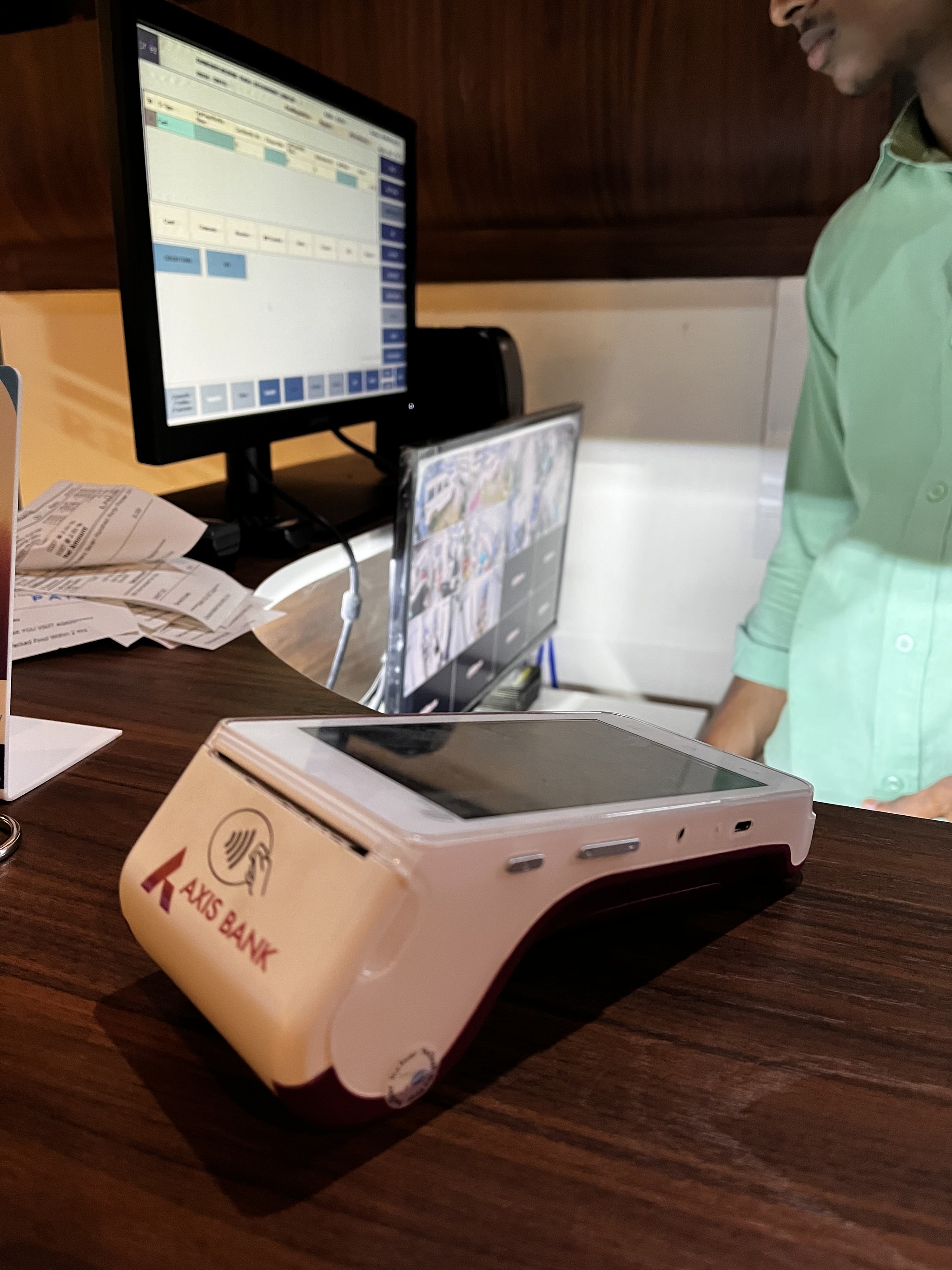
Addressing challenges like the SDK nature, SaaS model, diverse payment methods, regulations, dual use cases, and varying POS device specifications required a careful balance in design decisions.
SDK Nature
SaaS Personality
Diverse Payment Methods
Regulations & Certification
Bank Branding and Interface Tidiness
Diverse Payment Methods
Designing for dual use cases
Various Screen Sizes
Managing app size and feature prioritisation.
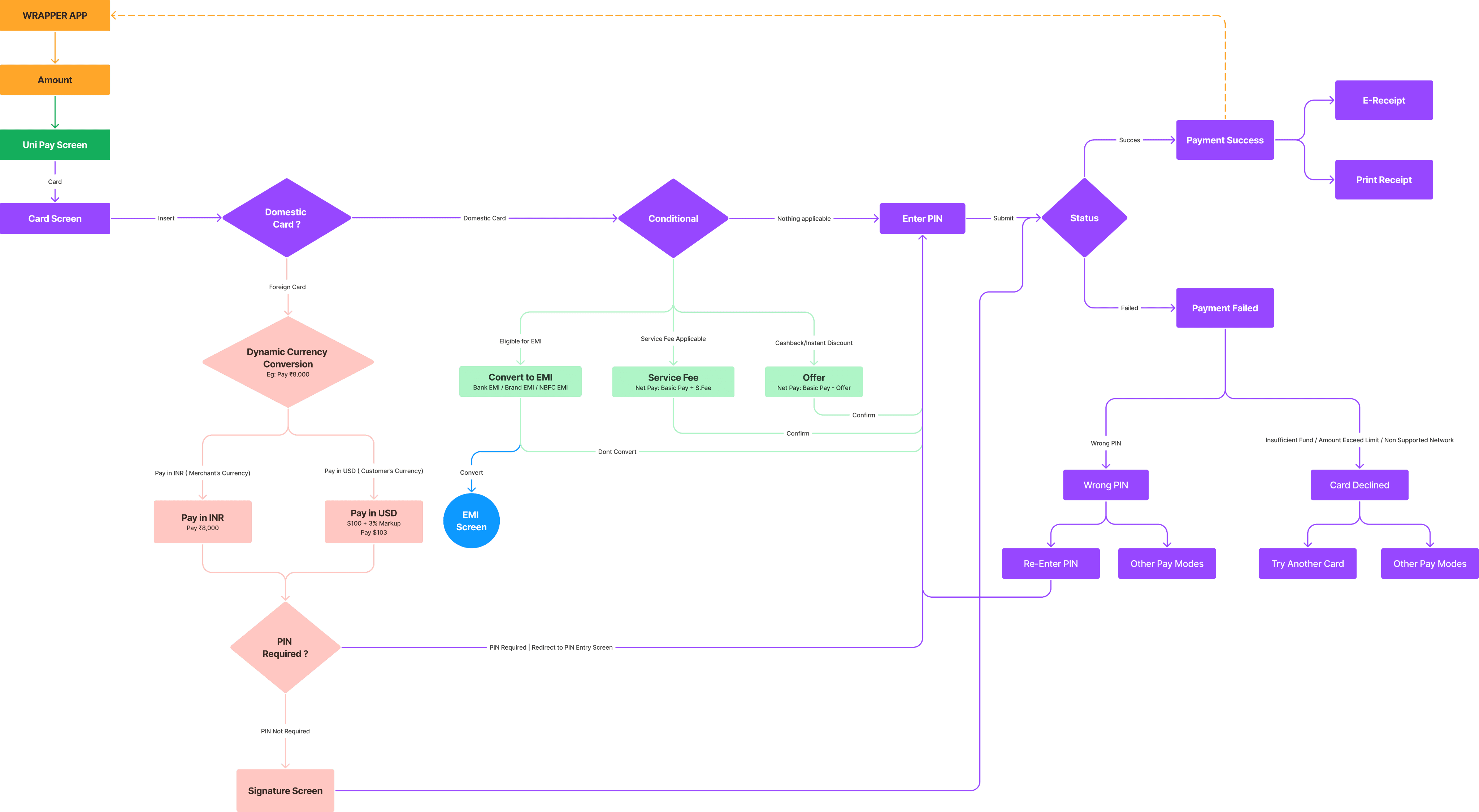
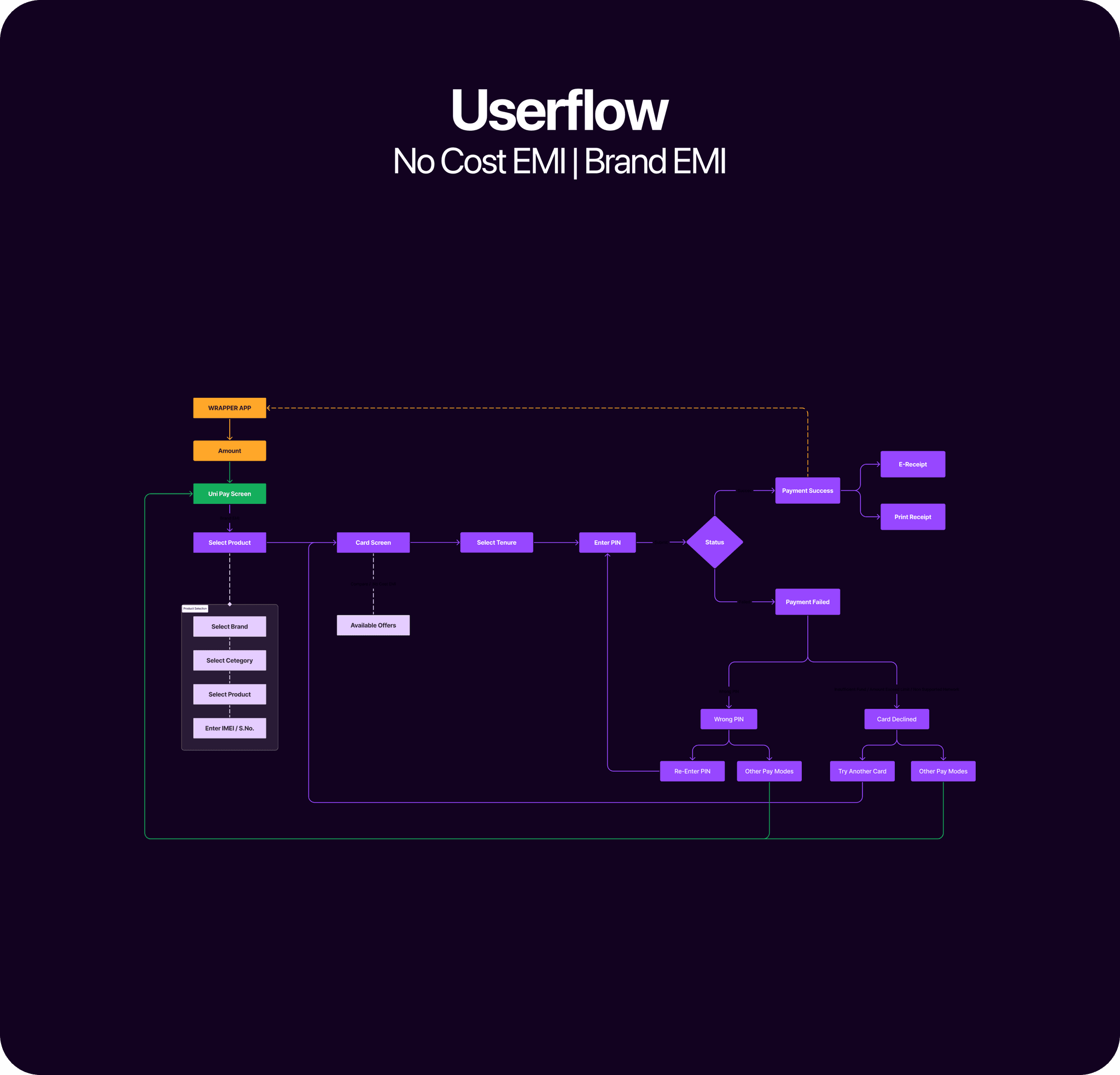
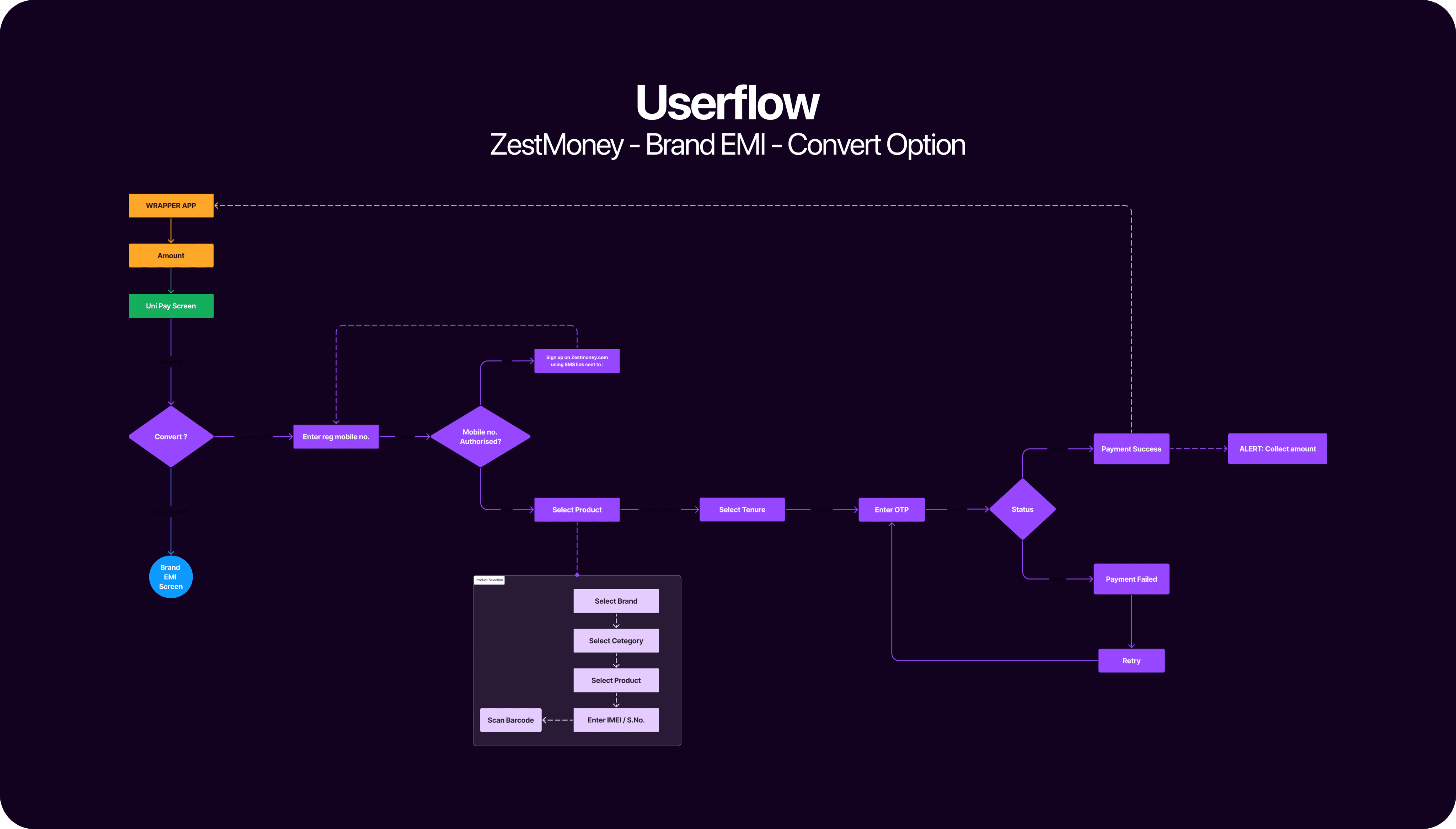
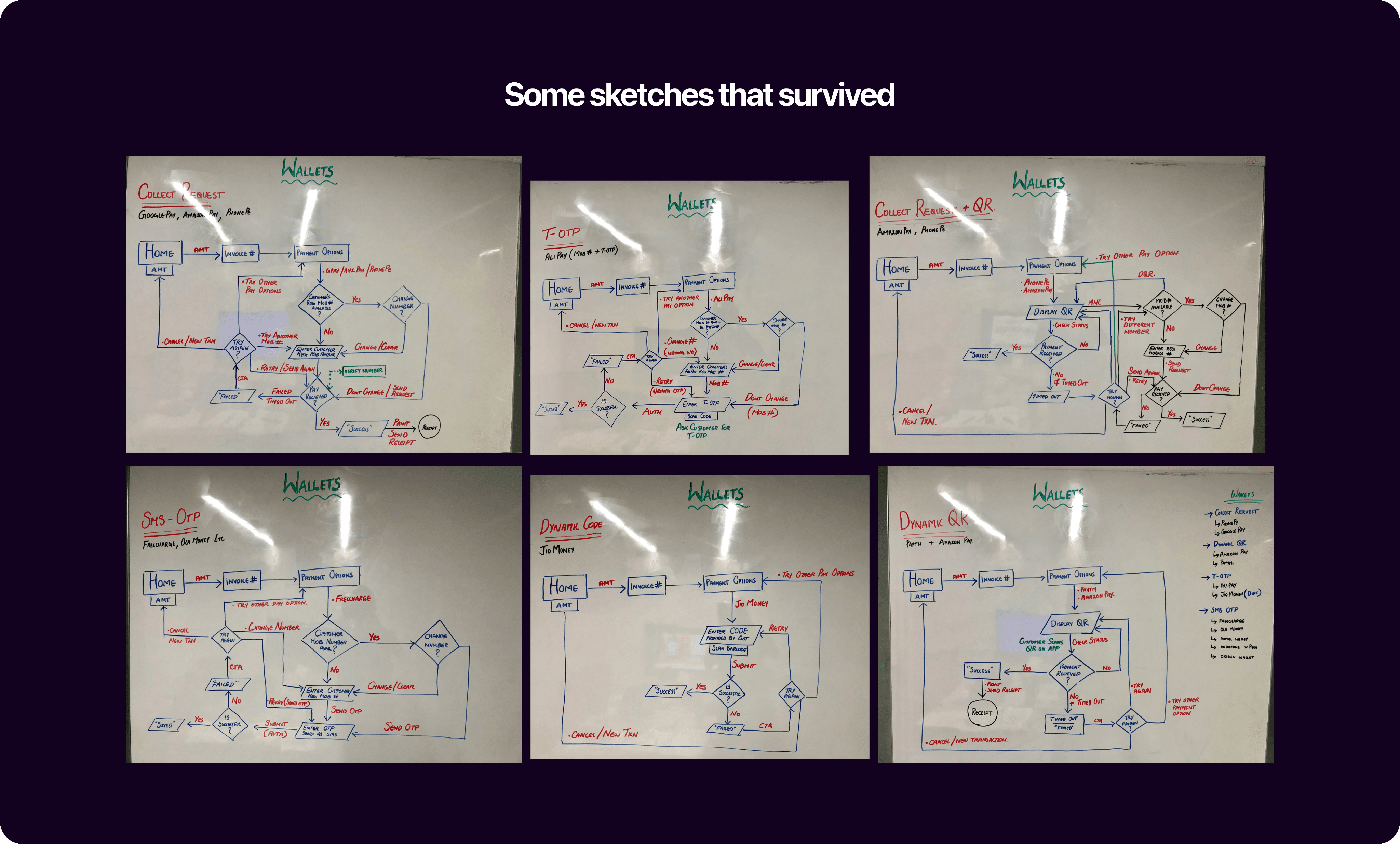
IA & User Flows
Weaving the Magic
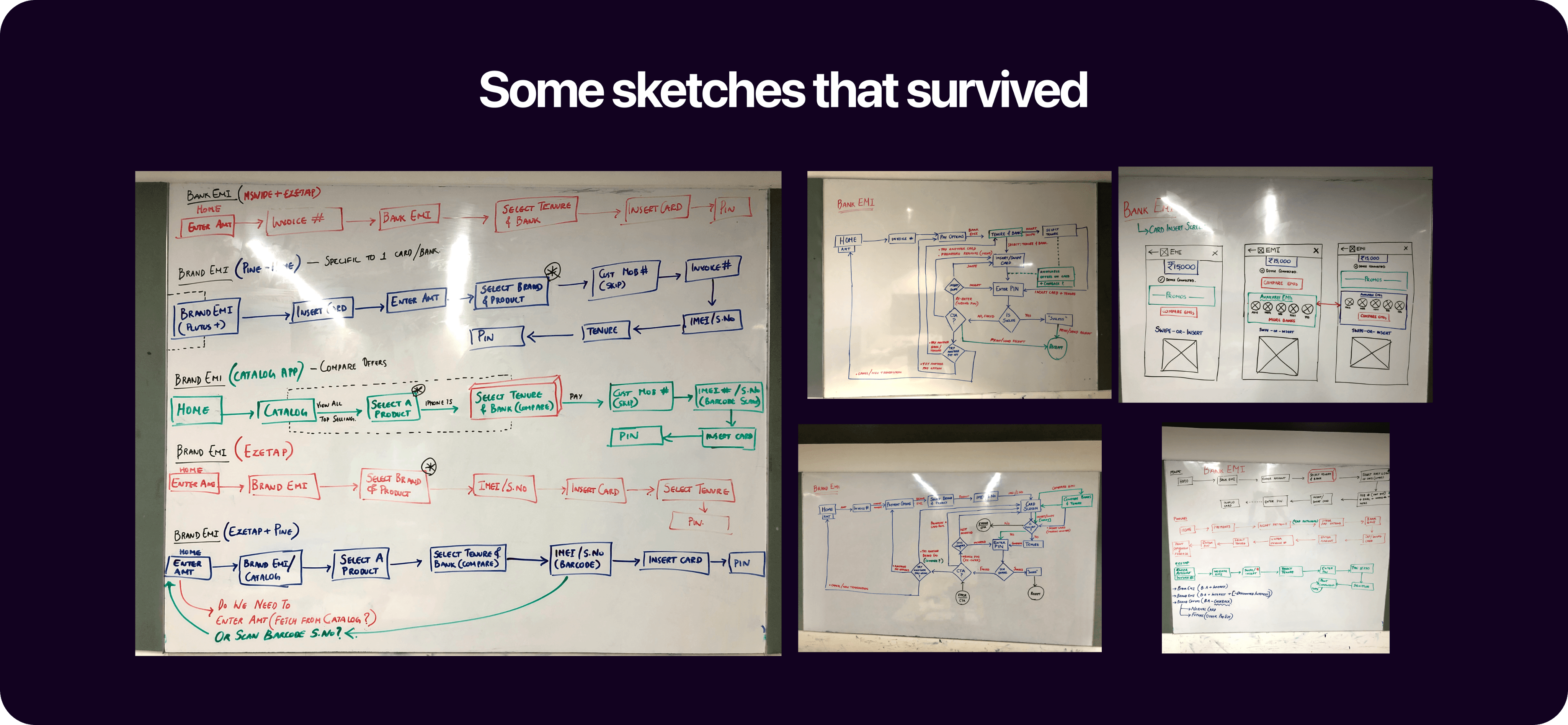
After a lot of talks with engineering team, analysing competitors and hundreds of iterations, the revamped user-flows for SA-X is finally ready.
To me, this was the most crucial UX design process for a Payment System. Thats why the app’s behaviour was integrated into the Userflows from the groundup.
Streamlining the userflow
I started by sketching diverse layouts and organizing them into a structured Information Architecture (IA). This formed the blueprint for an intuitive user journey.
Revamped the app’s information architecture to prioritise key features and provide easy access to essential functions while ensuring flexibility for future integrations.
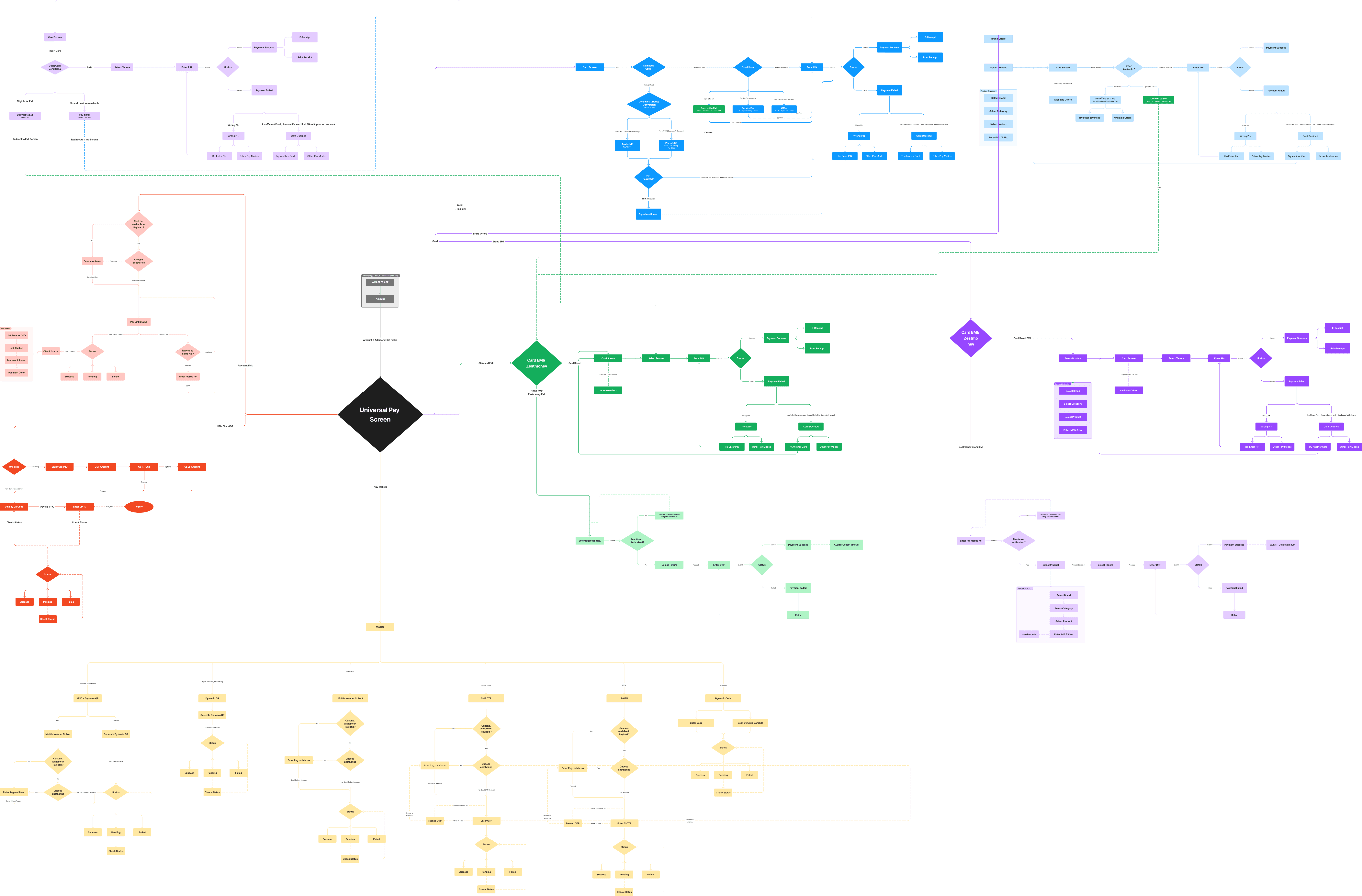
Speed in Transaction
Revamping user flows involved fine-tuning from the ground up, removing complexities, and simplifying navigation
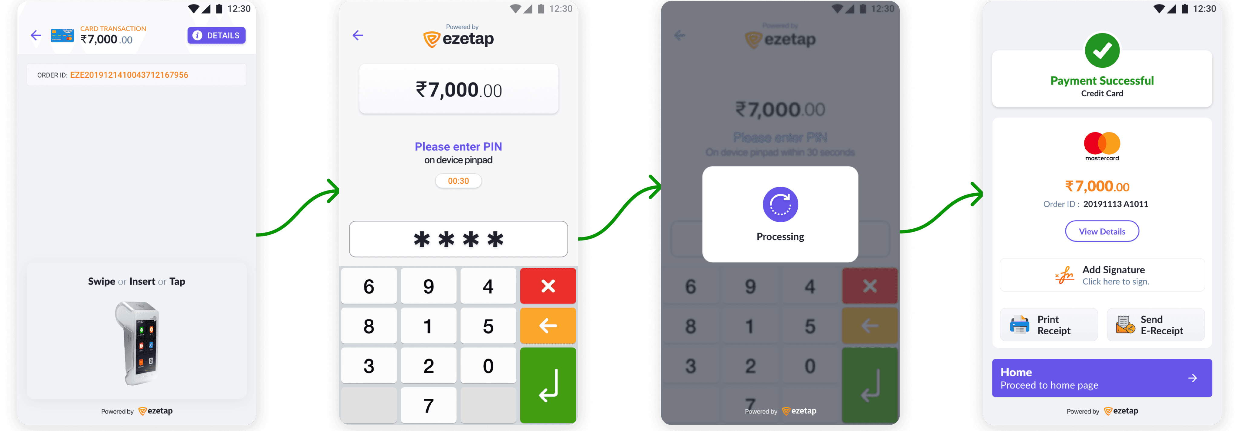
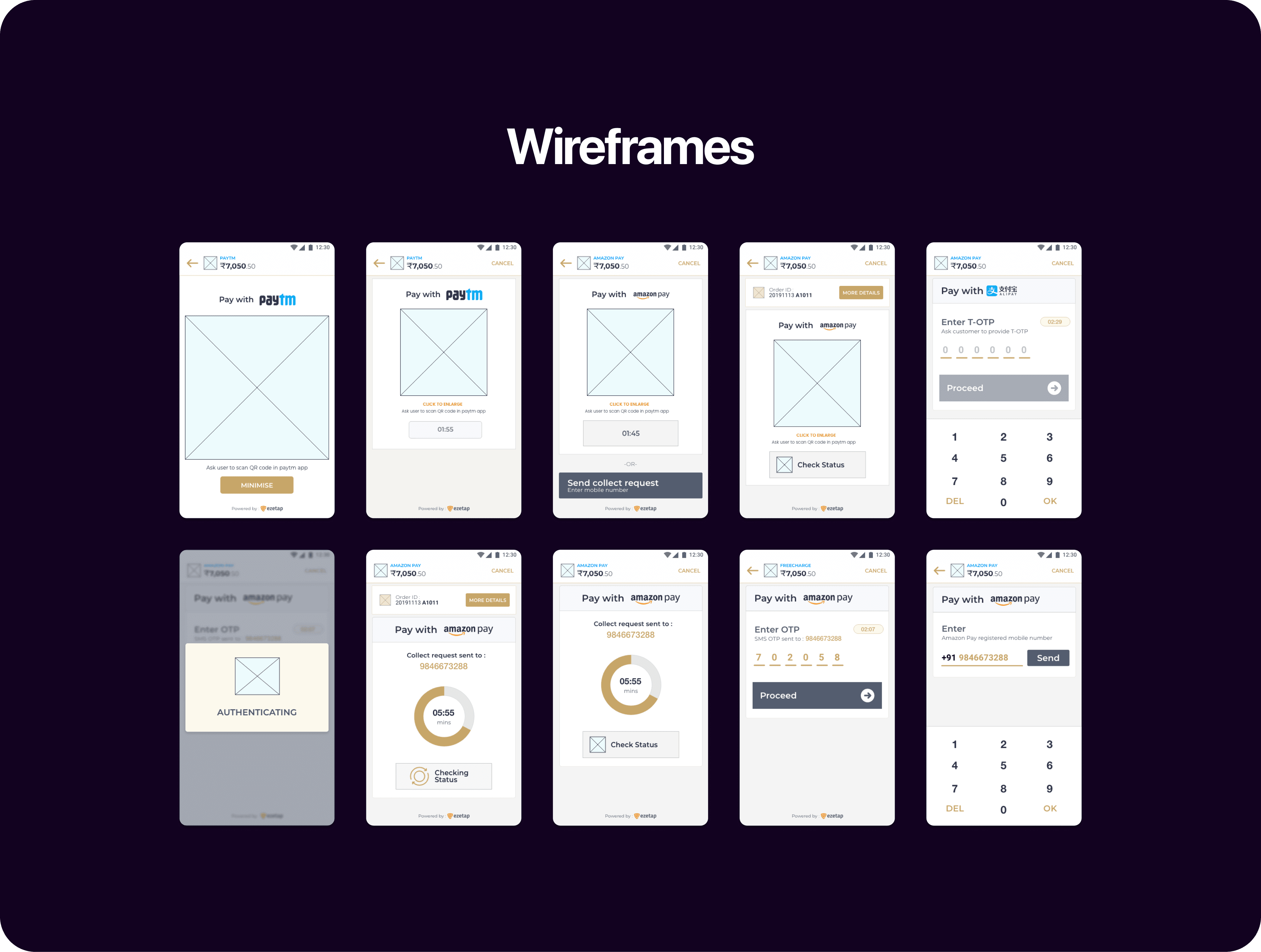
Design Process
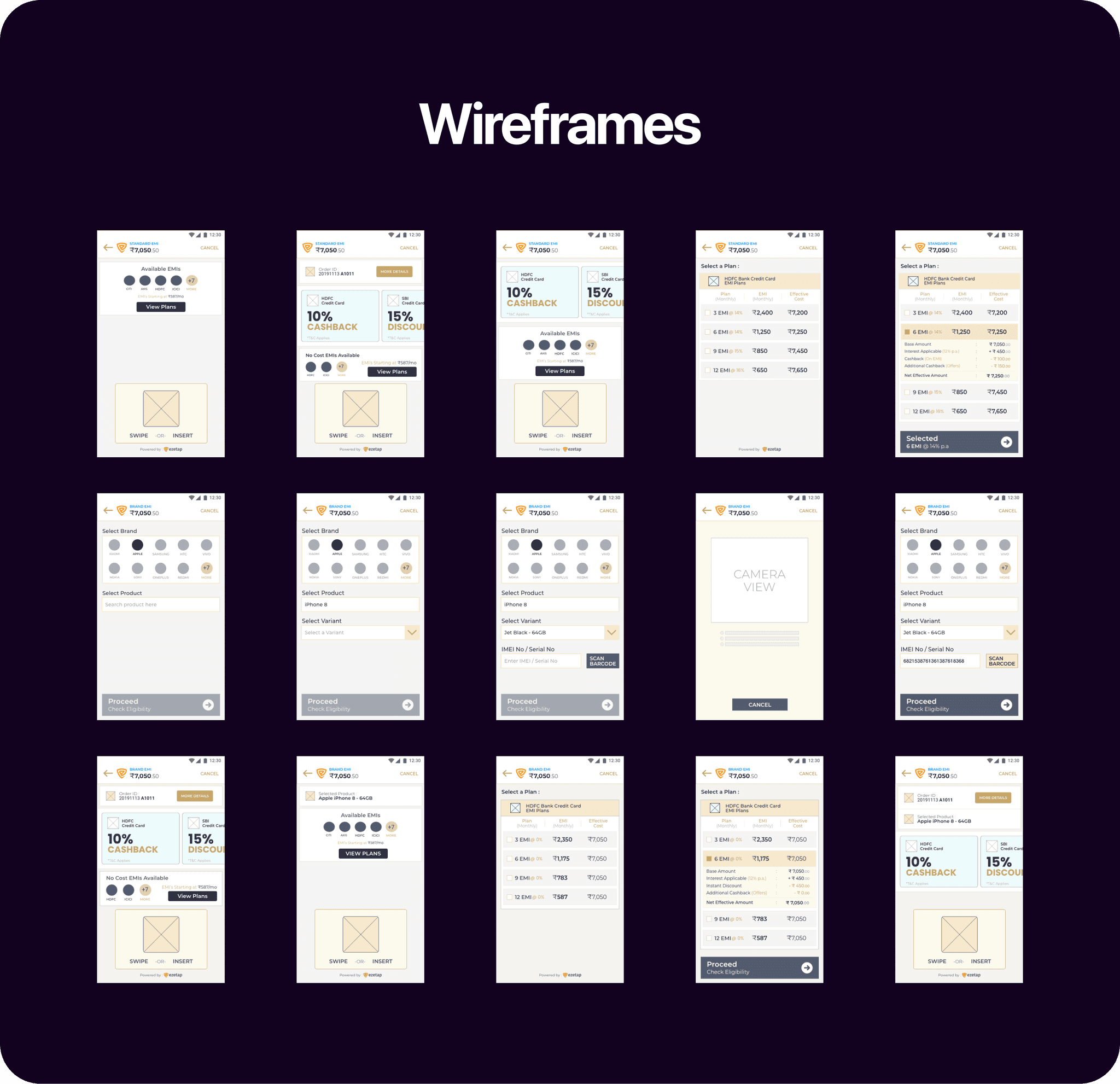
Sketches & Wireframes
The transformation of the mPOS-X Framework hinged on the meticulous process of wireframing and continuous iteration.
Here’s a concise journey into how I shaped the app’s interface to create a seamless user experience:


Wireframe Prototype
These were iteratively tested and refined based on feedback from internal stakeholders and users.
Visual Identity
Dynamic
Design
System
One of the core objectives of the redesign was to incorporate custom dynamic bank branding, harmonising the app’s appearance with each bank’s unique identity. Balancing branding elements while maintaining a clean interface posed a significant challenge

Firstly, we created a Design System that caters to our specific needs.
Balancing branding elements while preserving a clean interface presented a significant challenge.
Lato
Lato Typography
Lato offers a clean, modern feel that improves readability, which is critical in fintech for clear communication of financial information. It’s also multi-lingual and versatile across headers, body text, and labels. It provides a sense of professionalism and trustworthiness.
Header 1
Lato Heavy - 36pt
Freedom of thought, conscience
Header 2
Lato Regular - 36pt
Freedom of thought, conscience
Title 1
Lato Bold - 32pt
Freedom of thought, conscience
Title 2
Lato Regular - 32pt
Freedom of thought, conscience
Headline 1
Lato Bold - 24pt
Freedom of thought, conscience
Headline 2
Lato Bold - 20pt
Freedom of thought, conscience
Body
Lato Regular - 24pt
Freedom of thought, conscience
Caption
Lato Heavy - 20pt
Freedom of thought, conscience
Dynamic Fields
Primary
#6655E8
Secondary
#F5821E
TitleBarTheme
Light
TitleBar
#FFFFFF
Static Fields
White
#FFFFFF
Black Mirage
#1C202F
Background
#F0F2F5
Container
#F8F8FC
Border 1
#E6E6E6
Border 2
#D6D6D6
Caption 1
#5C7397
Caption 2
#99ABCA
Yellow
#FFC93E
Green
#55A94F
Orange
#F5821E
Red
#C65151
Through a detailed analysis, we identified primary and secondary colors unique to each bank's identity.
This insight guided our approach to strategically assign colours across the app's interface.
Bank
Primary
Secondary
HDFC Bank
ICICI Bank
Kotak Bank
Yes Bank
Network International
SBI Payments
Axis Bank
IDFC First Bank
#004C8F
#004A7F
#003874
#0062A8
#003366
#292075
#AE275F
#9D1D27
#ED232A
#F5821F
#ED1C24
#D71920
#FF6666
#00B5EF
#EB1165
#BD7061
New Fields for Customization
To accommodate bank-specific branding, we introduced new fields. These offered precise control over the app's appearance for each bank.

Primary Color
#0D4A86
Secondary Color
#F37E20
Home Titlebar Color
#232323
Home Titlebar Theme
dark
Specific fields like titlebarColor and titlebarTheme were created to assign colors to non-home screen title bars.
This allowed for a darker bank identity representation on the home screen while maintaining a lighter theme on others.
Minimal Fields, Maximum Impact
To accommodate bank-specific branding, we introduced new fields. These offered precise control over the app's appearance for each bank.
Primary Color
#AE275F
Secondary Color
#EB1165
Titlebar Color
#FFFFFF
Titlebar Theme
light
Home Titlebar Color
#AE275F
Home Titlebar Theme
dark
Unified Design
Customized Branding
The solution seamlessly integrated custom bank branding while maintaining design minimalism. Banks could now harmonise their branding with the app's interface, enhancing the SAAS model and offering a consistent, personalised experience to users.
Pay Mode Icons


On Light TitleBar


On Dark TitleBar
Other Icons


On Light Container


On Dark Container
Icon Style
Our design includes bespoke, realistically styled, colorful icons that echo real-world payment methods and fit a light theme. To match darker titlebars, we also created a collection of monochrome white icons. Their purpose is to facilitate user behaviour guidance and assist with optical navigation.
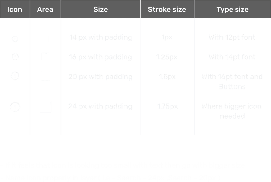
Icon Guideline
Scalable icons, with standard sizes at 20px, ensuring they are noticeable without overwhelming other elements.
4 px
Small 1
8 px
Small 2
12 px
Small 3
16 px
Medium 1
20 px
Medium 2
24 px
Medium 3
32 px
Large 1
40 px
Large 2
48
Large 3
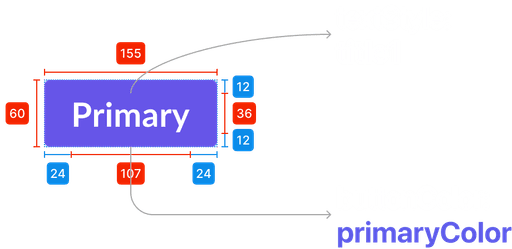
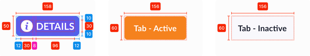
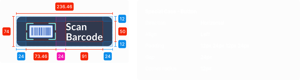
Layout Spacing
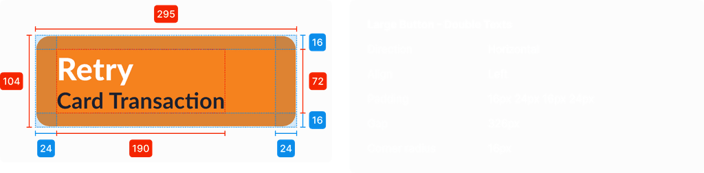
The design employs a 4-point grid schema, enabling uniform, versatile and scalable gaps that ensure balance on all display sizes of POS Devices which has very low resolution and low PPI.
Above example is displaced at xxhdpi resolution
Padding and Margins
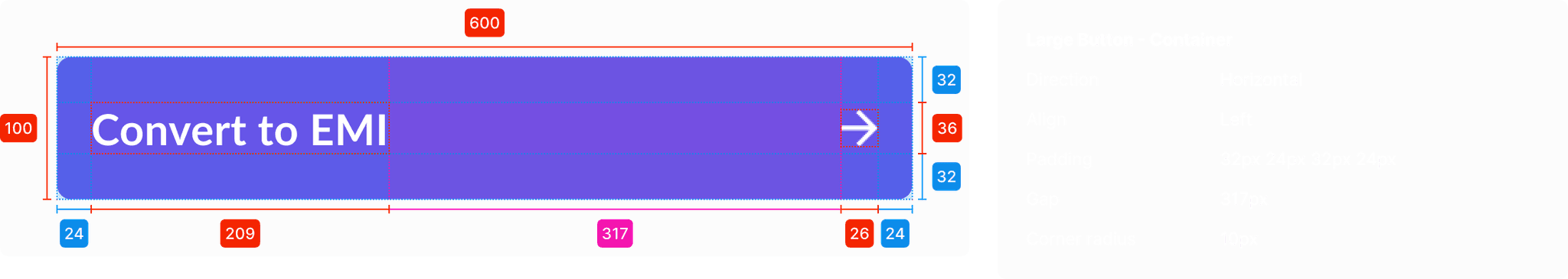
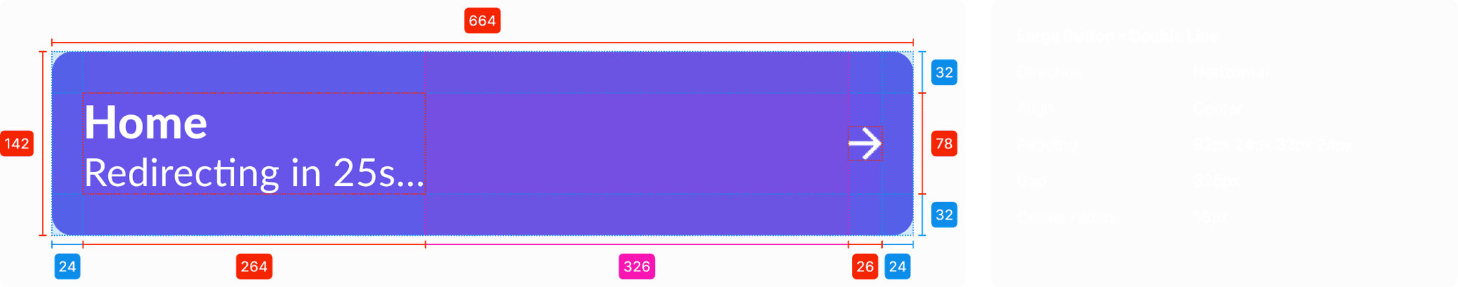
Various Buttons
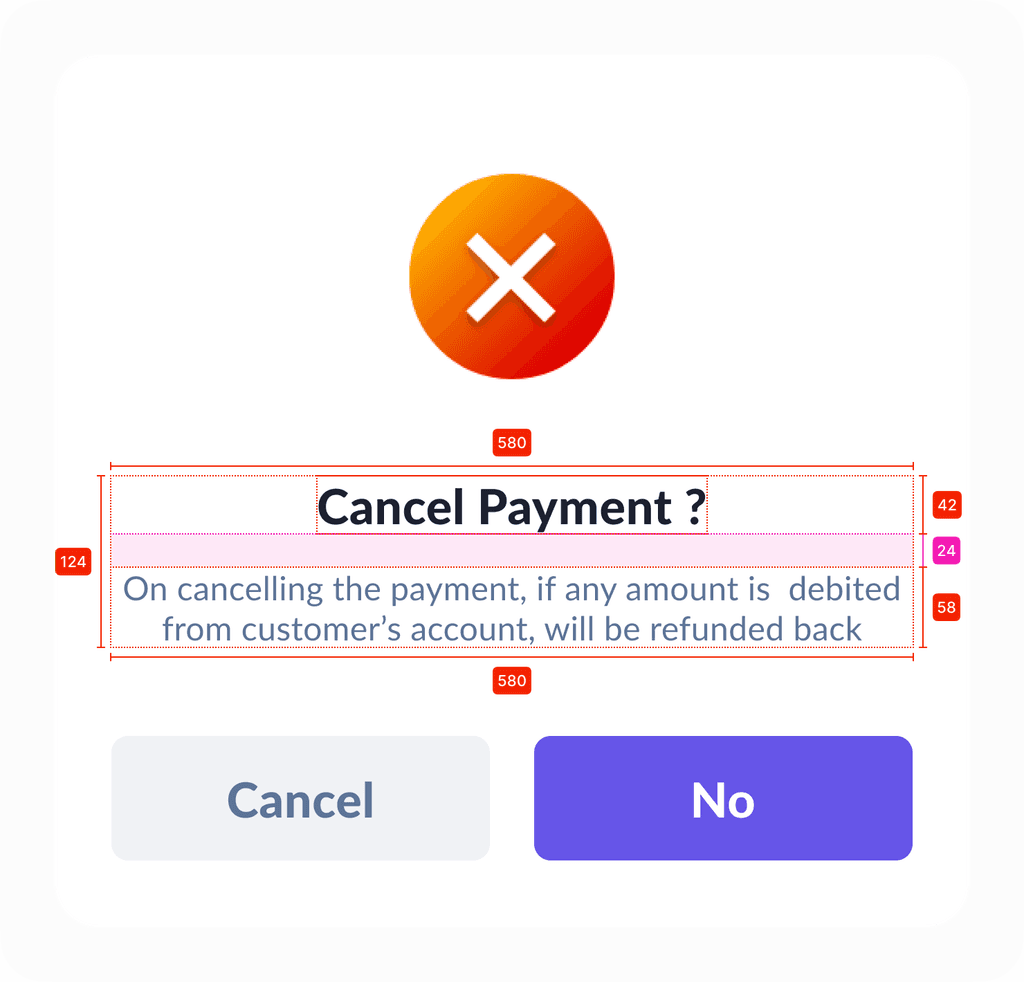
Filled with Primary or Secondary Colors with white text, rounded corners to maintain a modern look. Used for main actions like “Submit,” “Save,” and “Continue.” Subtle animations with slightly darkened shades, providing feedback on interactivity.
Titlebar on various payment modes
Titlebar on various dark themed bank branding

Title Bar
Variations of titlebar on various payment mode screen. Currency symbol (₹/$) is used everywhere instead of currency code (if available)


Other Components
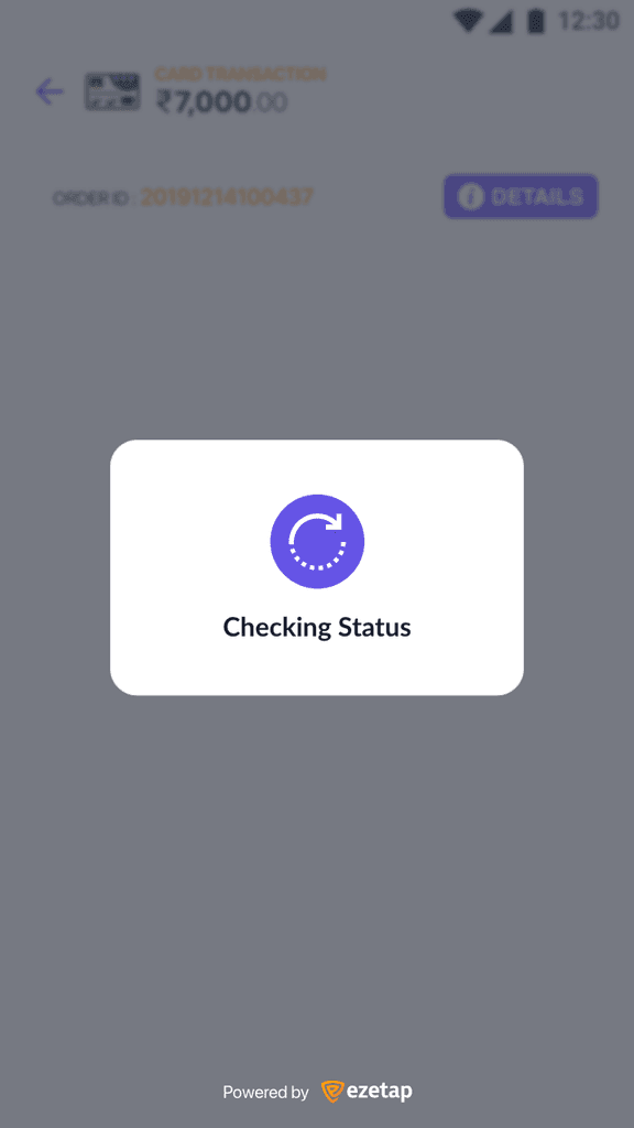
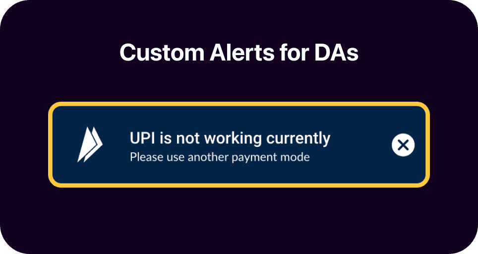
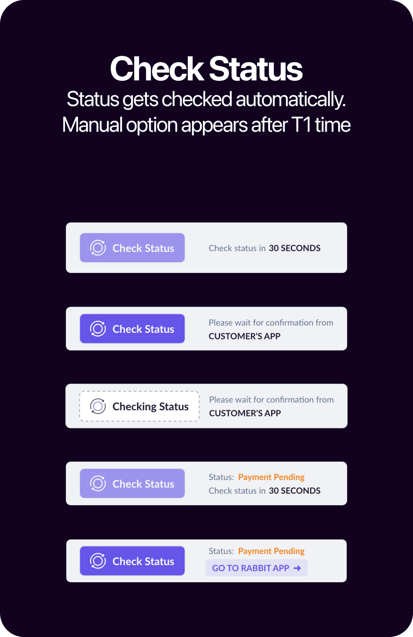
A variety of card templates have been established with different states (conditions). What we refer to as 'card components' may also be seen as templates, given they incorporate multiple base elements. Used alerts to give quick feedback on performed tasks.
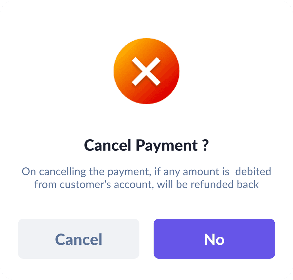
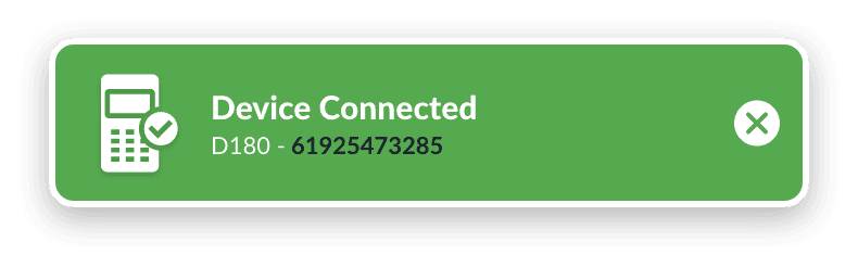
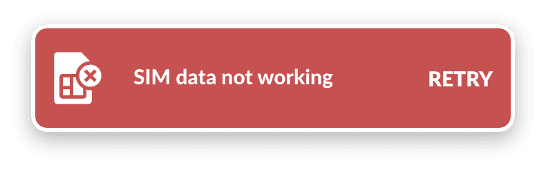
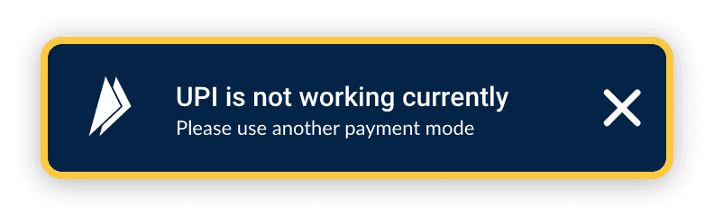
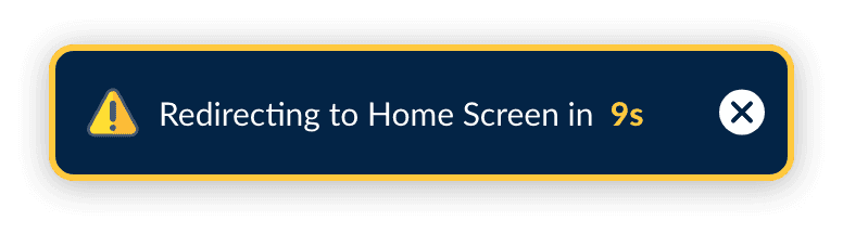
Alerts / Toast Messages


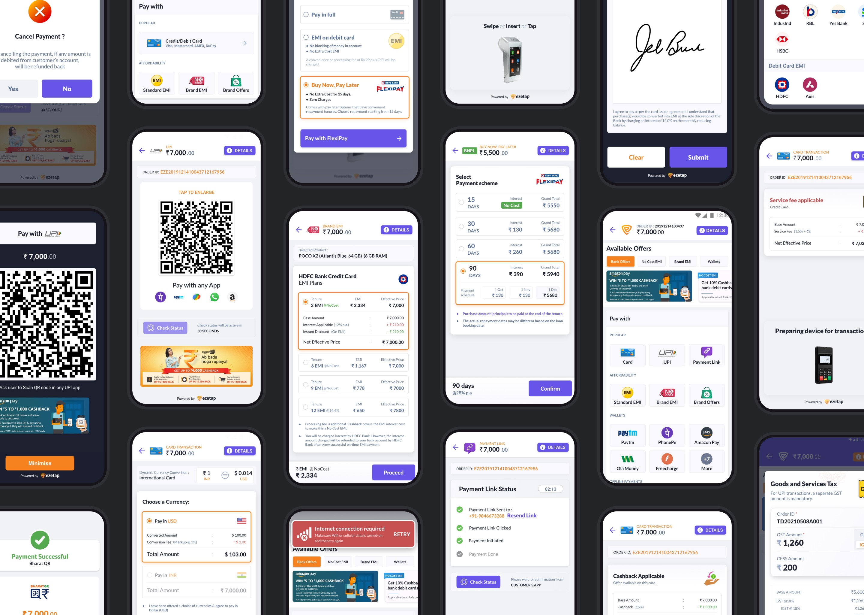
150+ unique screens of
UI Designs
Total 500+ screens based on various conditions and solutions


Balancing Functionality and Innovation
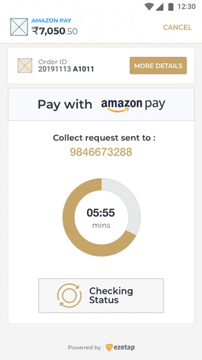
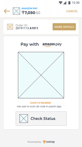
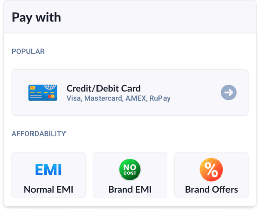
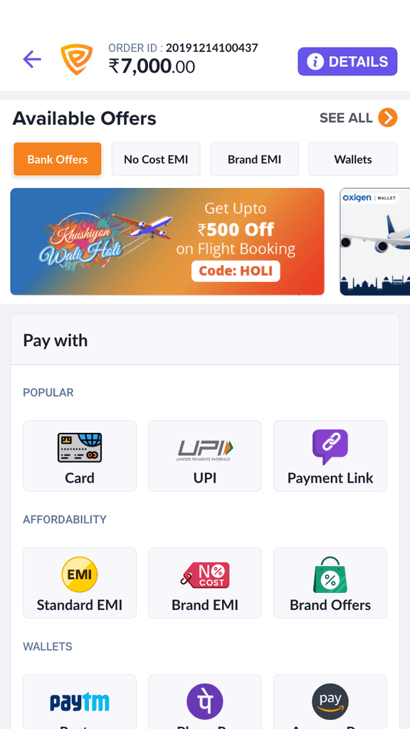
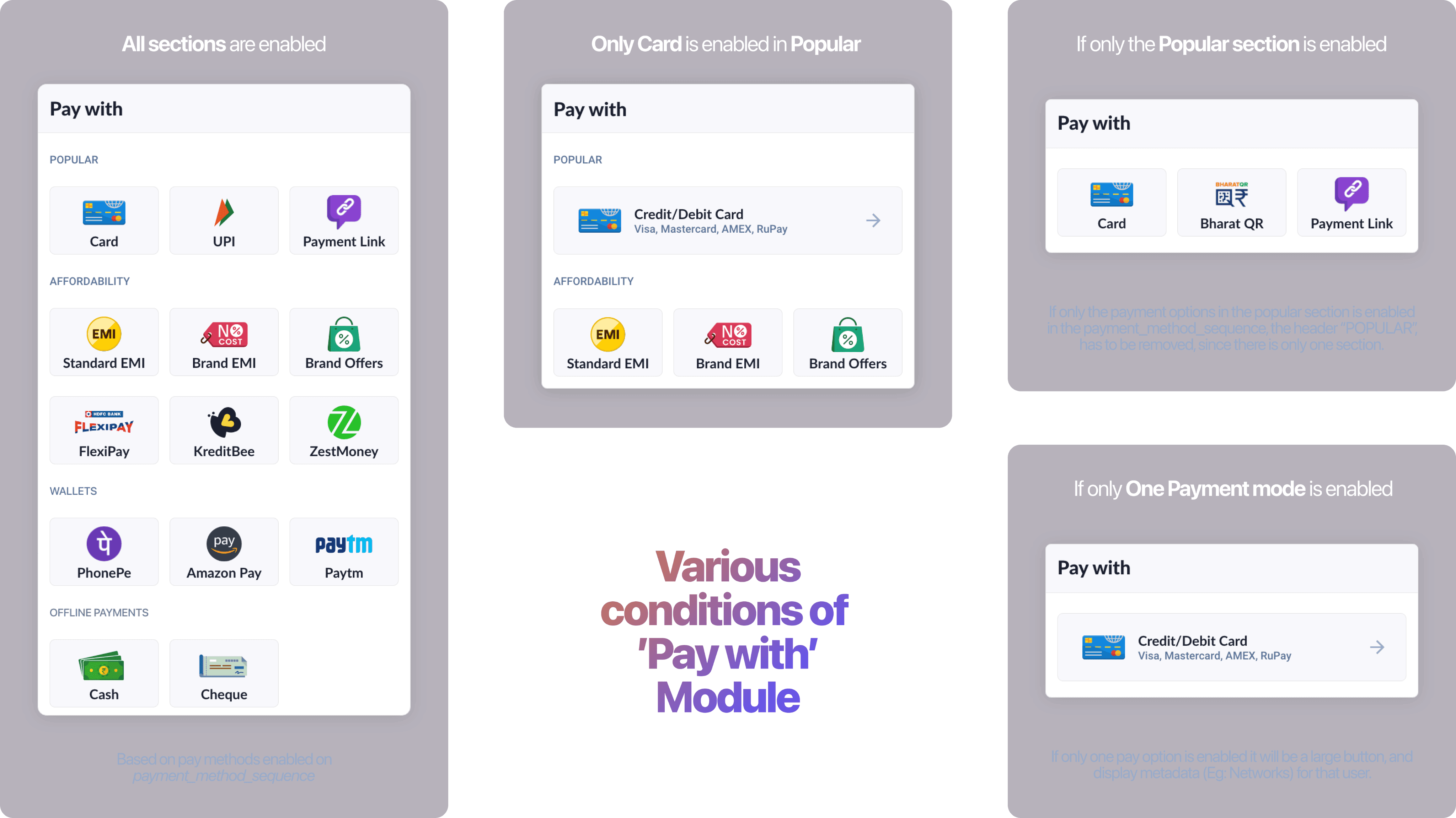
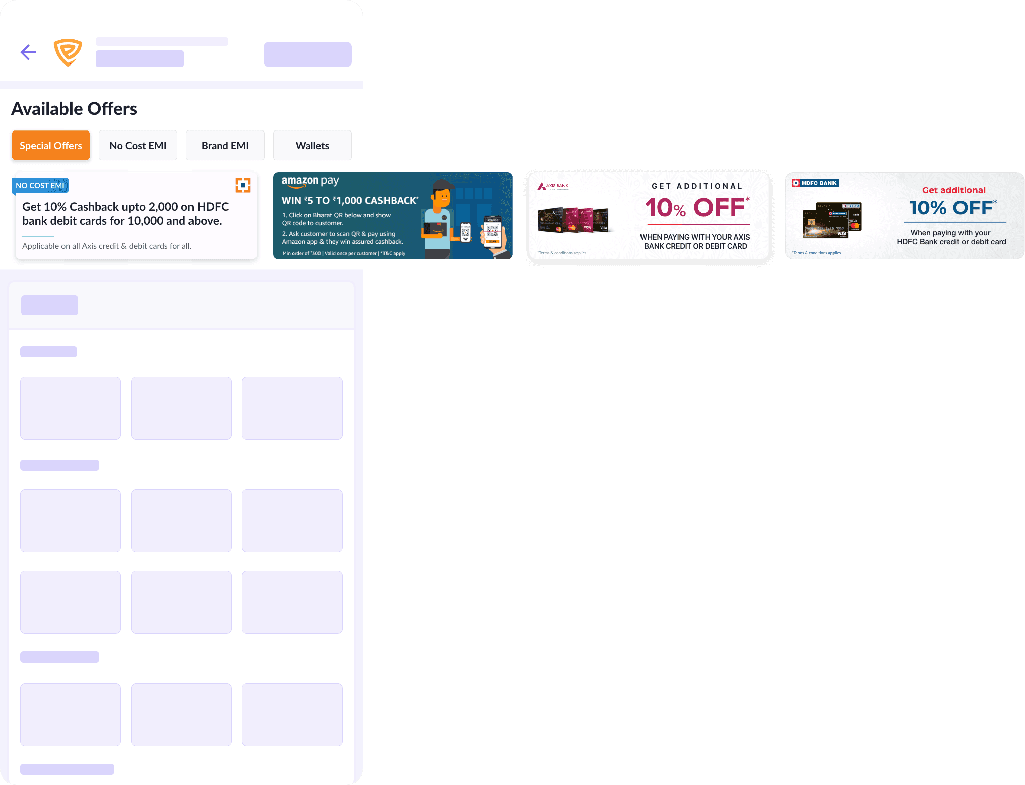
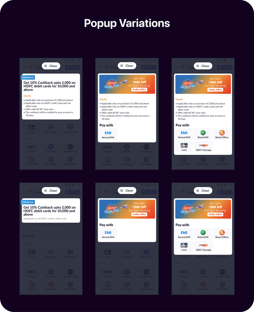
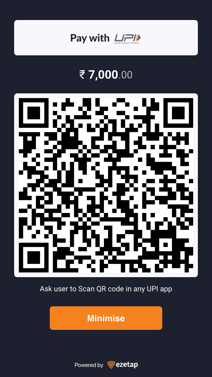
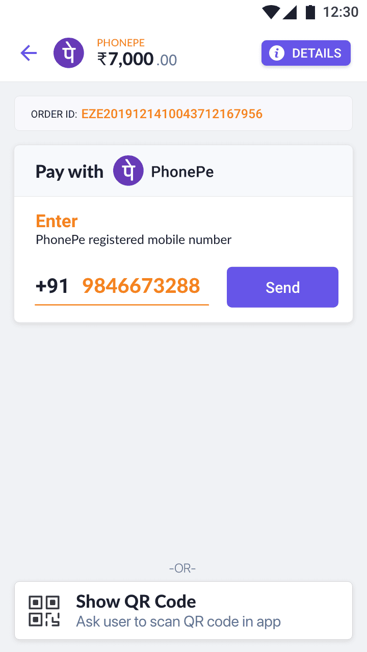
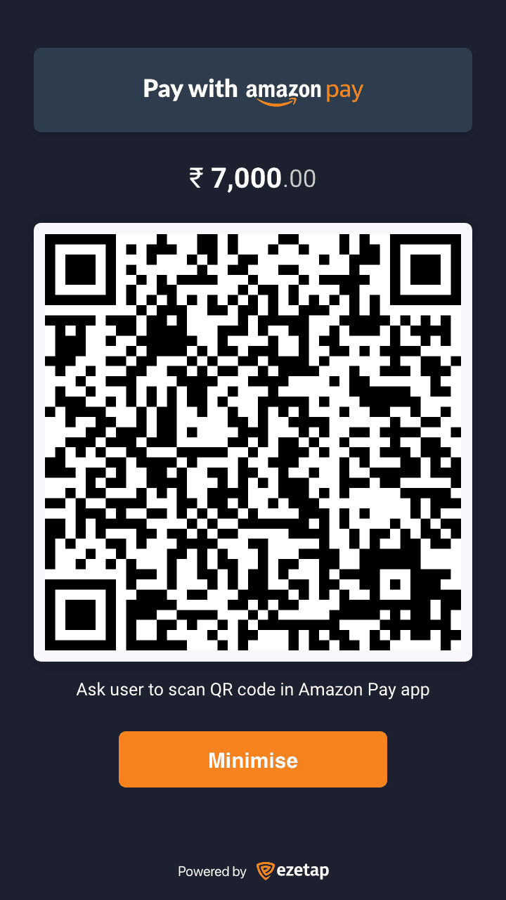
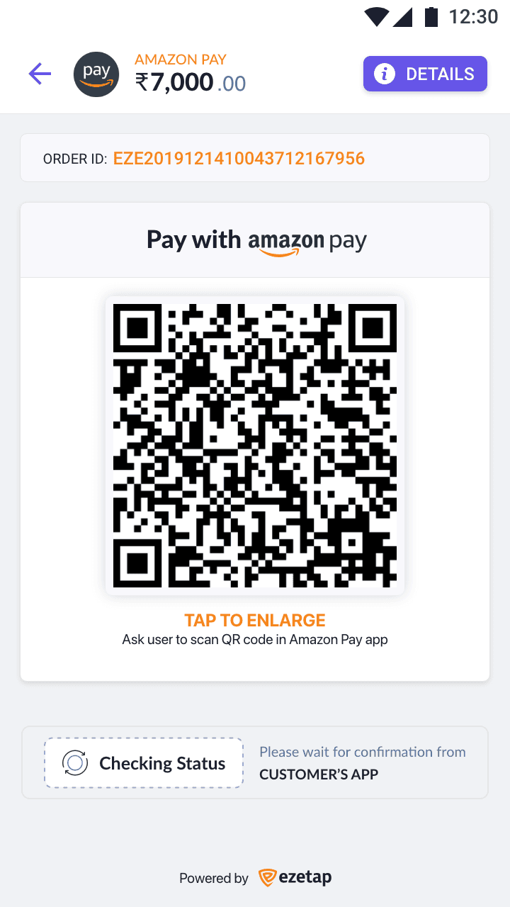
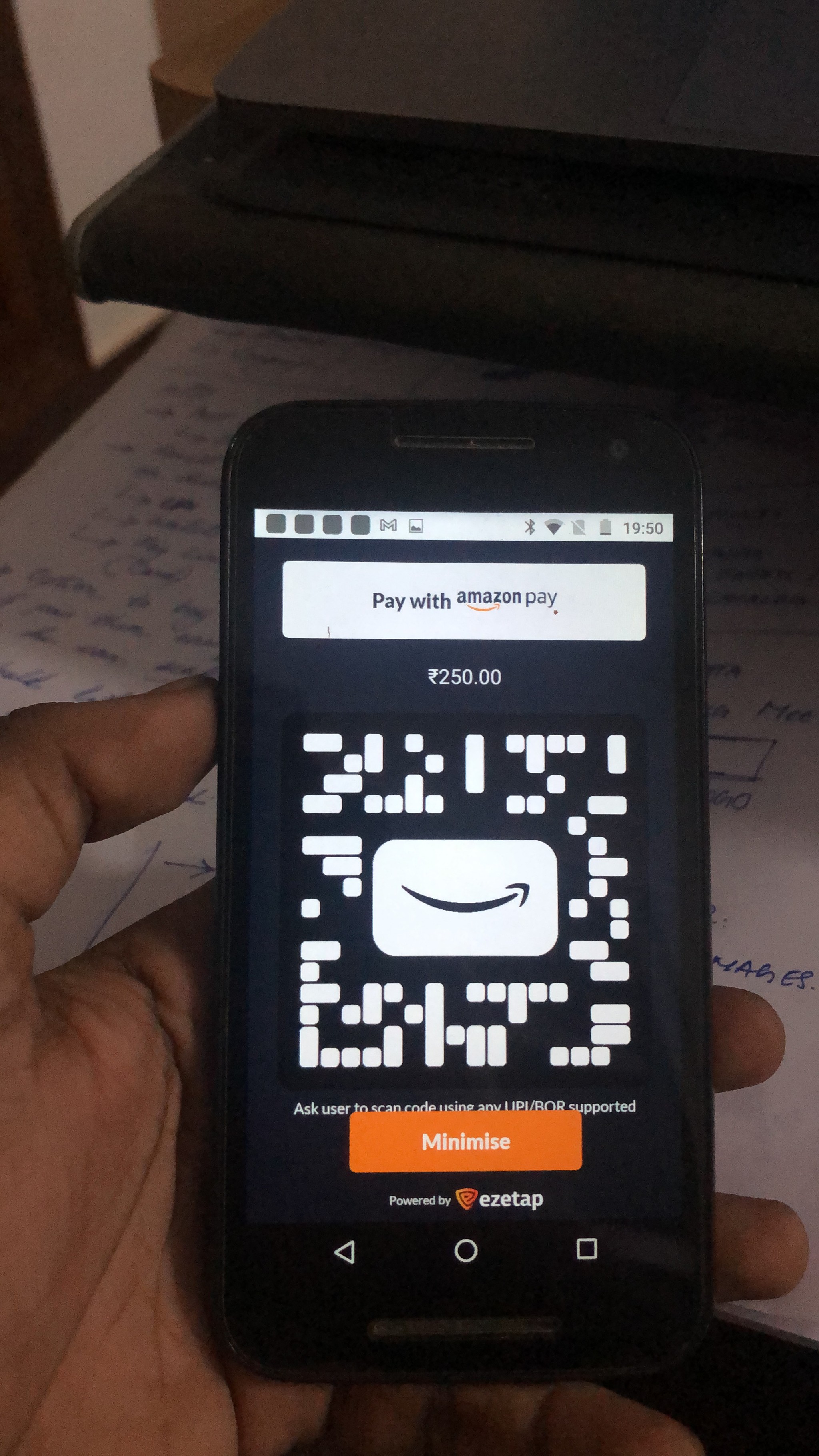
Pay with
Screen
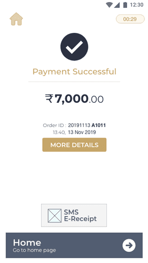
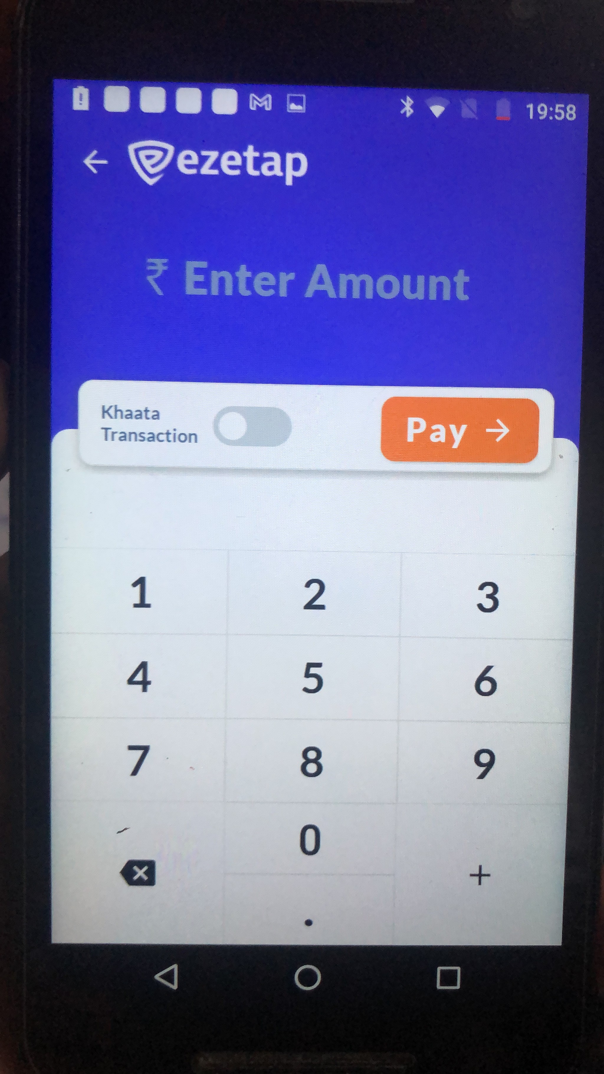
Universal Payment Screen or 'Pay with' screen is the screen in which the user chooses the payment mode. This screen also displays additional details about the order and payment offers if available.
Solution
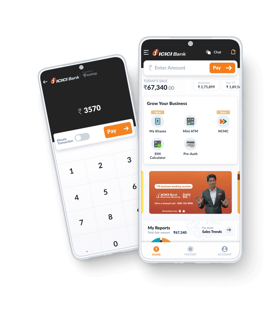
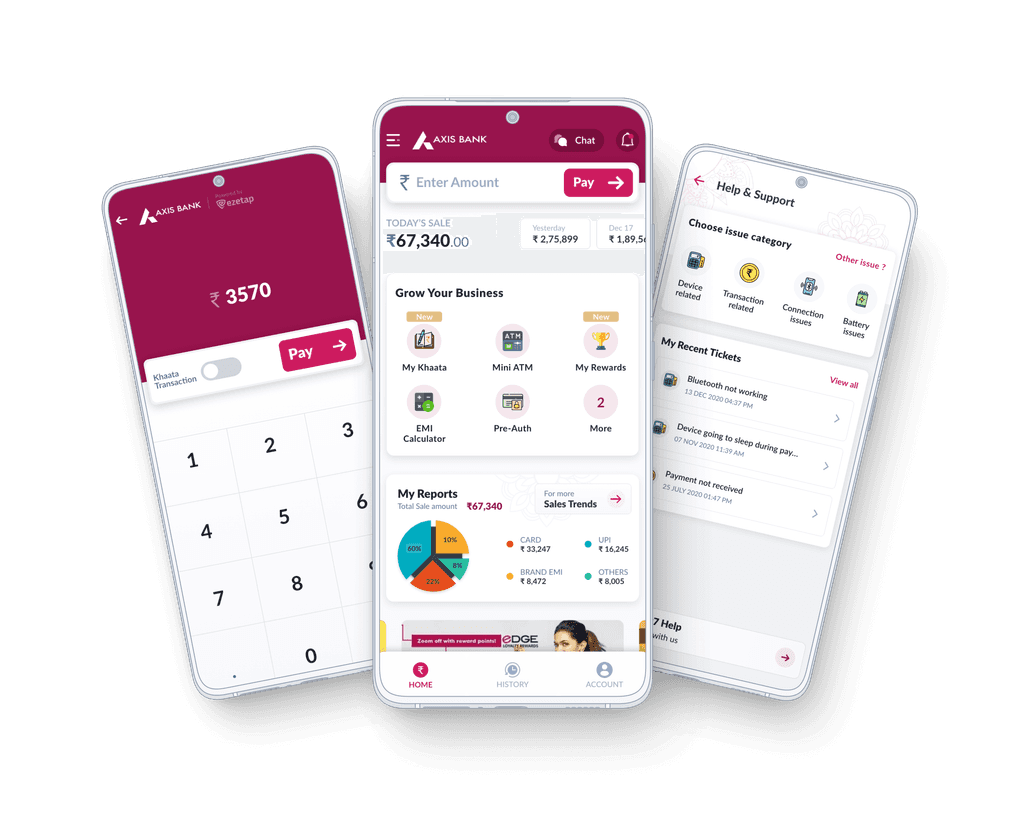
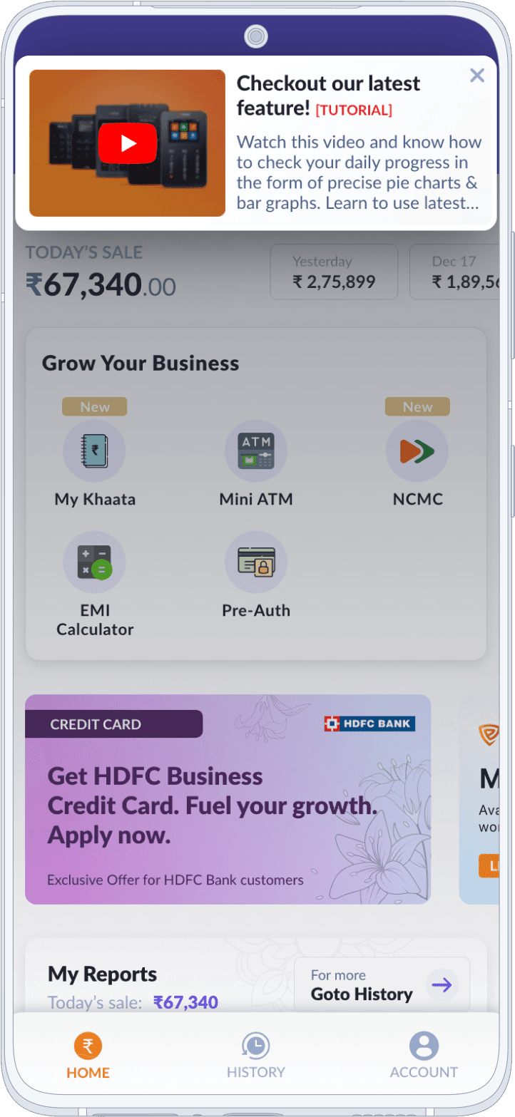
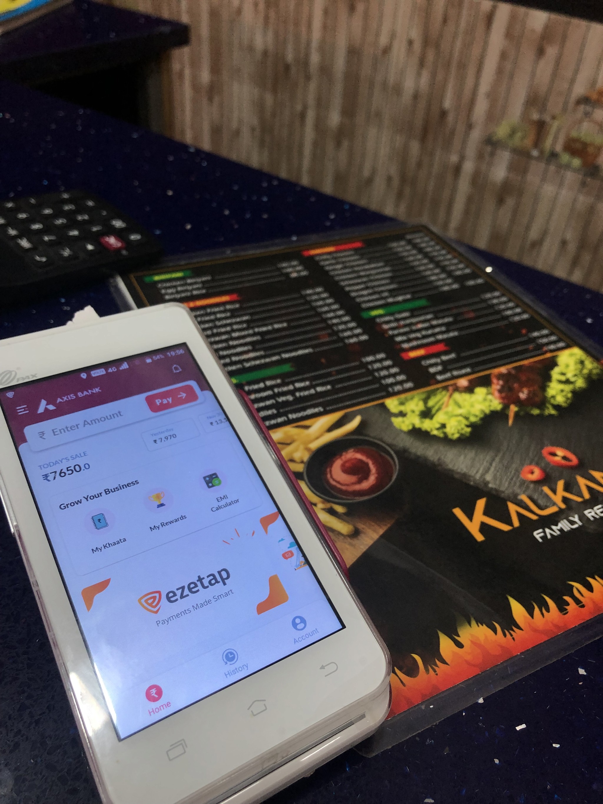
To address this, we revolutionised the Home Screen into a dynamic dashboard.
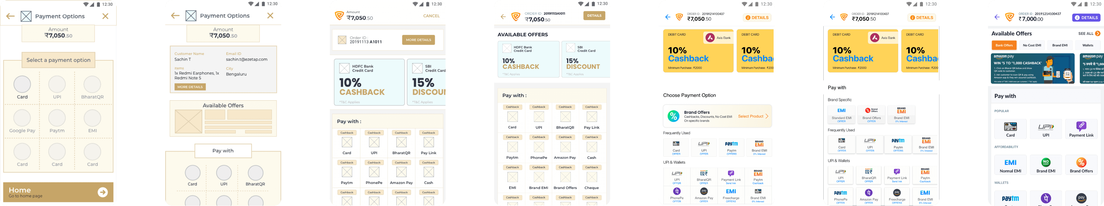
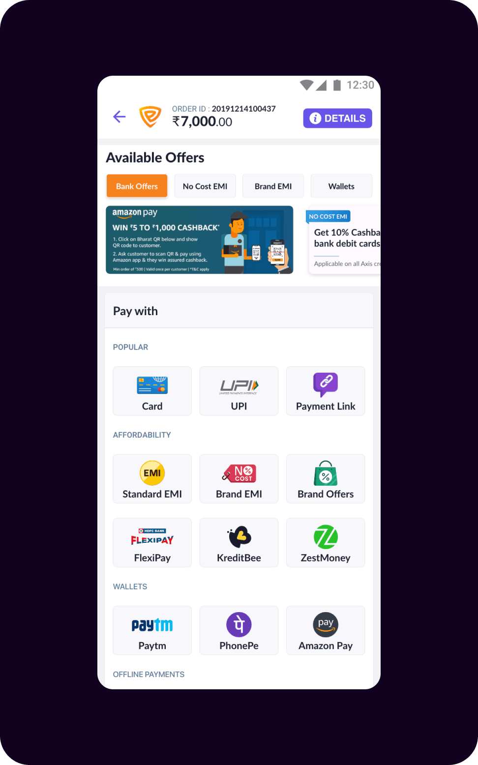

Universal
Payment Screen
This strategic redesign prioritised a holistic view of all features, empowering merchants with an "at a glance" experience.
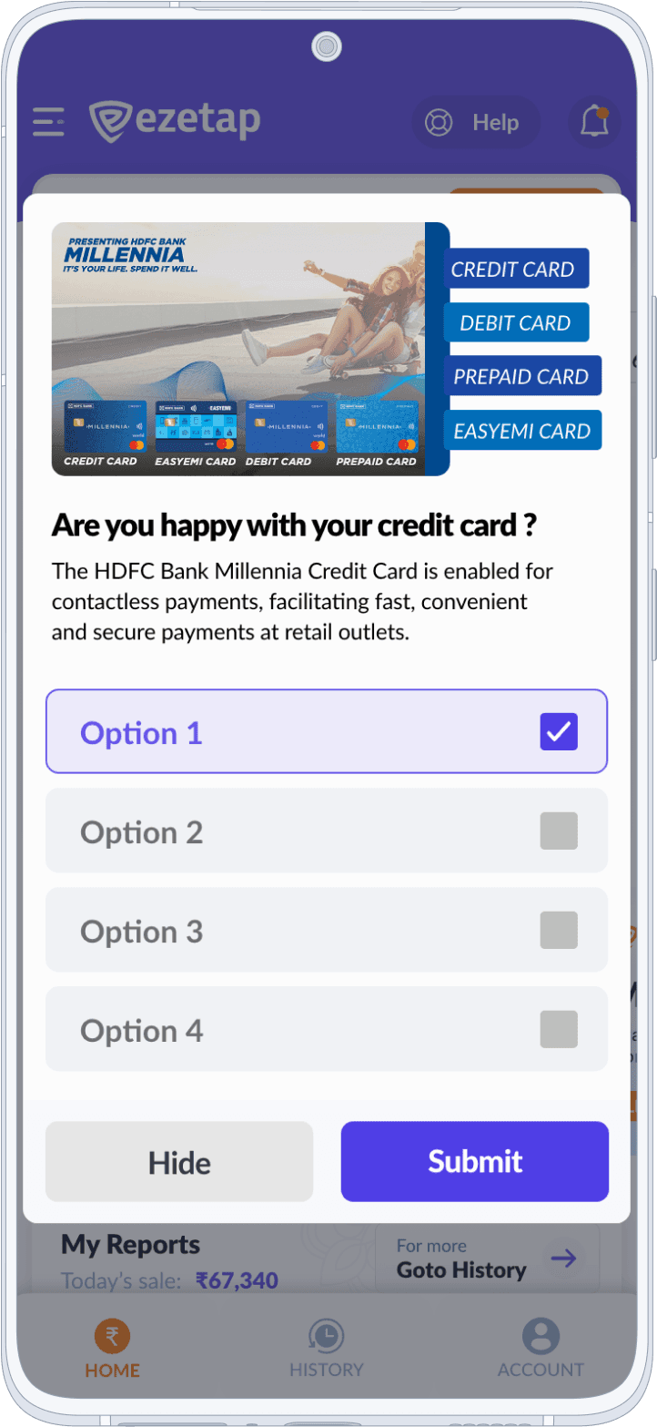
Payment Promos
JSON-based
Template Generator
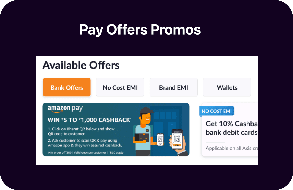
A JSON-based template generator was introduced to enable promo configuration. Banks/NBFCs could easily add text or image promos to the configurations for display on the main screen.
Created a JSON-based template generator allowing banks to configure promos easily.
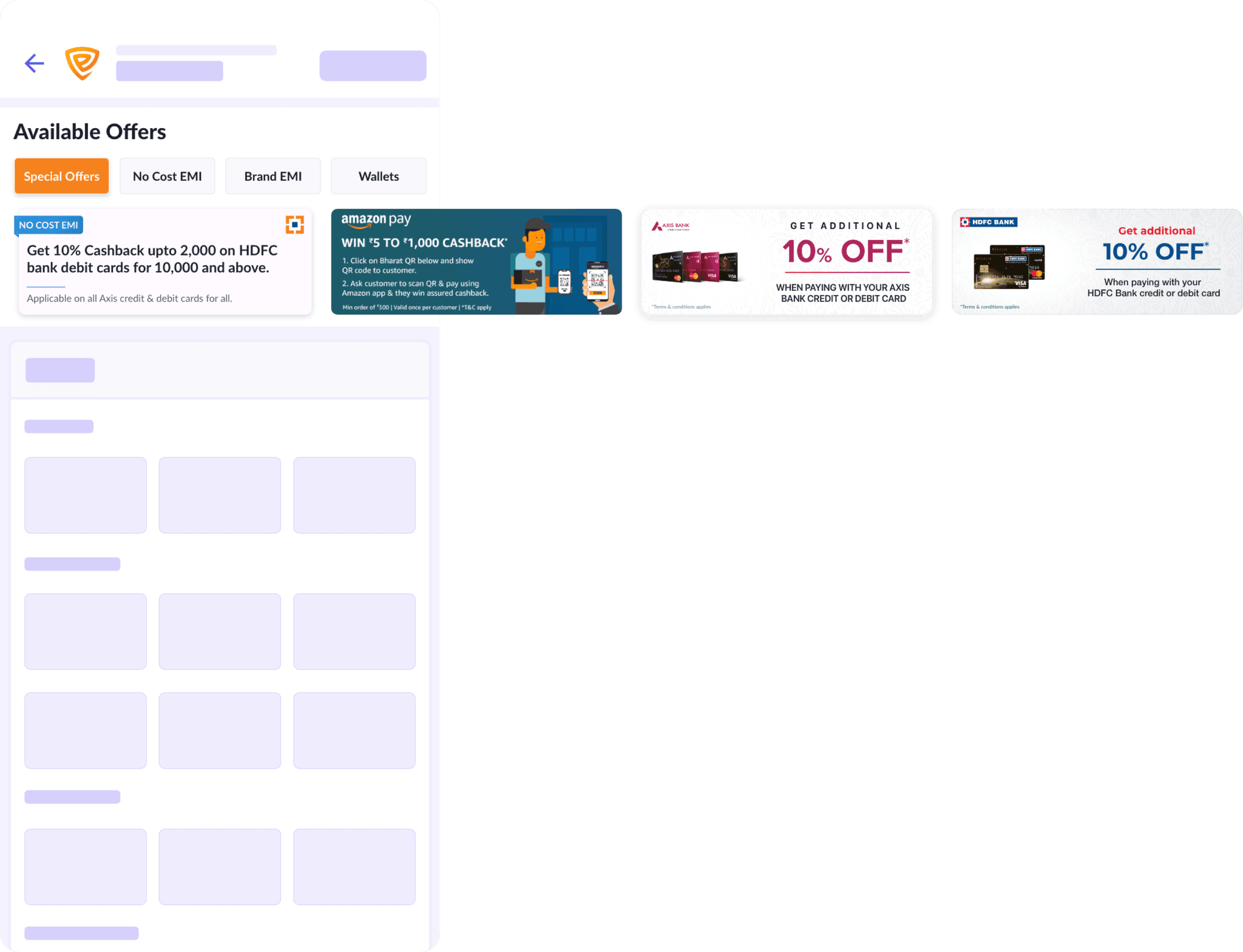
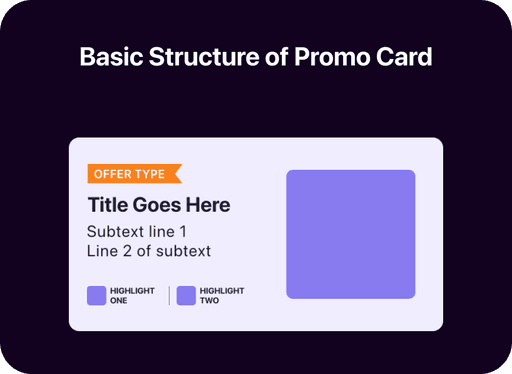
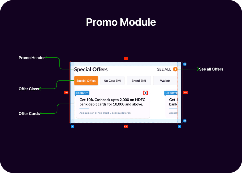
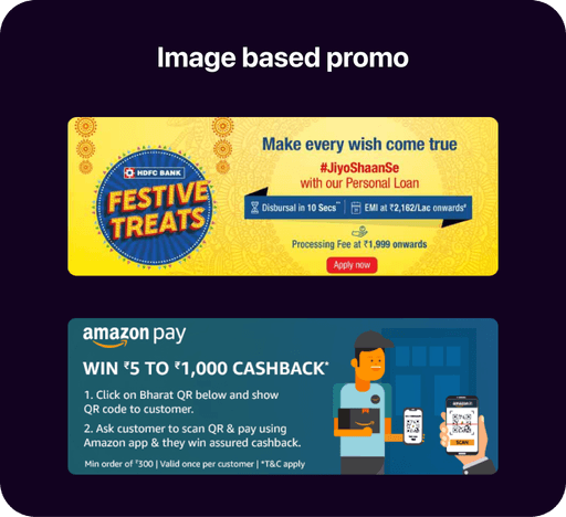
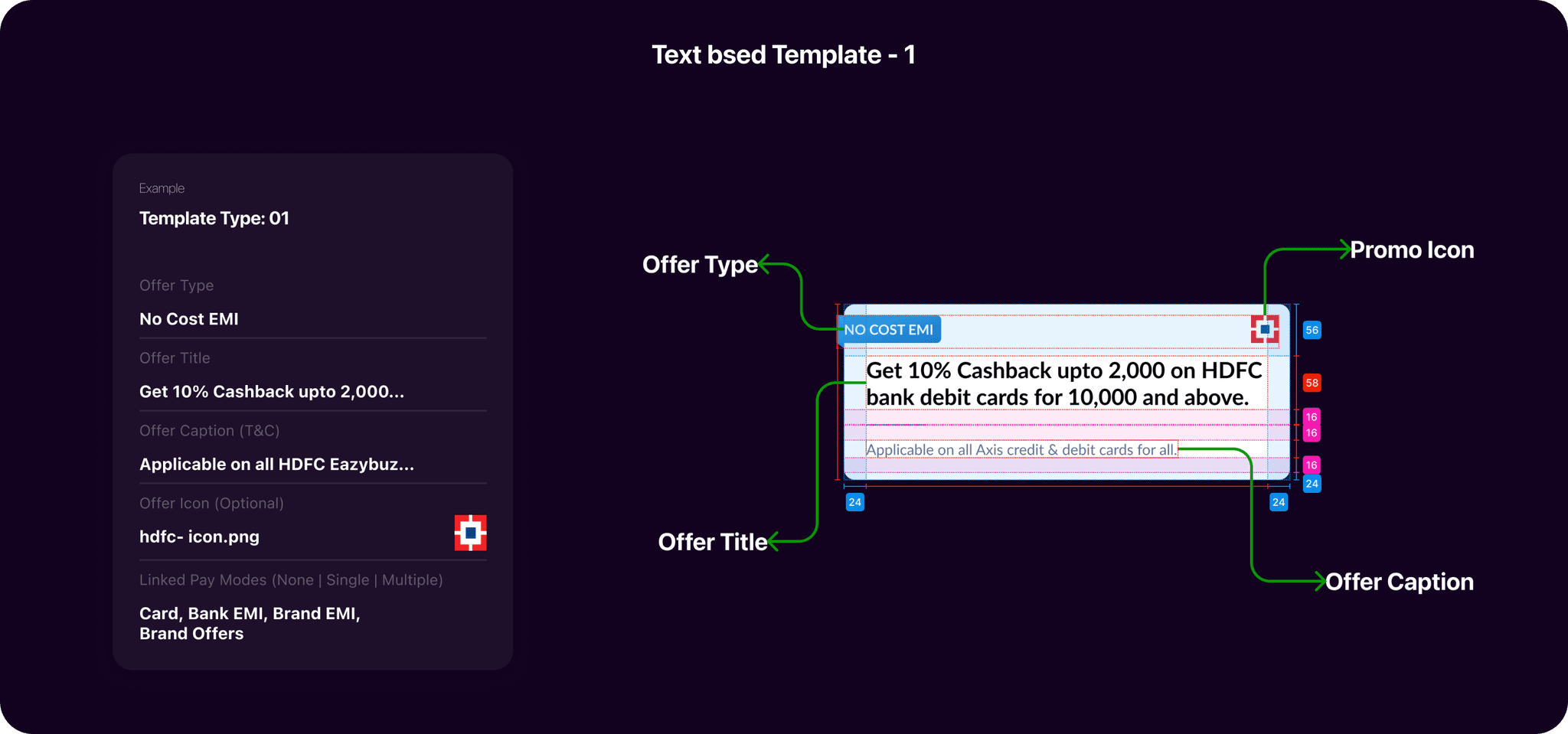
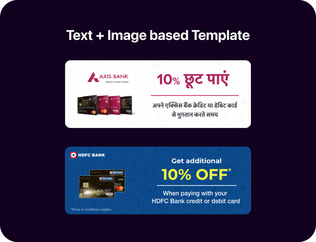
Payment Offer Promos
Notification Centre
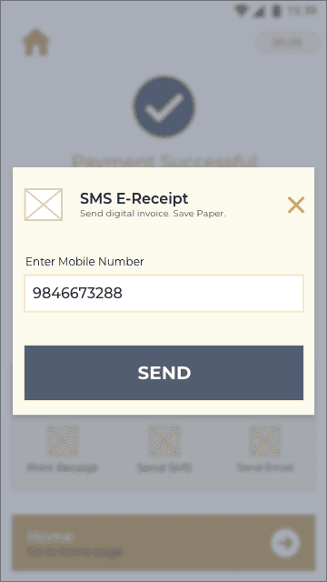
Where merchants receive alerts, triggers, and updates about critical information. Whether it's about their Khaata, rewards, or new features, merchants can effortlessly stay informed and make well-informed decisions.
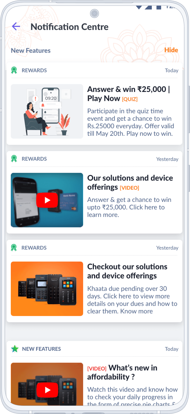
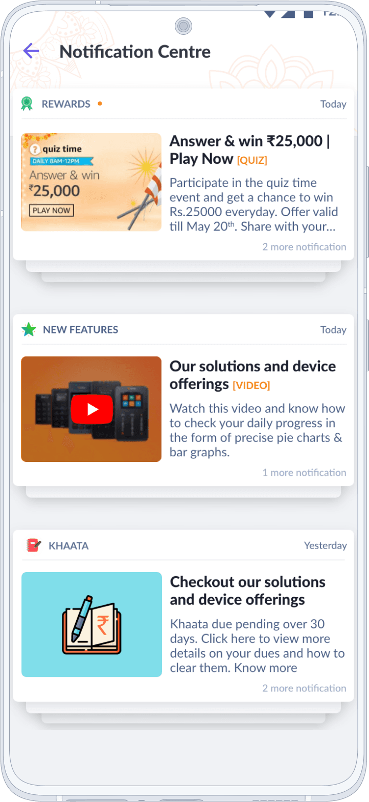
In-App Messaging
Establishing direct communication between merchants and providers through personalized messages and offers
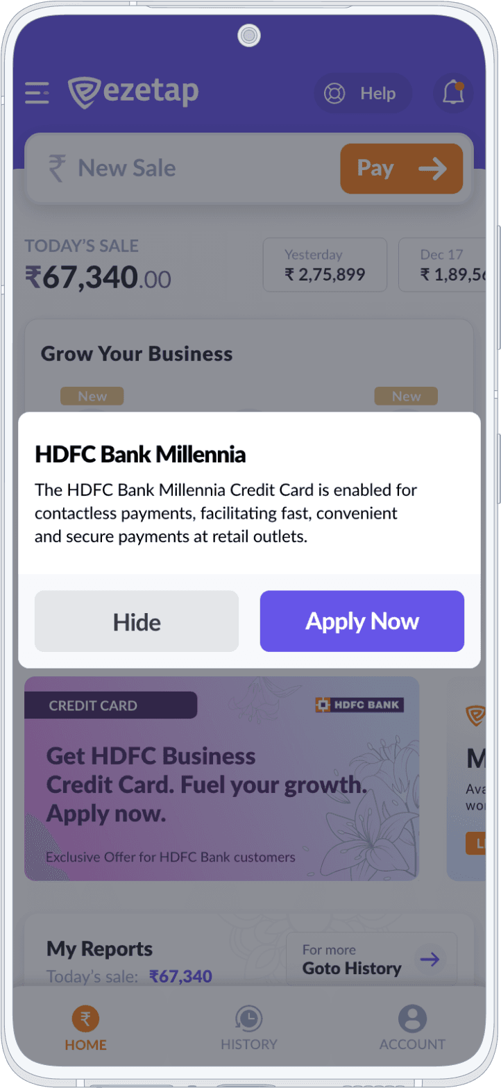
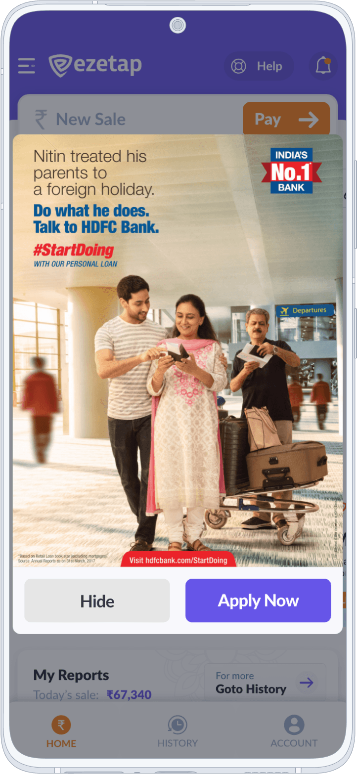
Promo 2.0
The Promo 2.0 comprising of a powerful Promo generator, IAM & Notification Centre became an integral part of the app, providing an effective way to engage users with offers, deals, and promotions, ultimately enhancing the app's value to both merchants and banks.
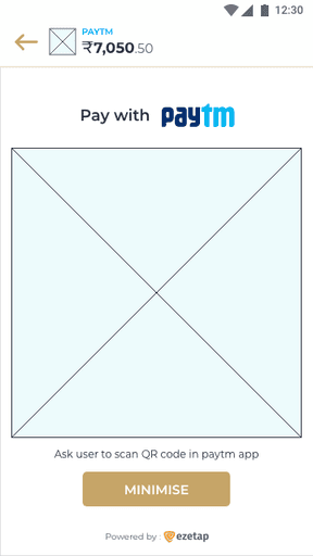
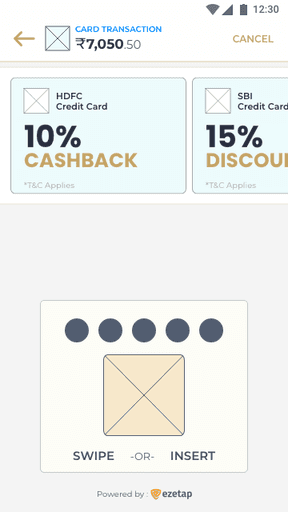
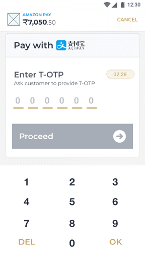
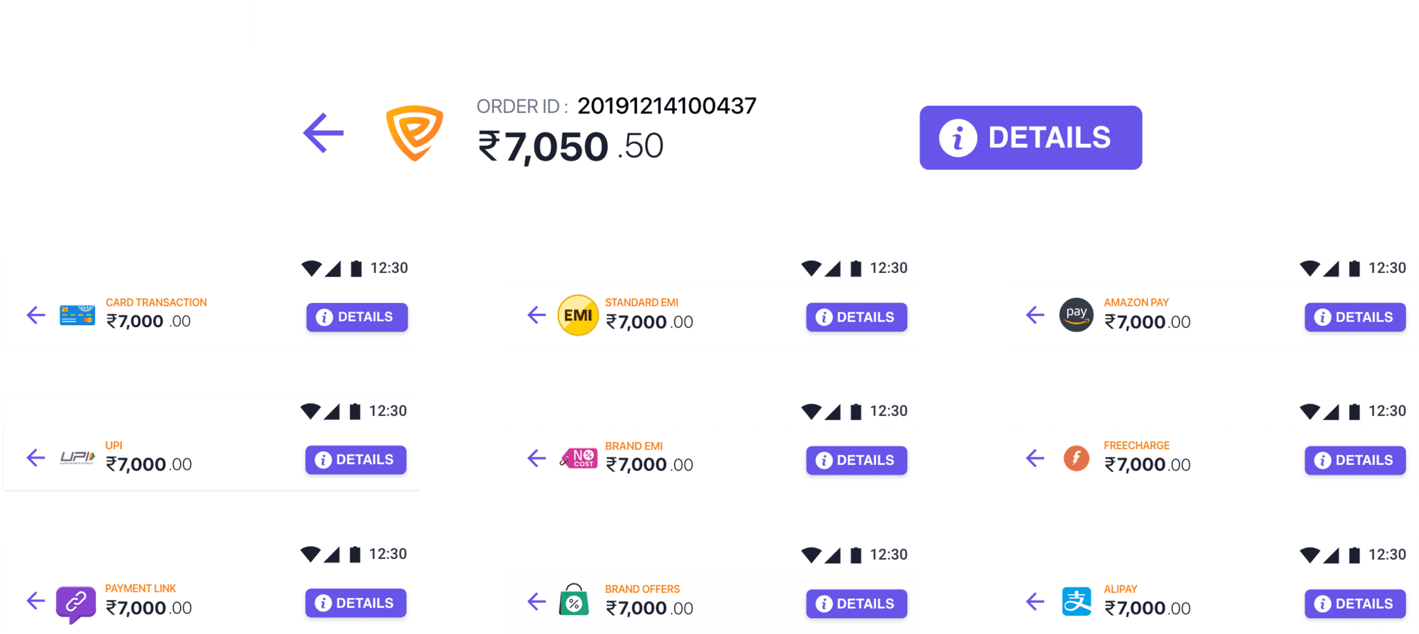
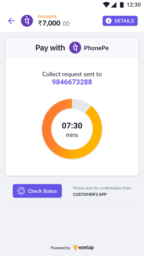
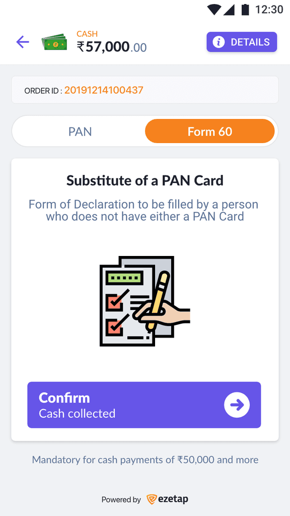
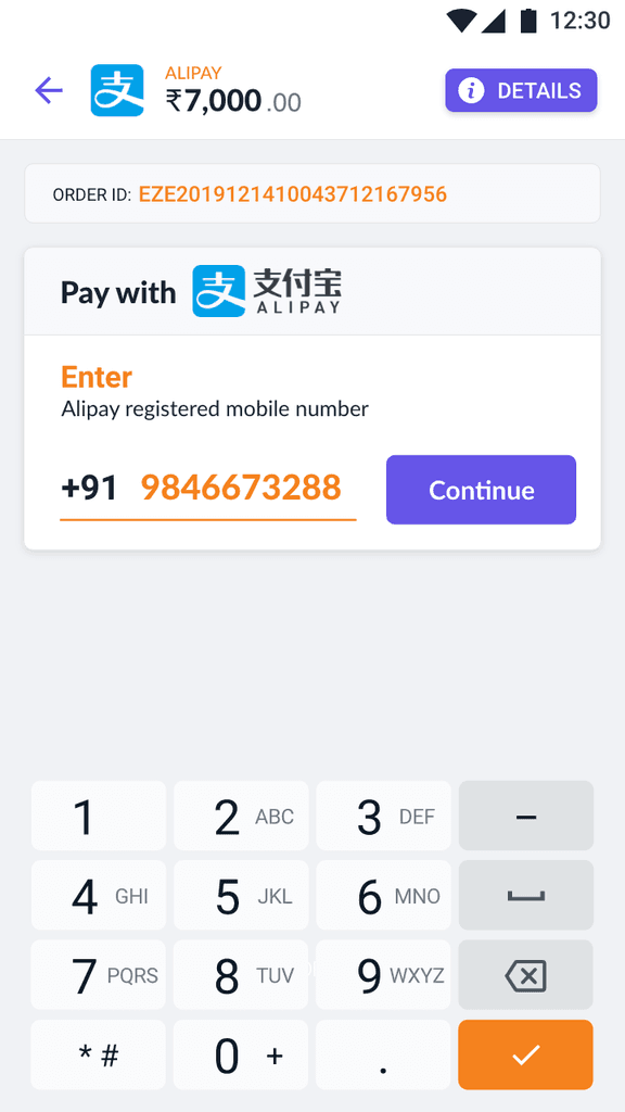
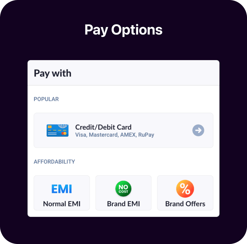
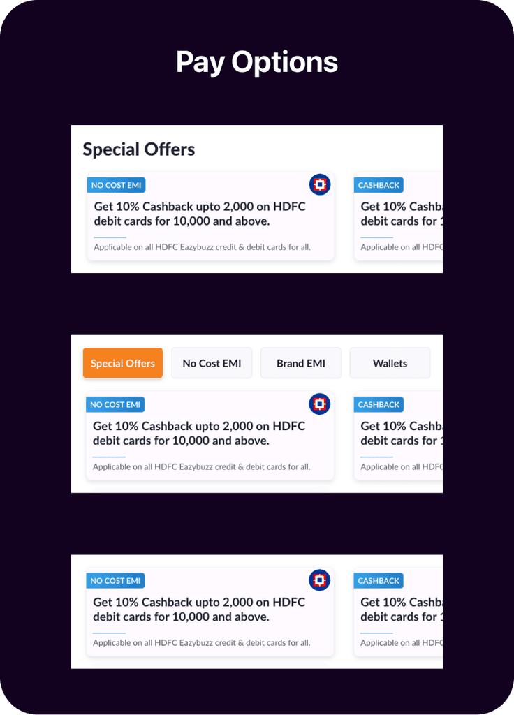
Simplified for Diverse Payments
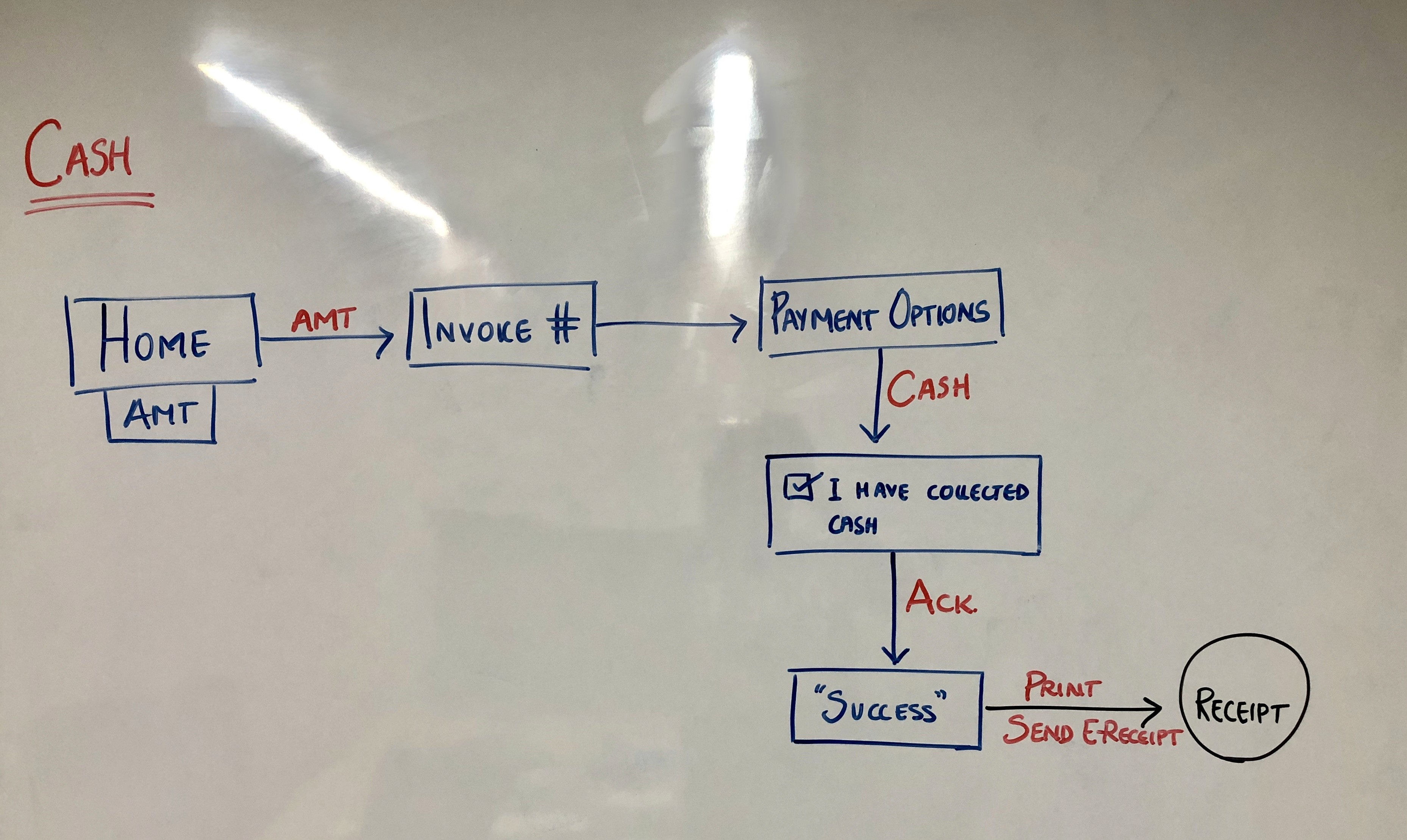
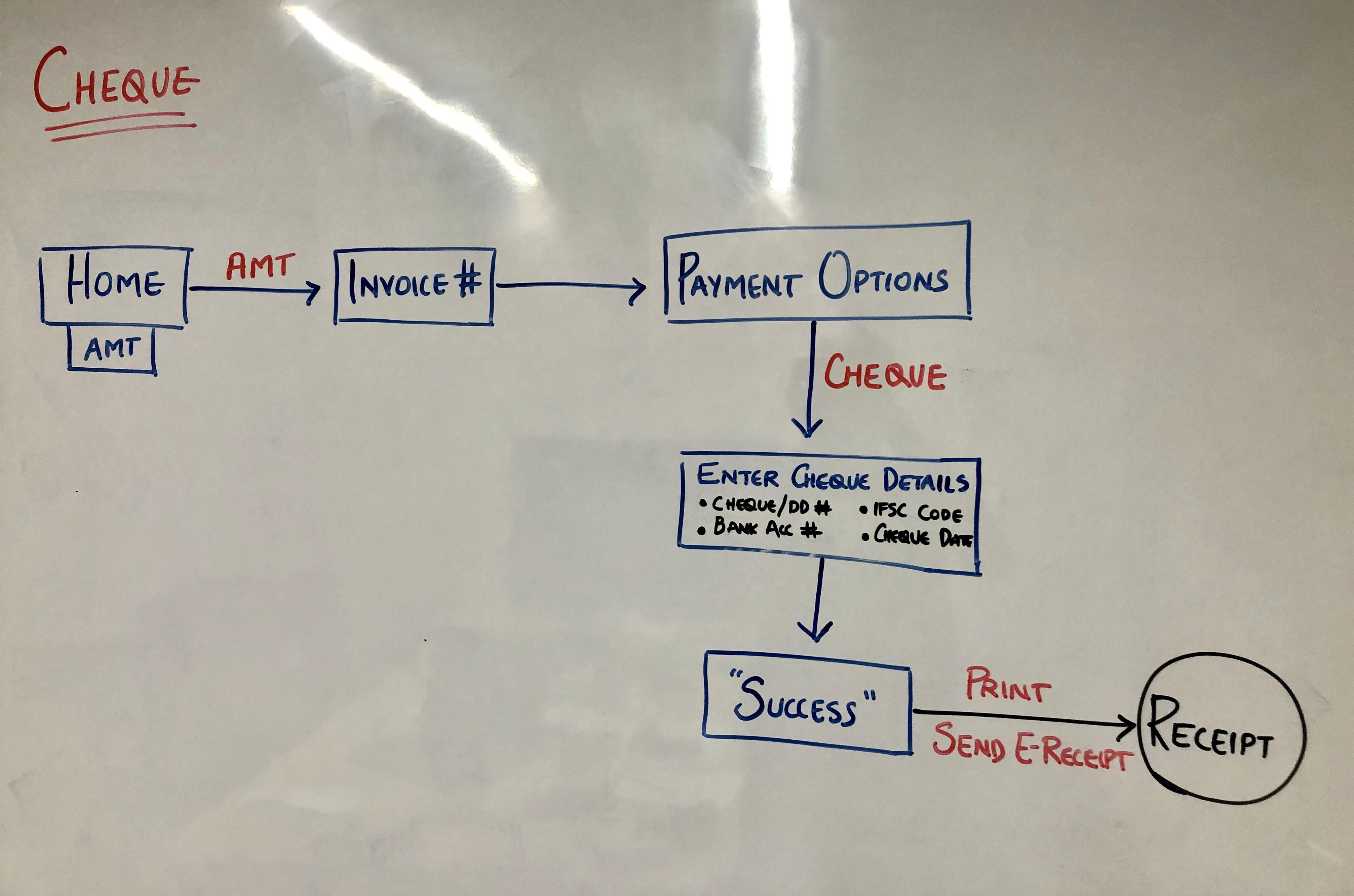
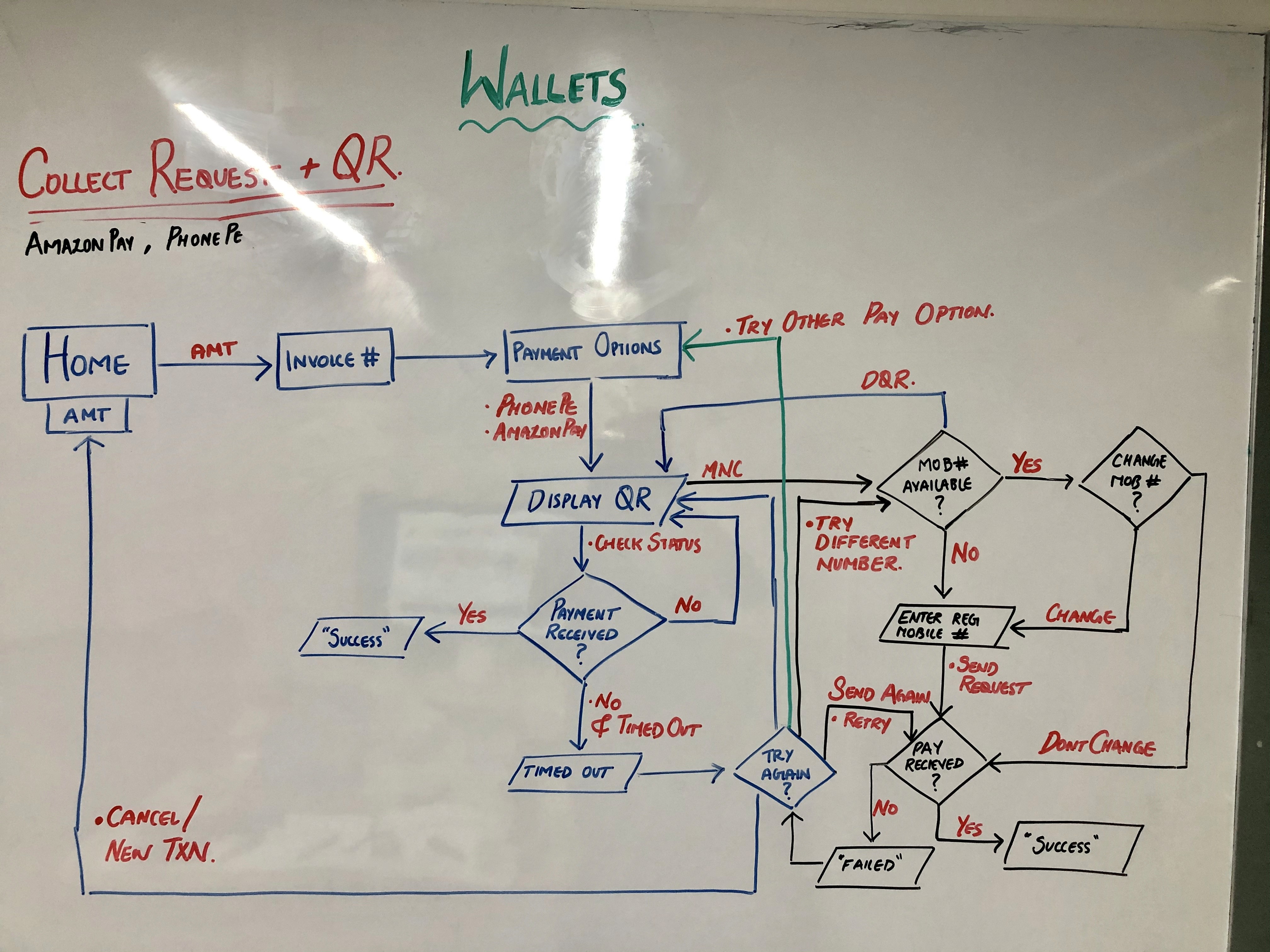
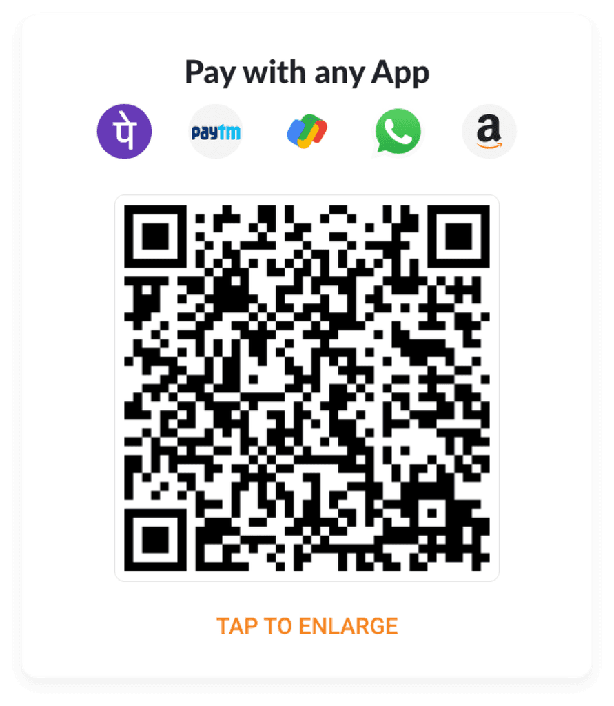
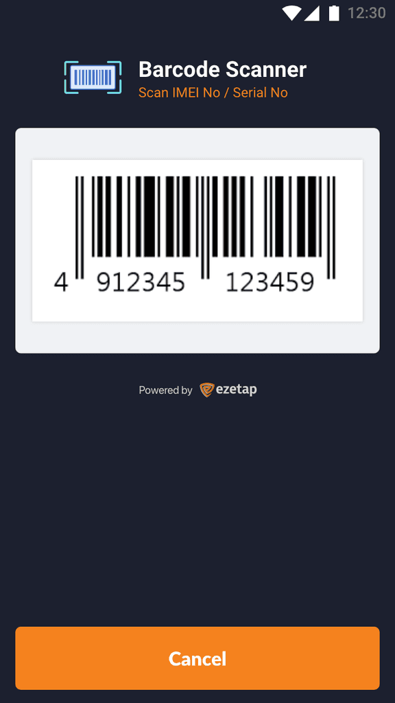
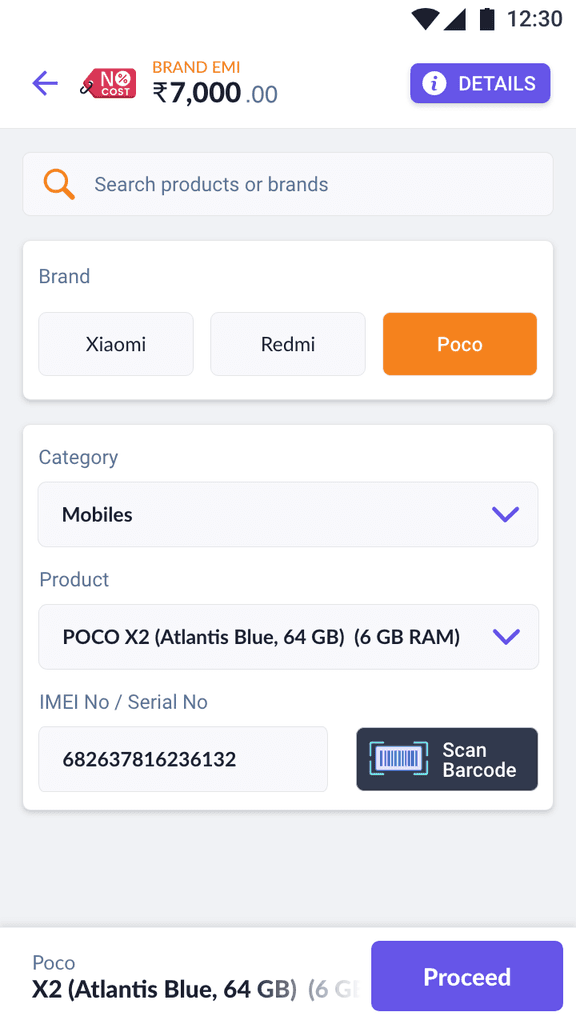
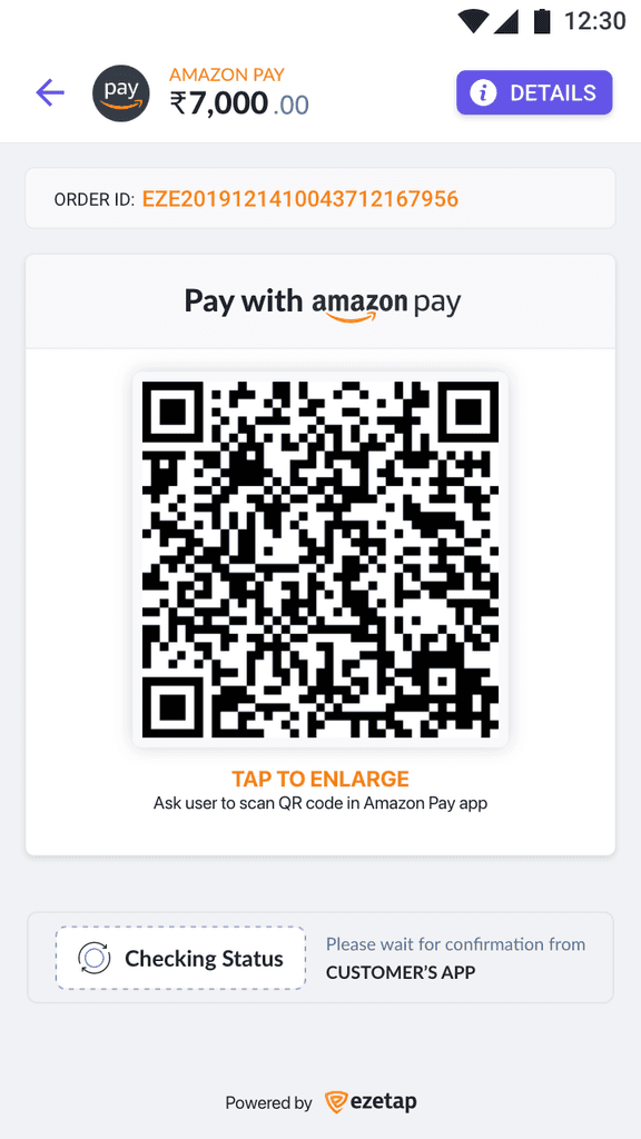
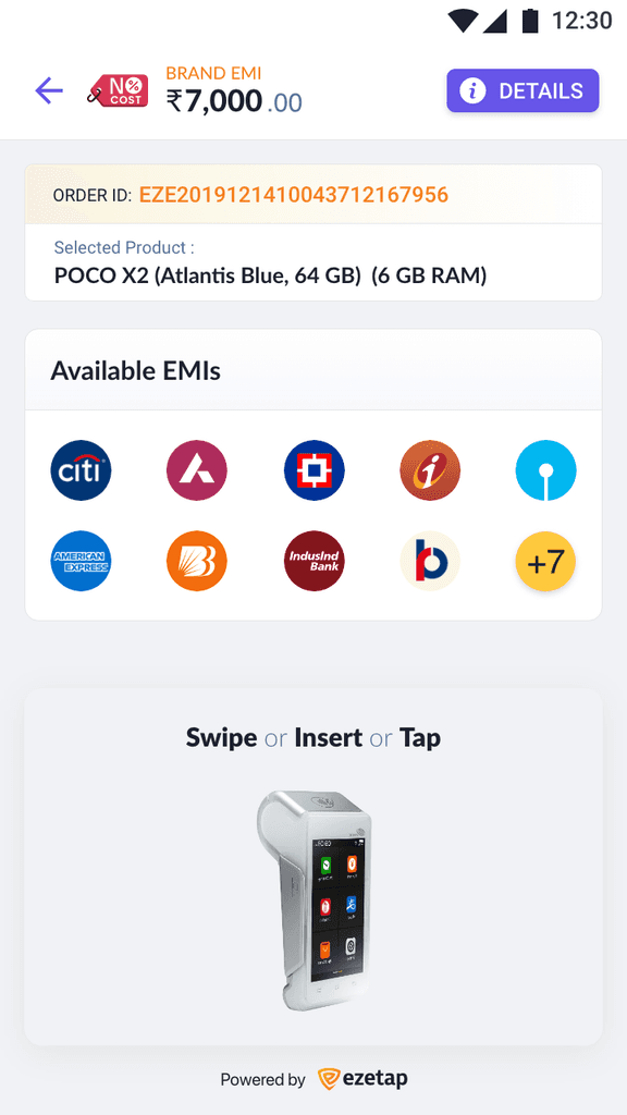
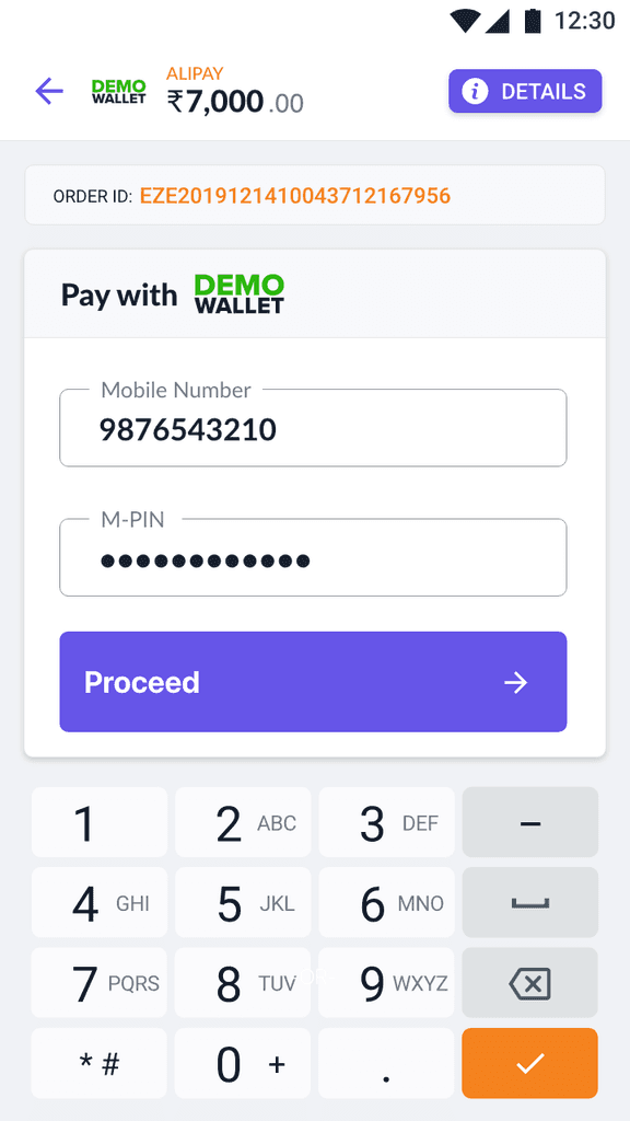
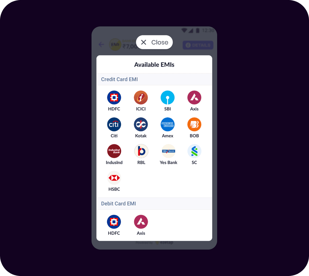
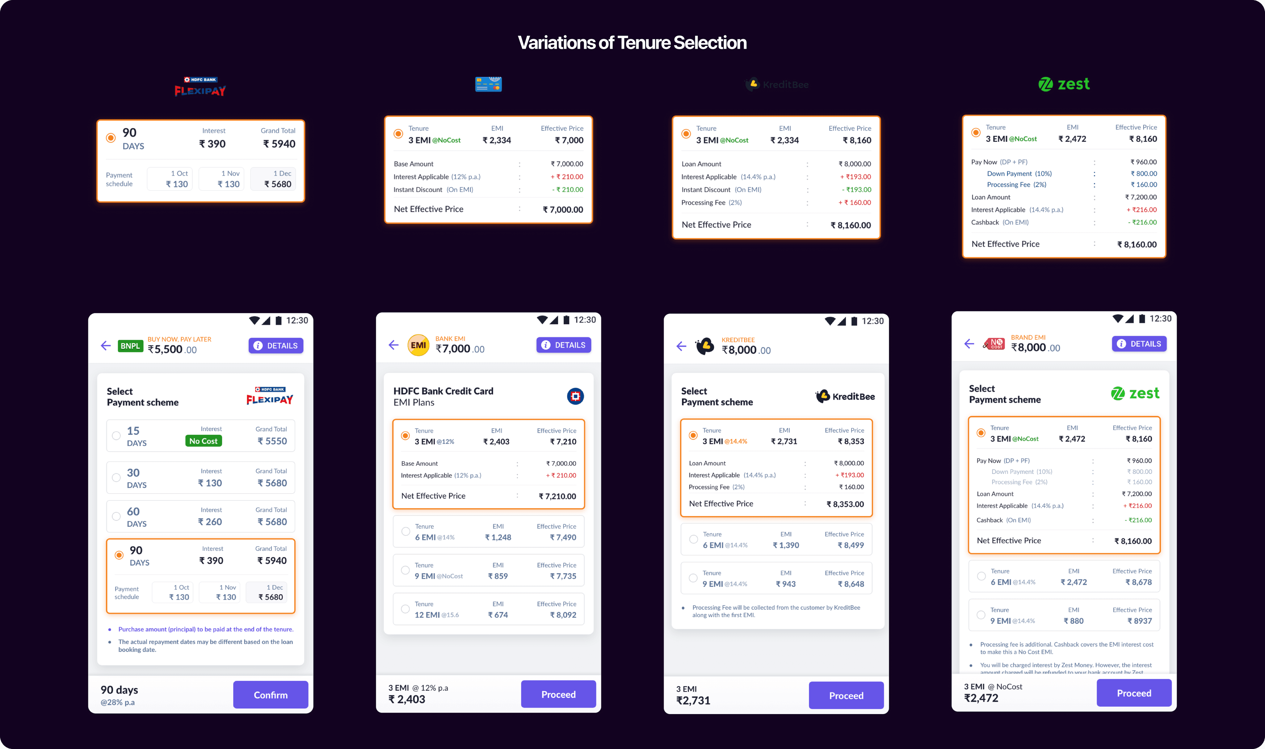
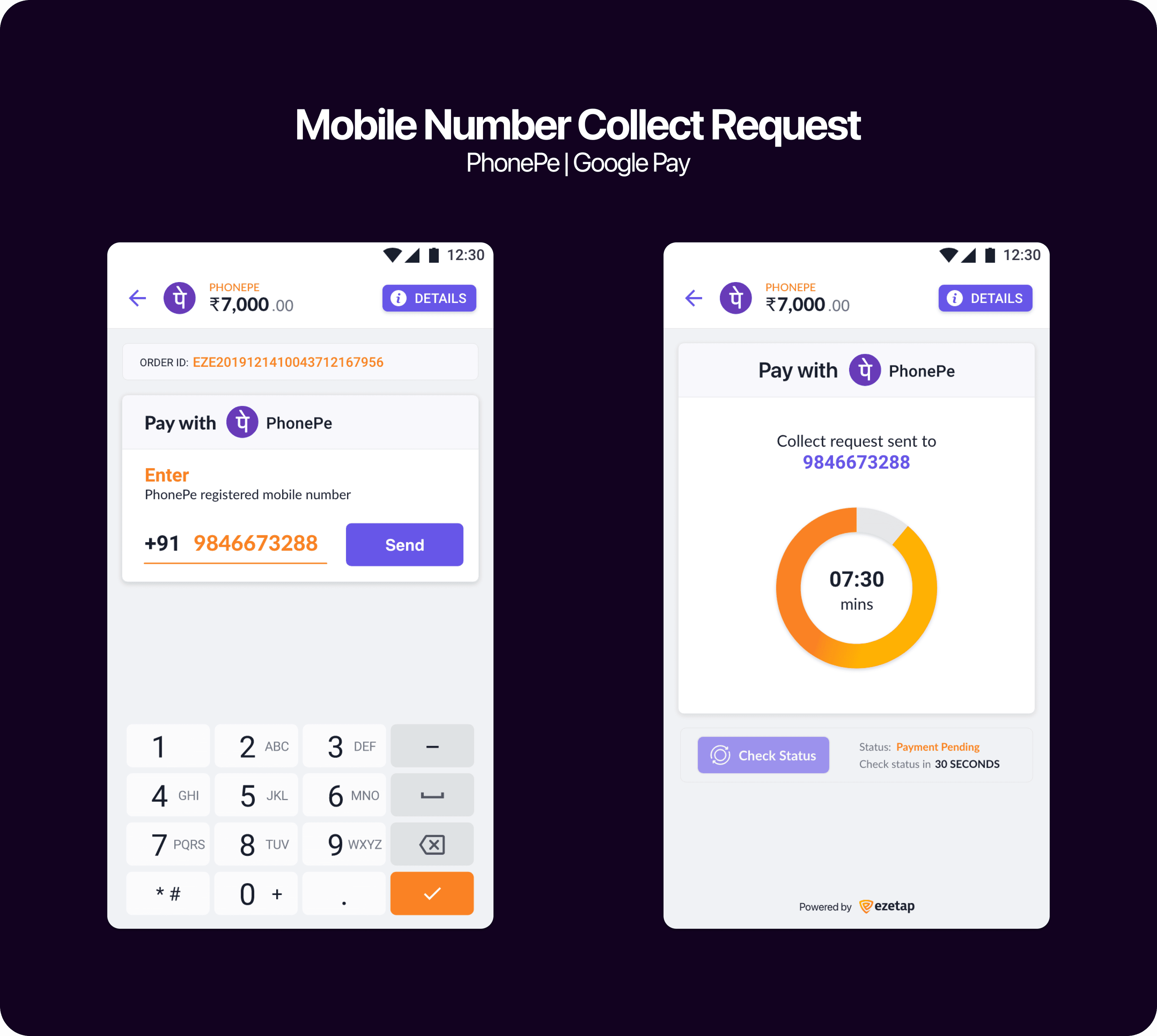
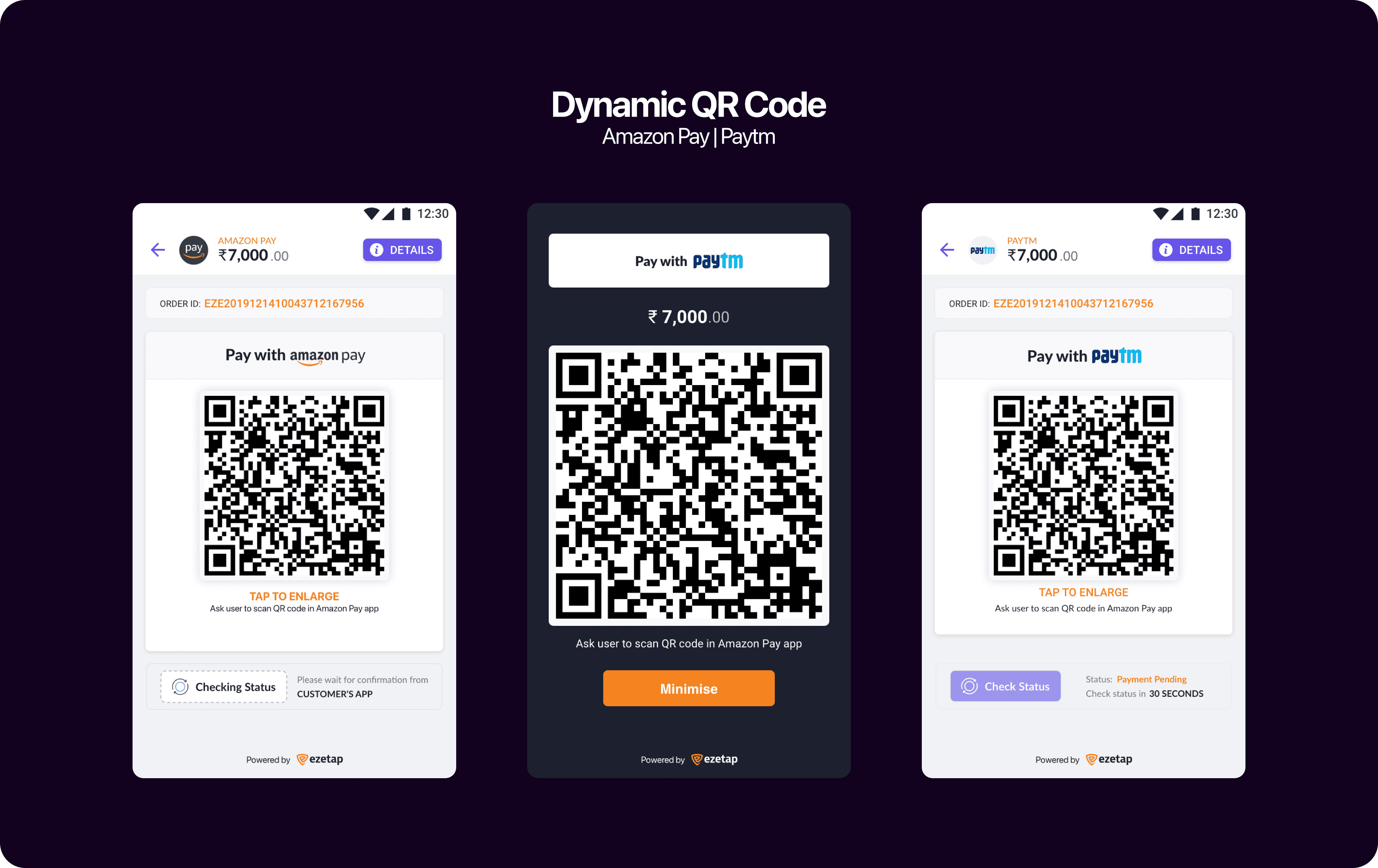
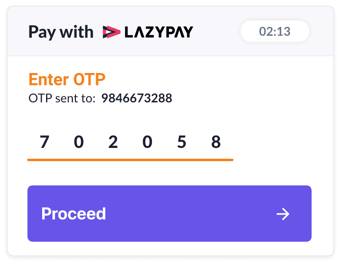
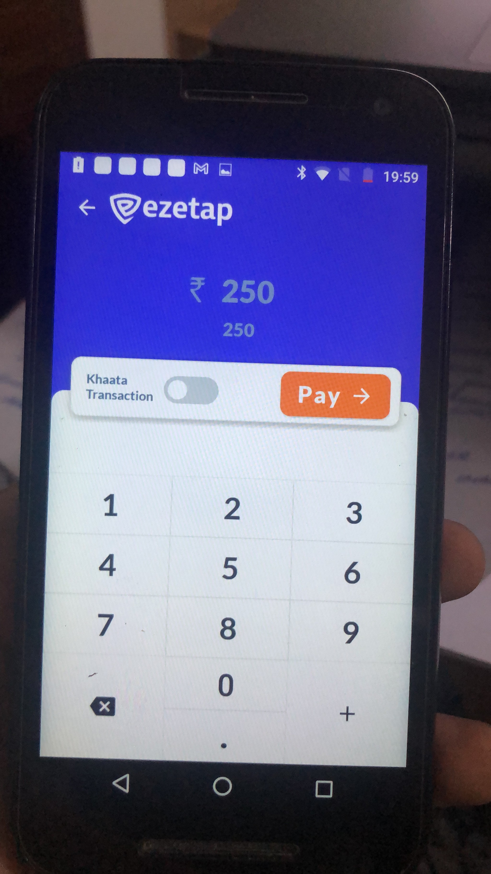
Payment Modes
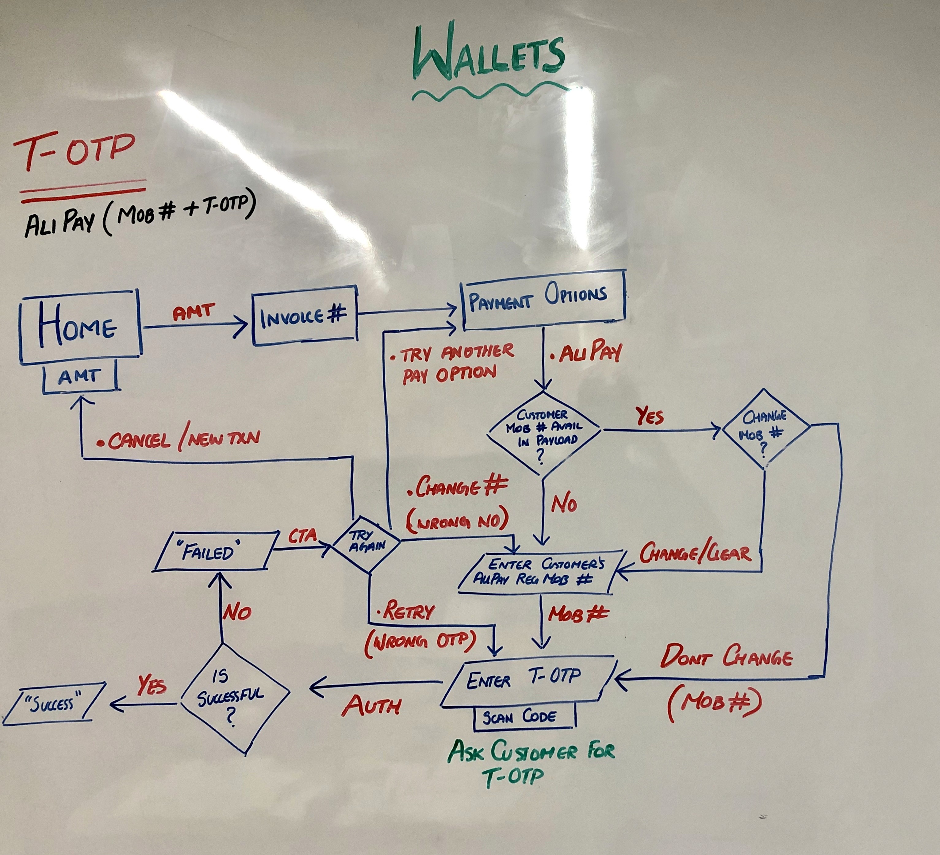
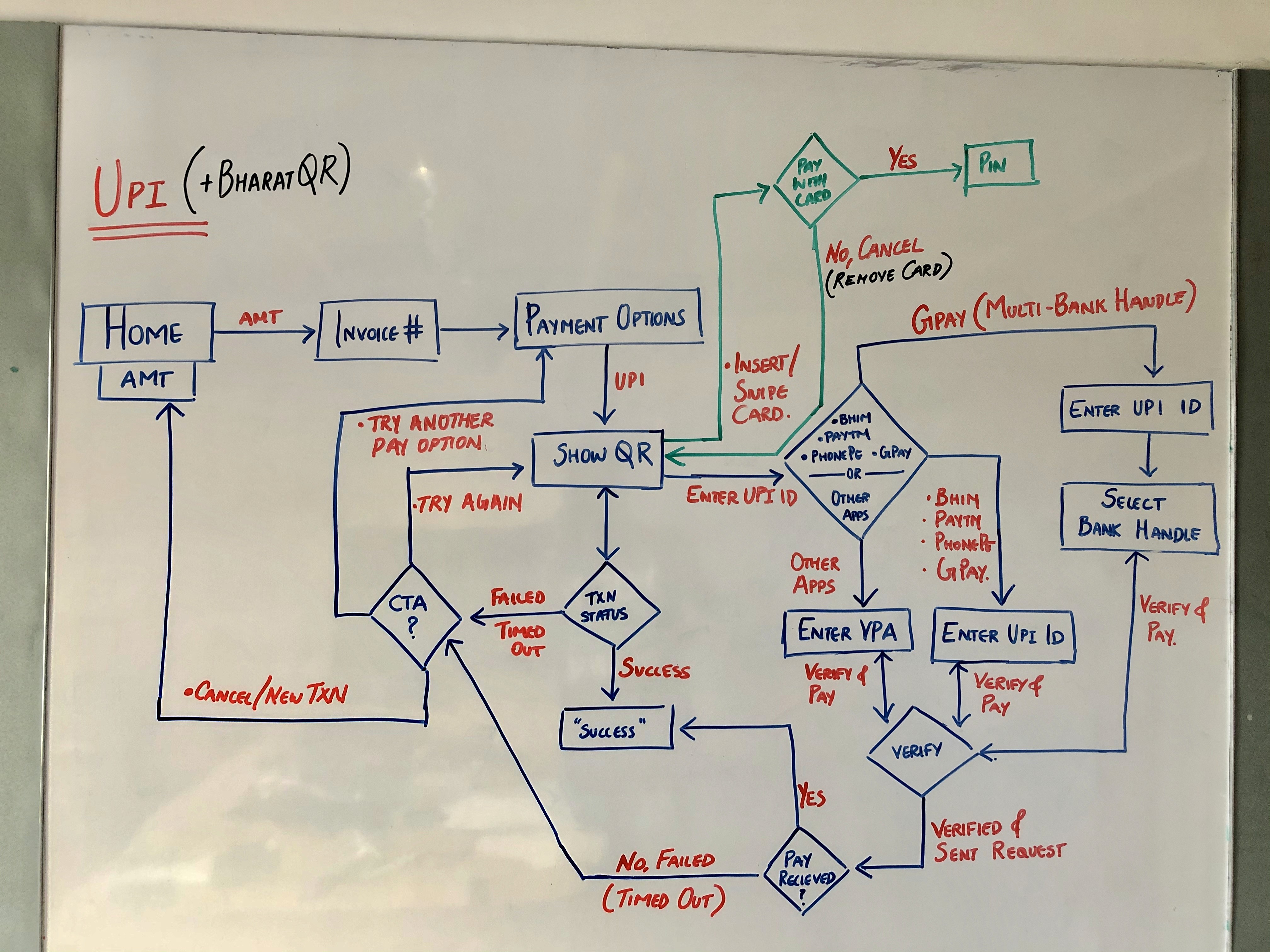
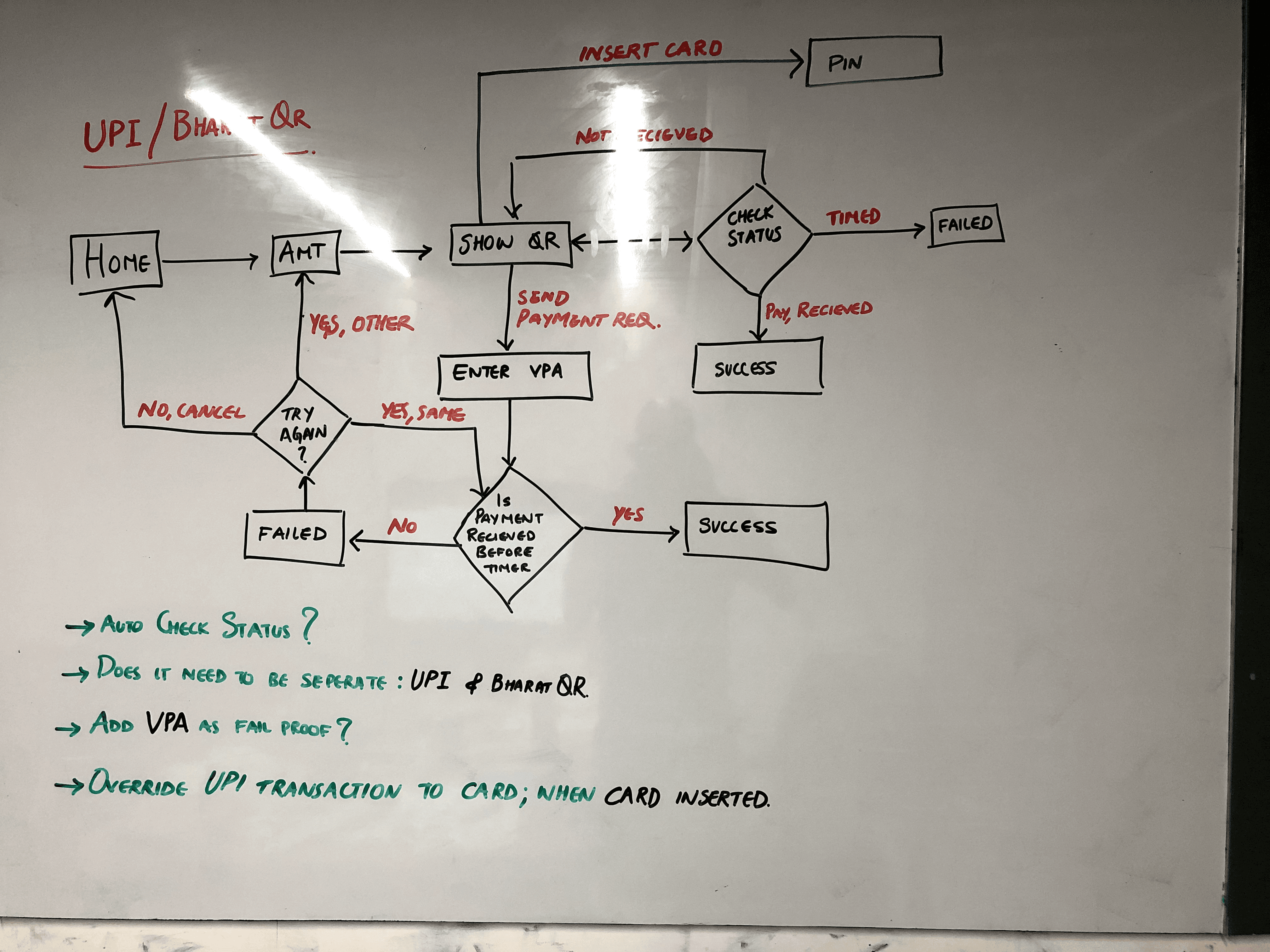
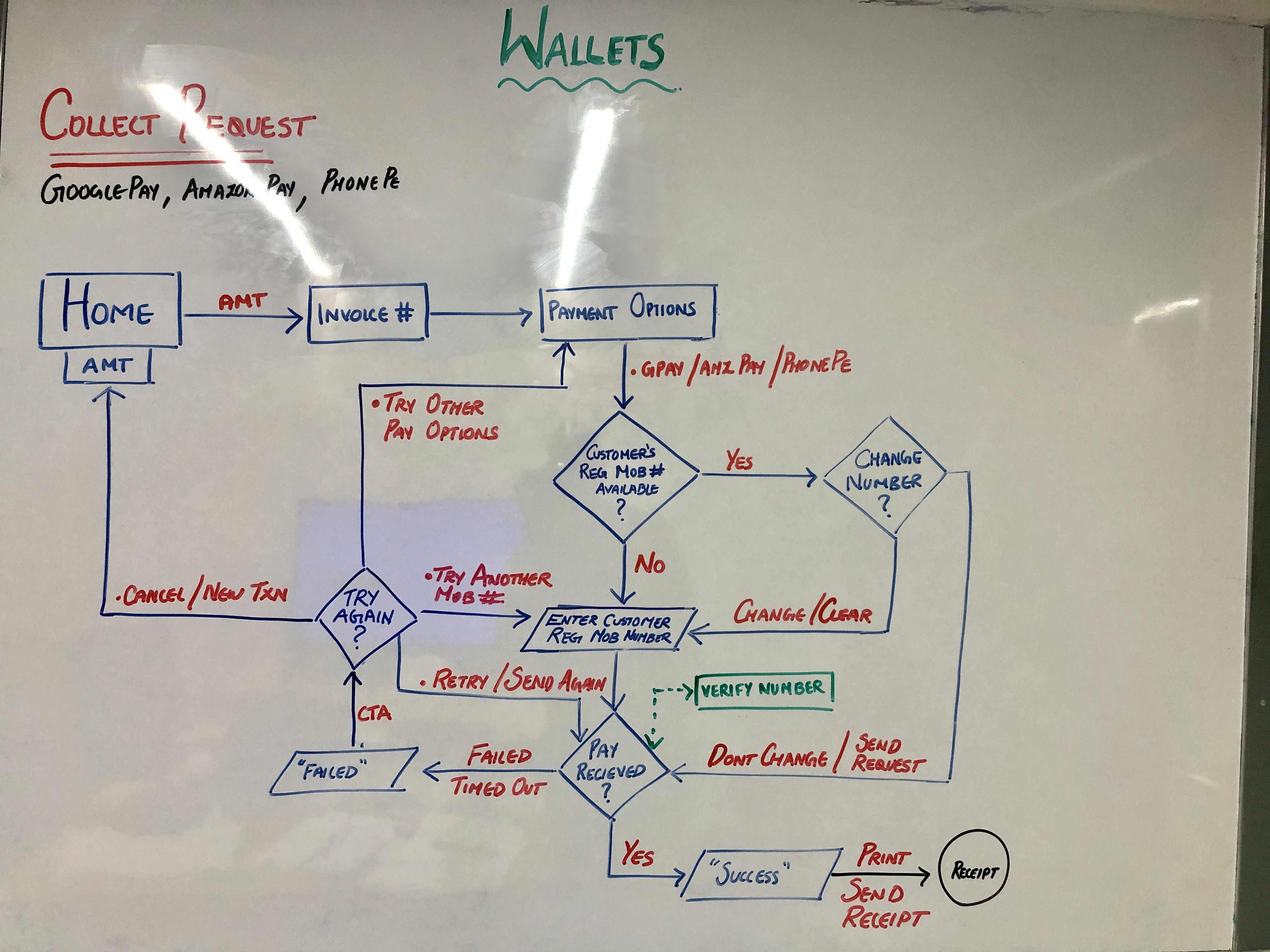
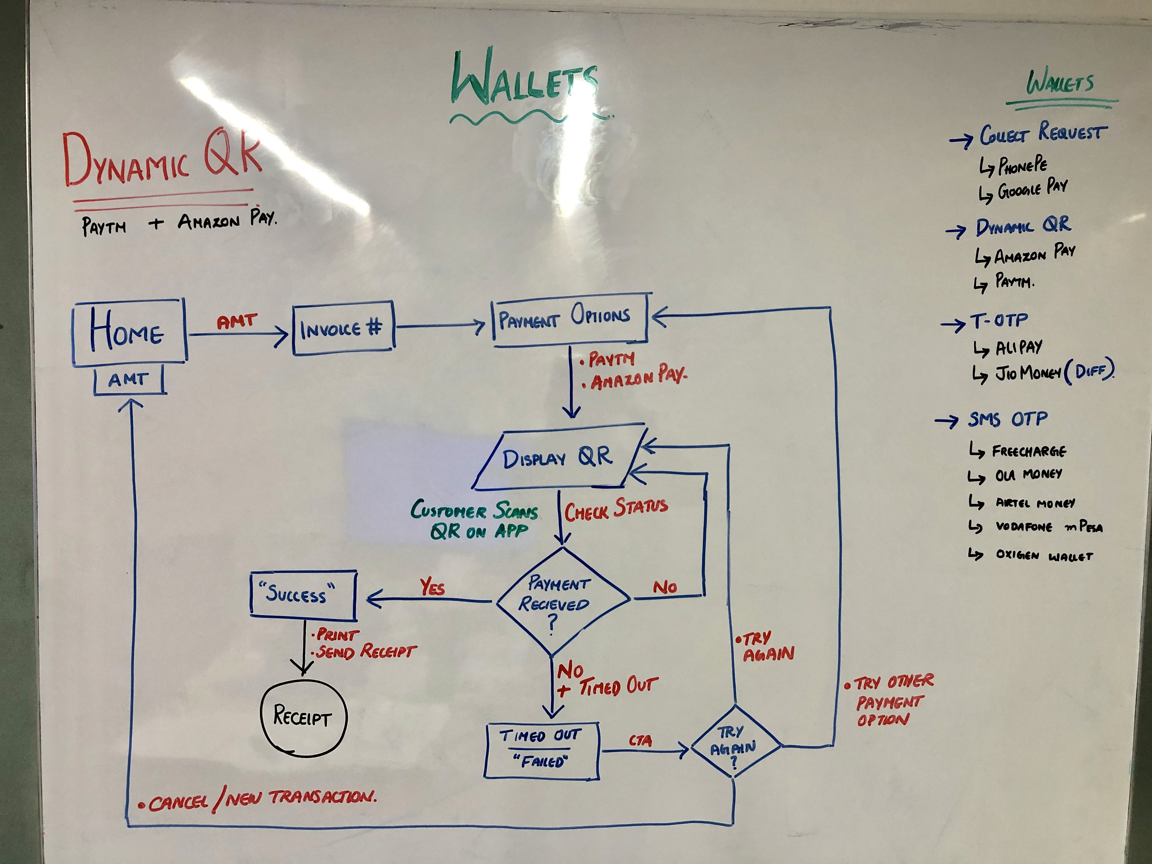
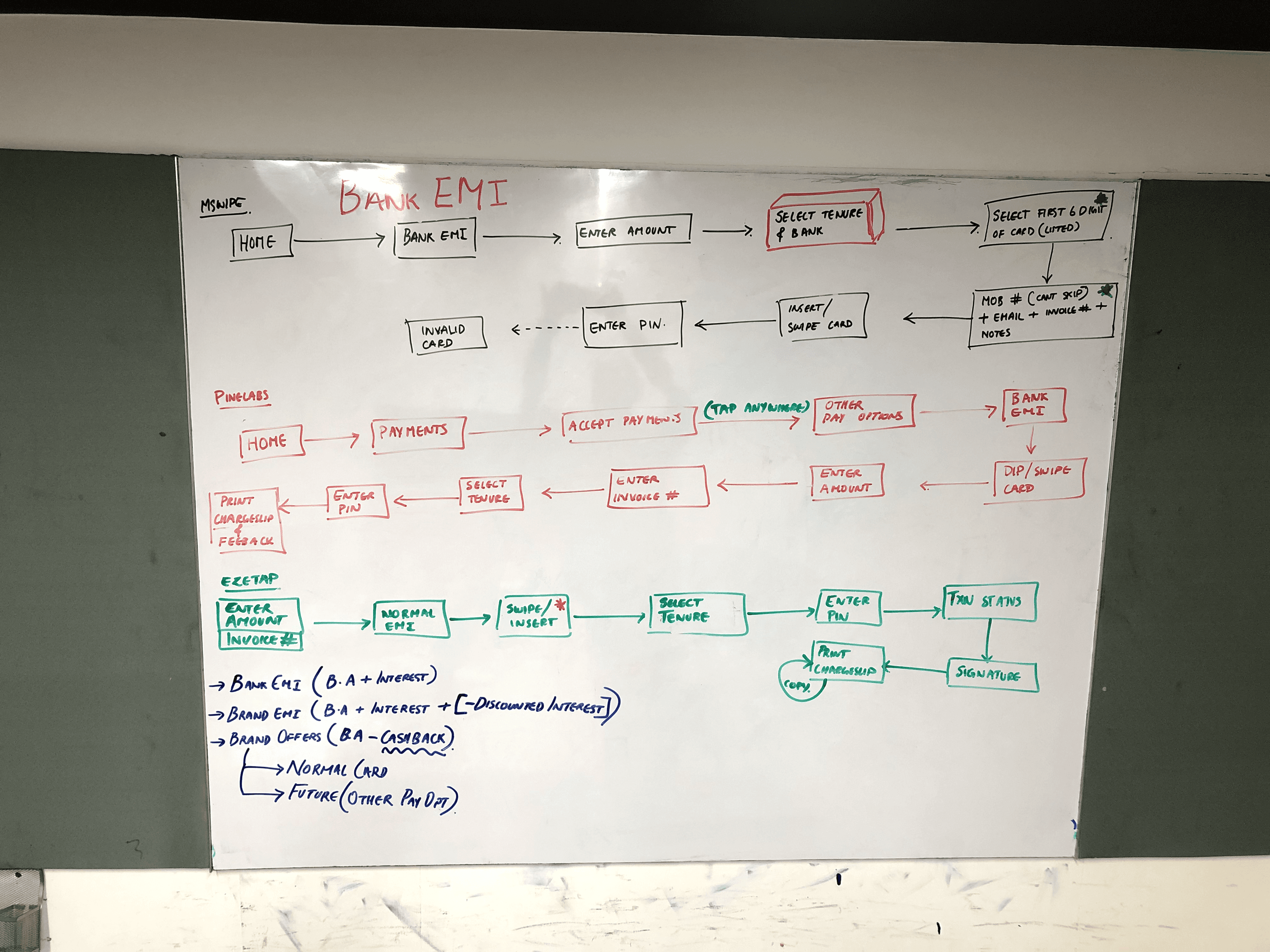
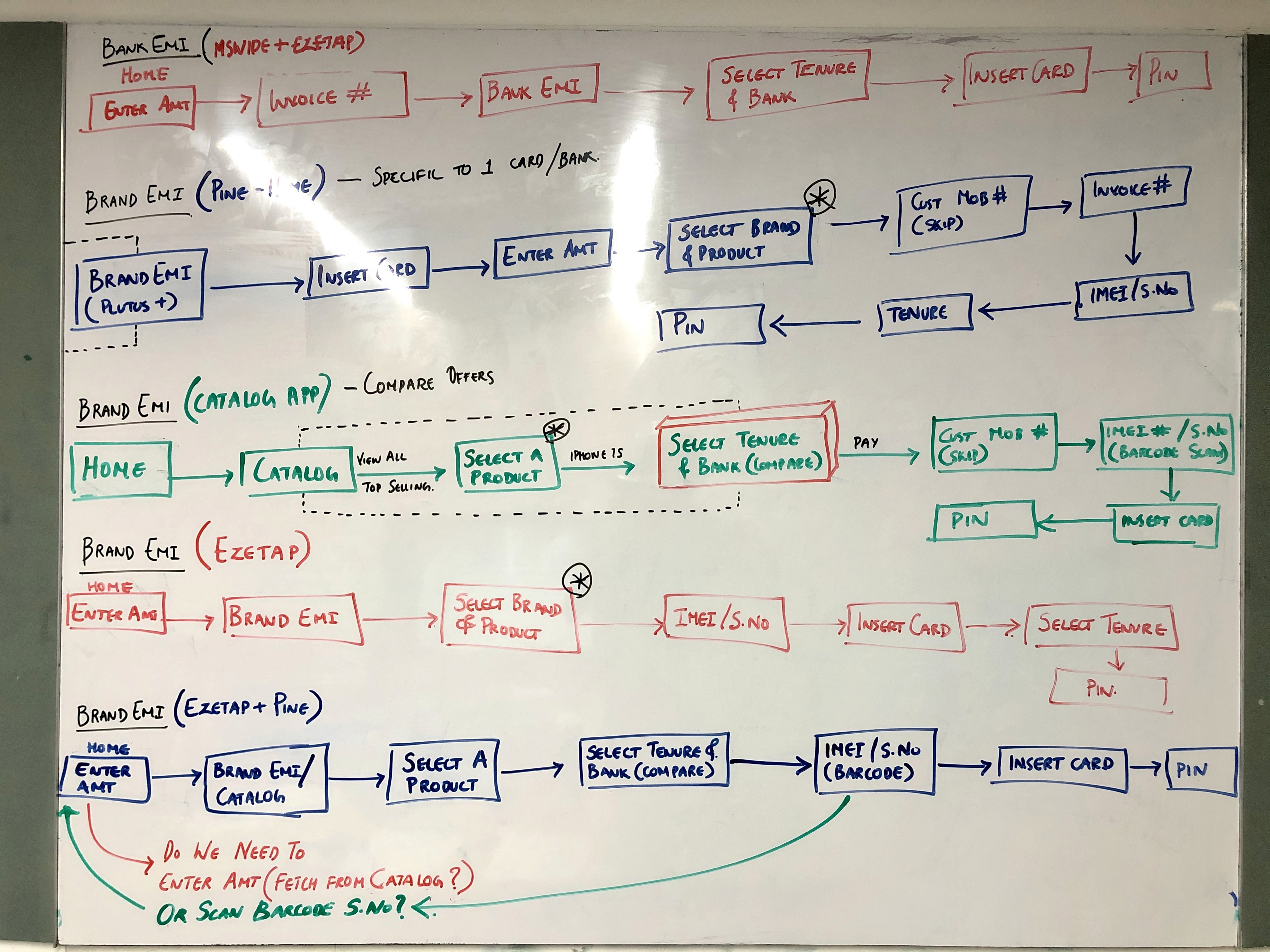
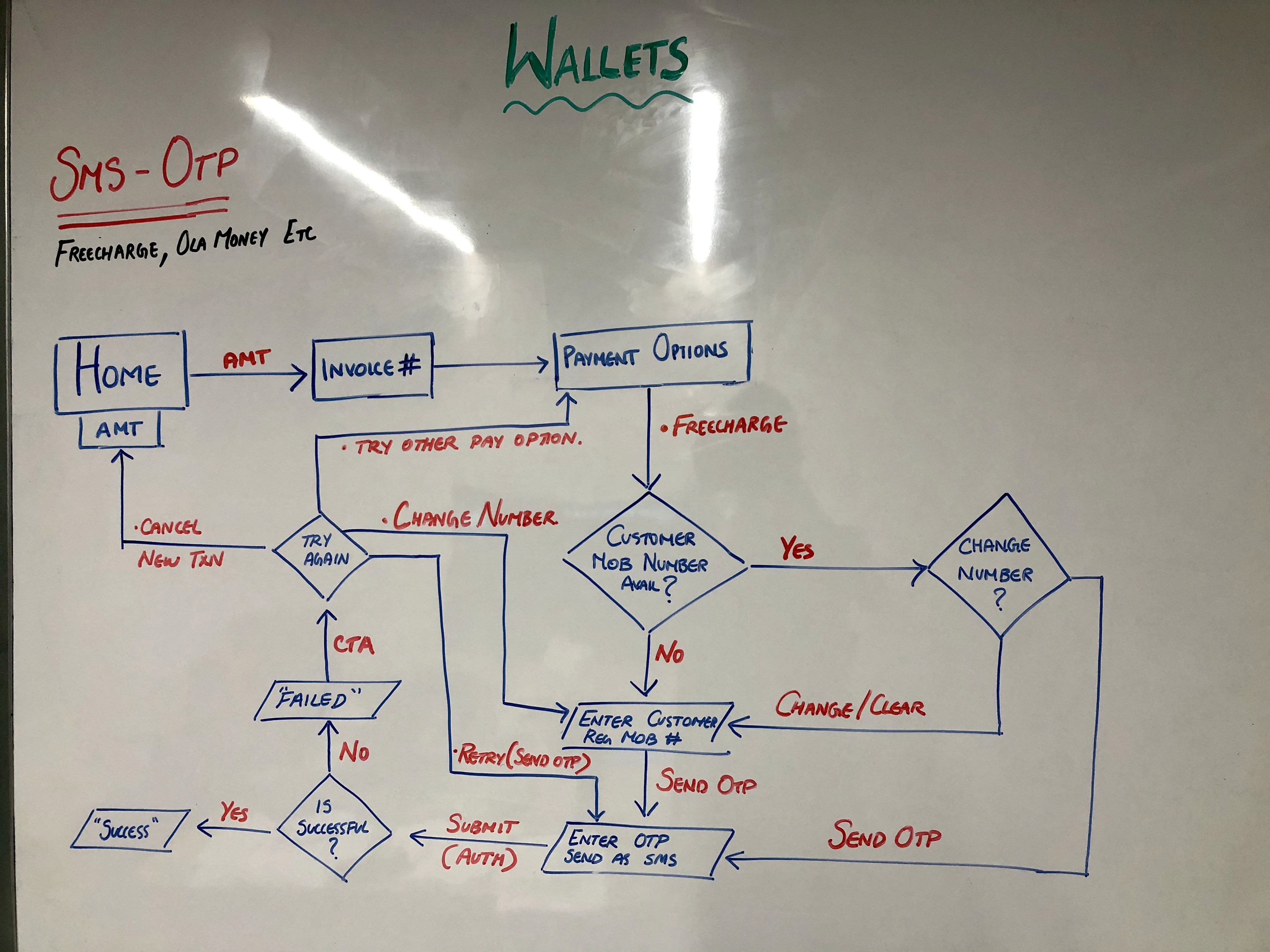
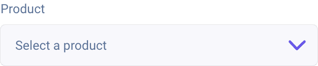
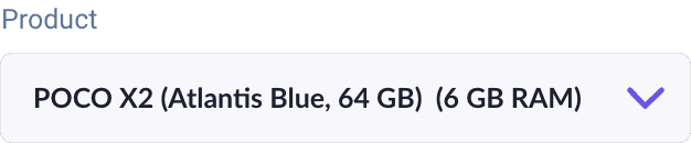
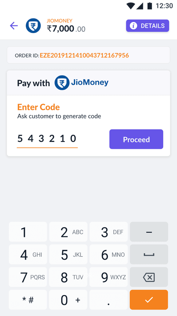
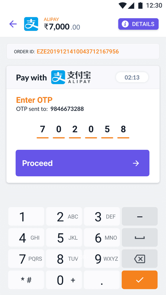
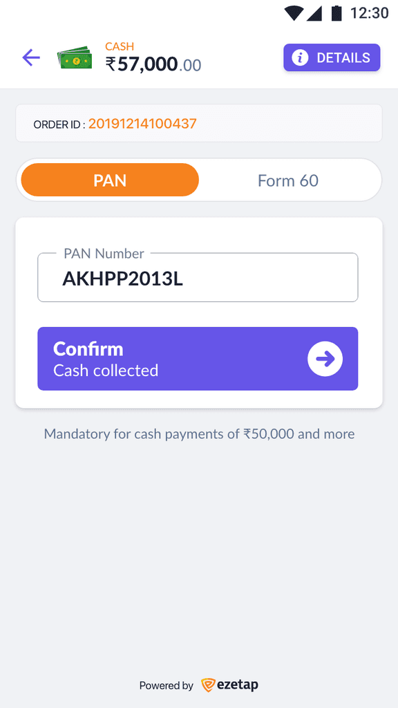
Various payment options/modes that Ezetap has such as Card, EMI, QR Code, Wallets, etc
The solution included a unified layout, intuitive categories, and detailed transaction views.
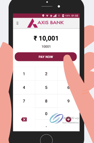
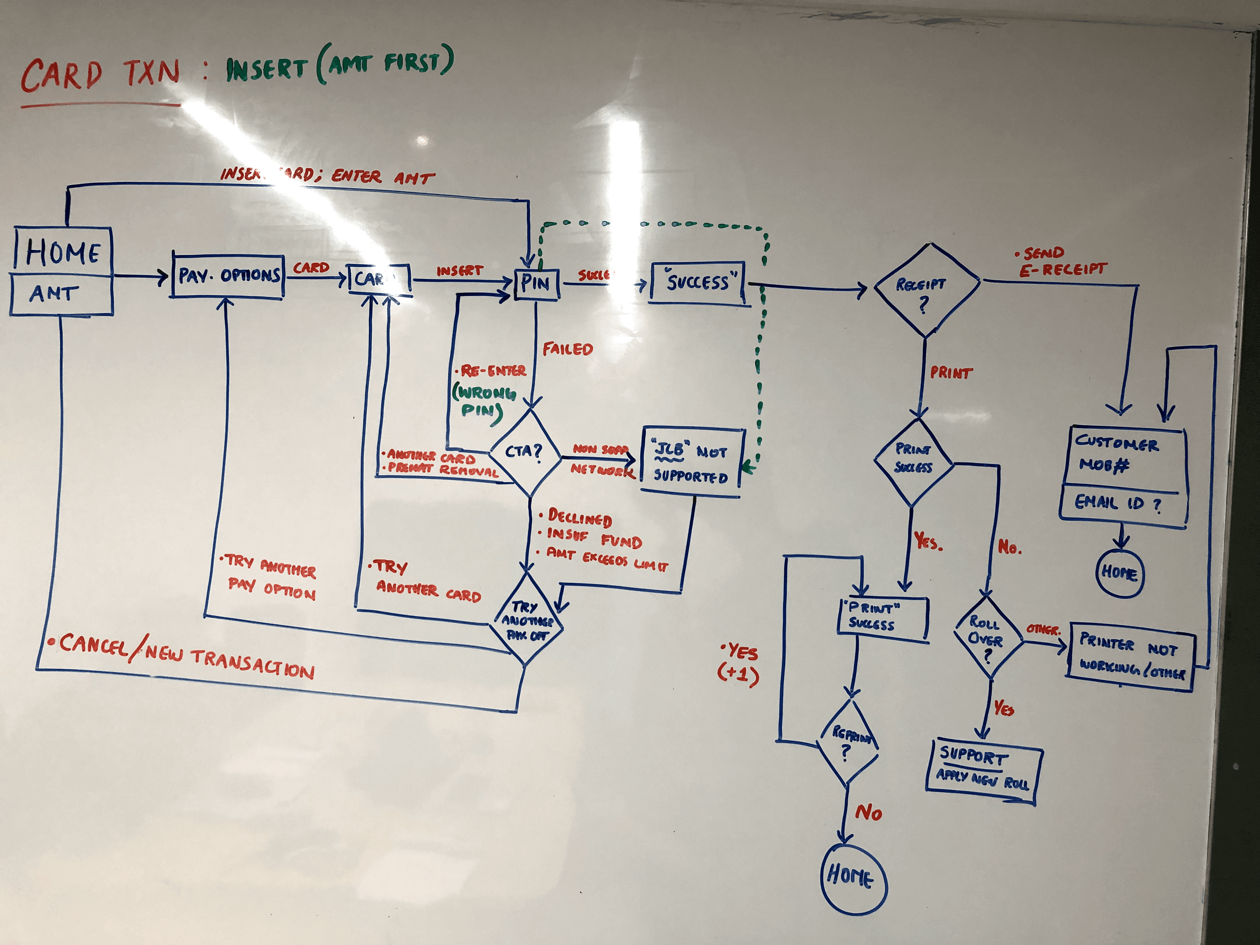
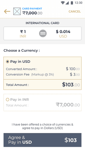
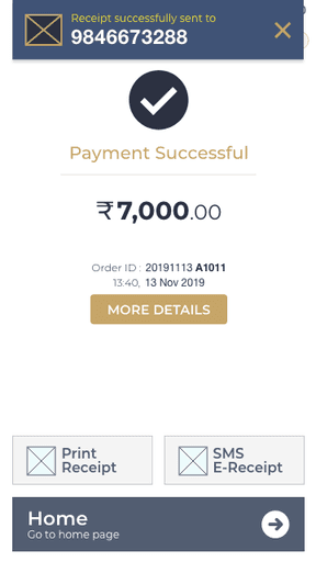
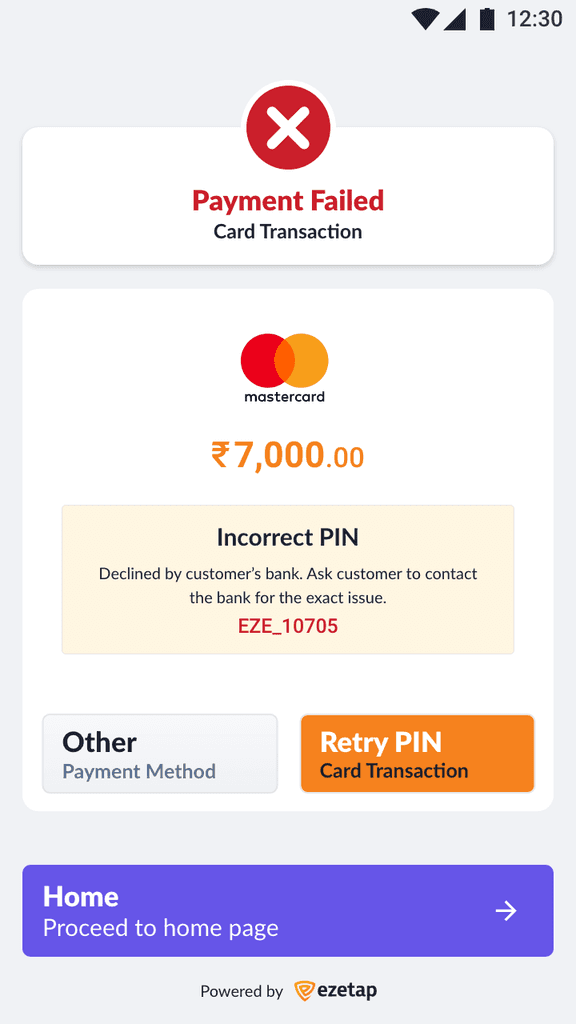
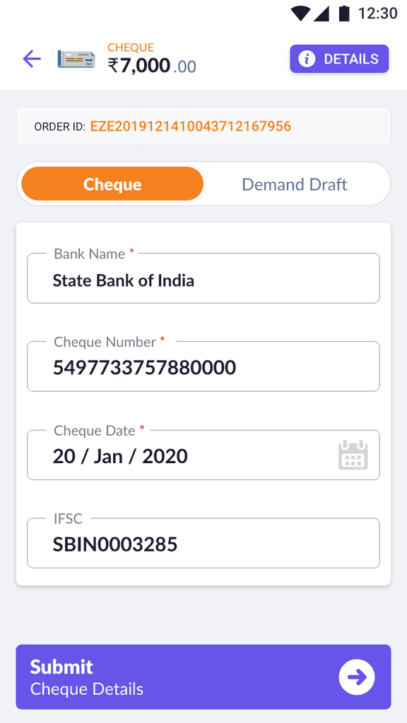
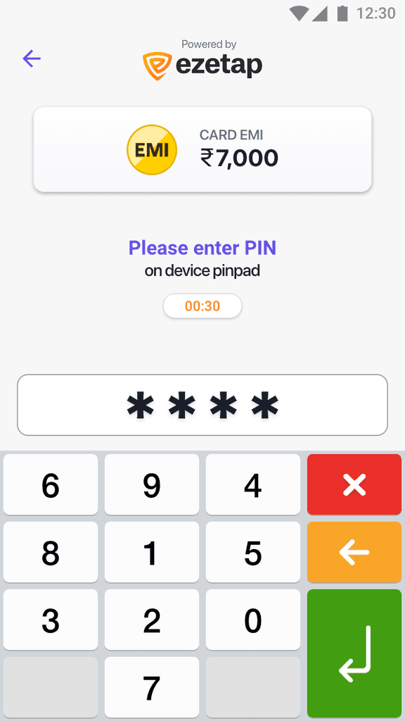
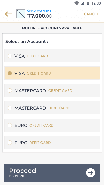
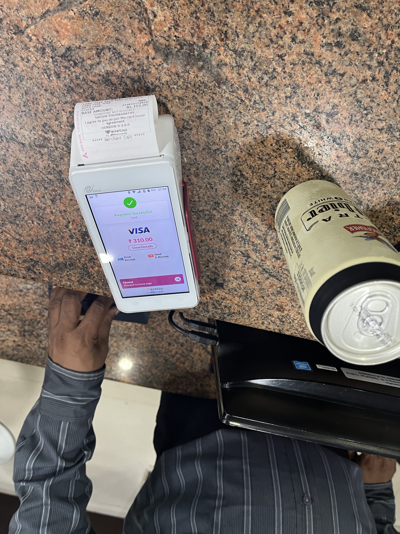
Payment Mode
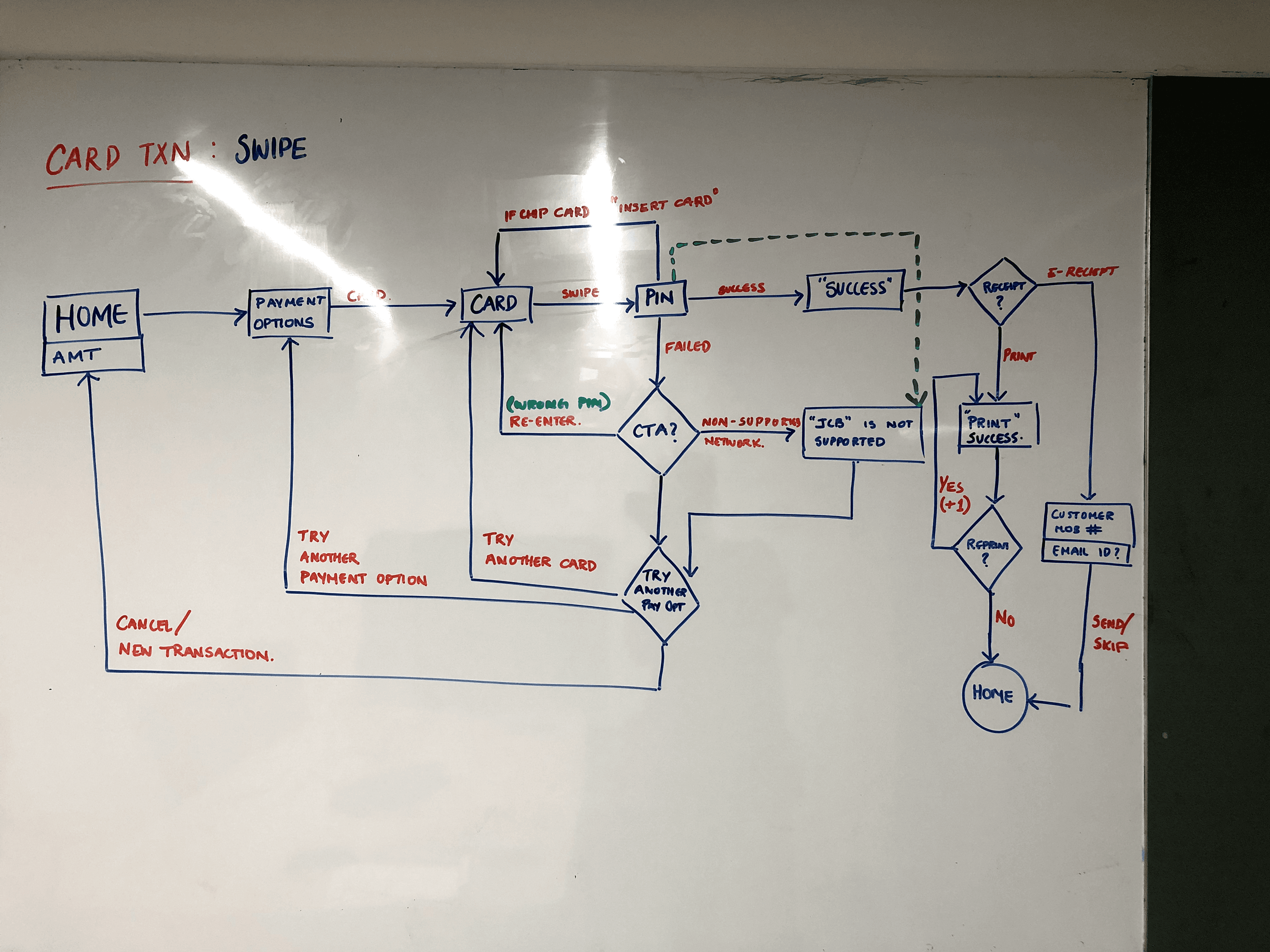
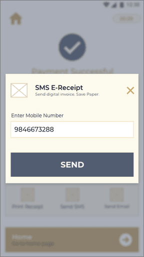
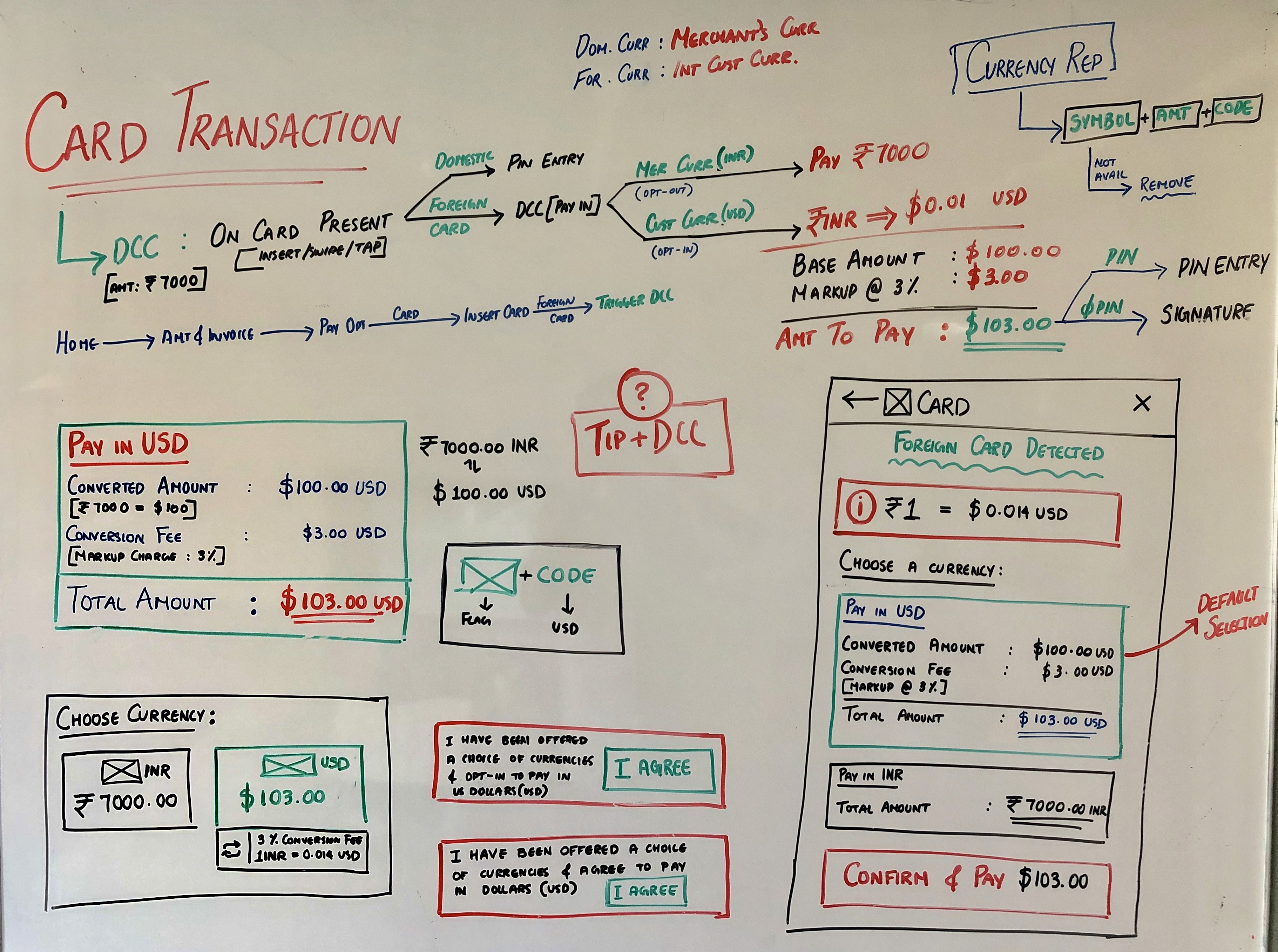
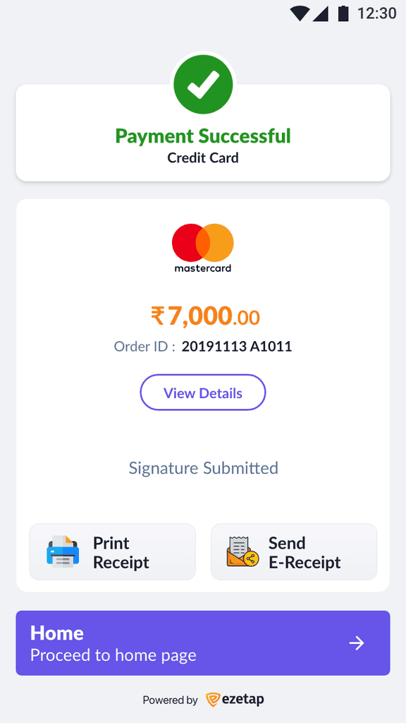
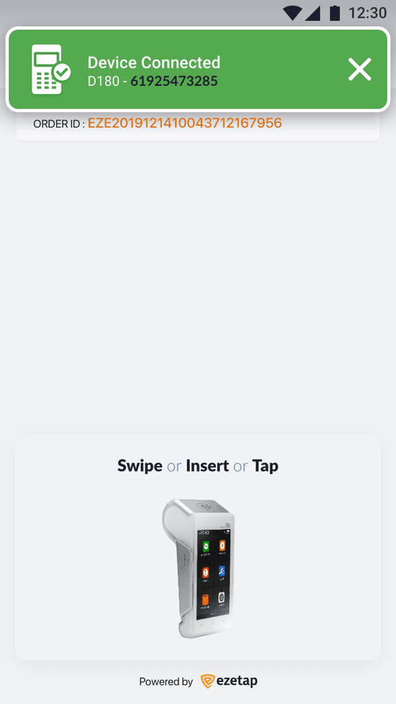
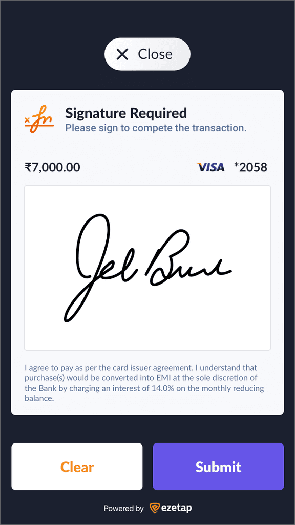
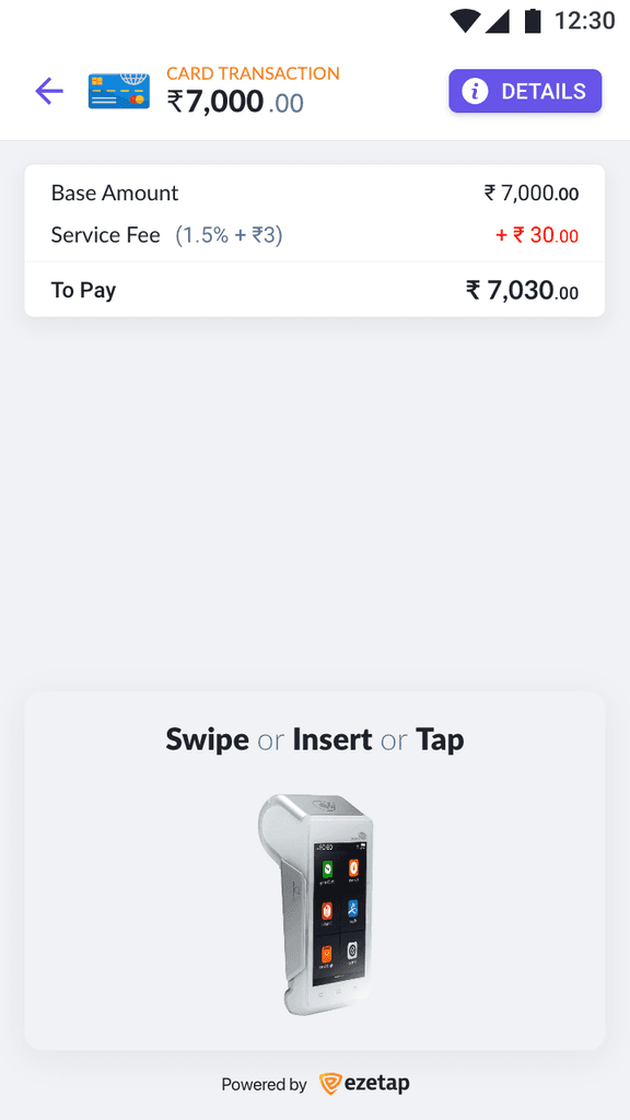
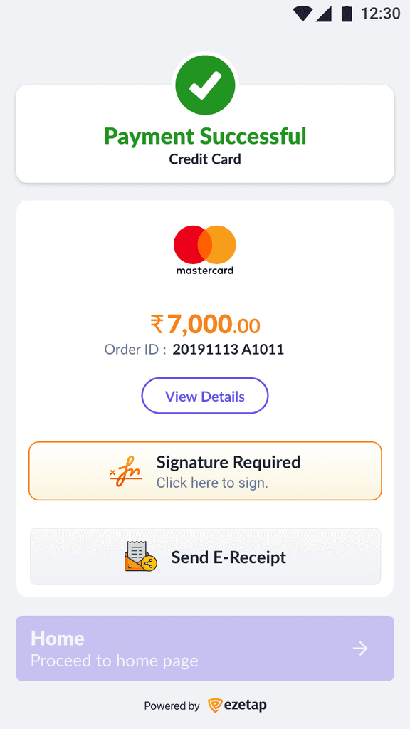
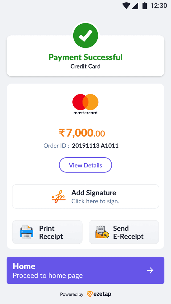
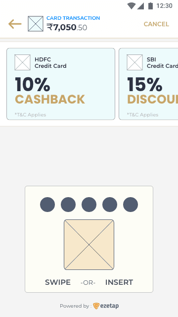
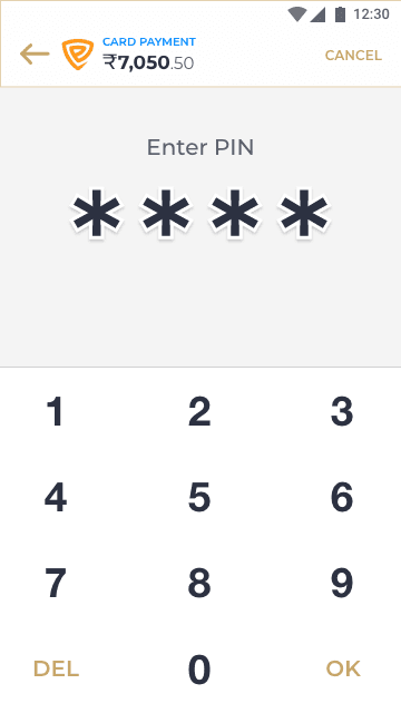
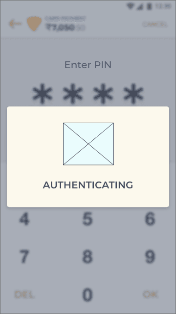
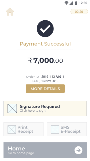
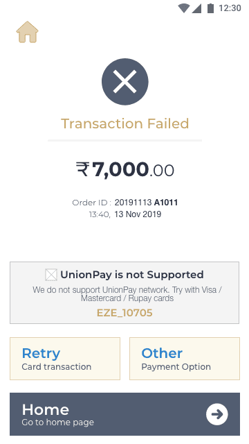
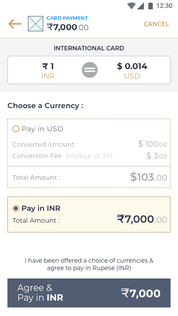
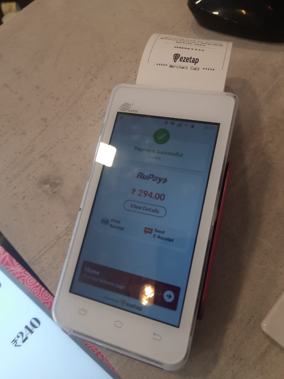
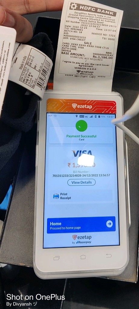
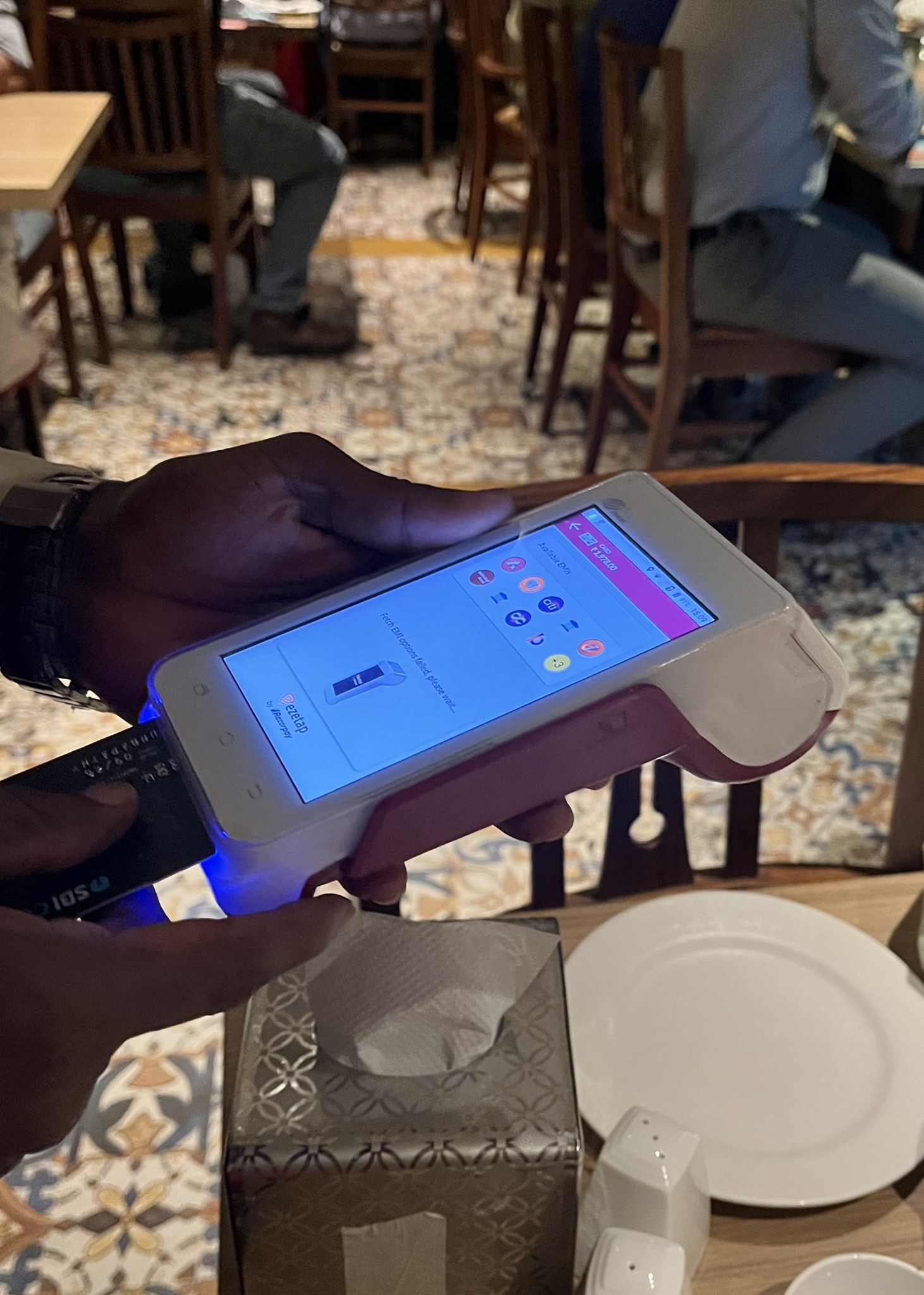
Card Payment
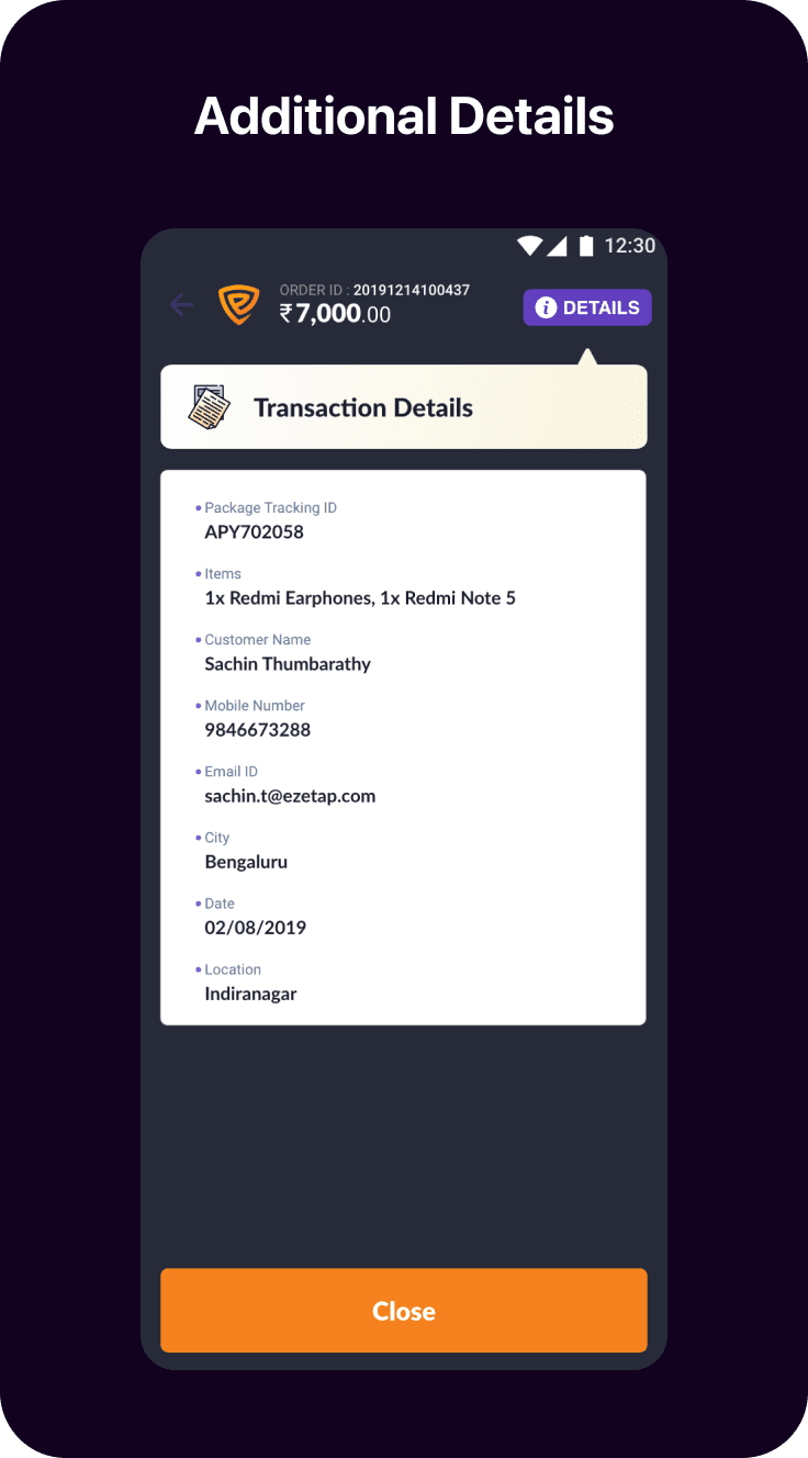
The help and support section encompasses logging support tickets and requesting callbacks.
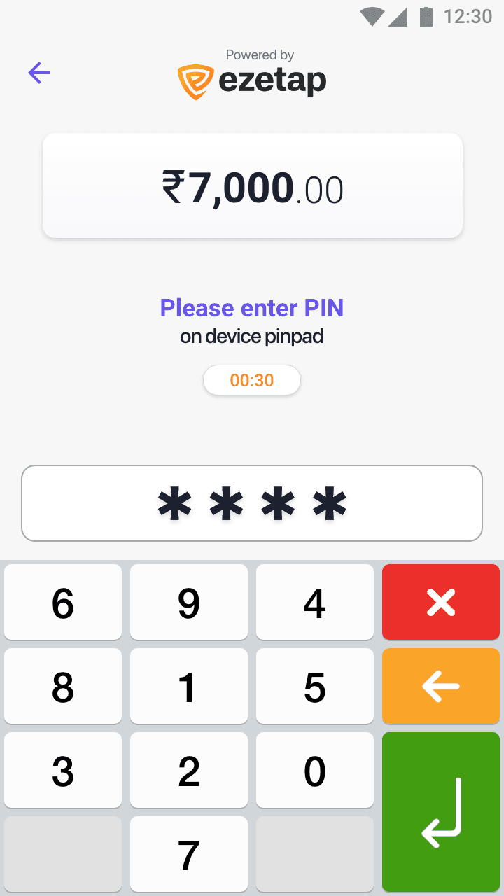
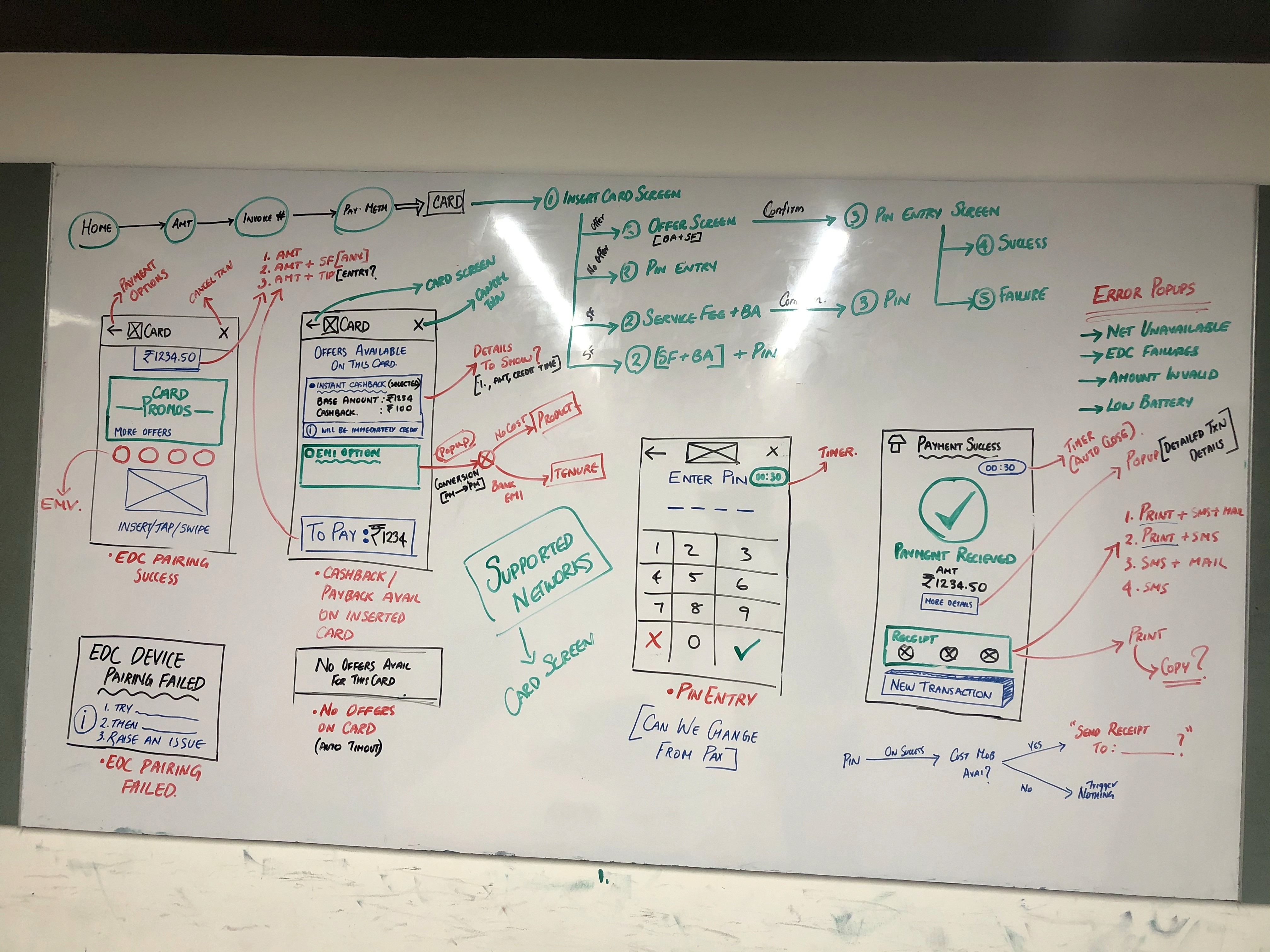
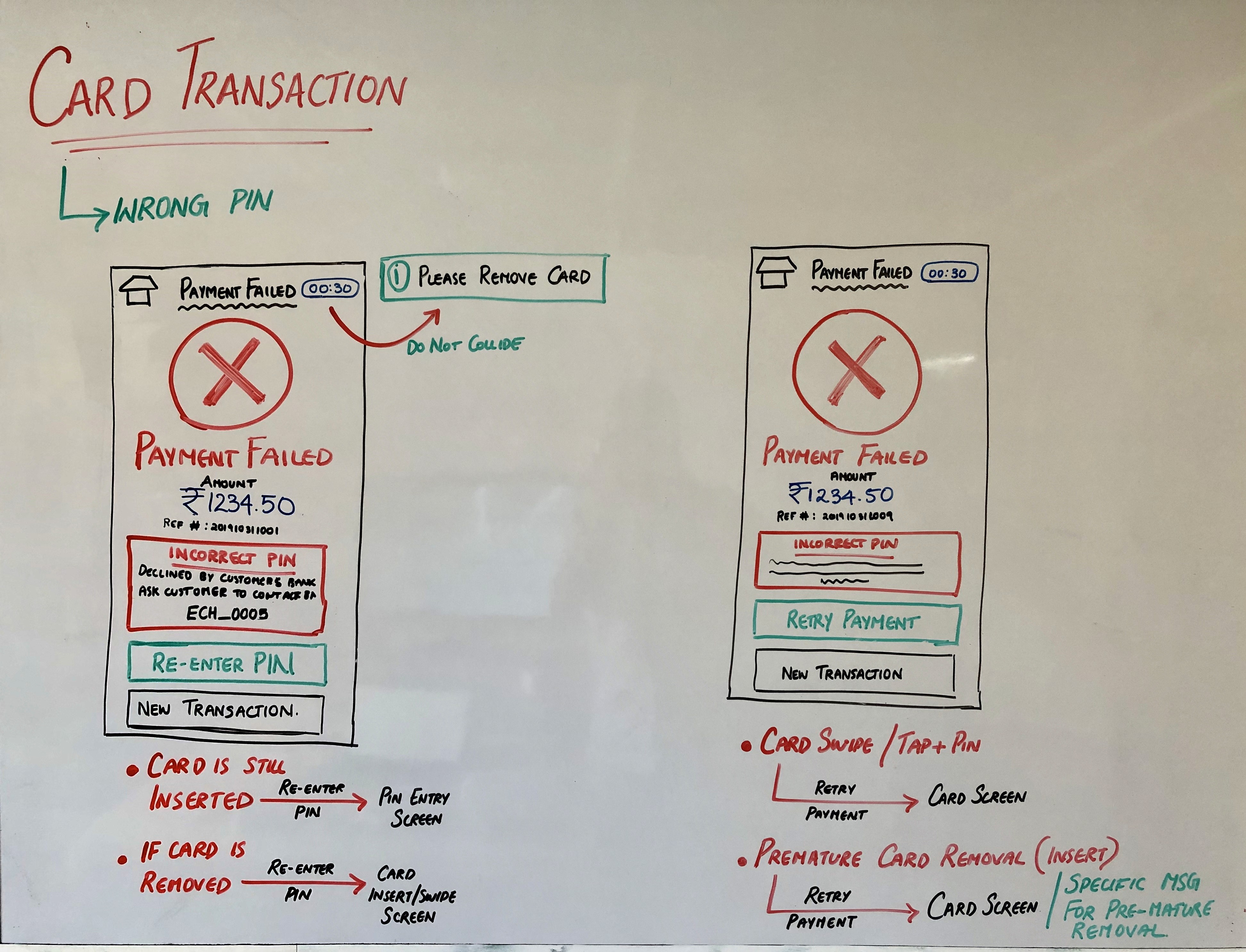
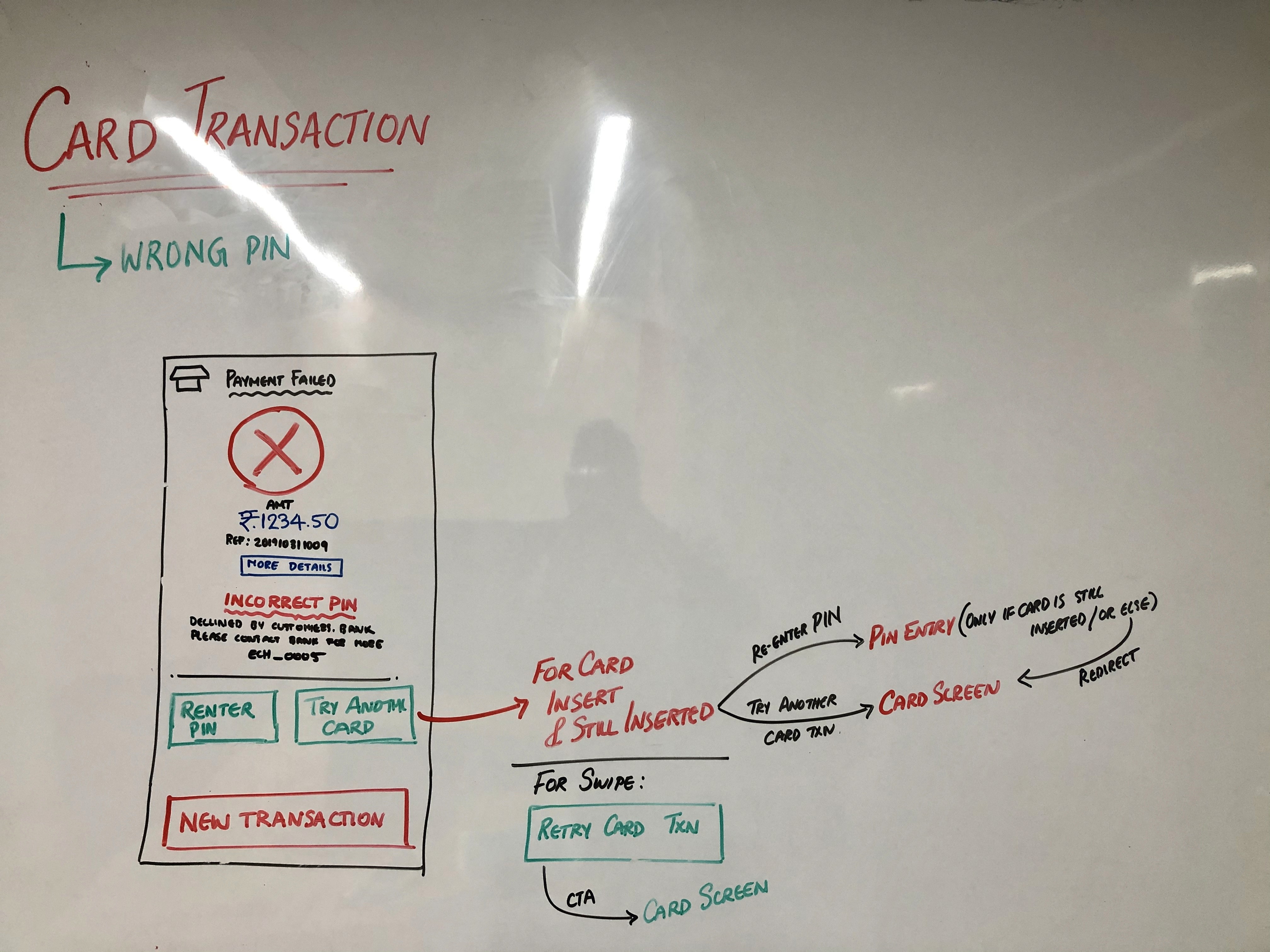
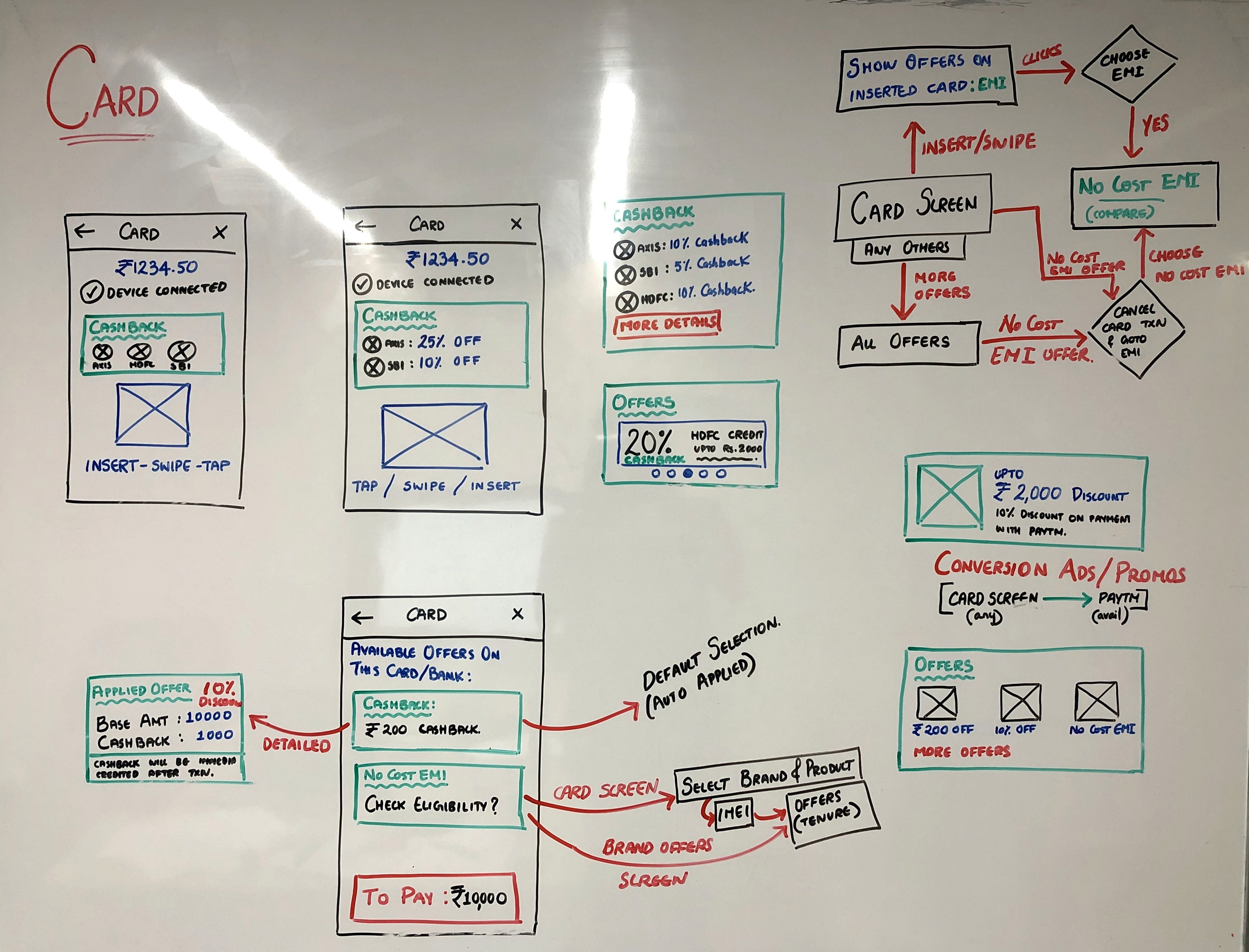
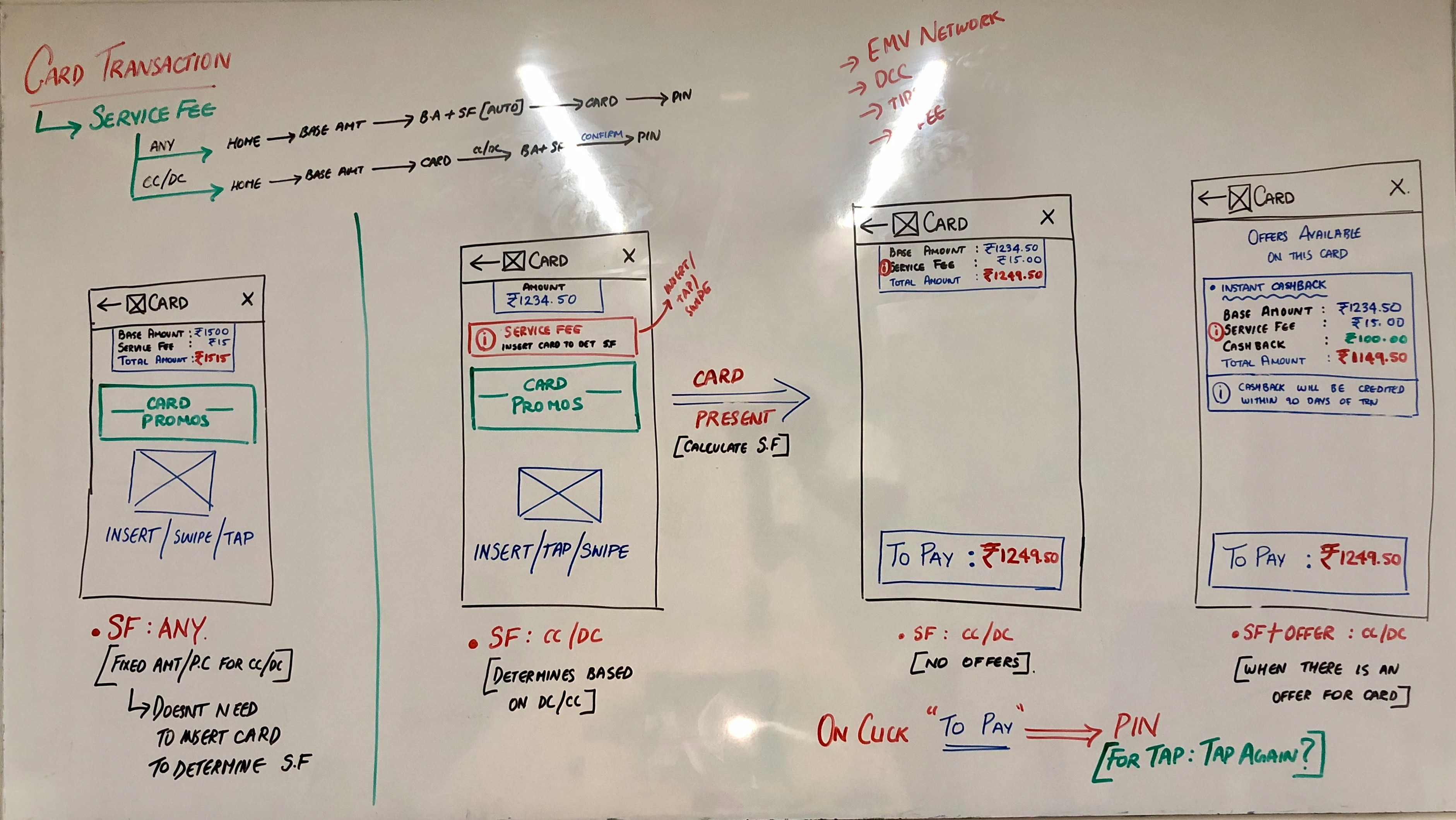
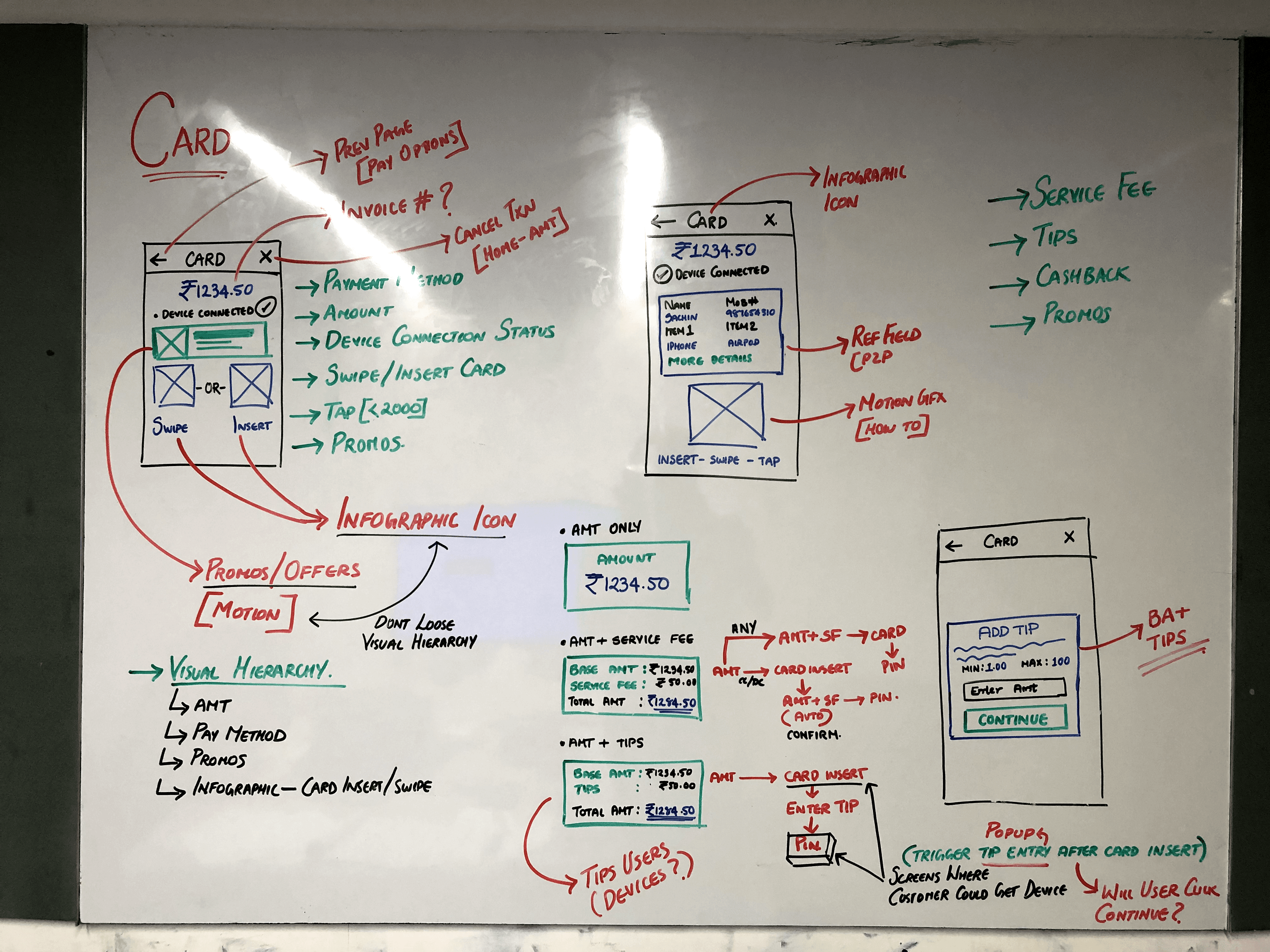
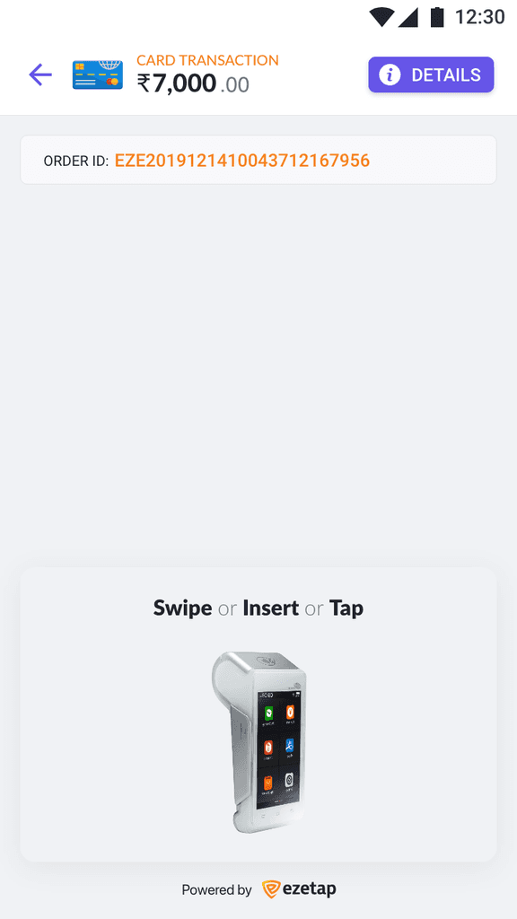
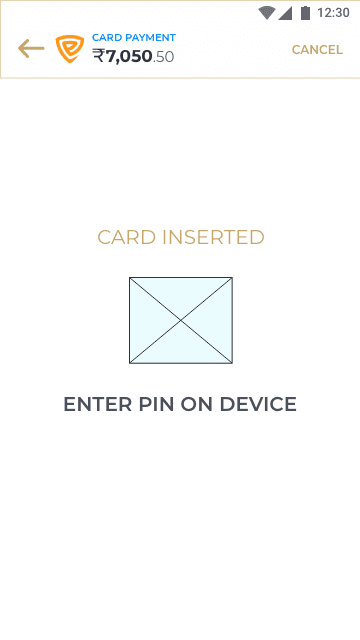
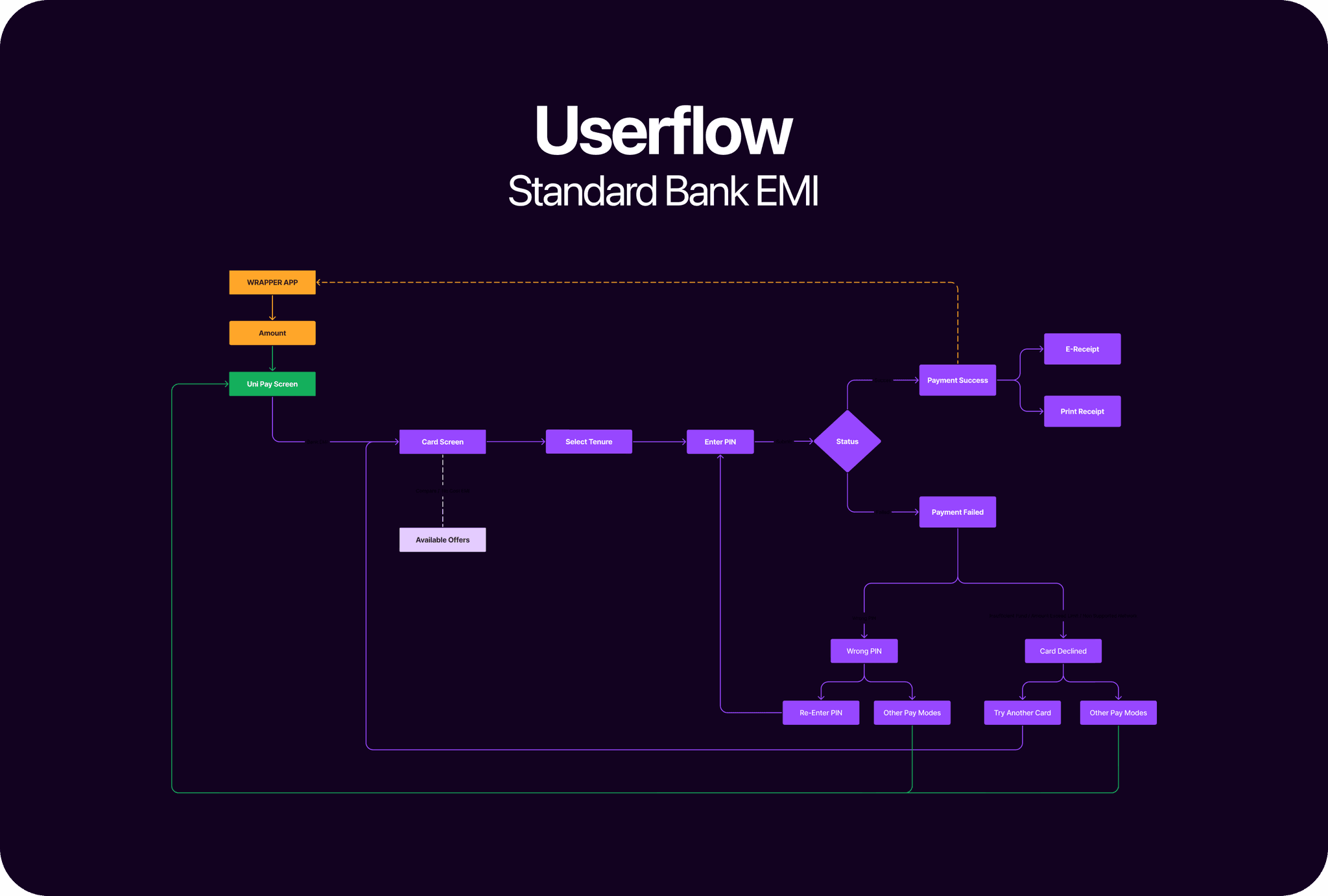
User Flow (Card Insert)
Basic Card Flow
Initial Sketches
Hi-Fi Wireframes
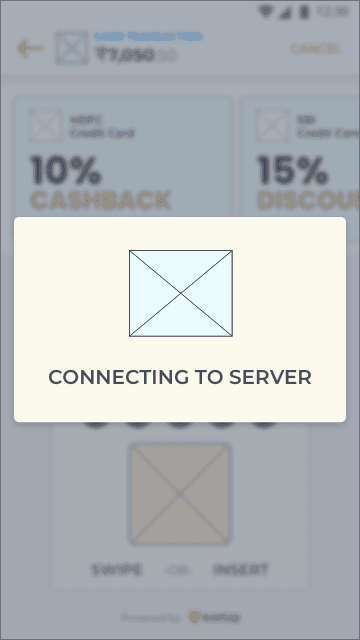


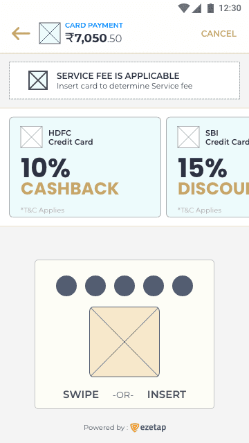
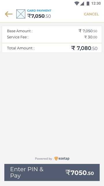
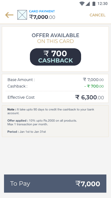
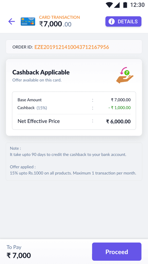
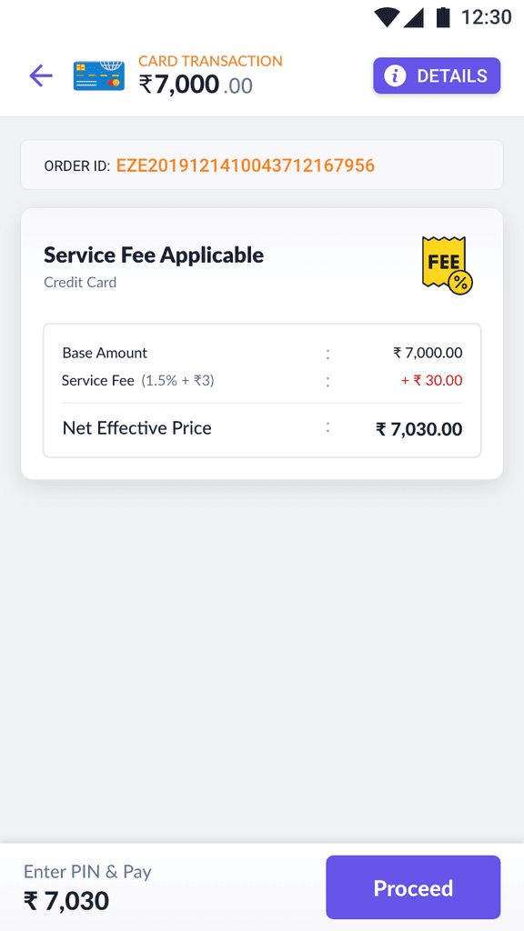
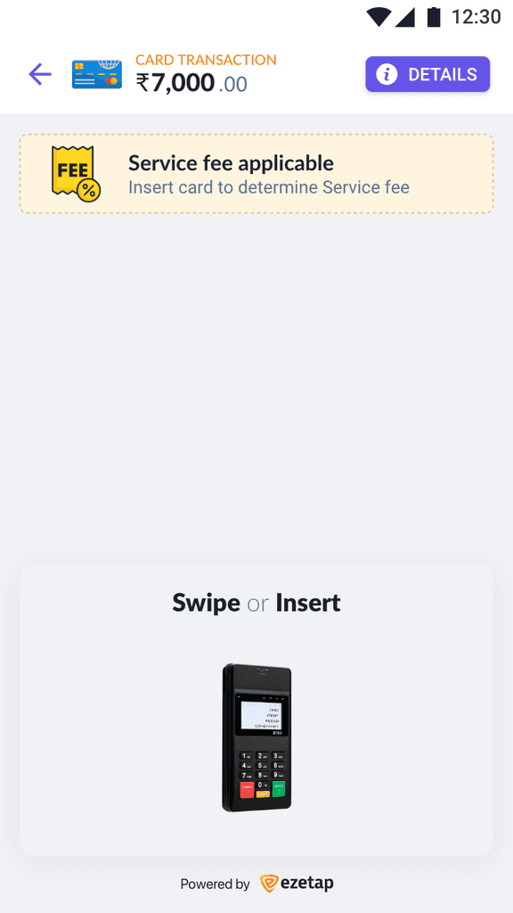
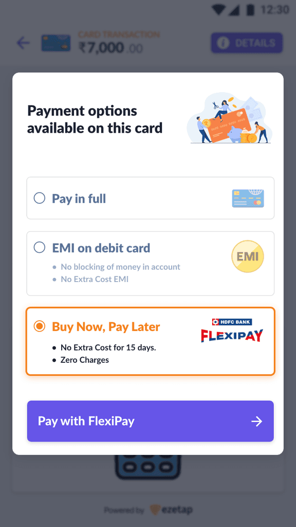
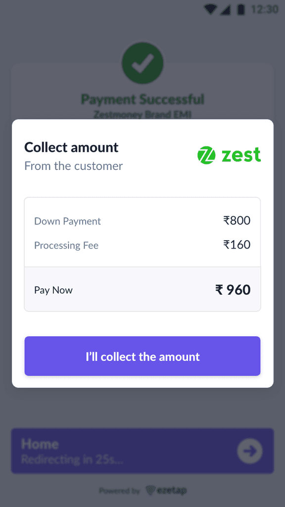
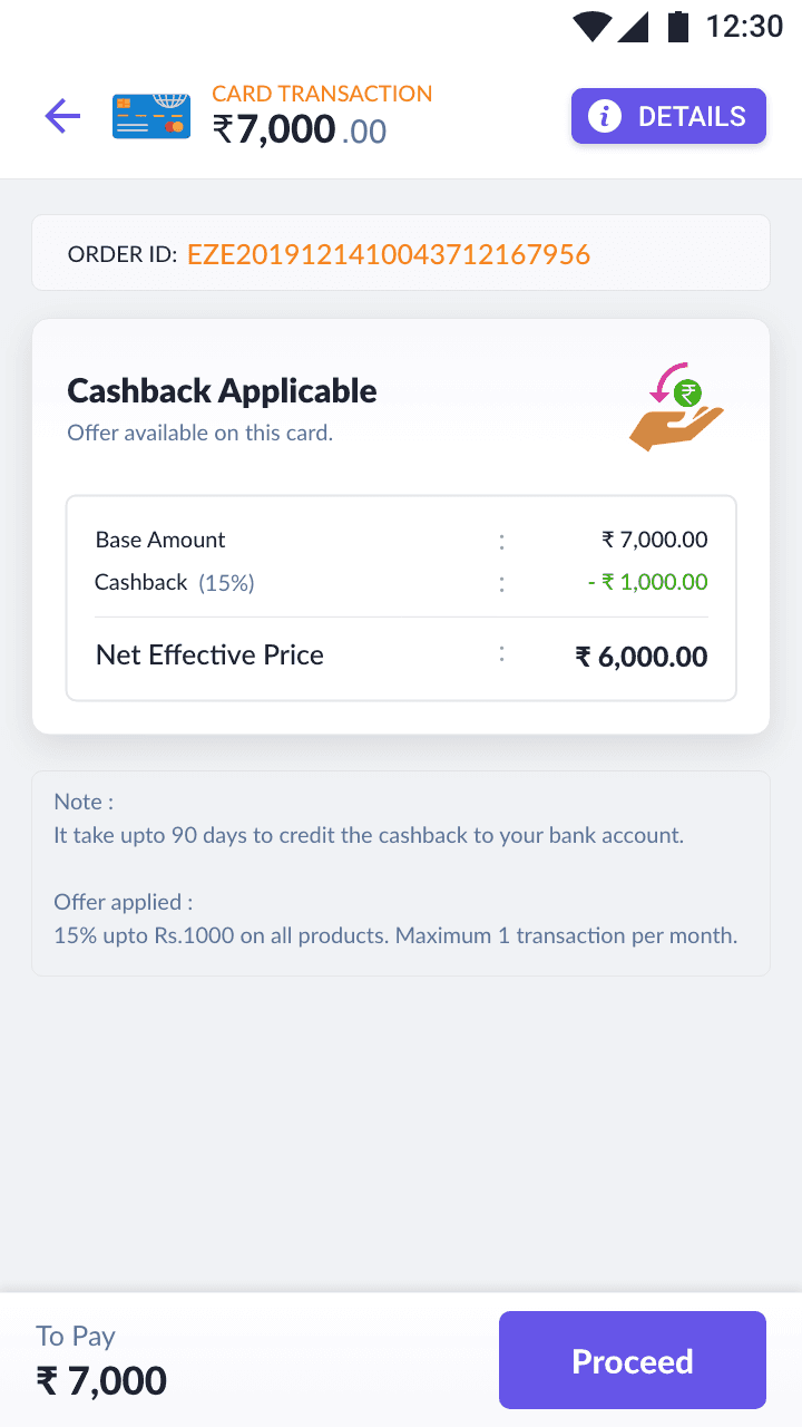
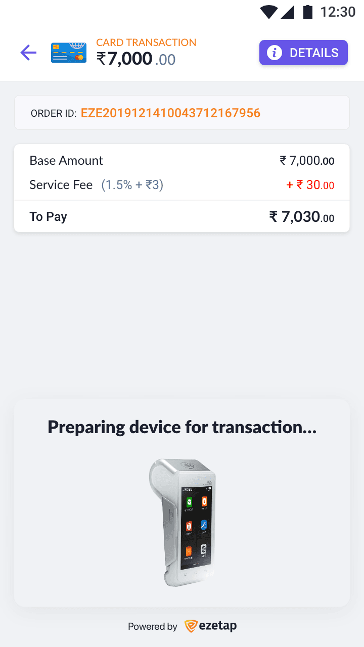
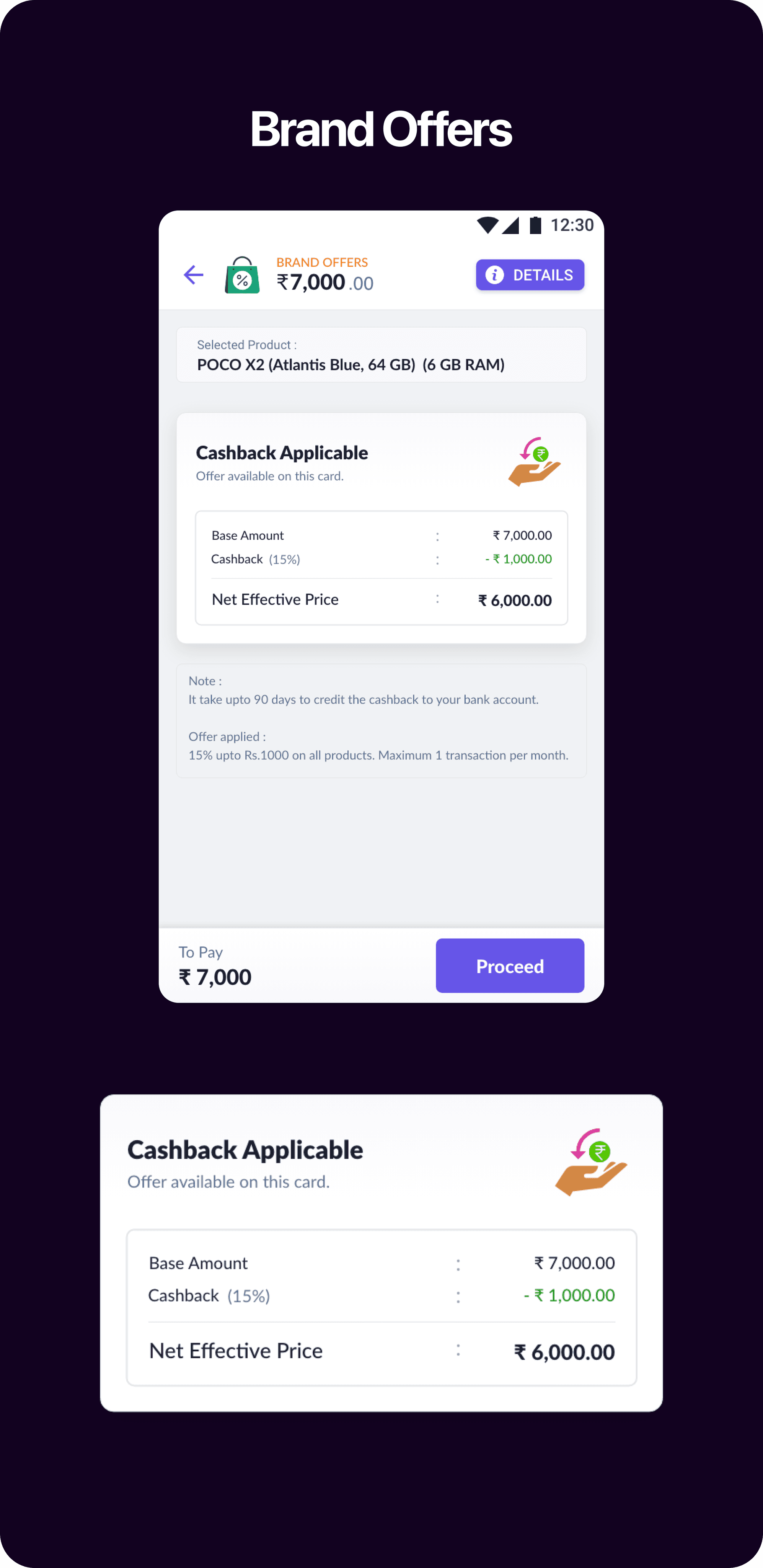
Service Fee & Cashback
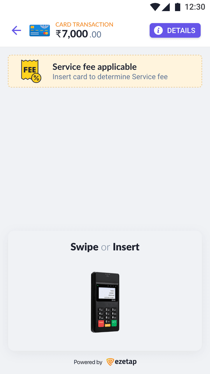
Service Fee
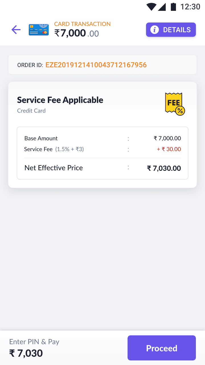
Service Fee
Cashback
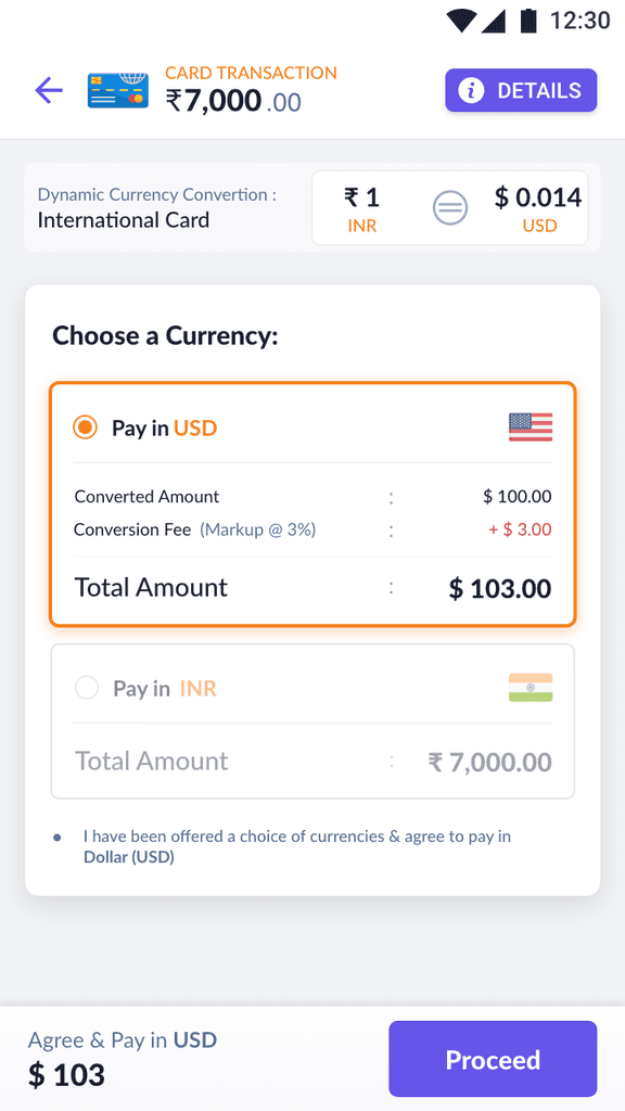
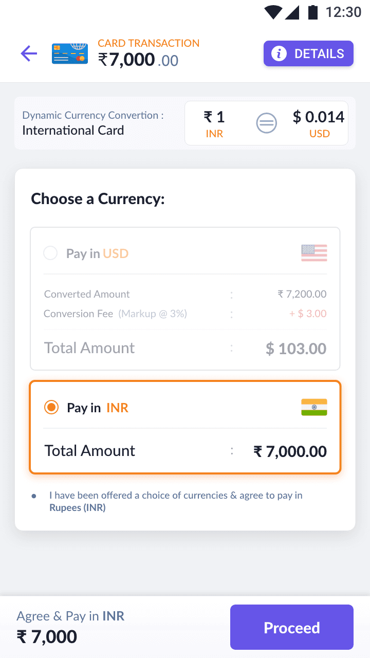
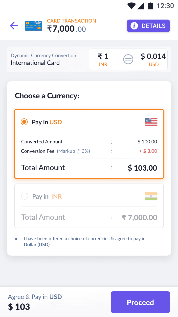
Dynamic Currency Conversion
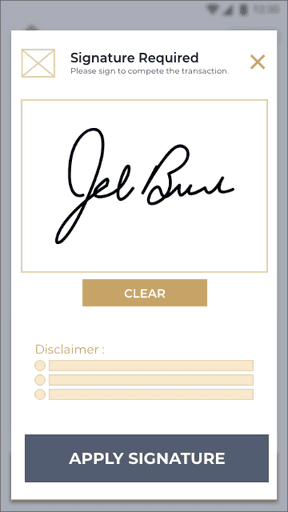
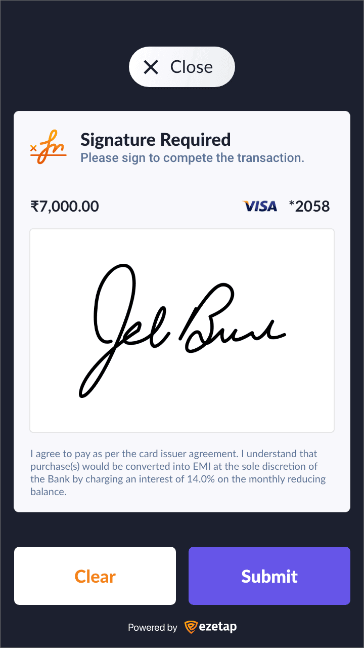
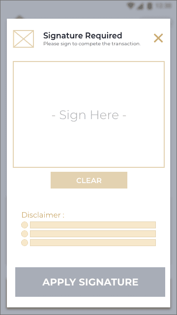
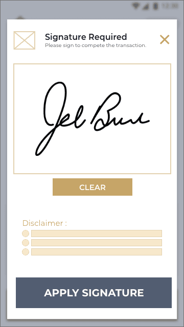
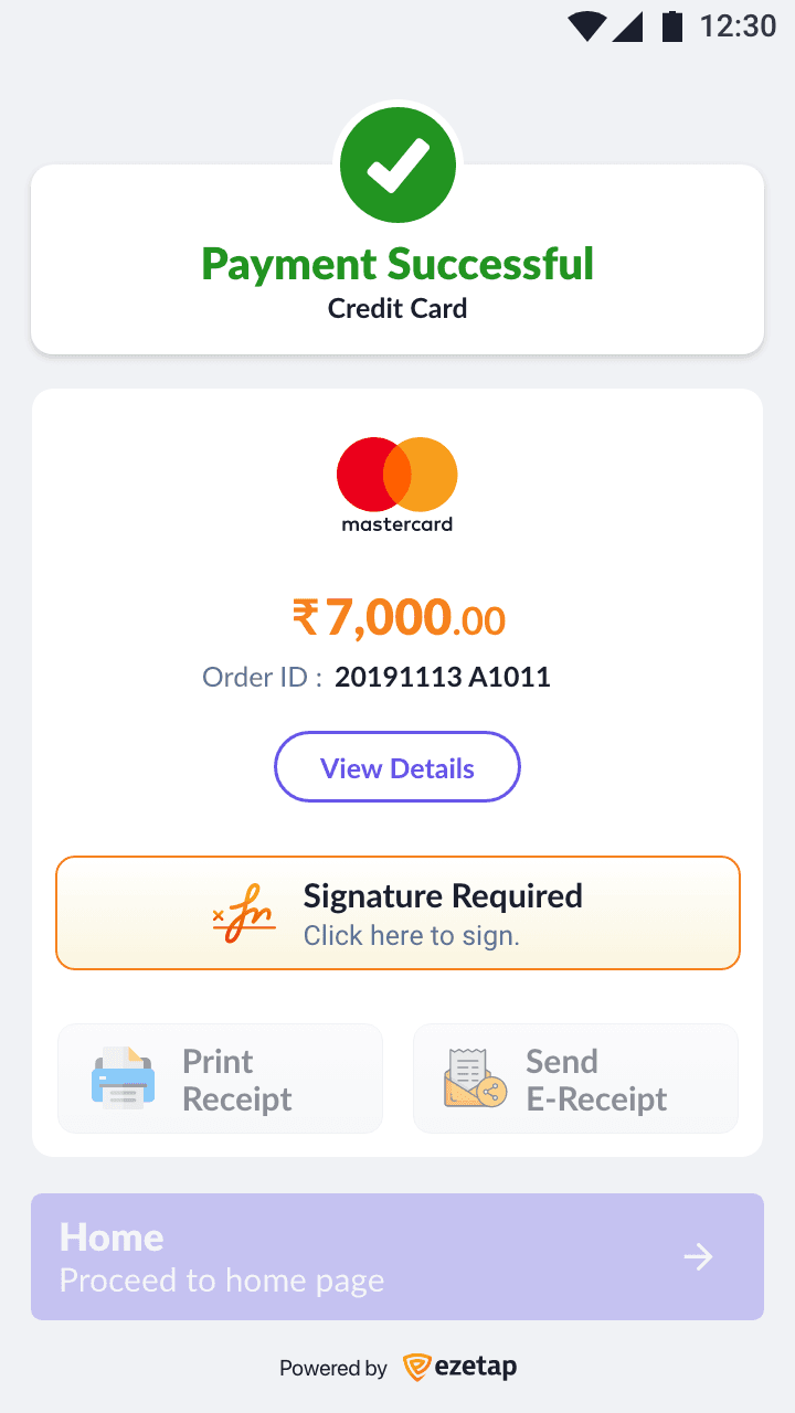
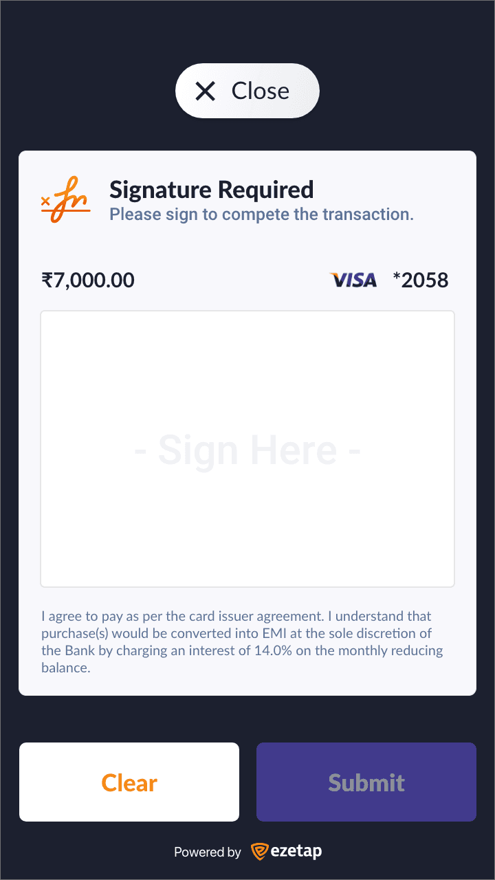
Signature

Payment Mode
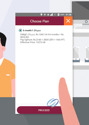
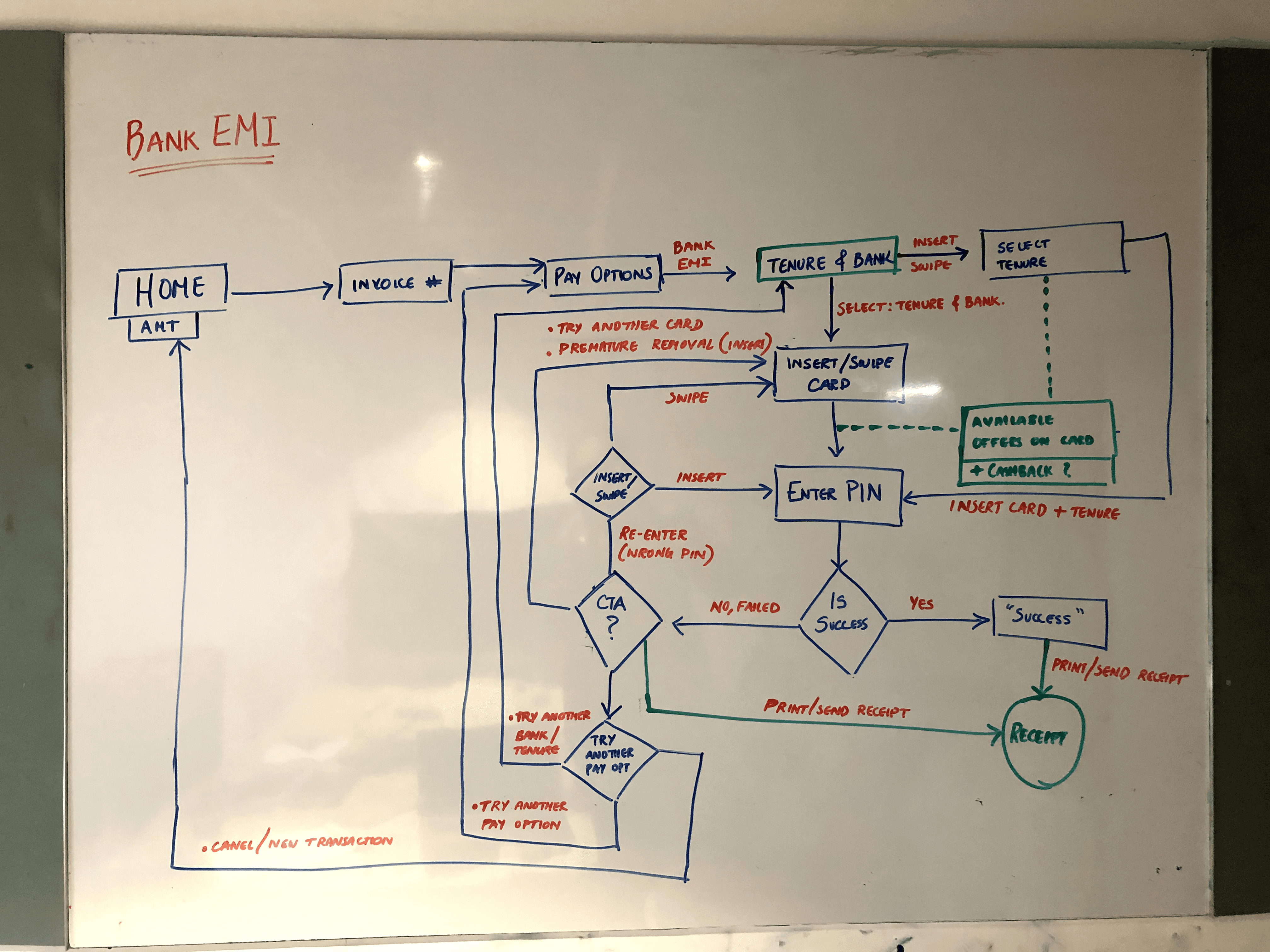
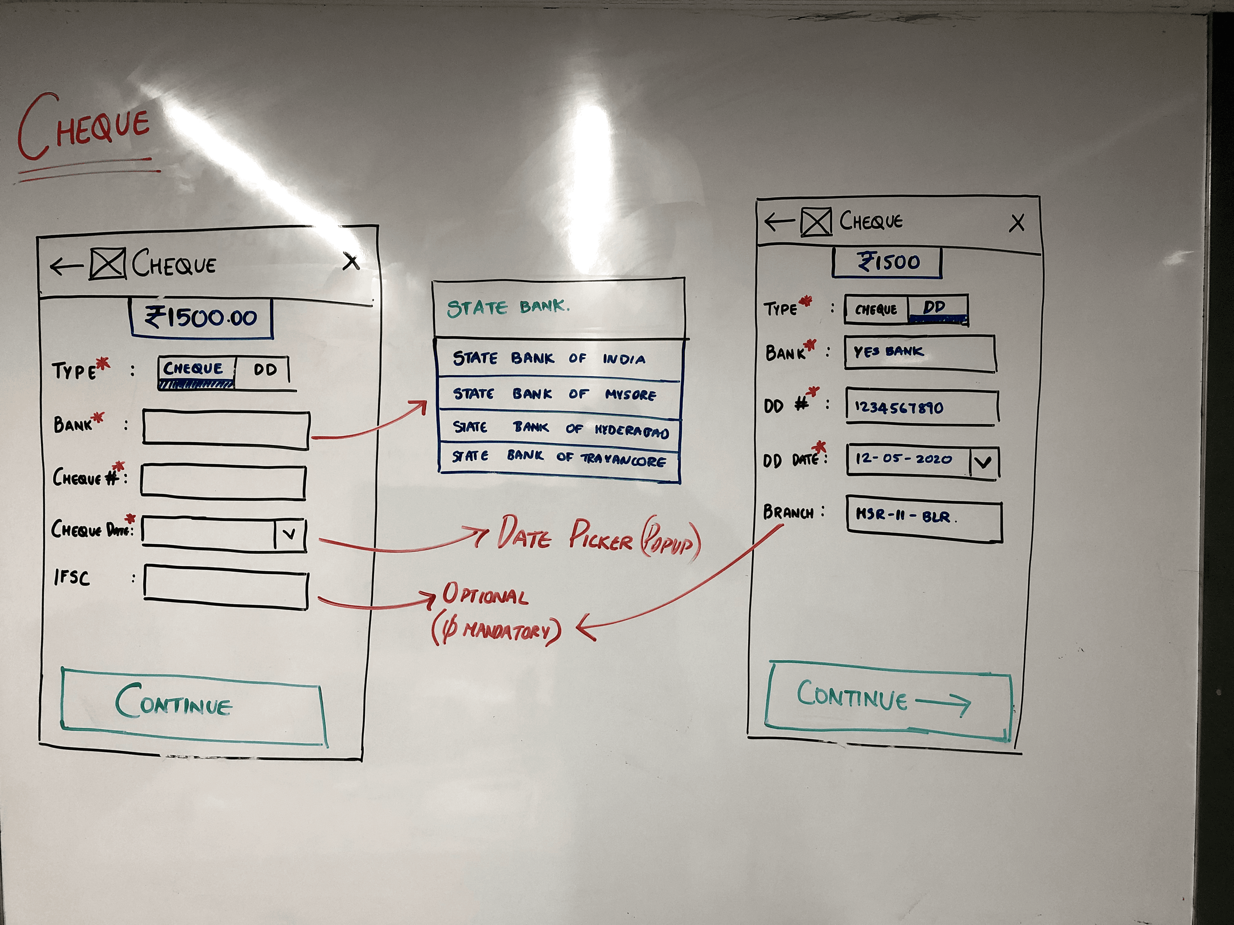
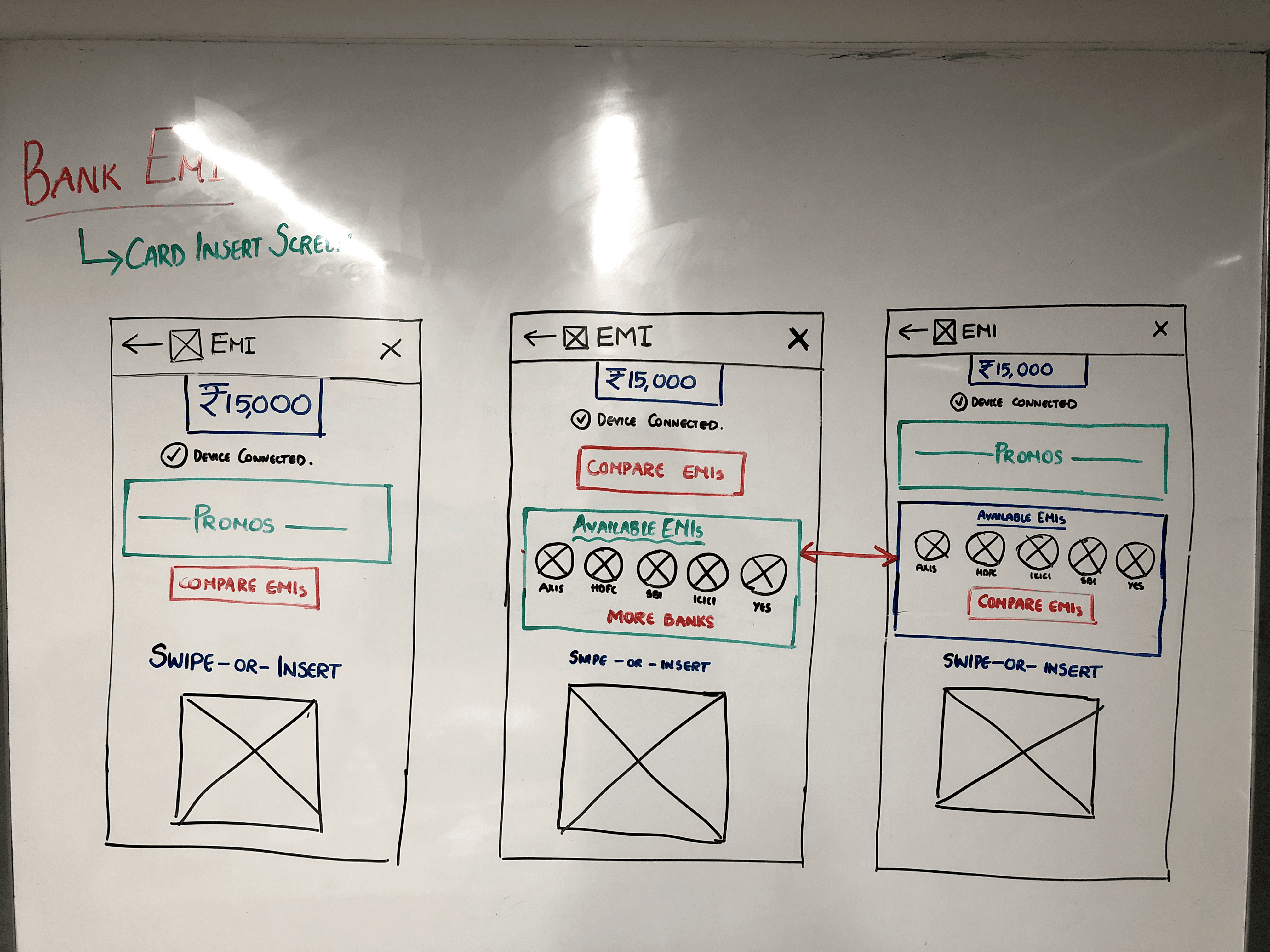
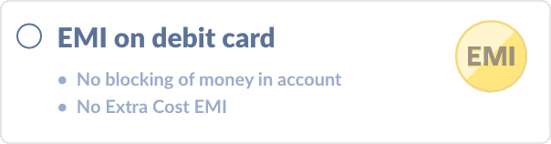
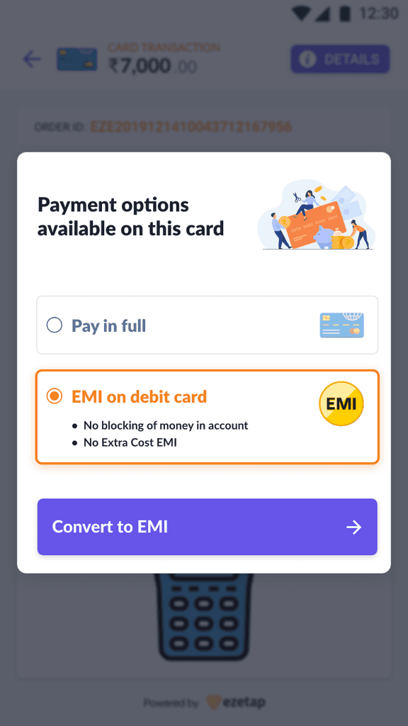
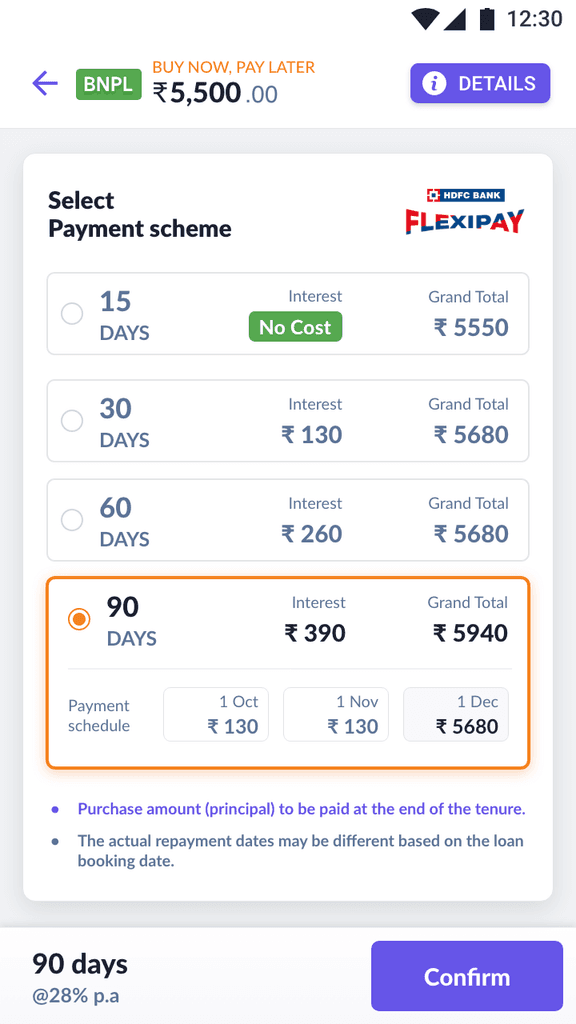
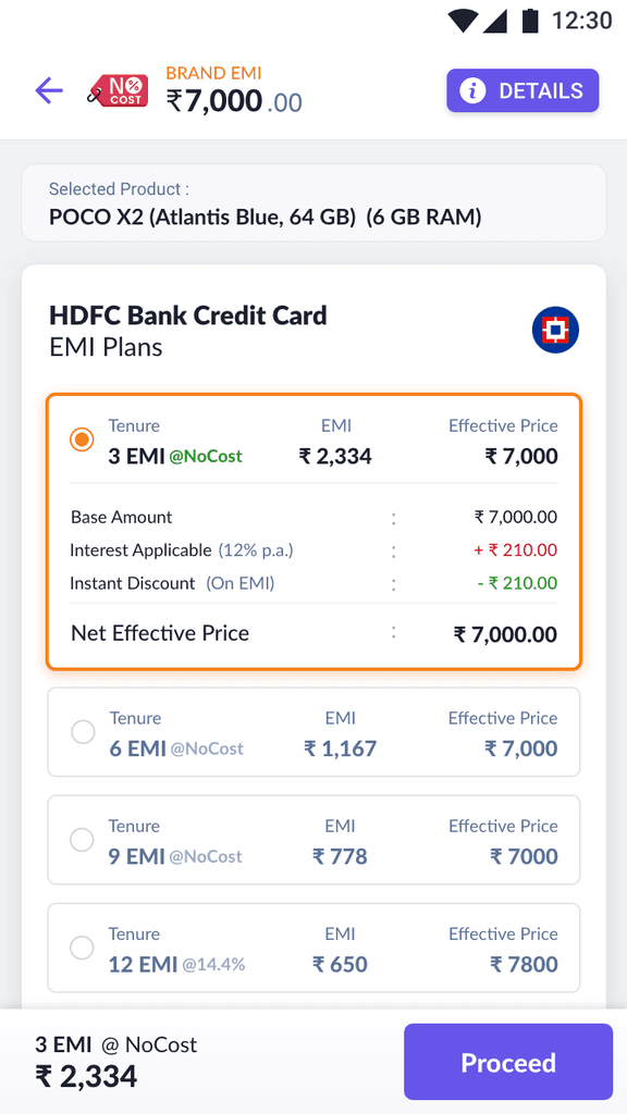
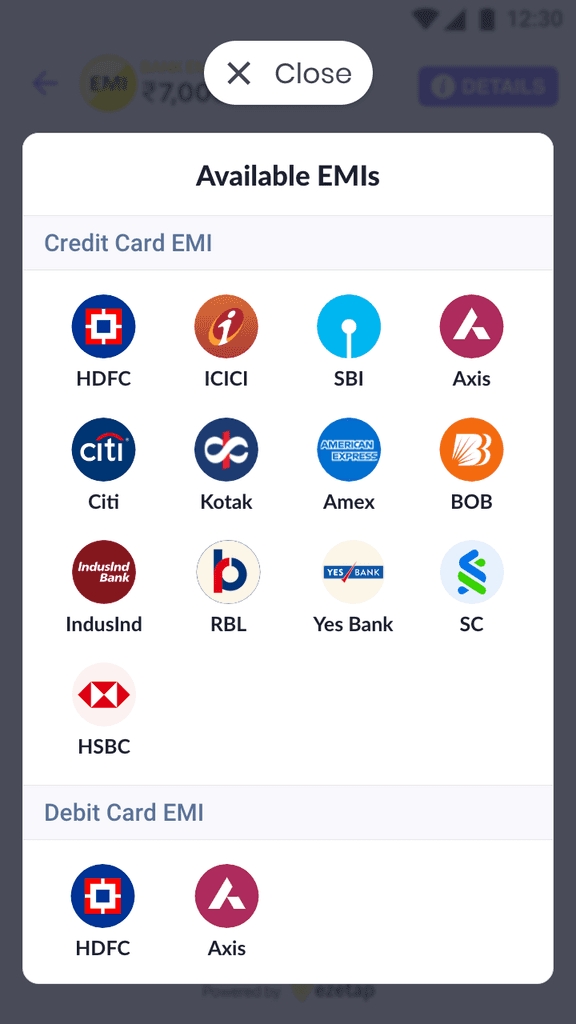
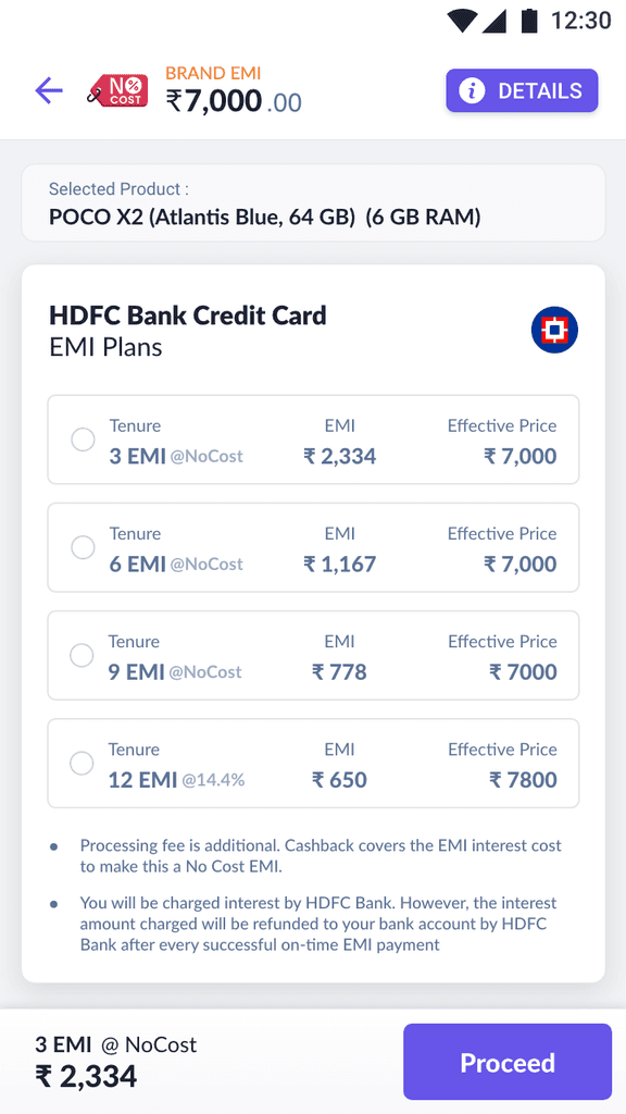
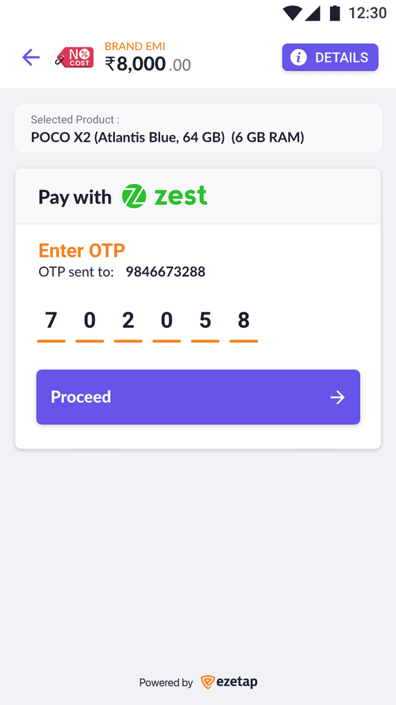
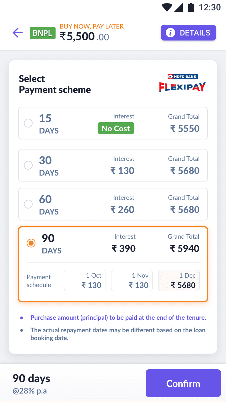
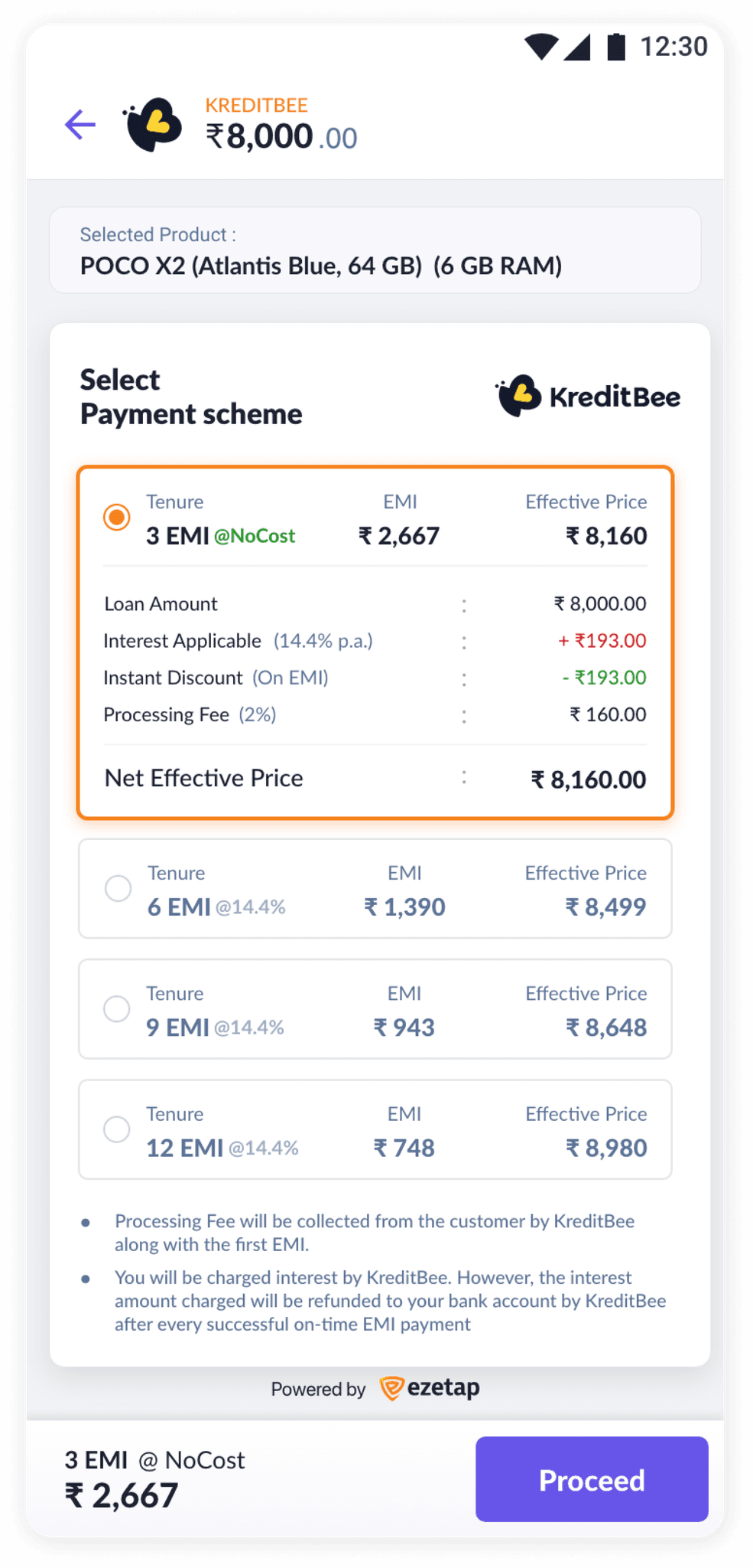
Bank based EMIs
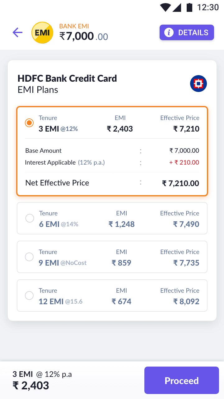

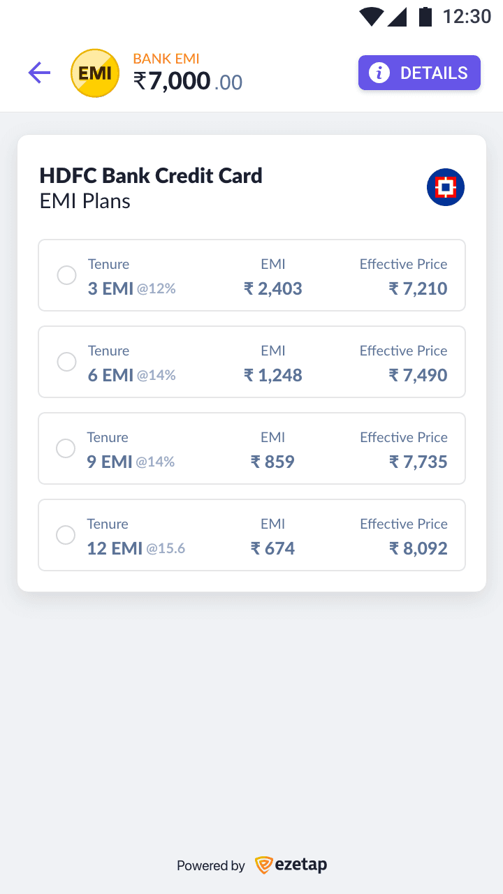

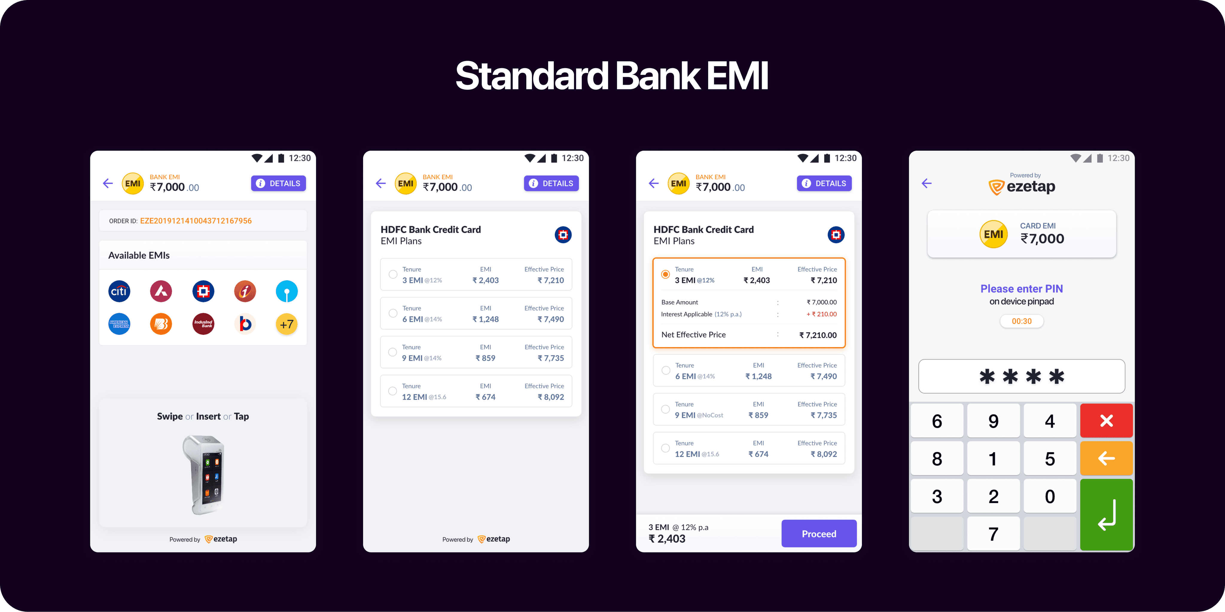

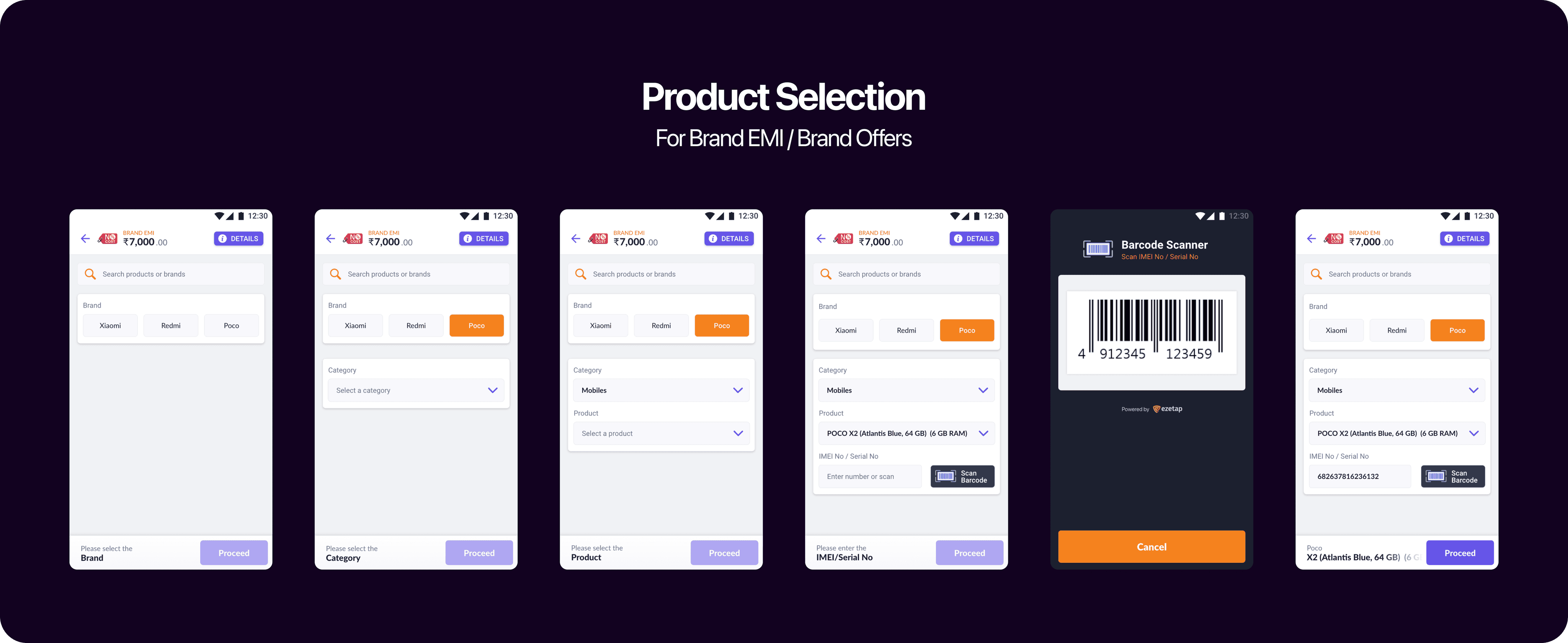
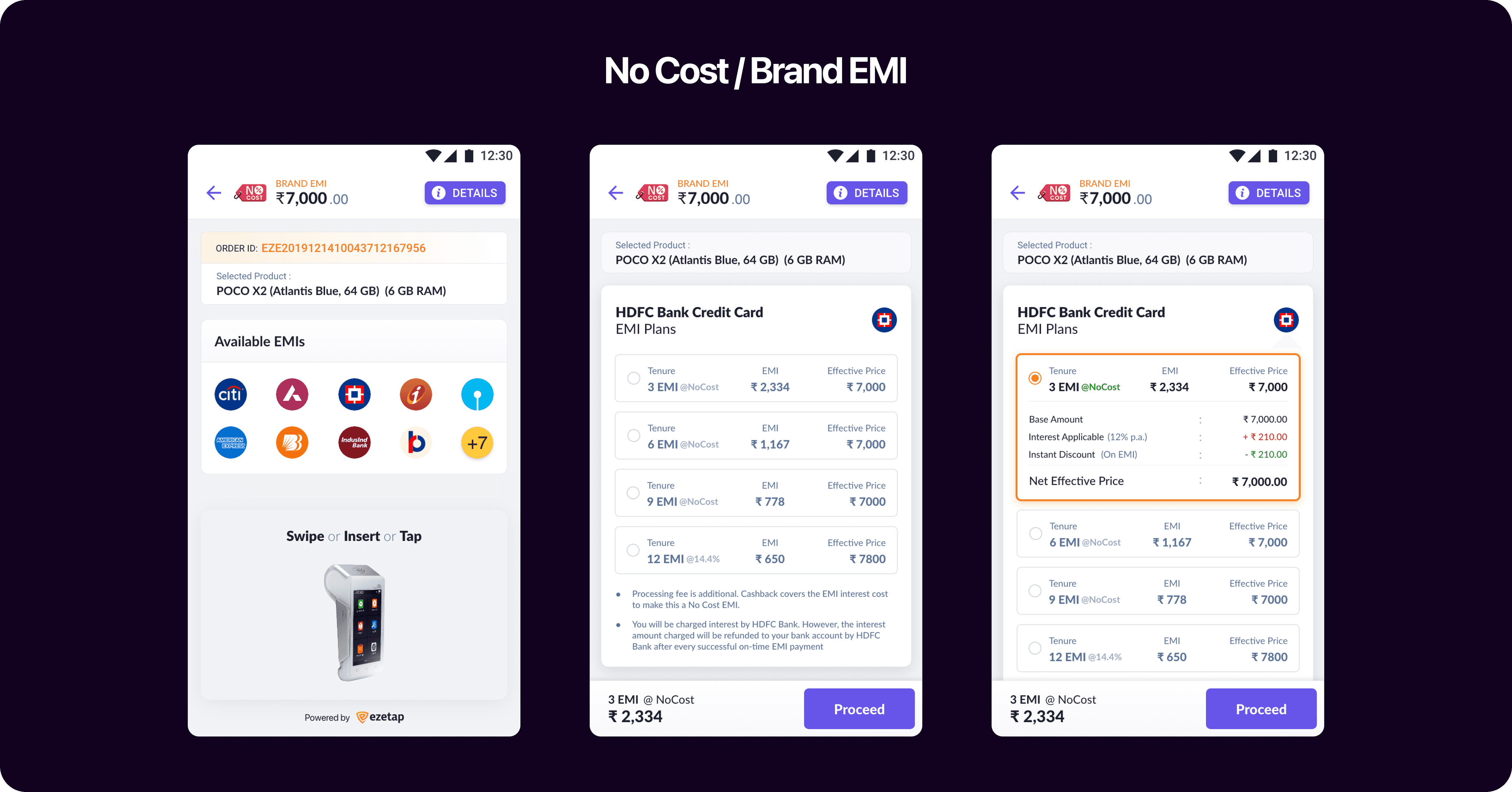
Bank Based EMI
Payment Mode
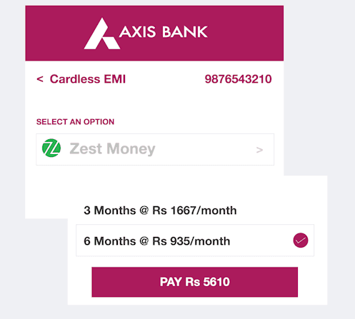
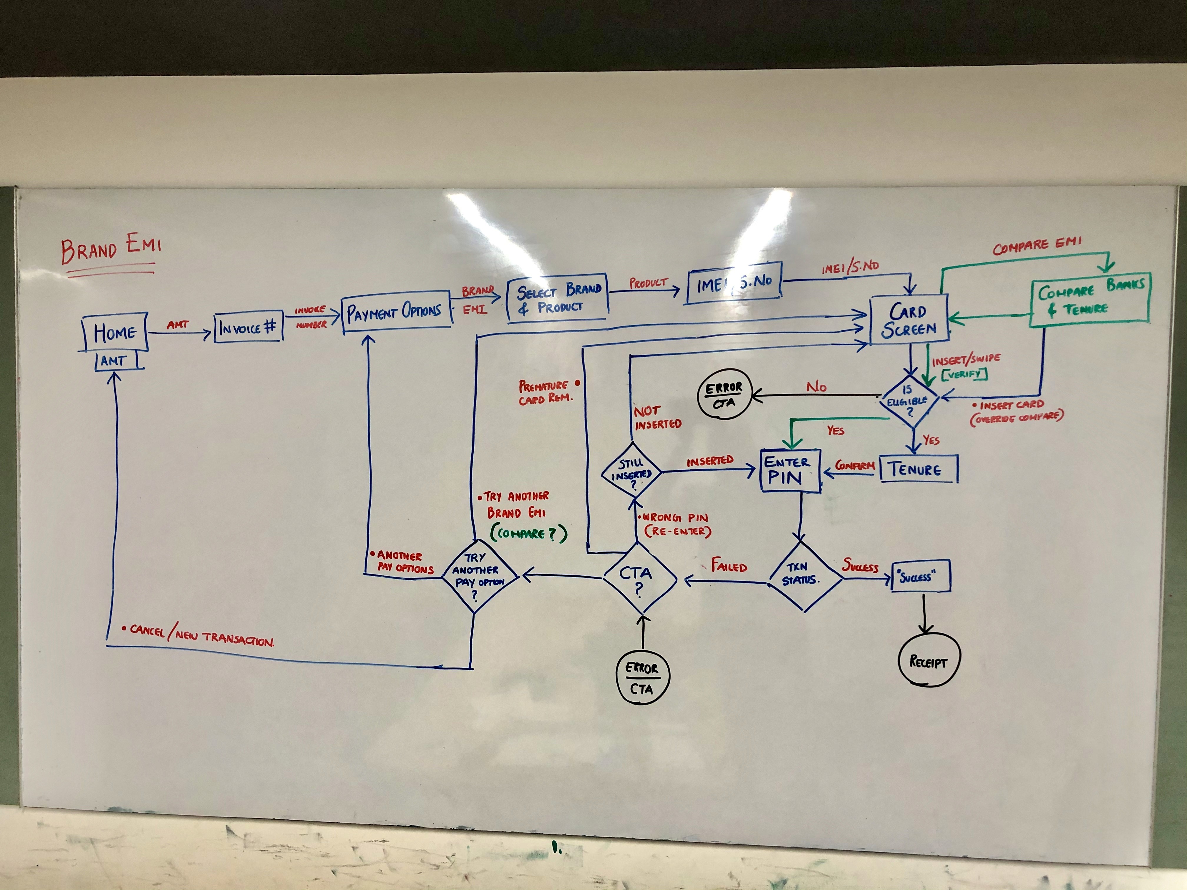
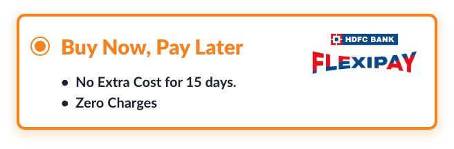
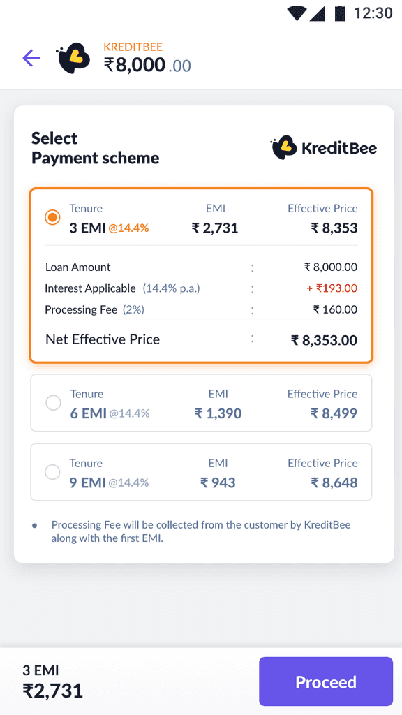
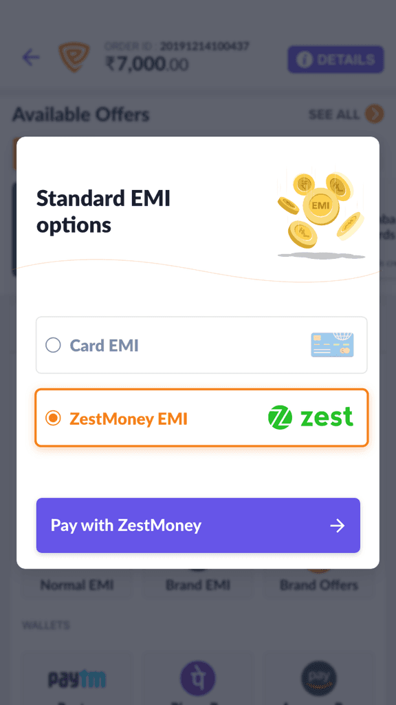
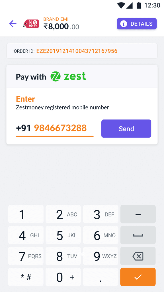
Other Affordabilities

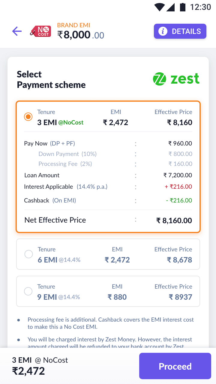
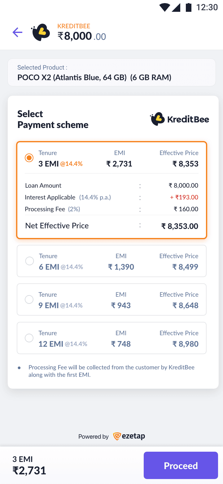
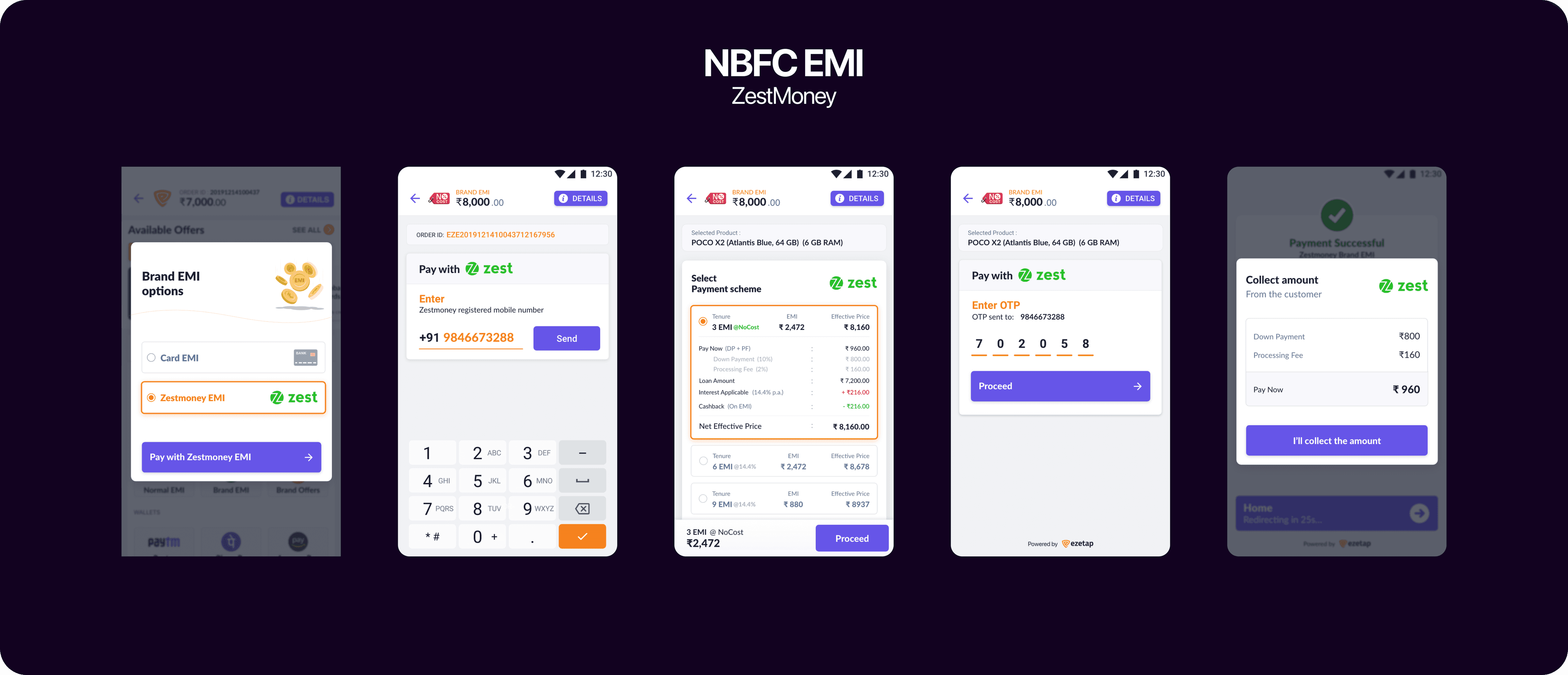
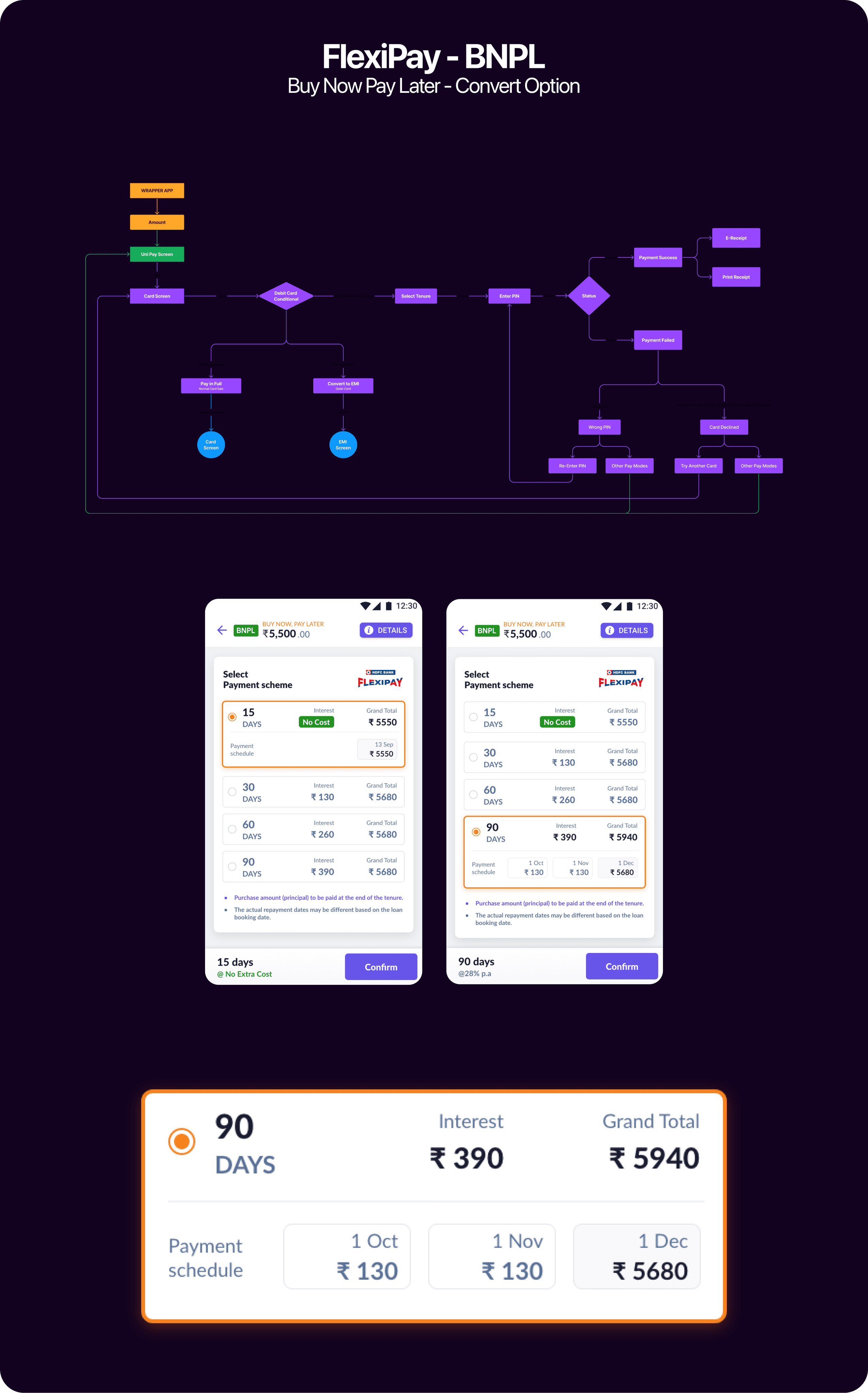
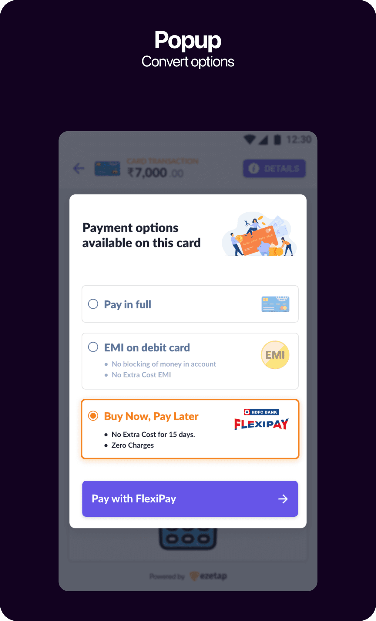
Other affordability options
Payment Mode
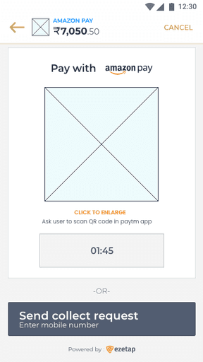
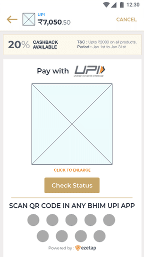
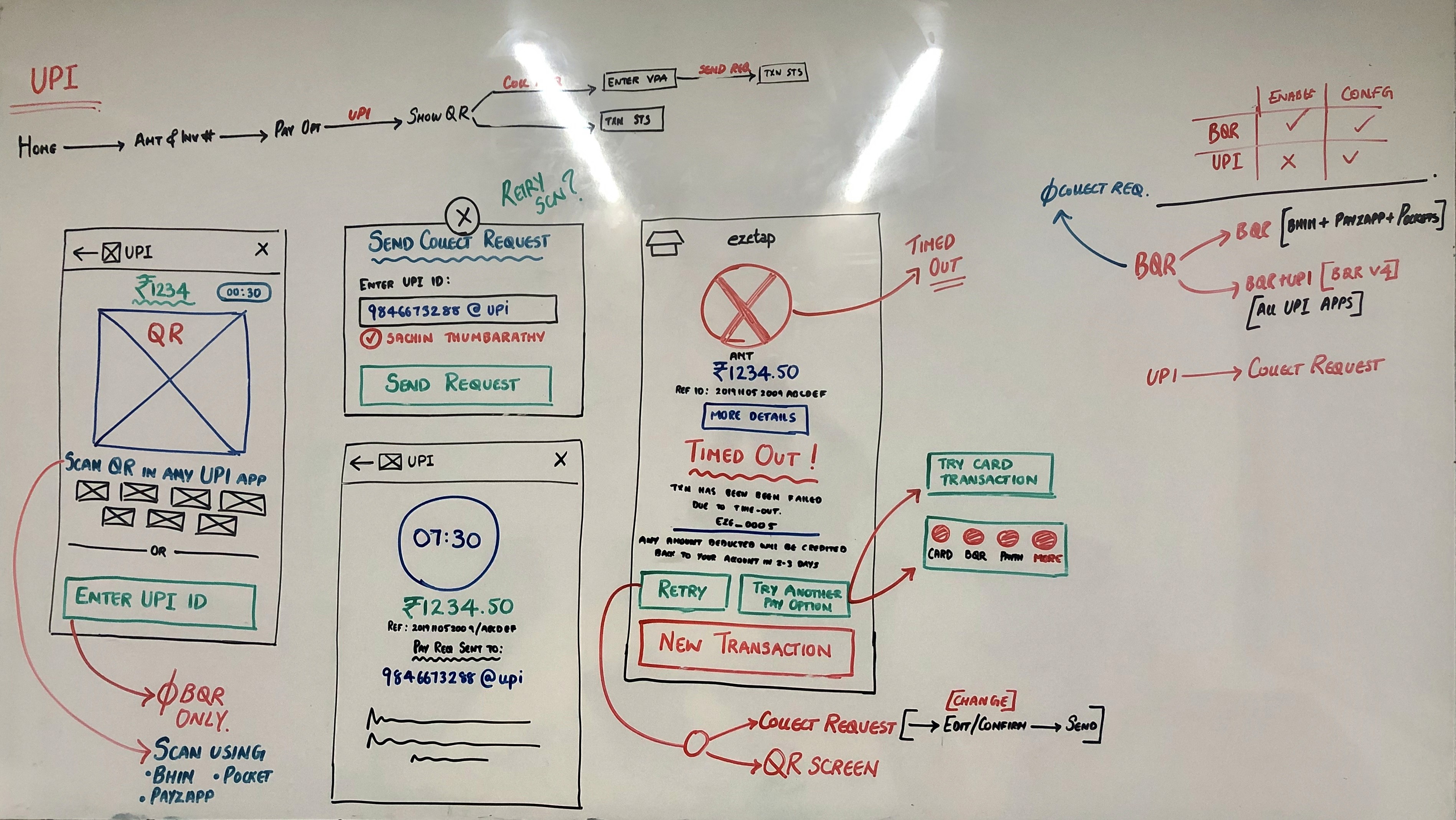
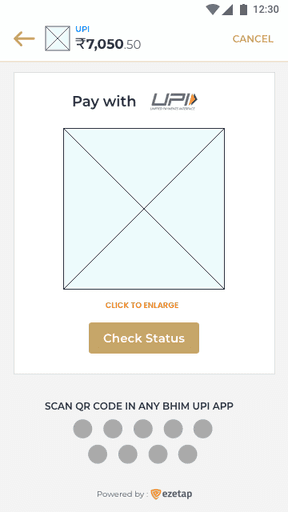
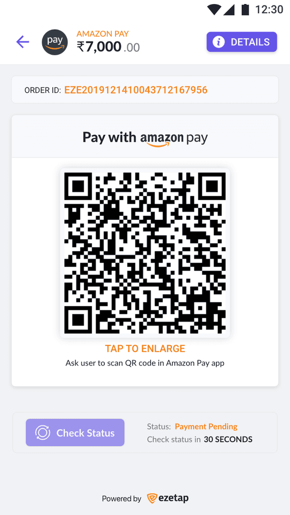
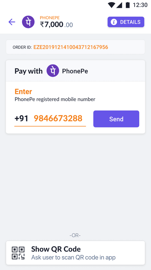
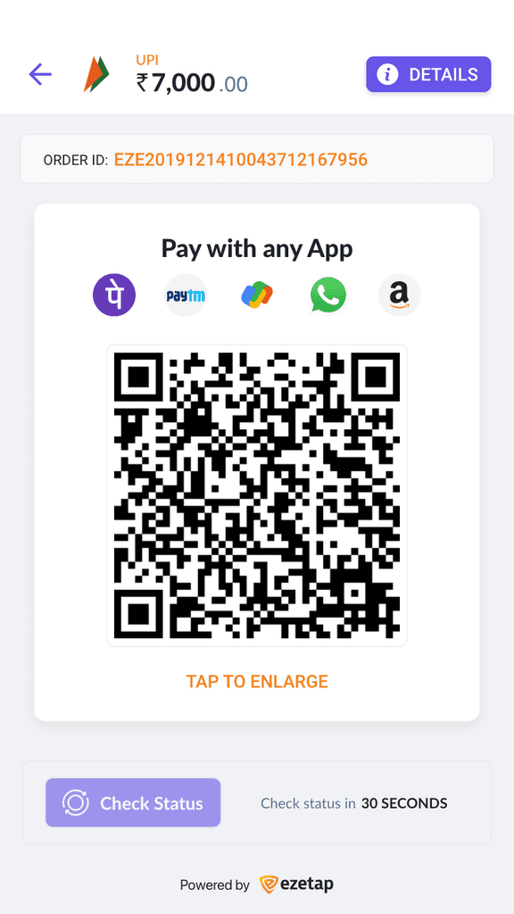
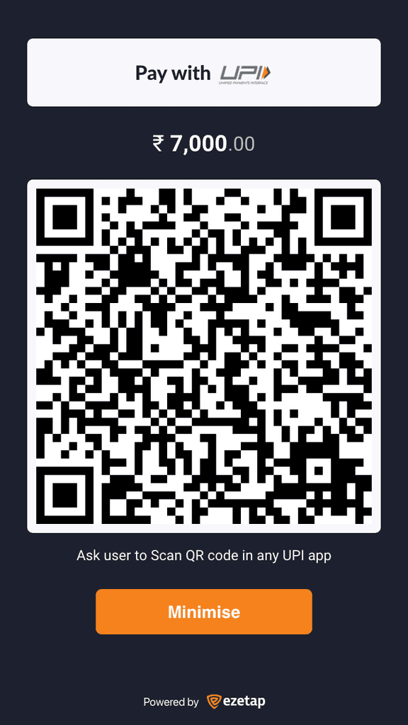
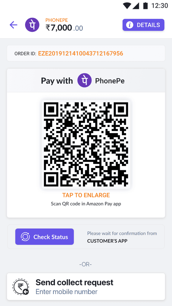
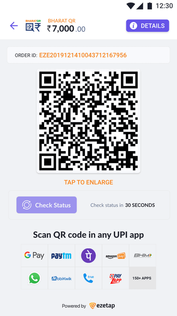
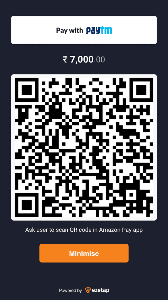
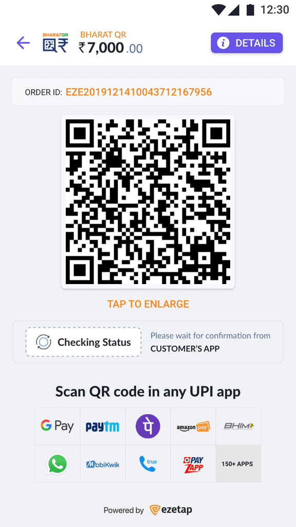
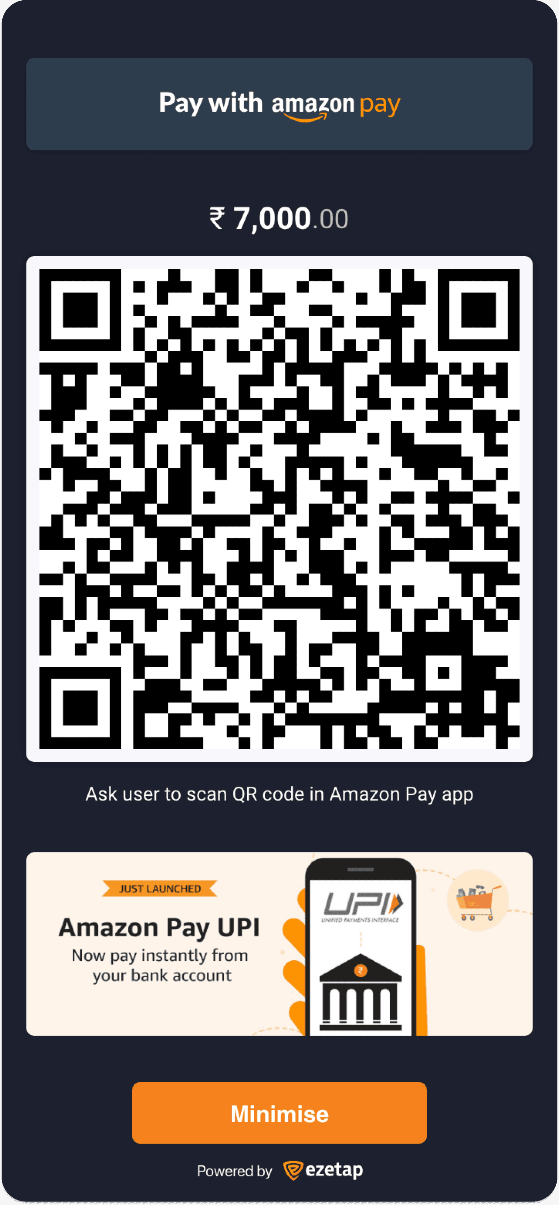
UPI & Bharat QR
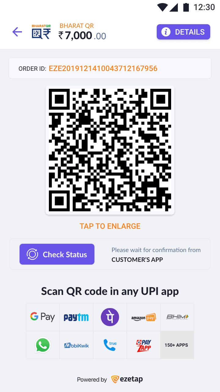
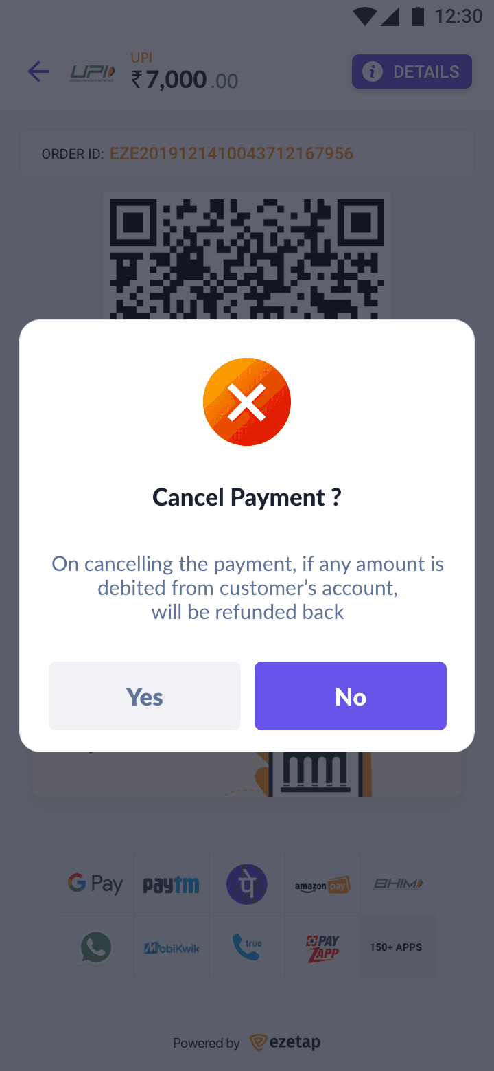
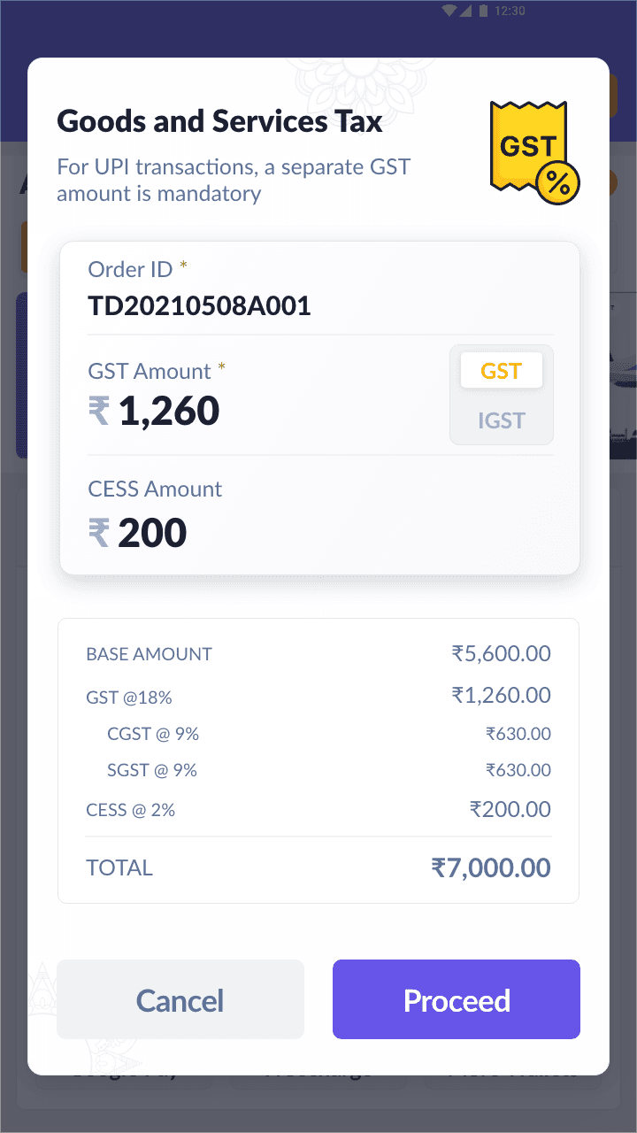

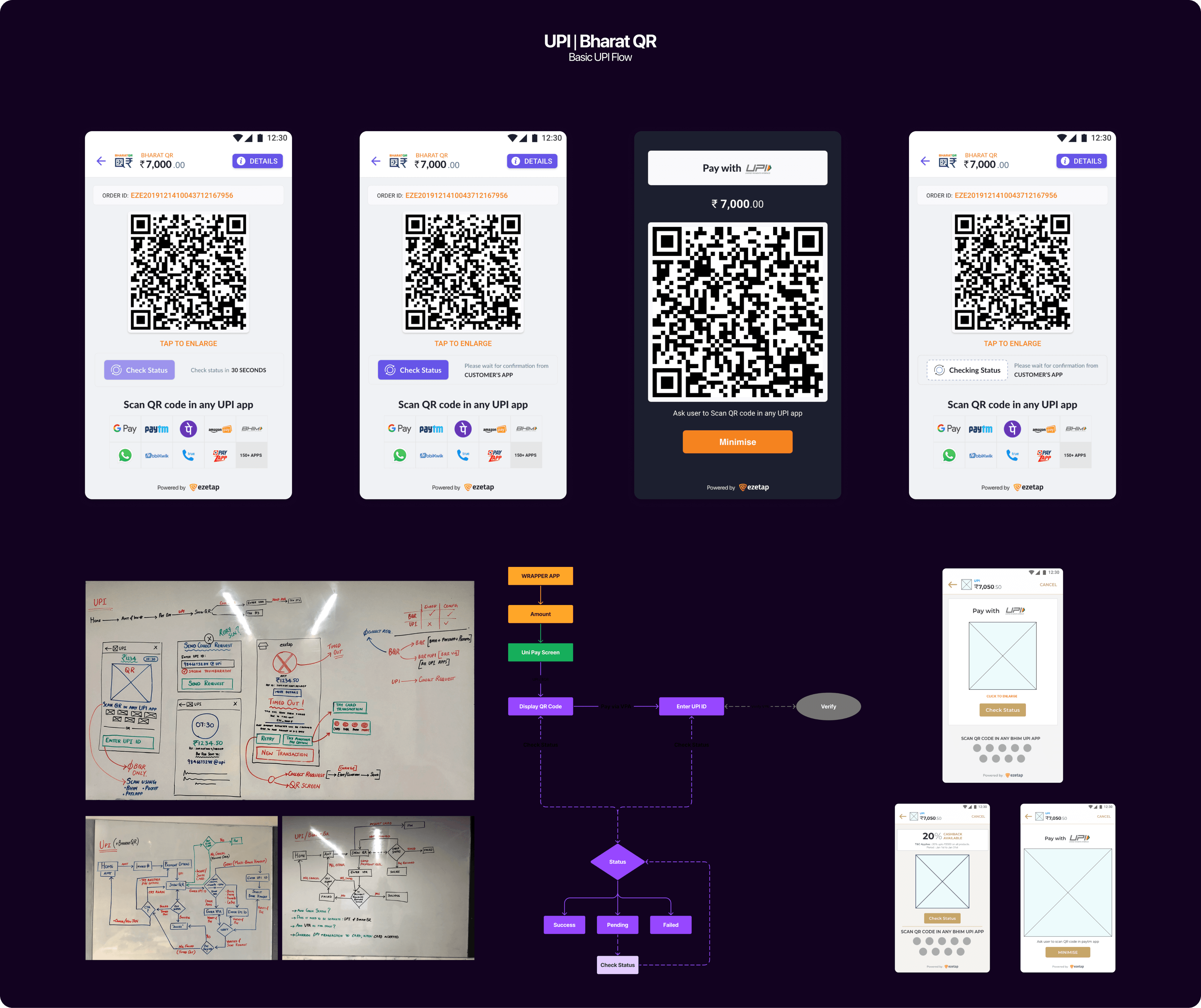
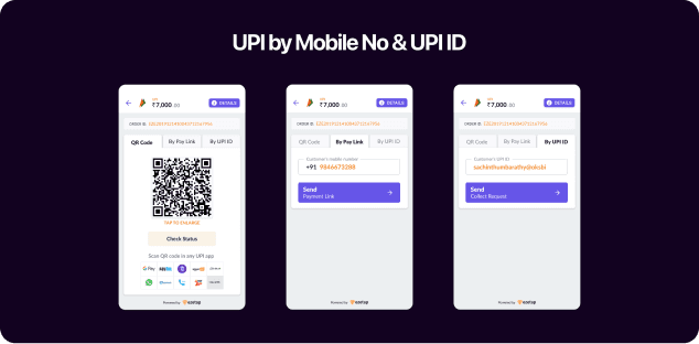
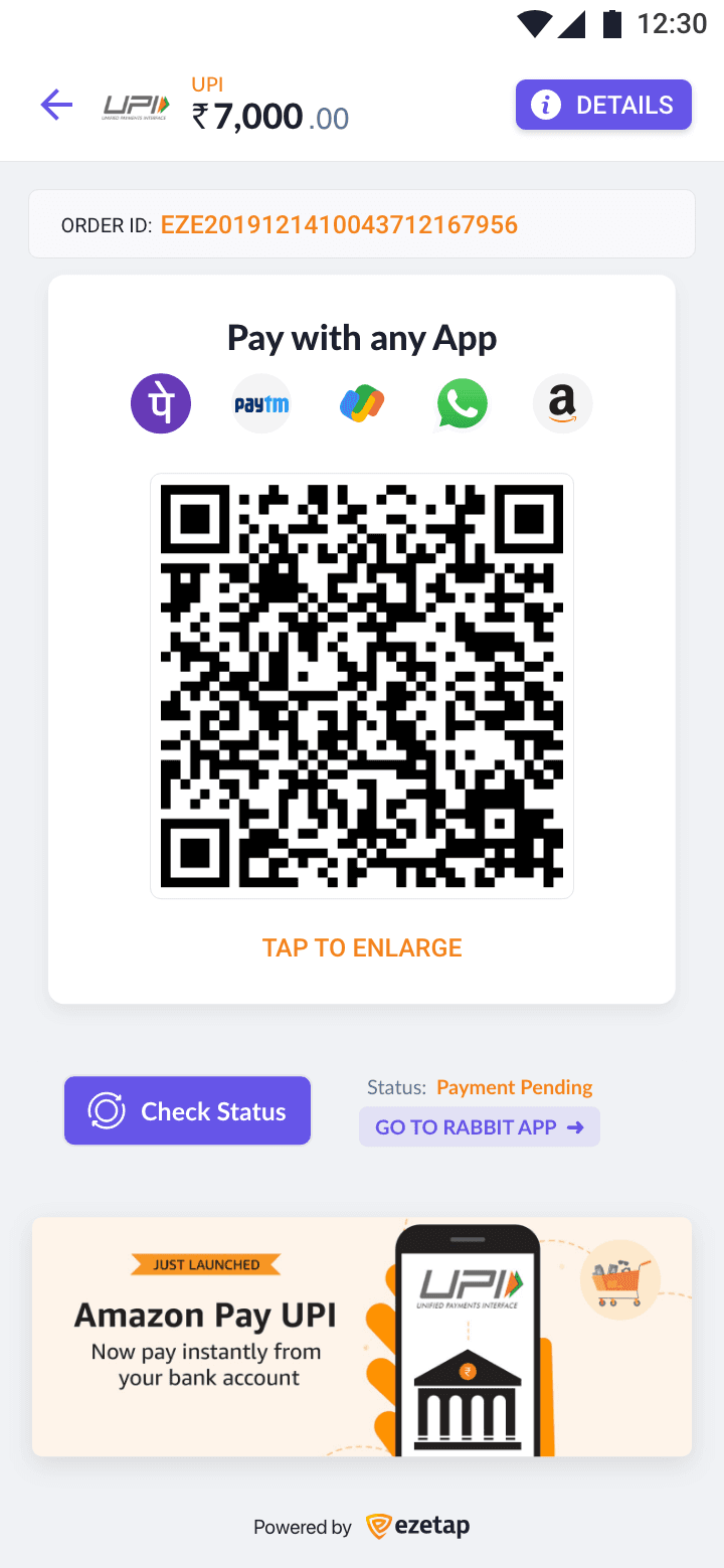
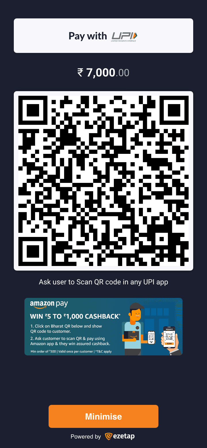
UPI | Bharat QR
Payment Mode
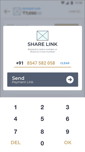
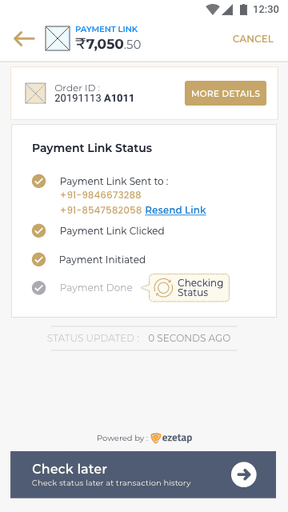
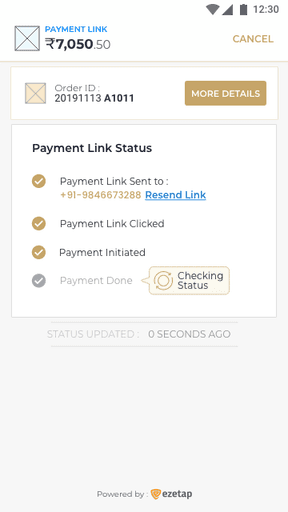
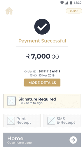
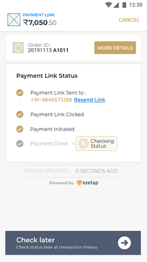
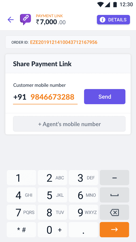
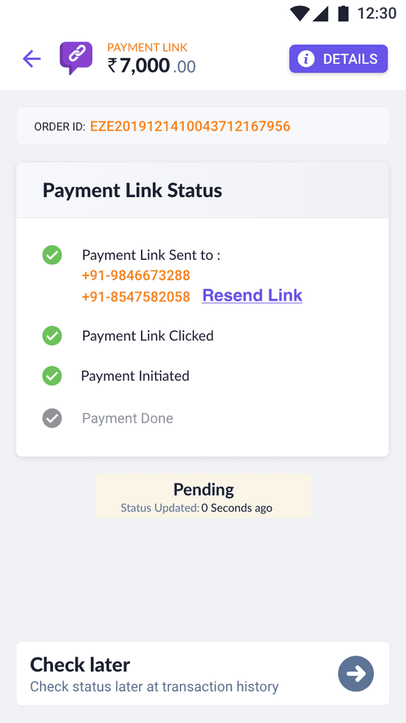
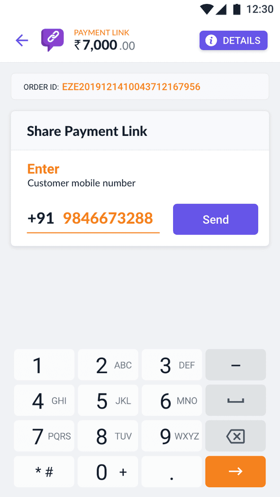
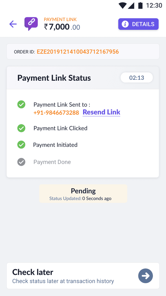
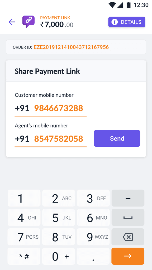
Payment Link
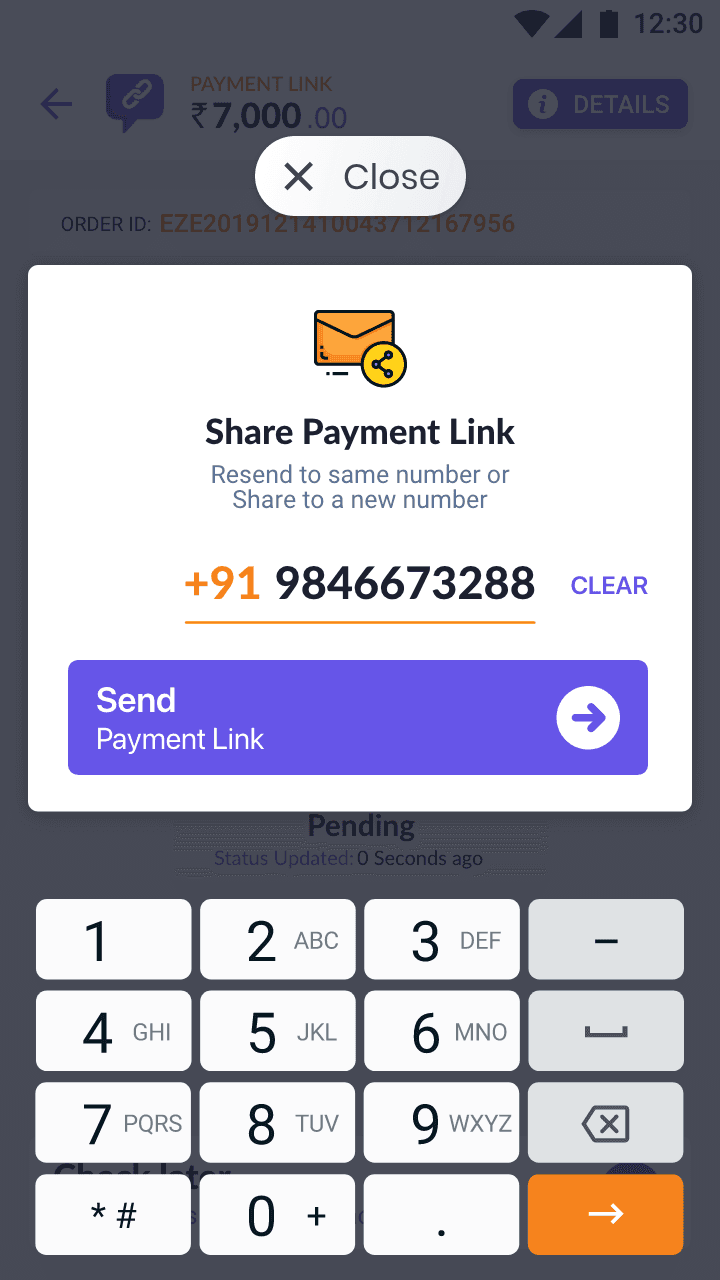
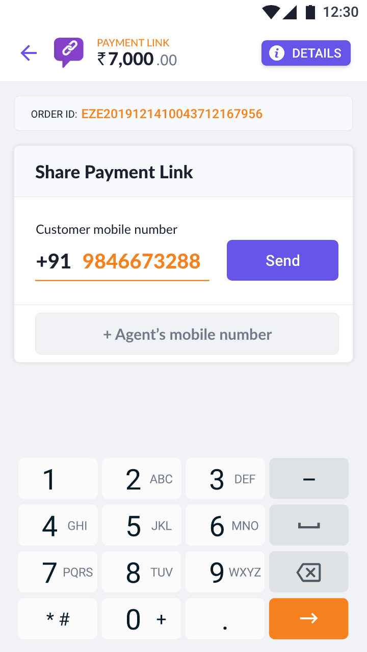
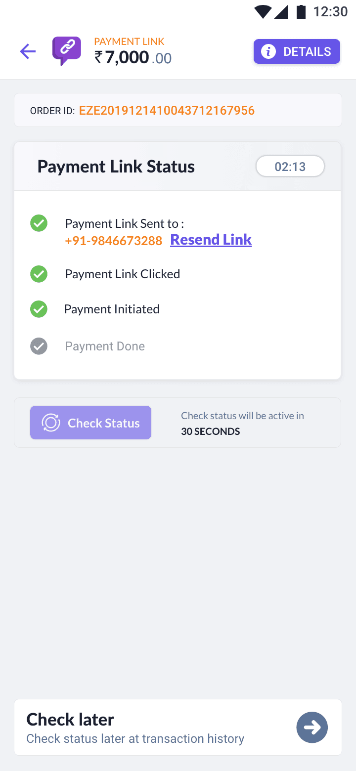
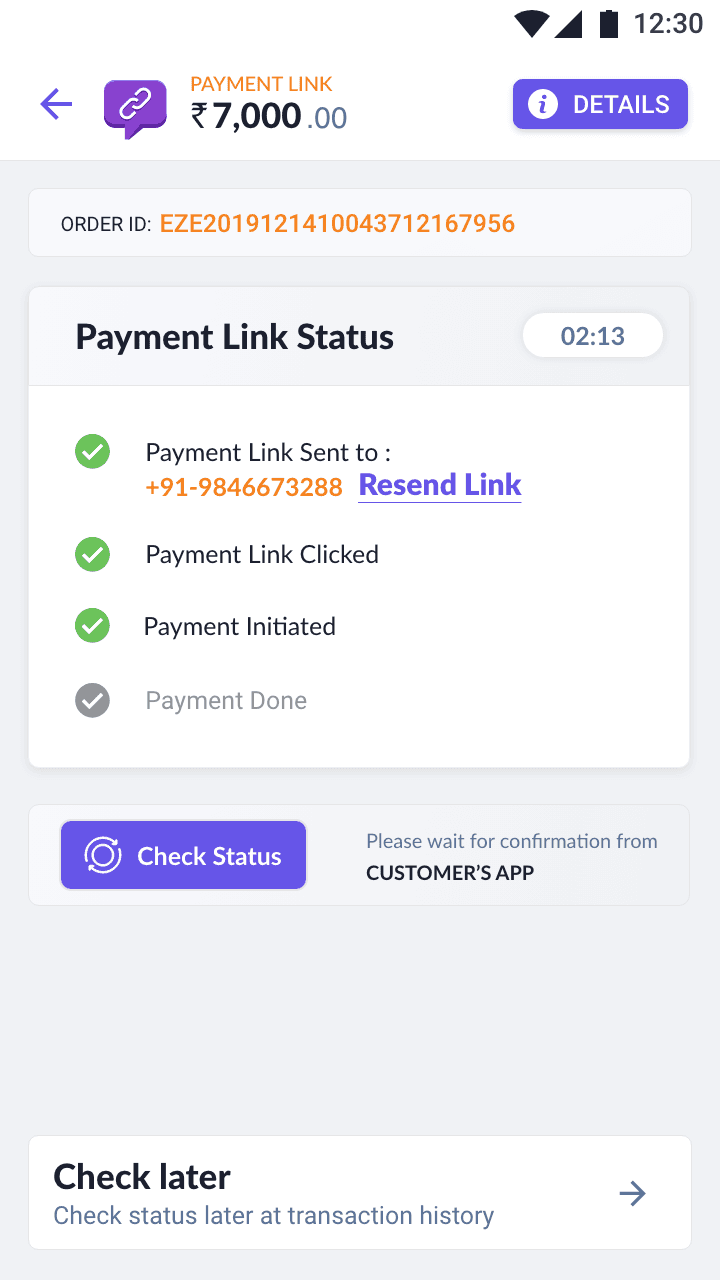
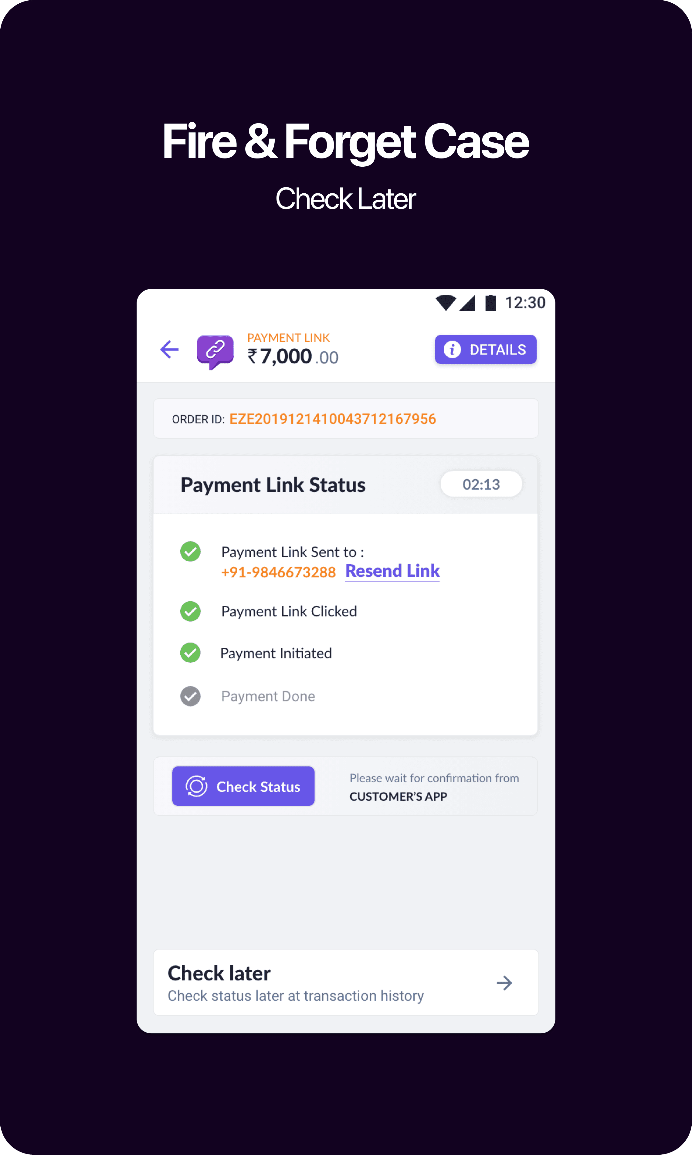
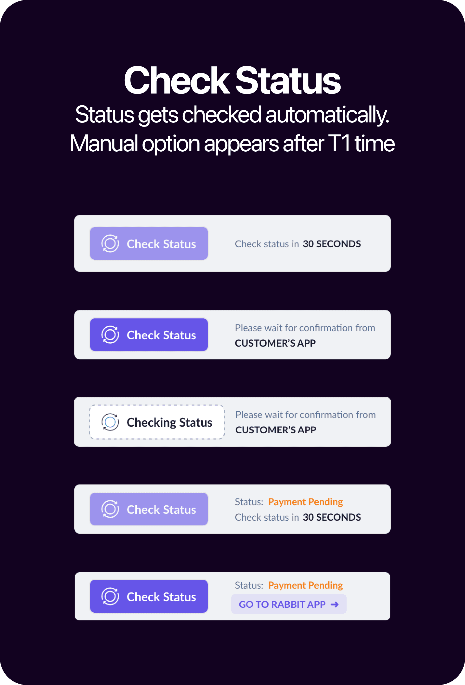

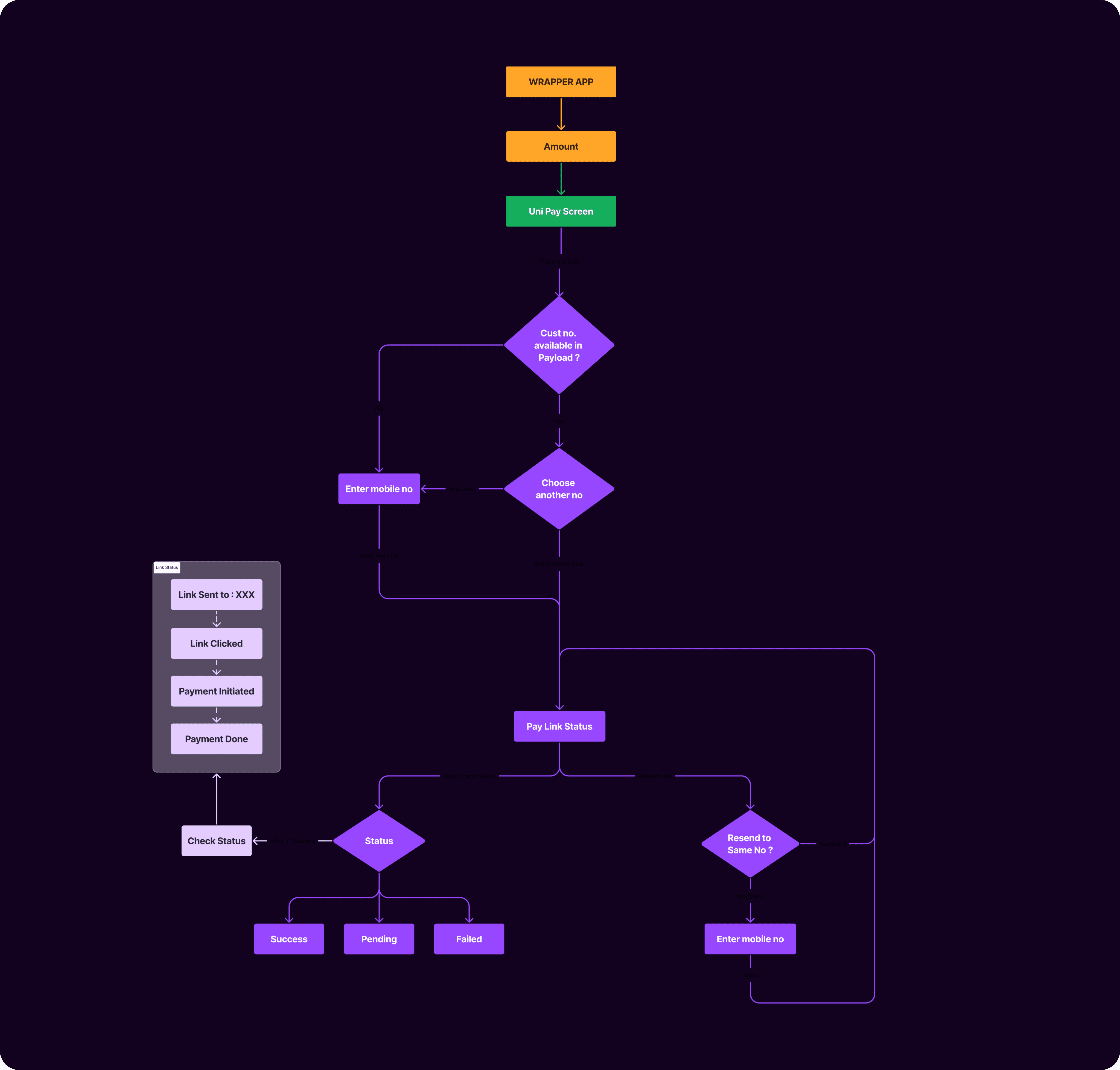

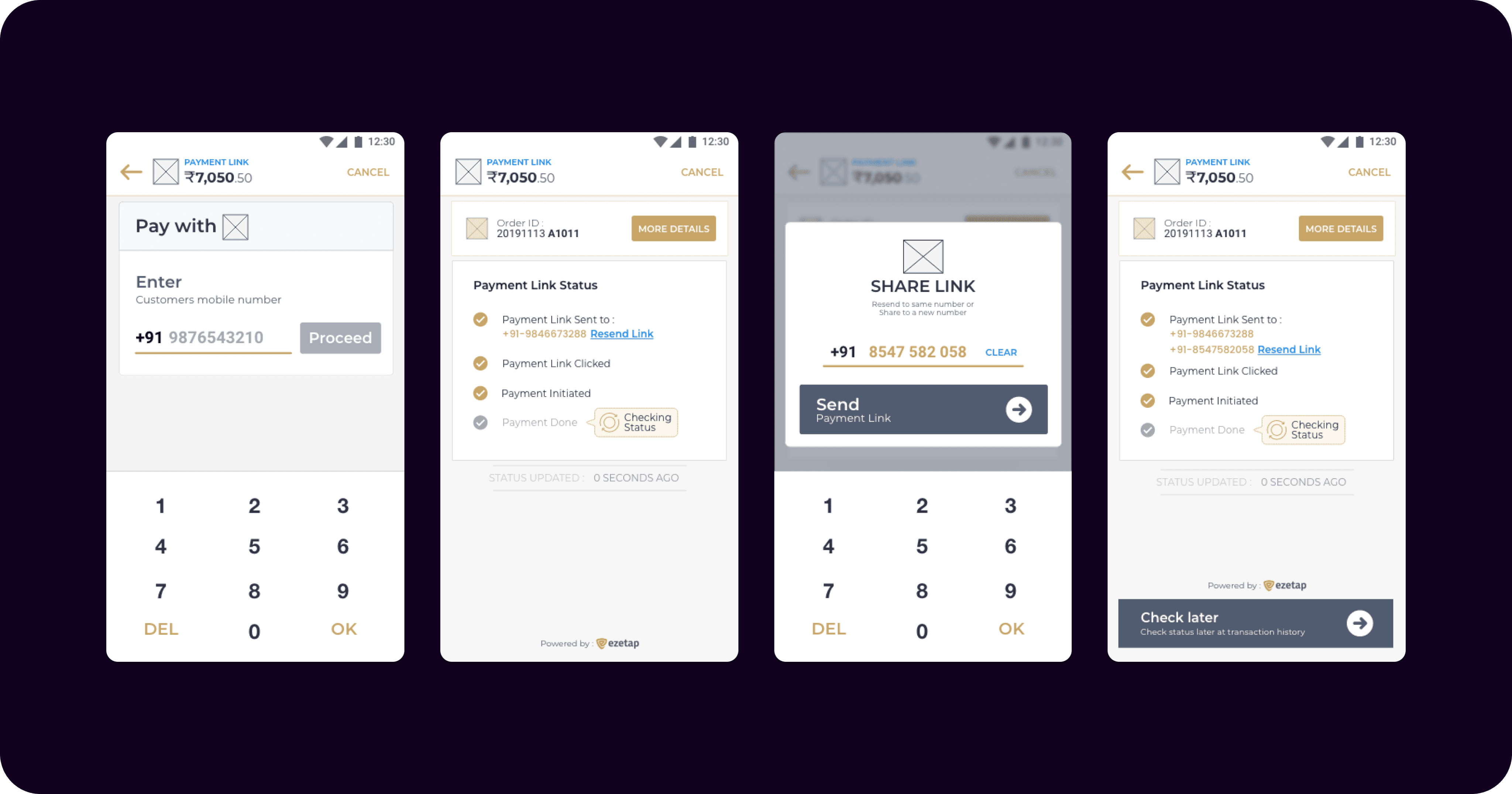

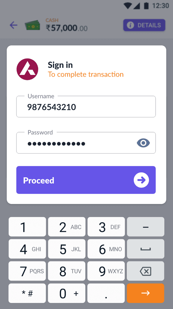
Payment Link
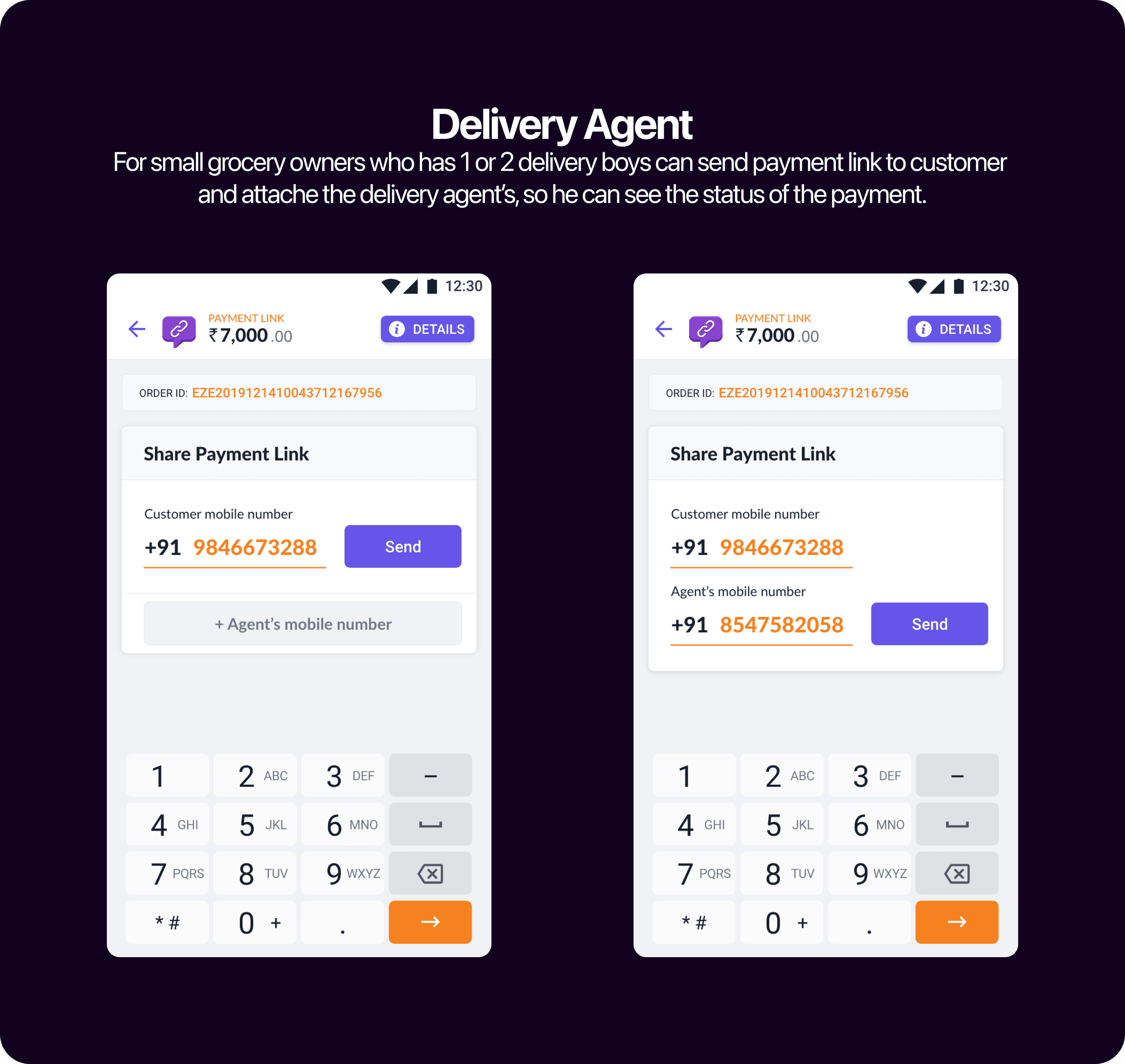
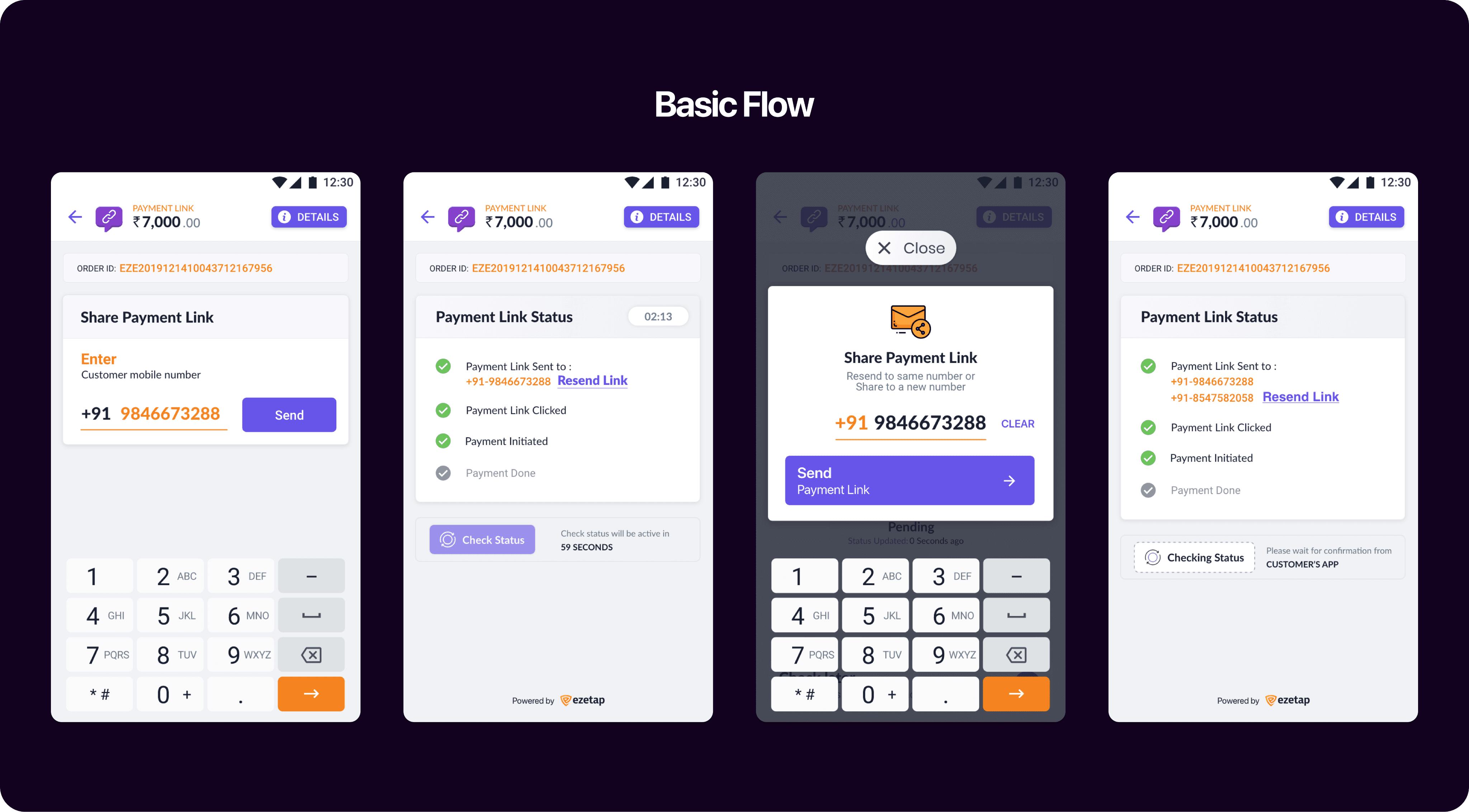
Payment Mode
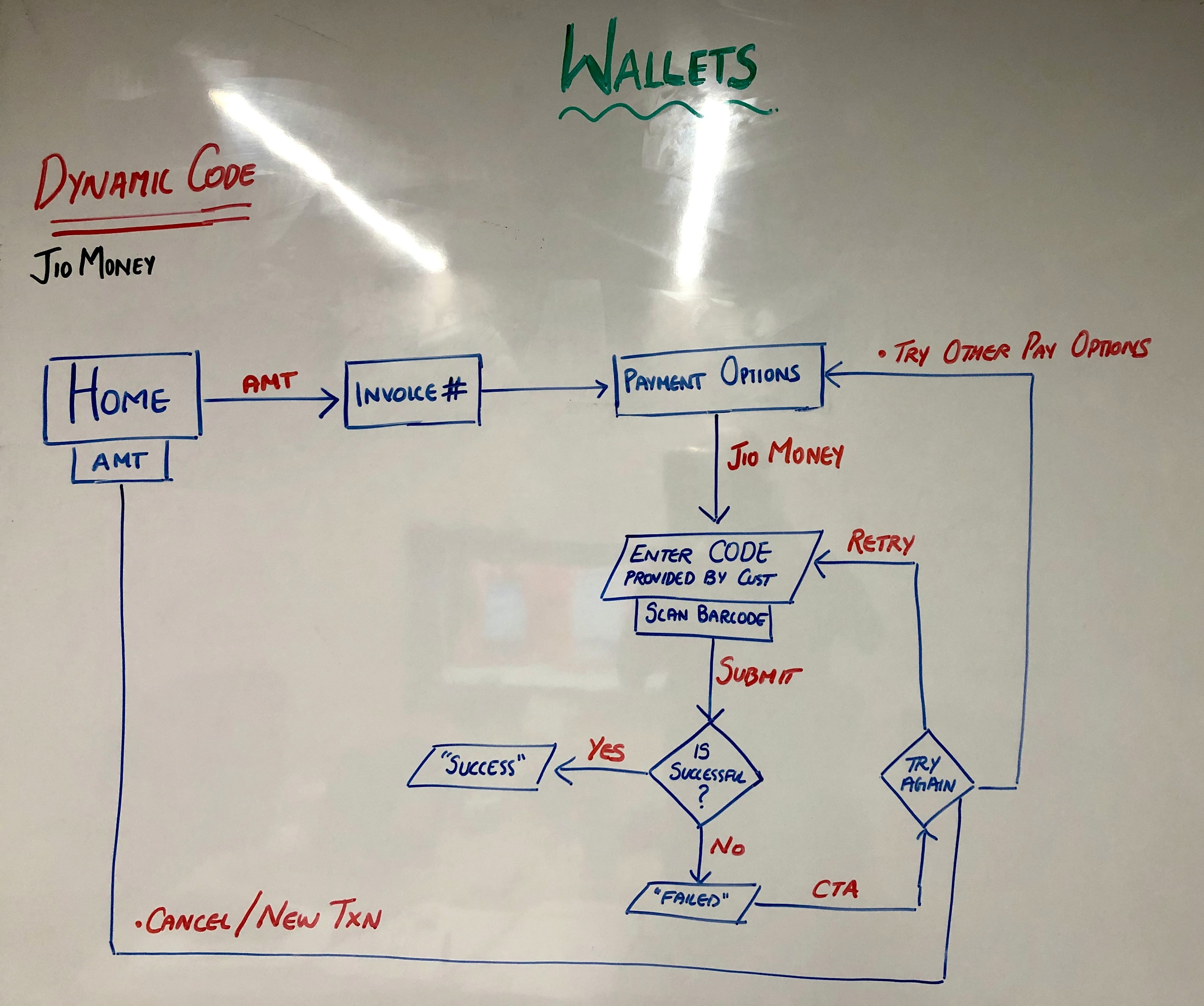
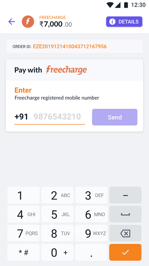
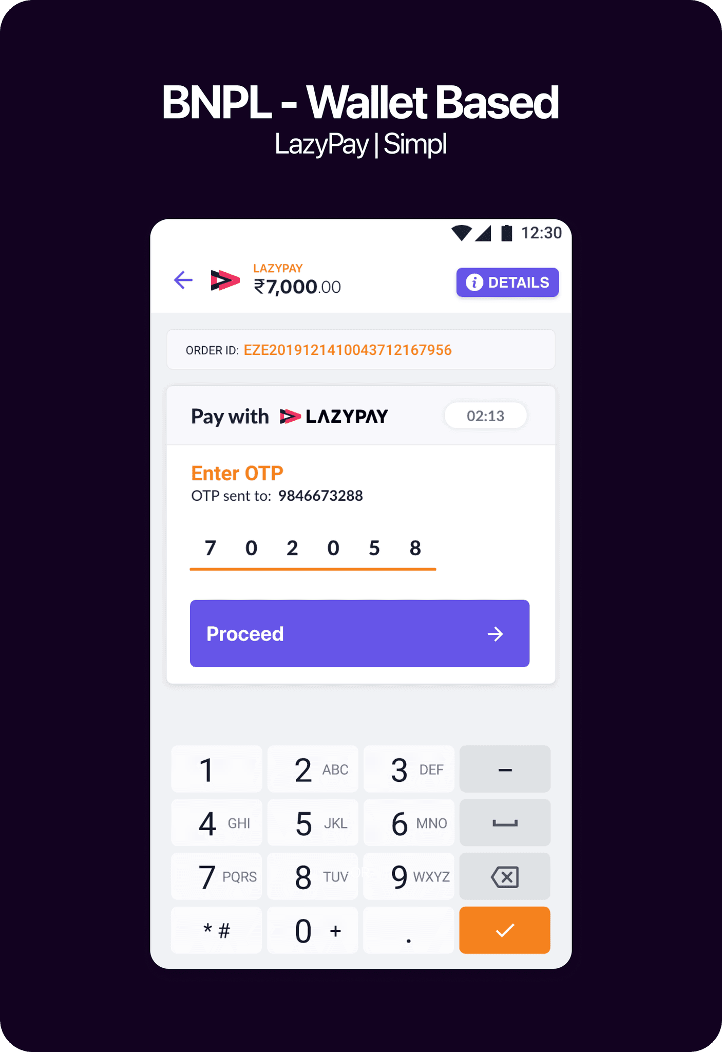
Walletware 2.0

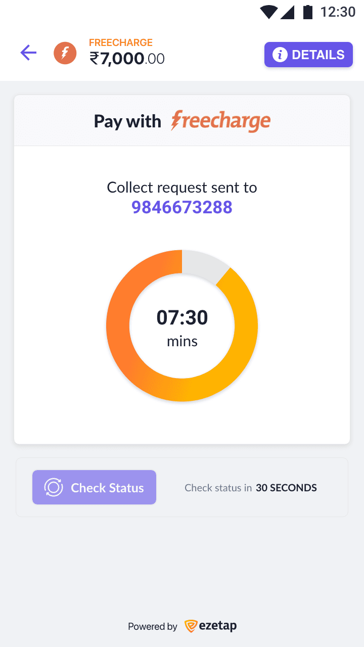
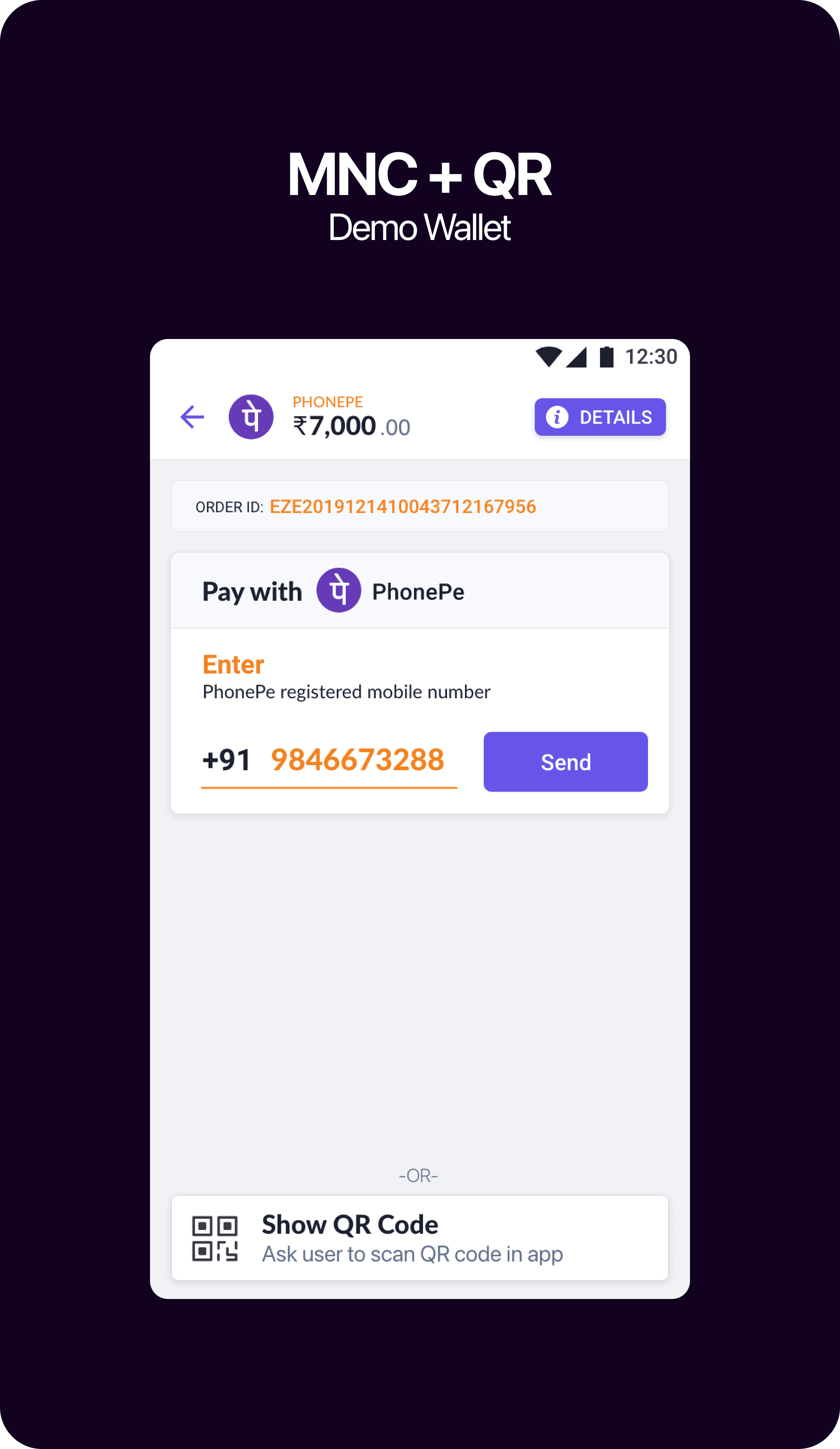
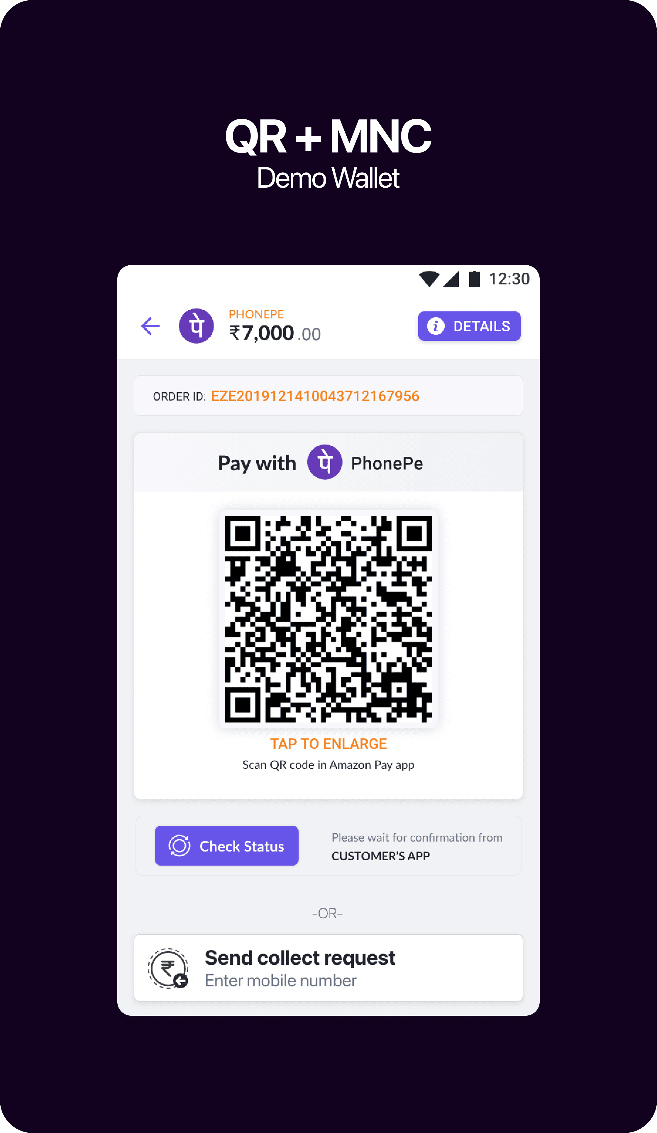
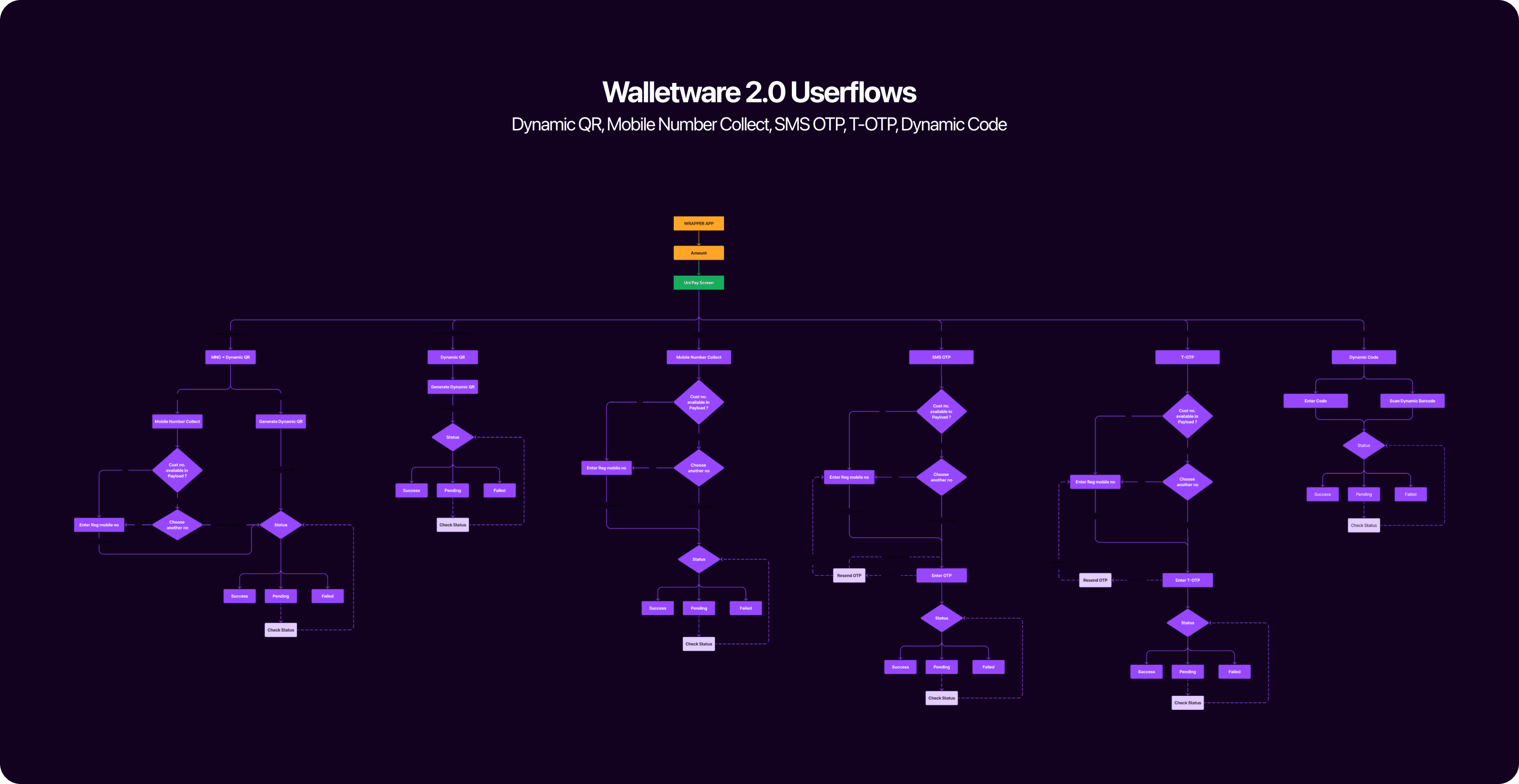
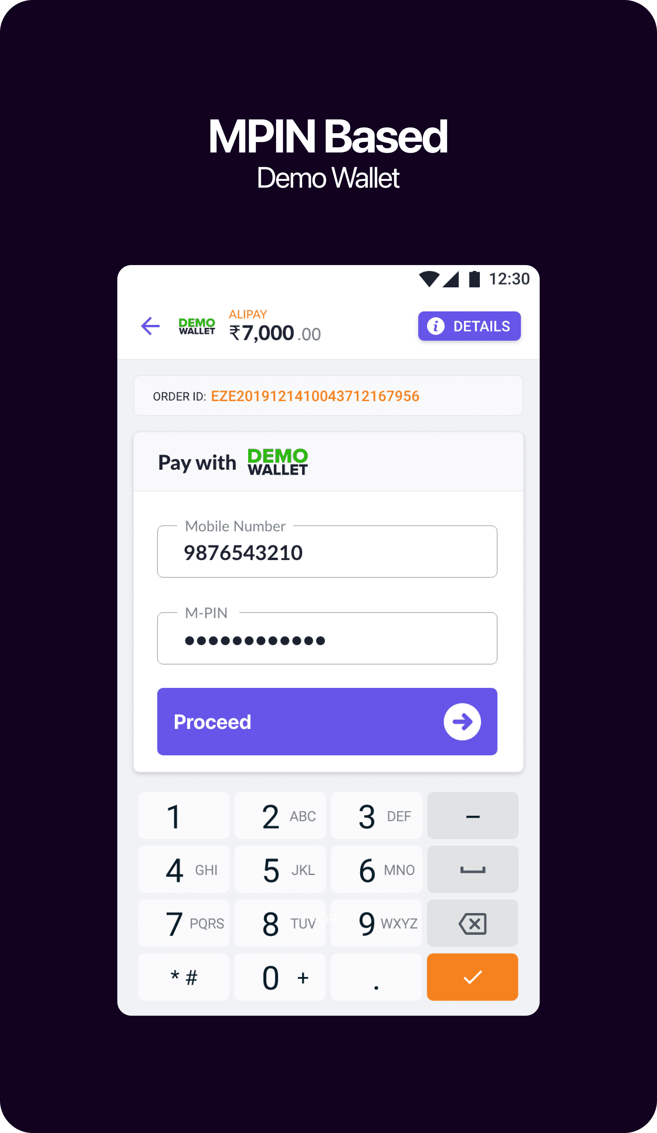
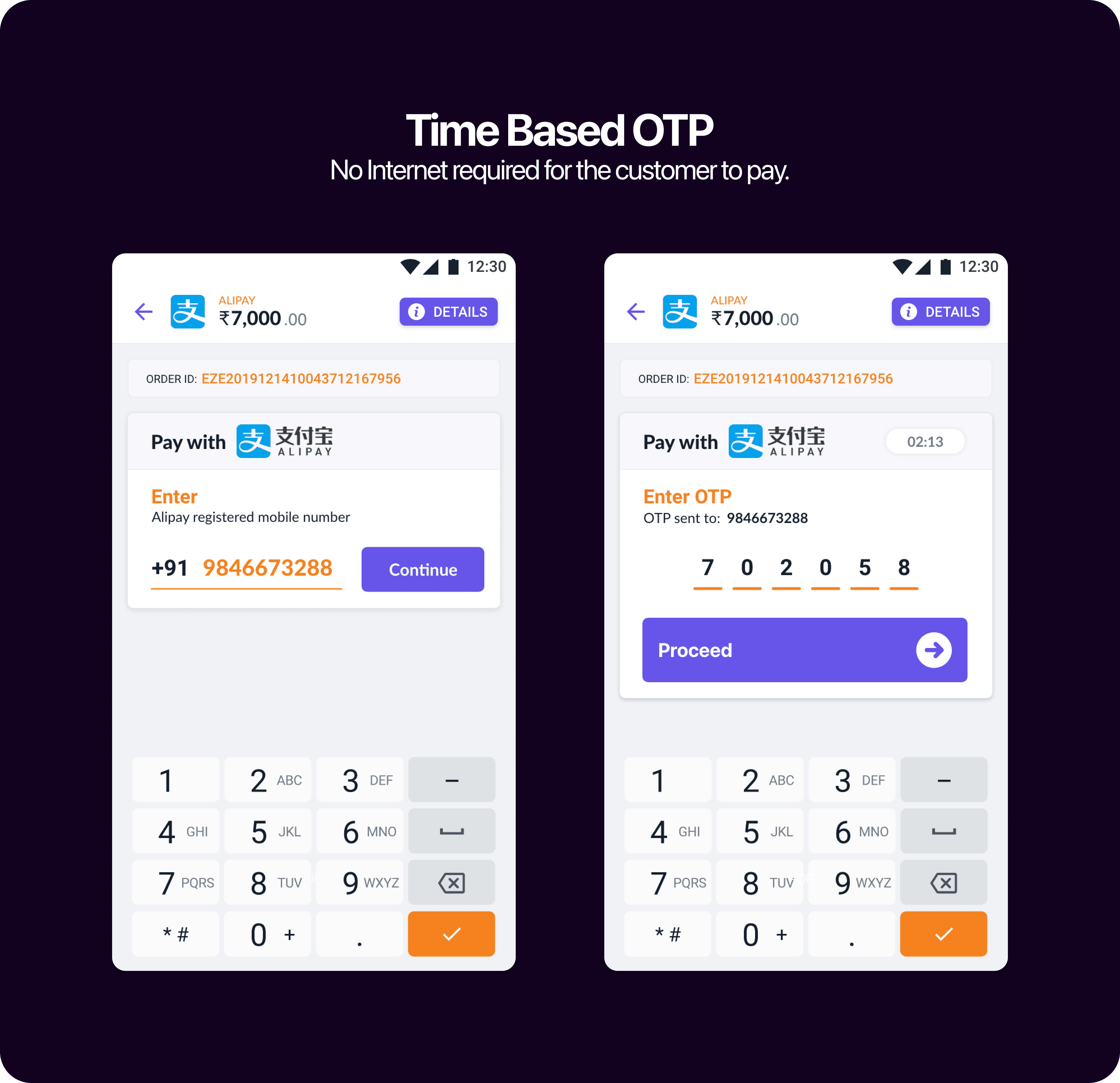
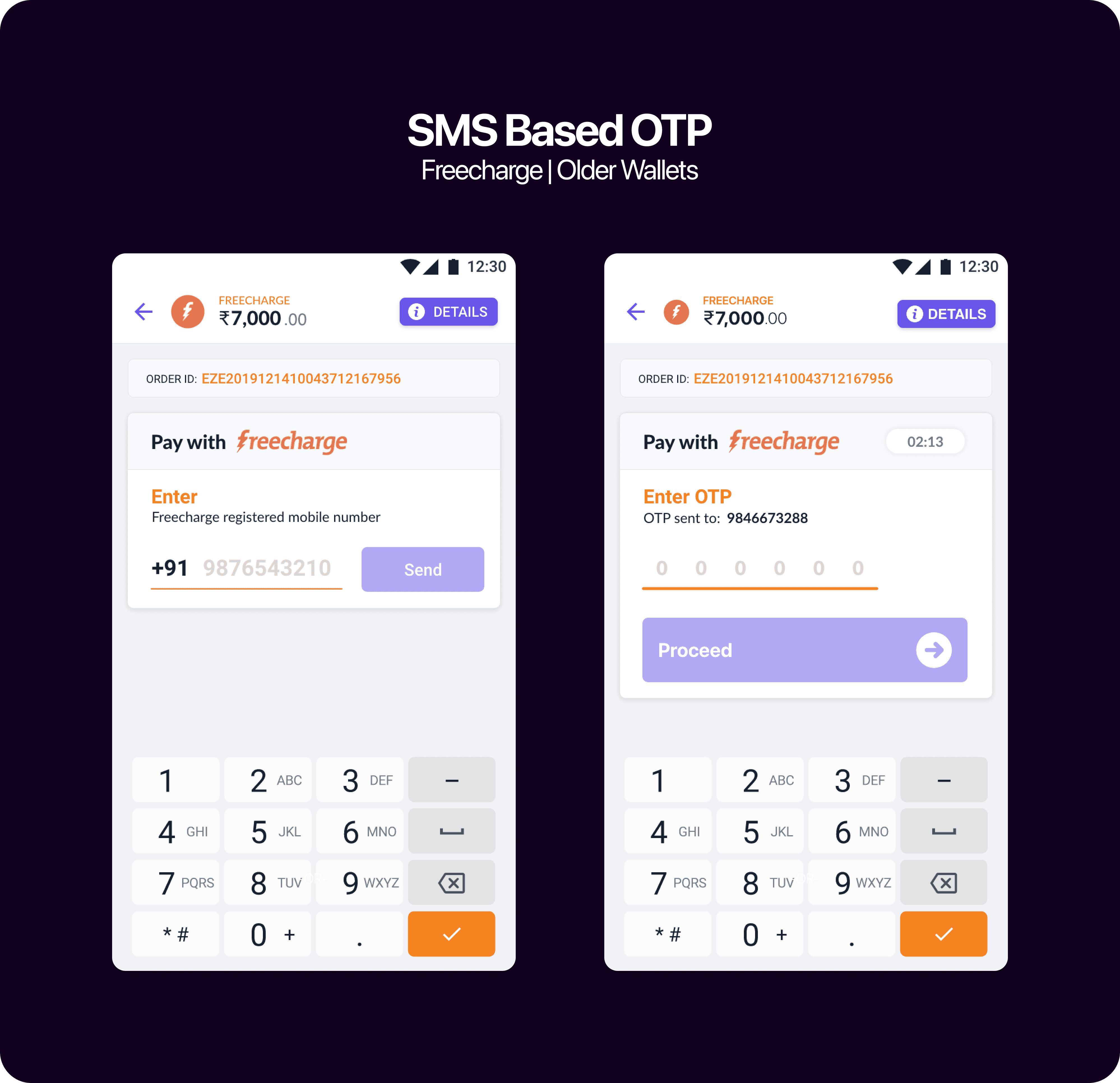
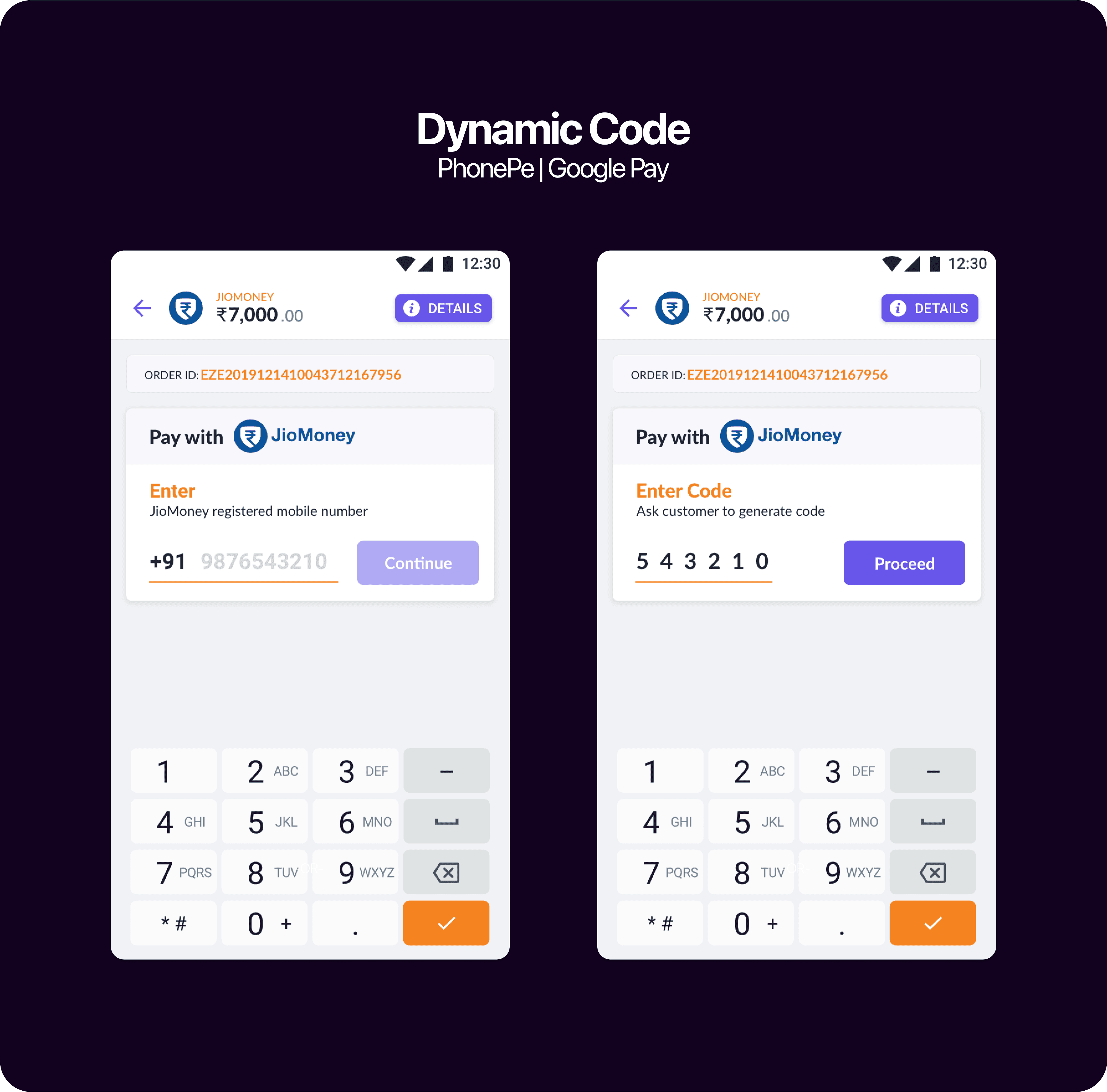
Walletware 2.0

Optimised for Diverse Payments
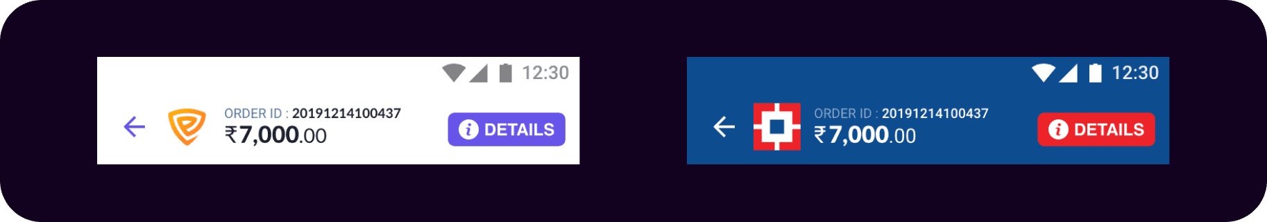
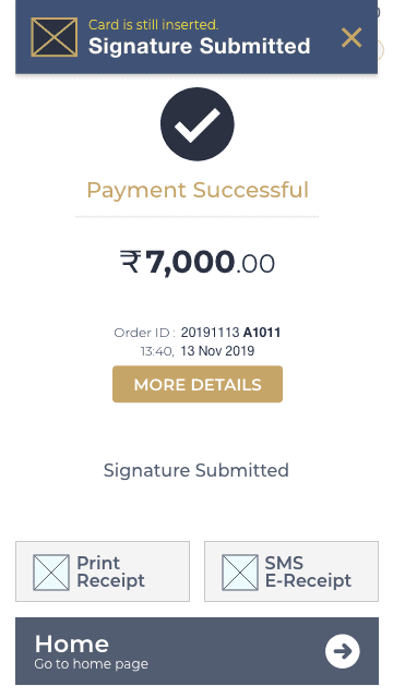
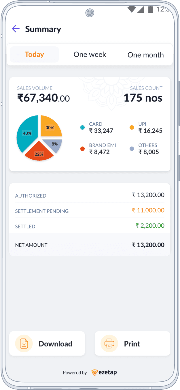
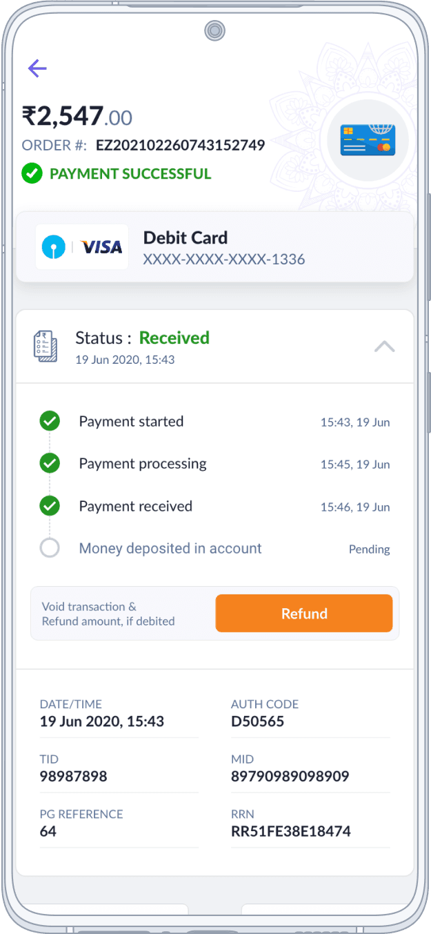
Transaction History
In redesigning the Transaction History section, we tackled the challenge of presenting diverse payment methods cohesively.

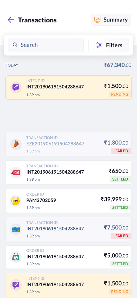

Enhanced Transaction History for Diverse Payments
This redesign significantly contributes to providing a streamlined and efficient payment experience for merchants.
An integrated design, logical groupings, and comprehensive transaction insights were the resolution.
Clients can now seamlessly understand their financial activities, whether it's Credit Cards, Wallets, EMIs, Payment Links, or UPI
History
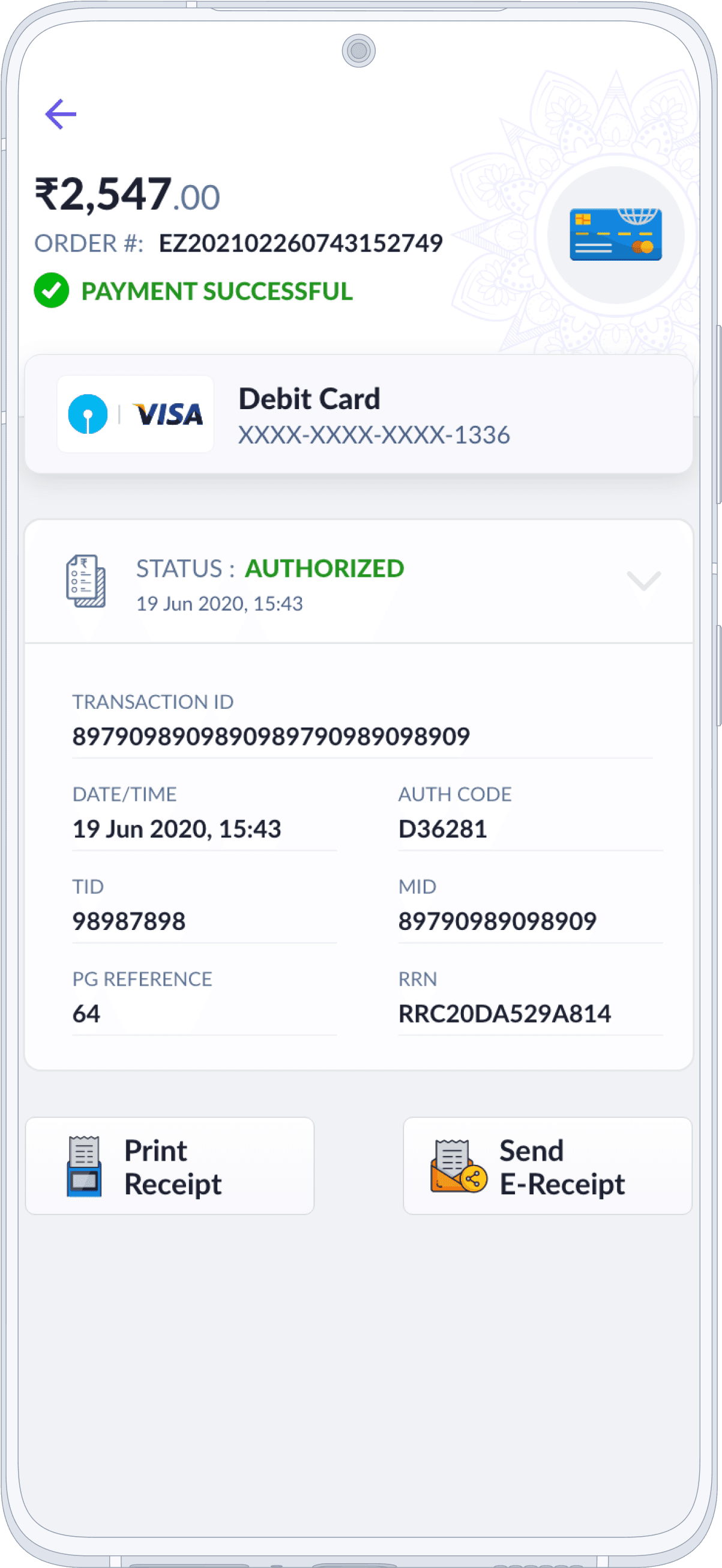
Transaction View
The revamped Transaction History section offers a user-friendly experience tailored to diverse payment methods.
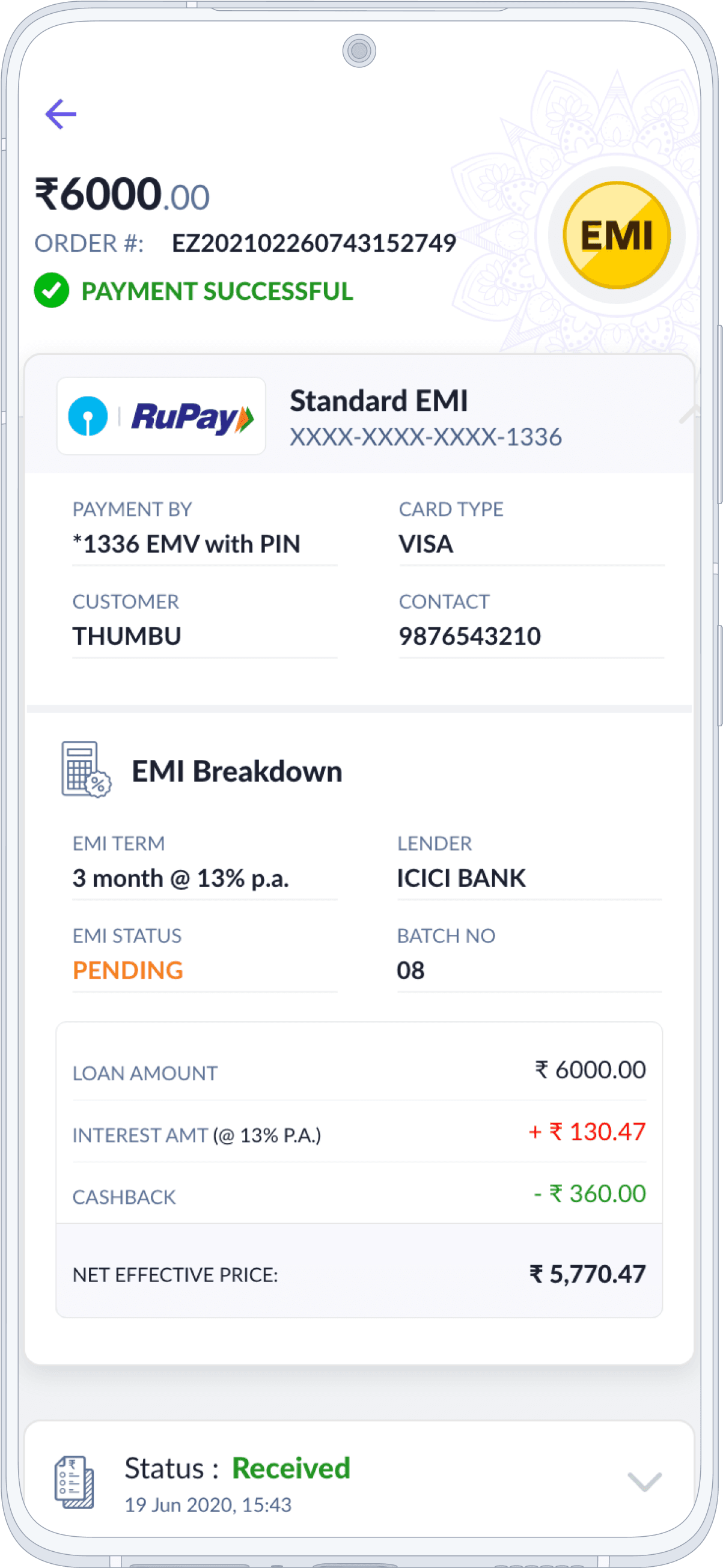
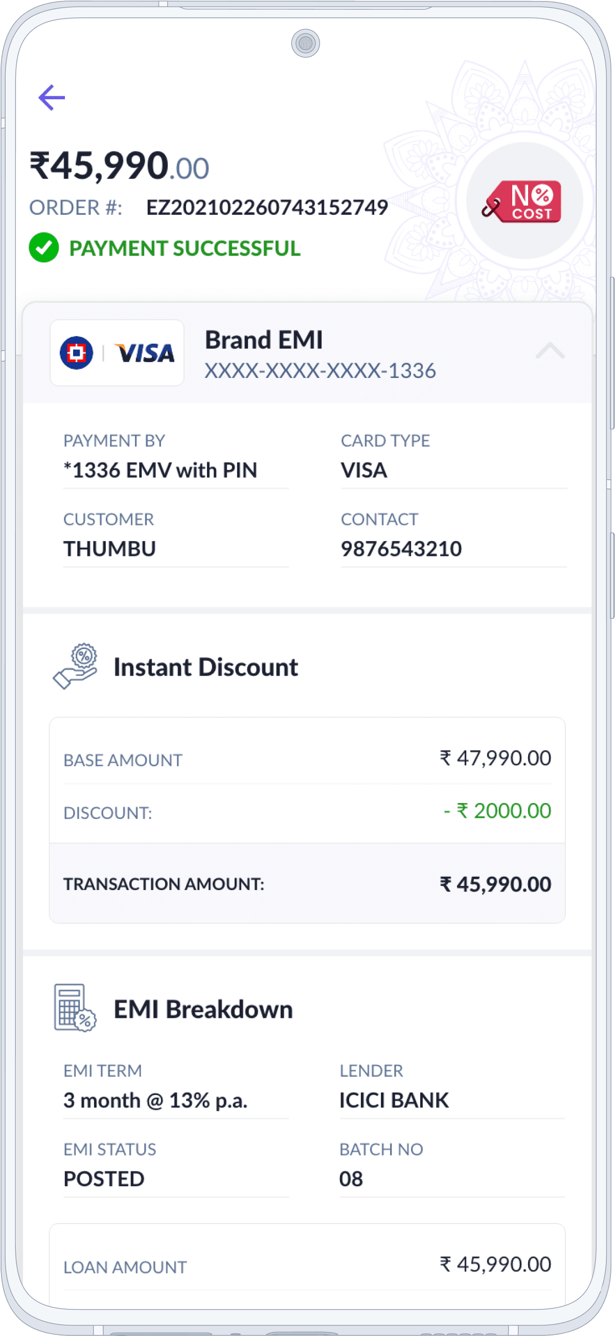

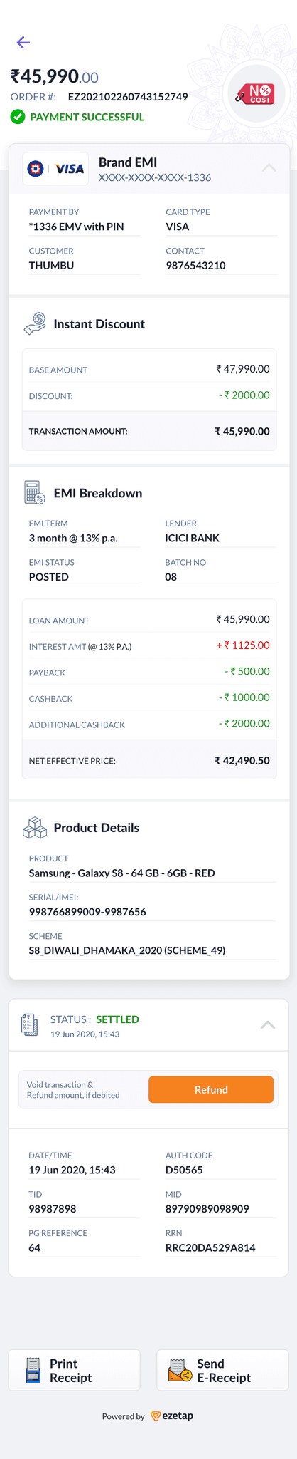
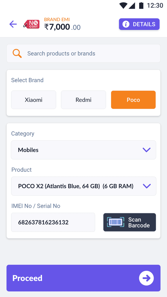
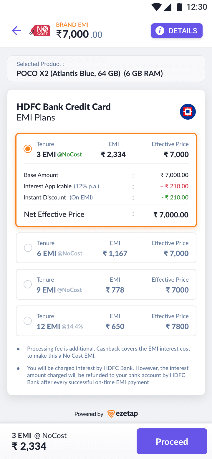
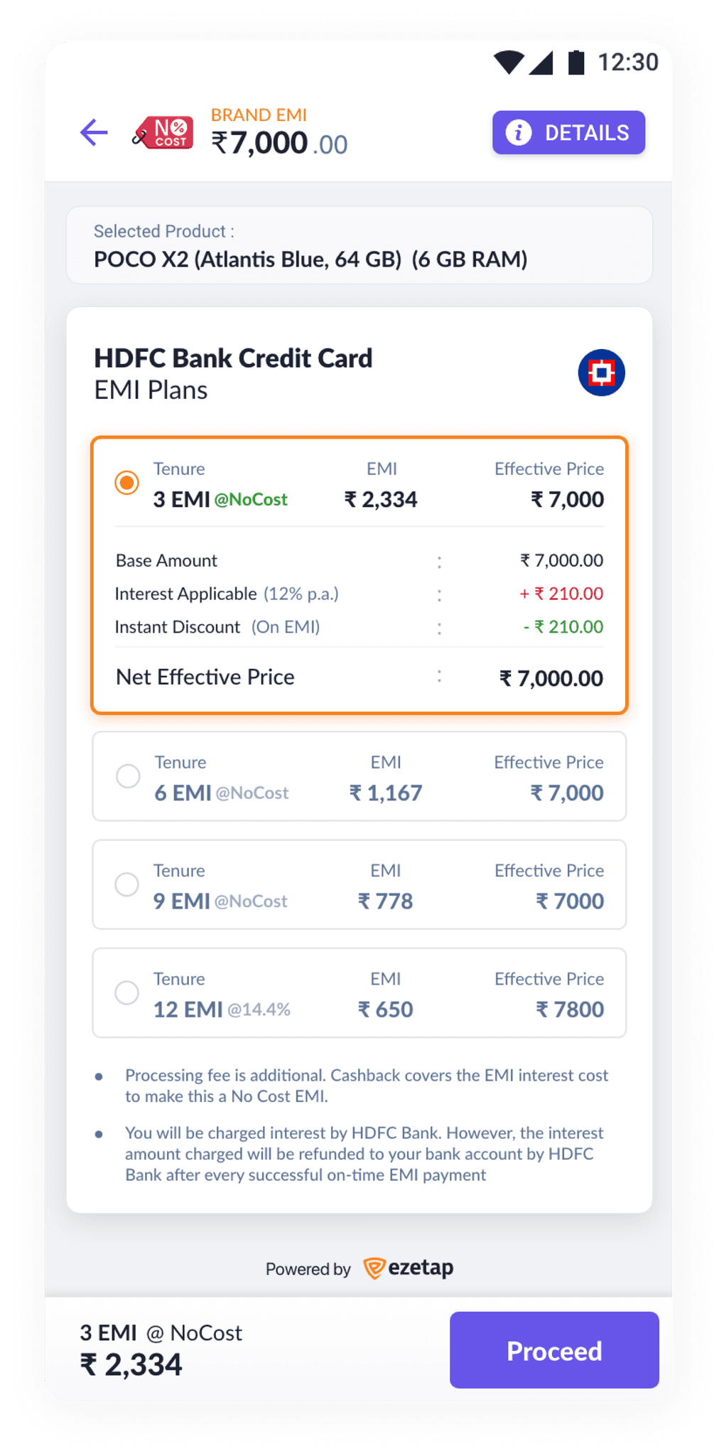
No Cost EMI - Expanded
The revamped Transaction History section offers a user-friendly experience tailored to diverse payment methods.
History
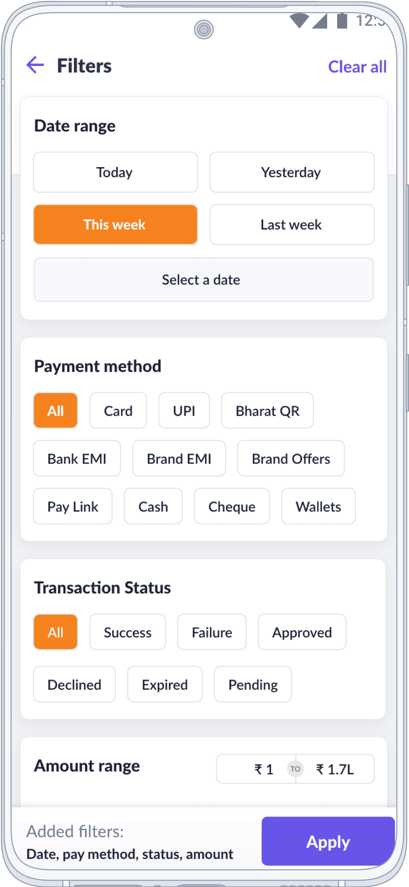
Filters & Summary
With advanced filters, a summary overview, and a detailed transaction view, users can effortlessly track and access their transaction data.
In HDFC Branding
Prototype
XD Prototype of the App branded in HDFC Branding Colors:
What followed after the release!
Outcomes
Our release had a positive impact, attracting new users and pleasing partner banks with enhanced usability and aesthetics.
It brings me immense satisfaction to realize that the solution I assisted in crafting is now aiding millions of merchants via prominent banks in India and the Middle East.

The new user experience and interface have received widespread acclaim from end-users, partner banks, and enterprises, validating the substantial impact our work has made in the fintech solutions landscape.
End of Case Study
Thank you!
Please open Case Studies on Desktop
UX Designer
Design Manager
Motion GFX Animator
No Code Developer
UX Designer
Design Manager
Motion GFX Animator
No Code Developer
UX Designer
Design Manager
Motion GFX Animator
No Code Developer
UX Designer
Design Manager
Motion GFX Animator
No Code Developer
Crafted with ❤️ & Pixel Alchemy

©️ 2025 Sachin Thumbarathy. All rights reserved.