
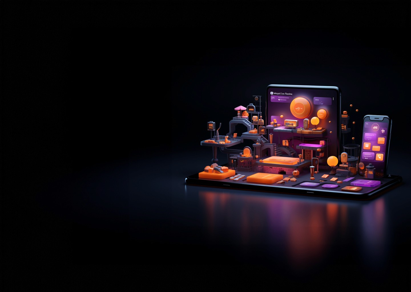
UX CASE STUDY
Razorpay POS
Framework
Intuitive and Scalable Design with a Dynamic Design System for Seamless Merchant Experience
Introduction
A Voyage of Transformation
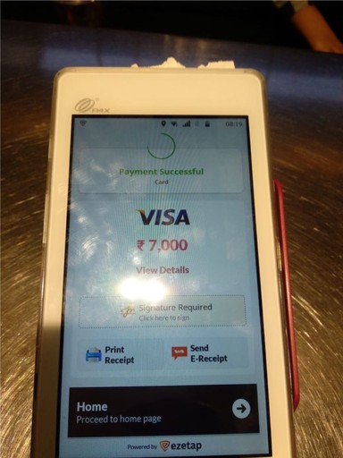
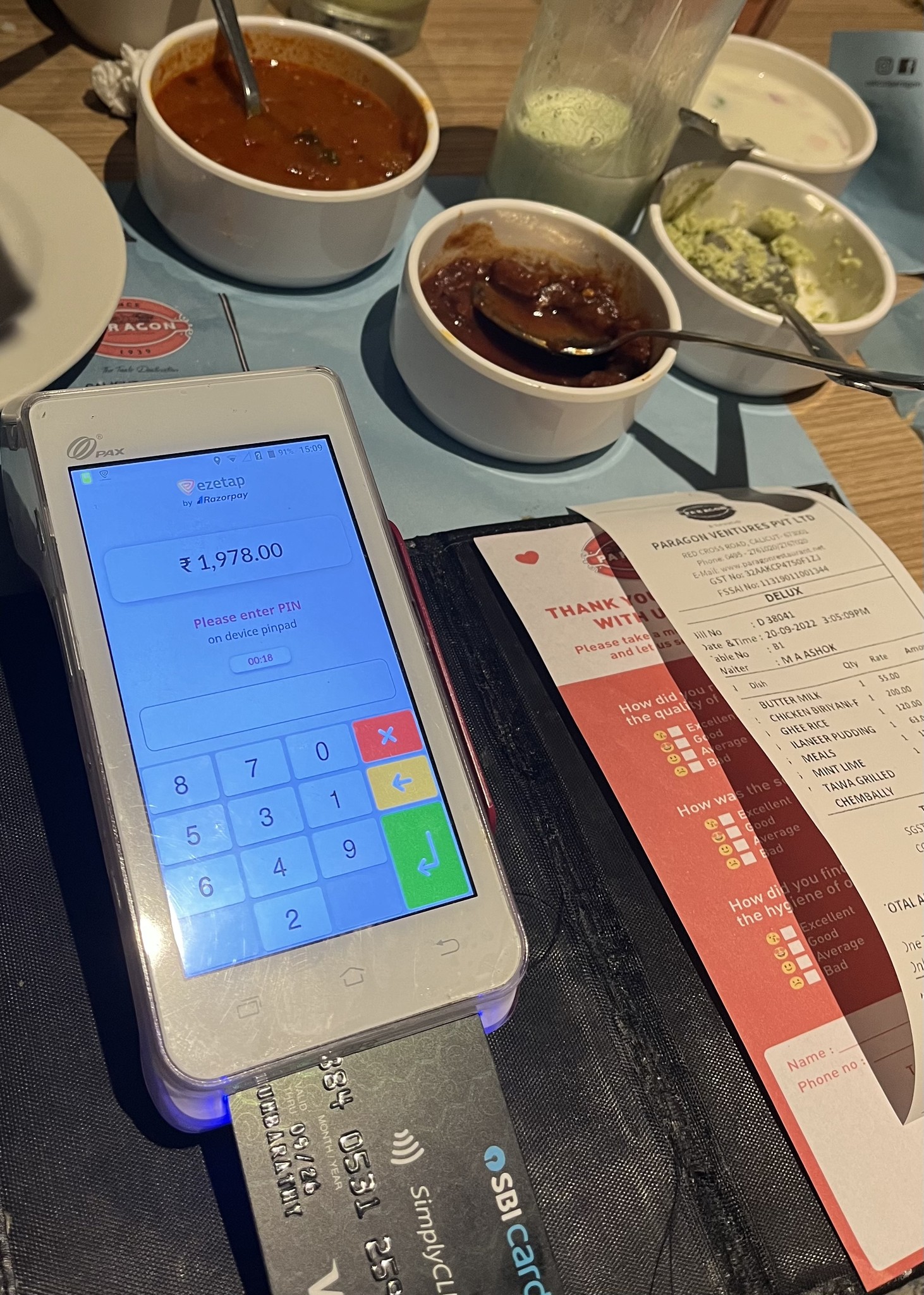
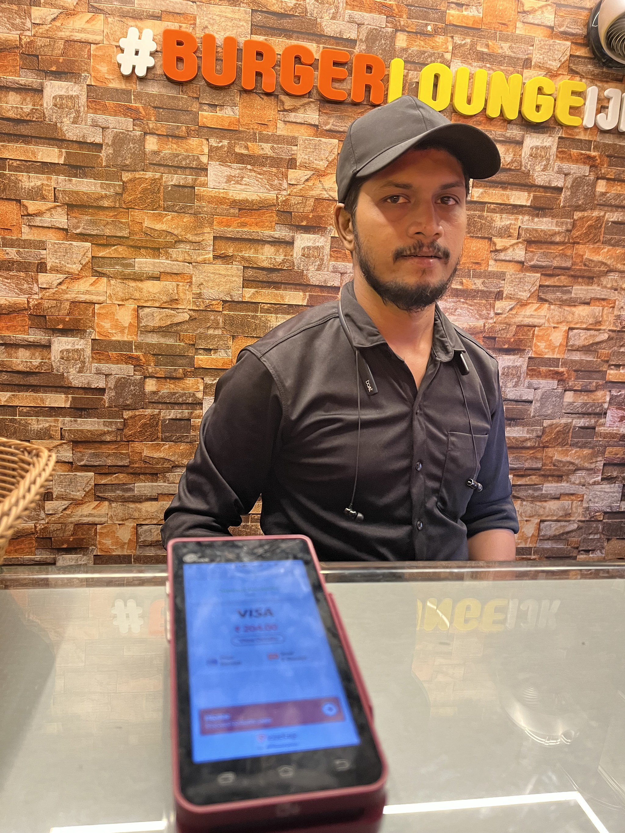
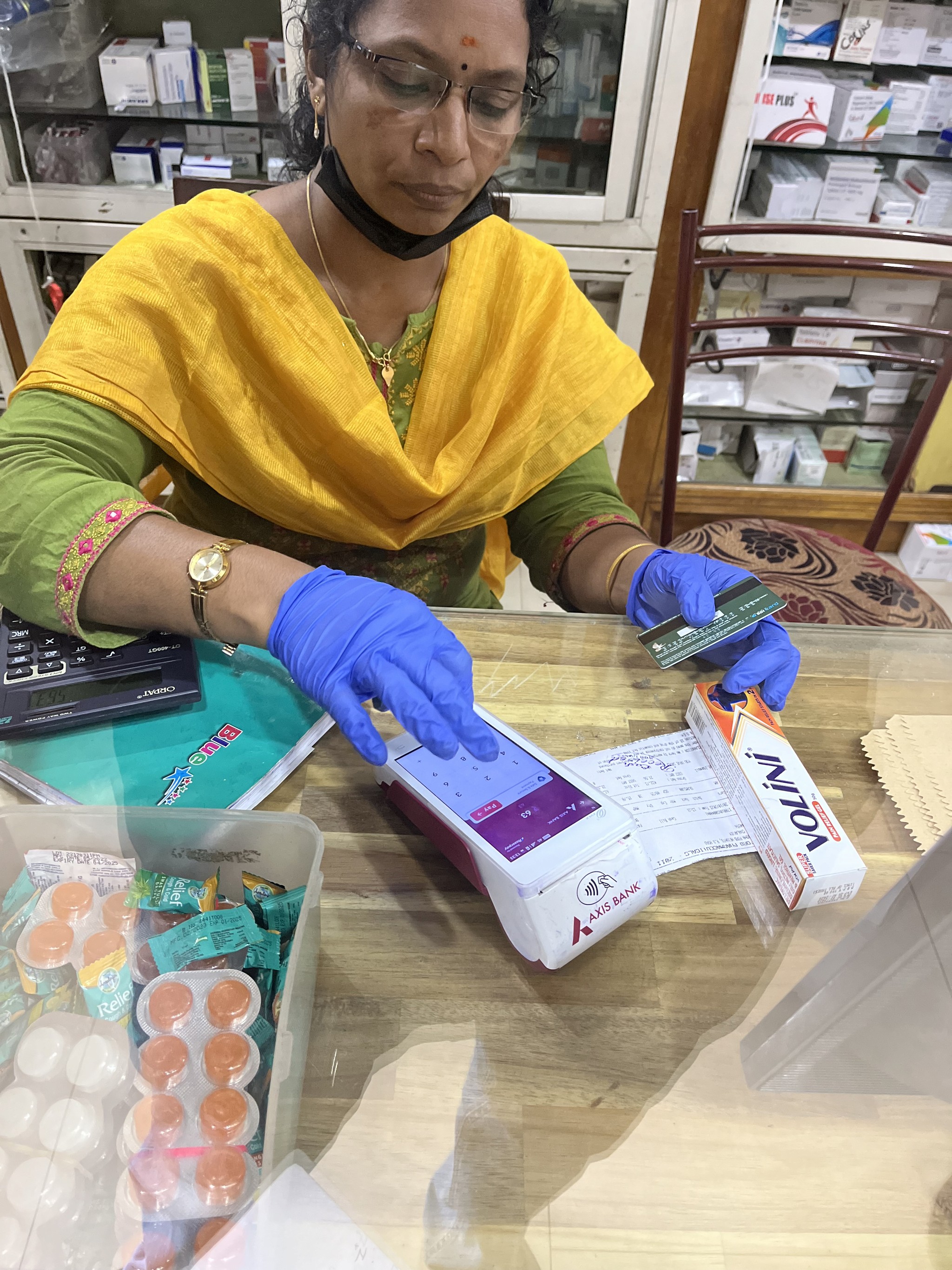
Welcome to the transformative journey of redesigning the mPOS-X Framework – an innovative mobile point-of-sale (mPOS) solution developed by Ezetap (Now Razorpay POS) for businesses.
This UX case study delves into the meticulous process of enhancing user experience, streamlining payment processing, and accommodating evolving payment technologies.
By incorporating UX best practices and addressing user and business needs, the redesigned mPOS-X Framework emerges as a versatile and user-friendly application, empowering merchants and delivering a seamless payment experience.
Client:
Ezetap (Now Razorpay POS)
Year & Duration:
2020
|
6 Months
Platform:
Android Mobile App
Design Team:
Sachin Thumbarathy (Lead)
|
Kalyani Pawar
Industry
Fin-Tech | PoS | Merchant


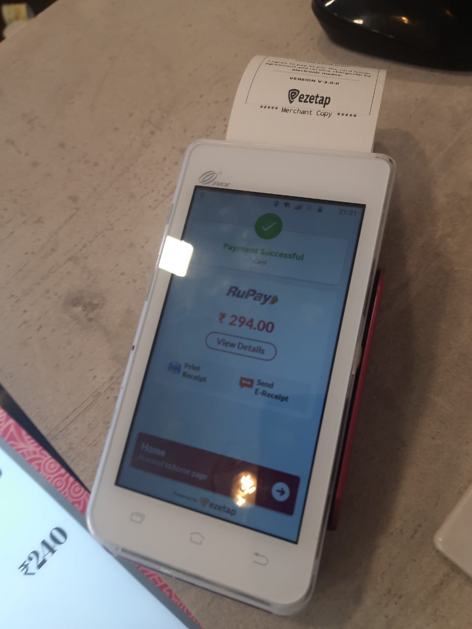
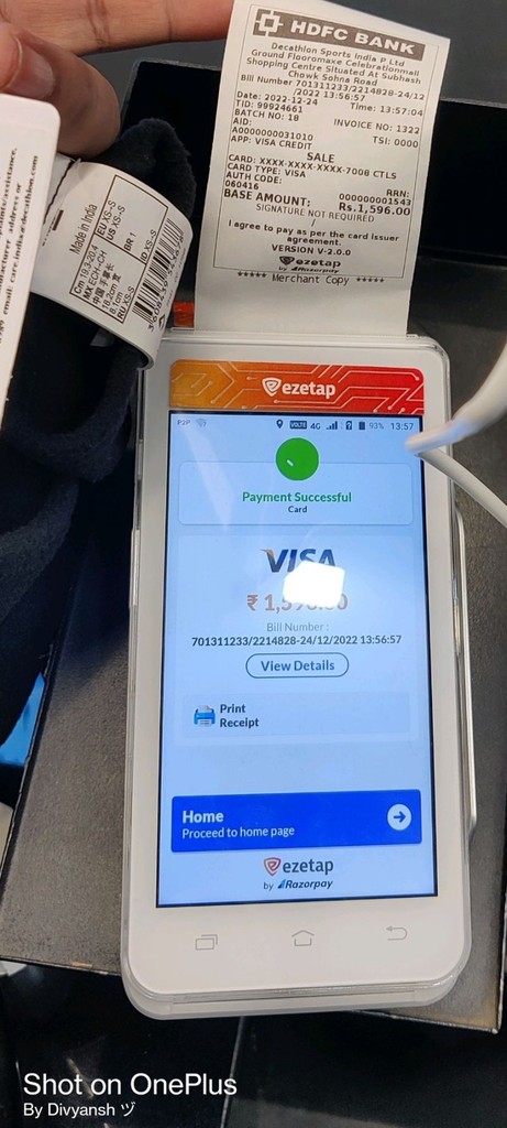
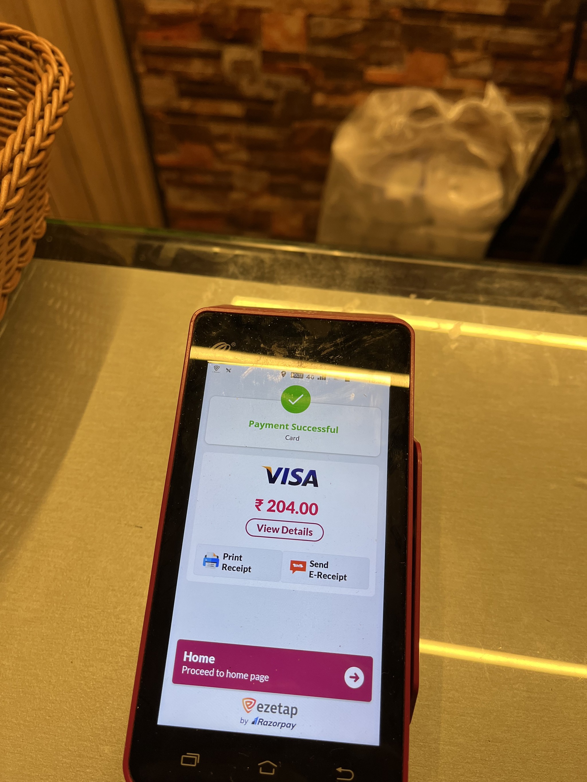
What is Ezetap?
What is Ezetap?
A Glimpse of
Ezetap's Symphony
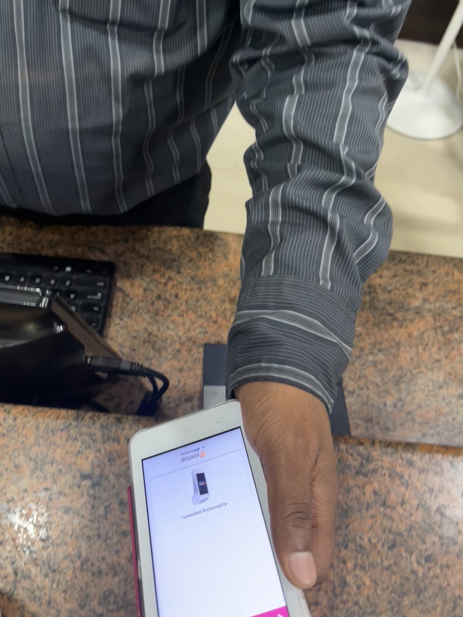
Picture a platform where half a million POS terminals across India and the Middle East orchestrate a harmonious progression of intelligent transactions.
Ezetap by Razorpay is an innovative payment platform conceived solely for commercial entities.
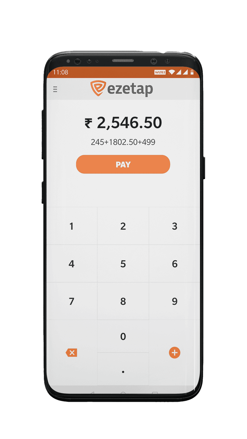
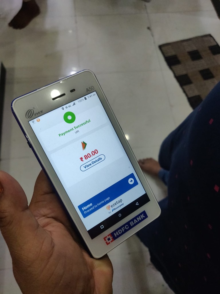
Introducing the mPOS app, a cutting-edge innovation that revolutionizes merchant solutions, placing emphasis on offline payment acceptance.
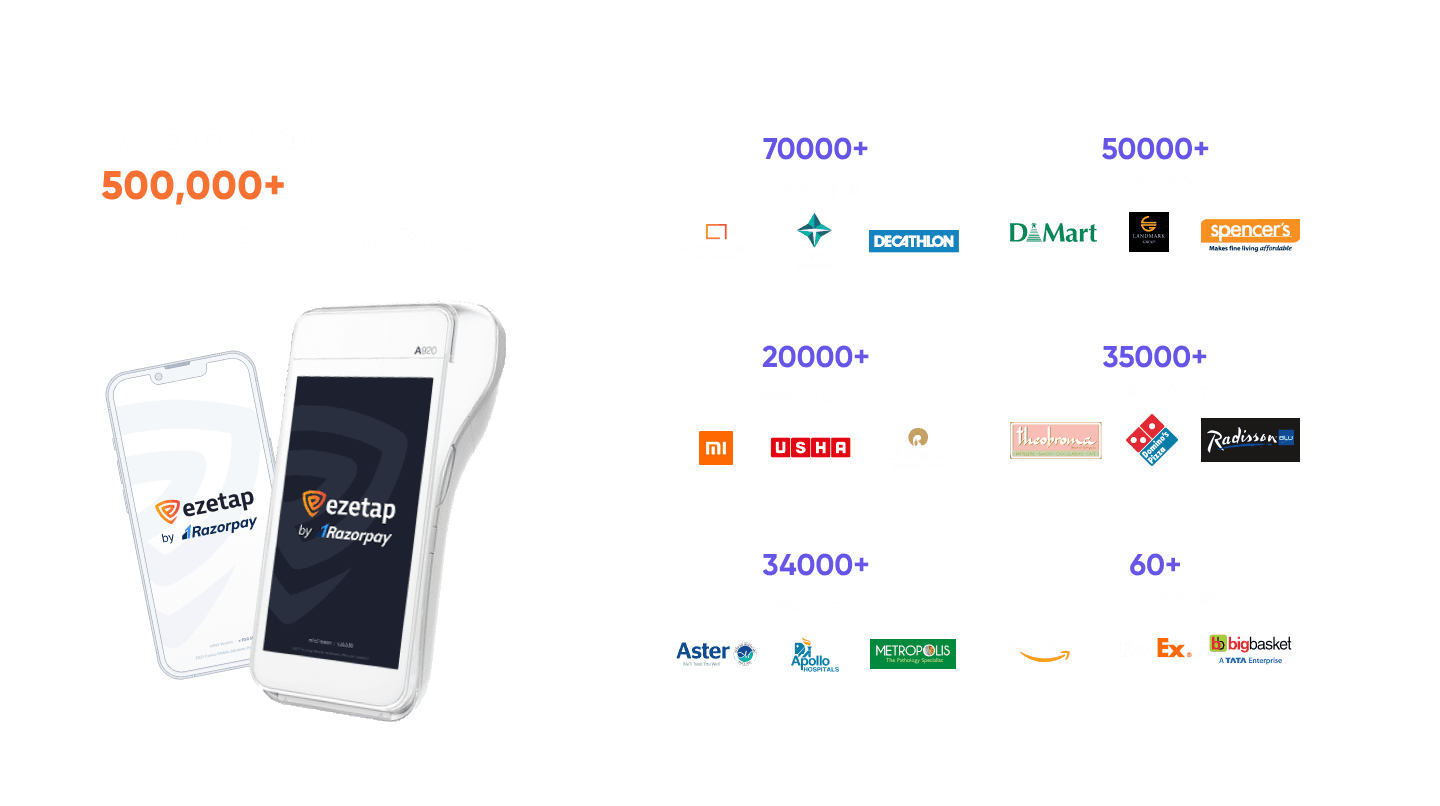
With a kaleidoscope of payment solutions, ezetap empowers merchants to orchestrate seamless transactions across various channels.
Lets get into the action.
Why the Encore?
The Calling of Redesign
The decision to revamp the mPOS-X app stemmed from a crucial realization:
The original version lacked dedicated UX design input, resulting in an unsatisfactory user experience.
The redesign aimed to rectify this by incorporating best UX practices and ensuring user needs and workflows were at the forefront.
It aimed to create a cohesive and user-centered design that enhances every aspect of the app's functionality, ensuring a seamless and enjoyable payment experience.
The decision was clear:
a redesign that would harmonize UX practices, elevate user experience, and weave merchant needs into every pixel.
Design Goals & Objectives
The redesign aimed to achieve the following objectives

Intuitive Navigation
Paving a seamless path for users to access diverse app functionalities.
Future-Ready Flexibility
Creating a framework adaptable to emerging payment technologies and future features
Streamlined Joy
Paving a seamless path for users to access diverse app functionalities.
Bank Branding Elegance
Simplifying the payment acceptance process, making it a breeze for merchants and customers alike.
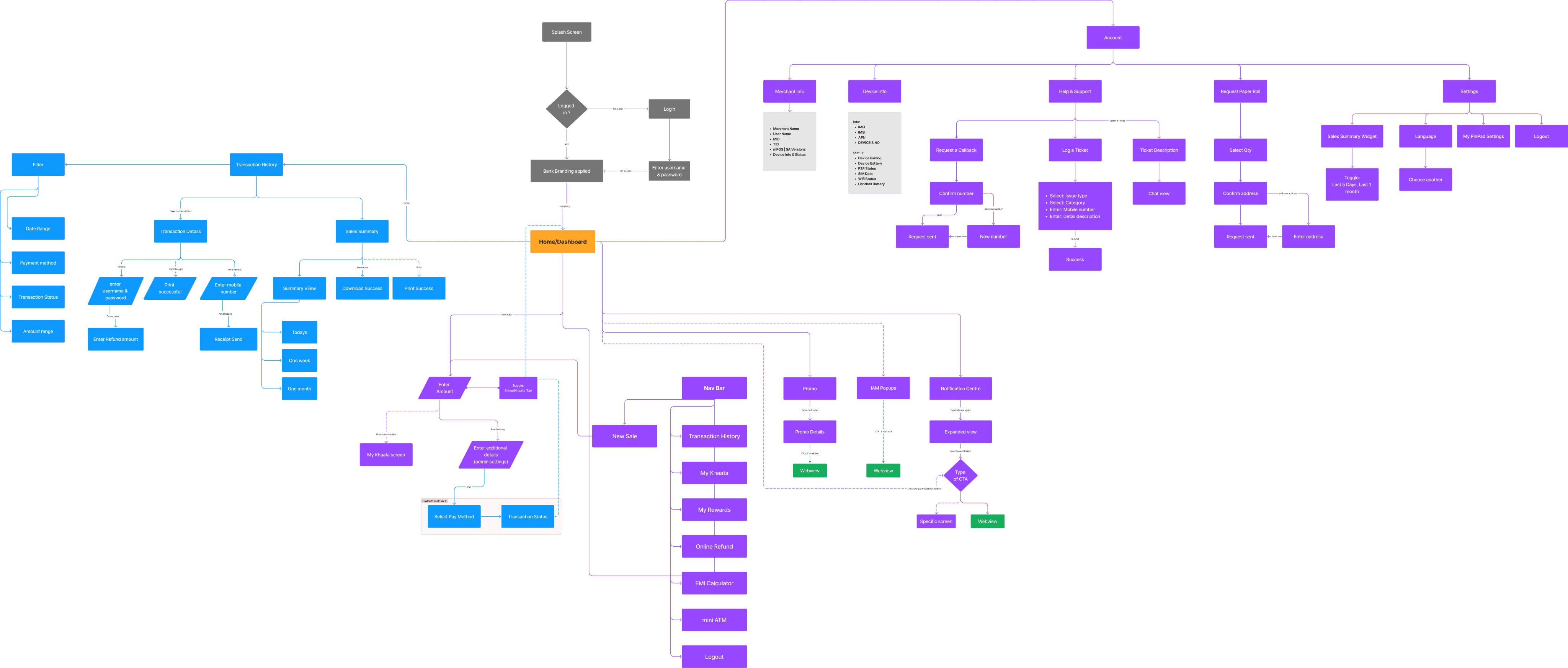
Information Architecture
Weaving the Magic
With a meticulous study of Pinelabs, Mosambee, Paytm for Business, and more, we imbued the mPOS app with unique, compelling features.
Insights from this journey informed every pixel, creating an app that stands tall in the crowd.
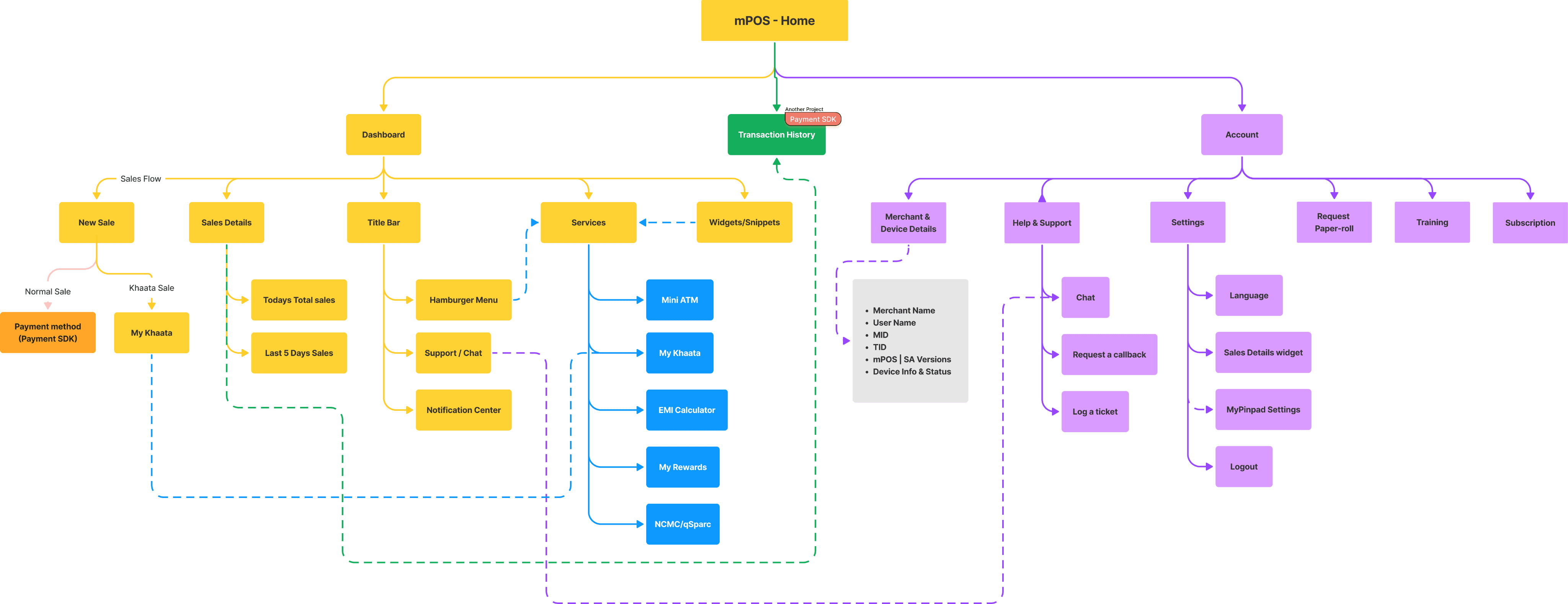
Structured information architecture set the stage for an intuitive user journey.

Balancing Functionality and Innovation
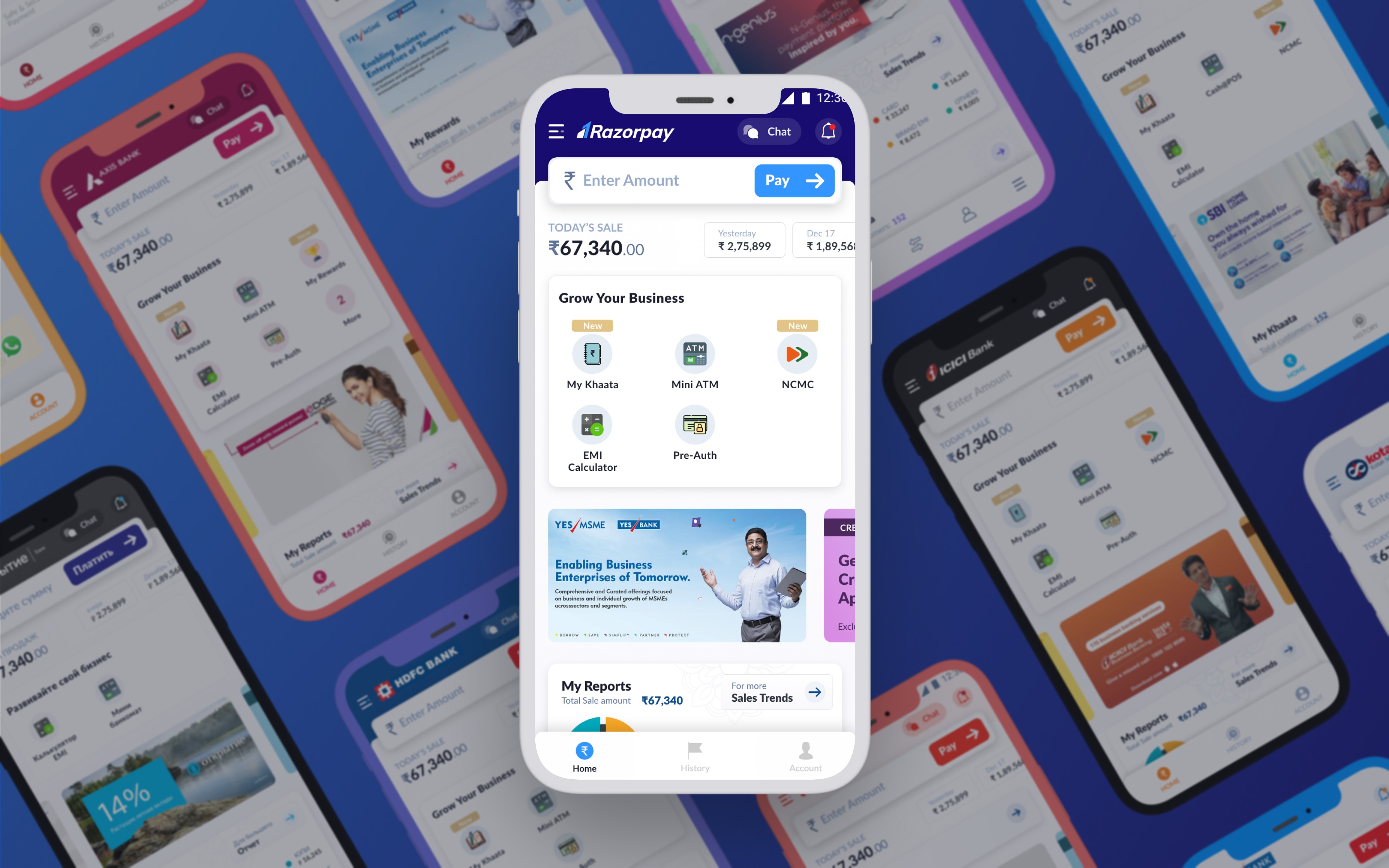
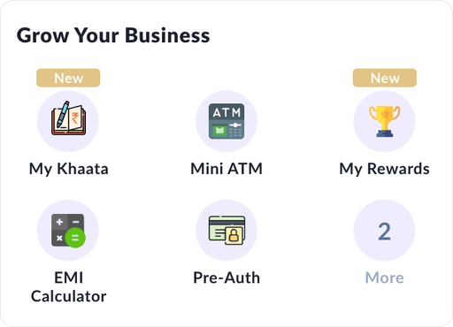
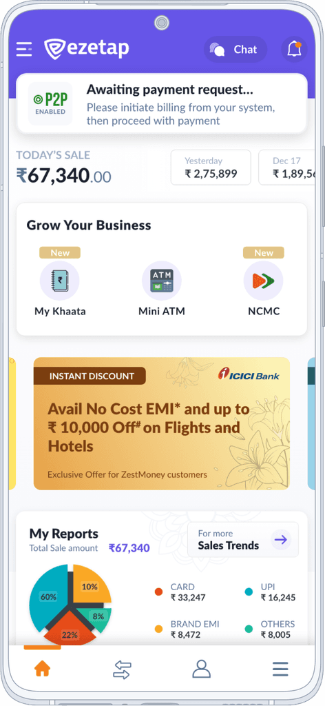
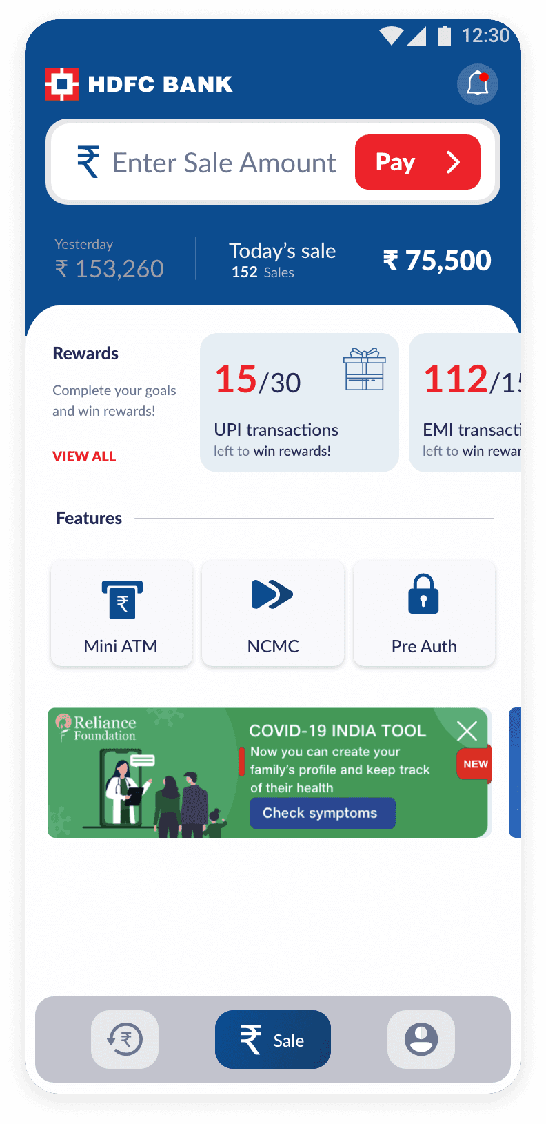
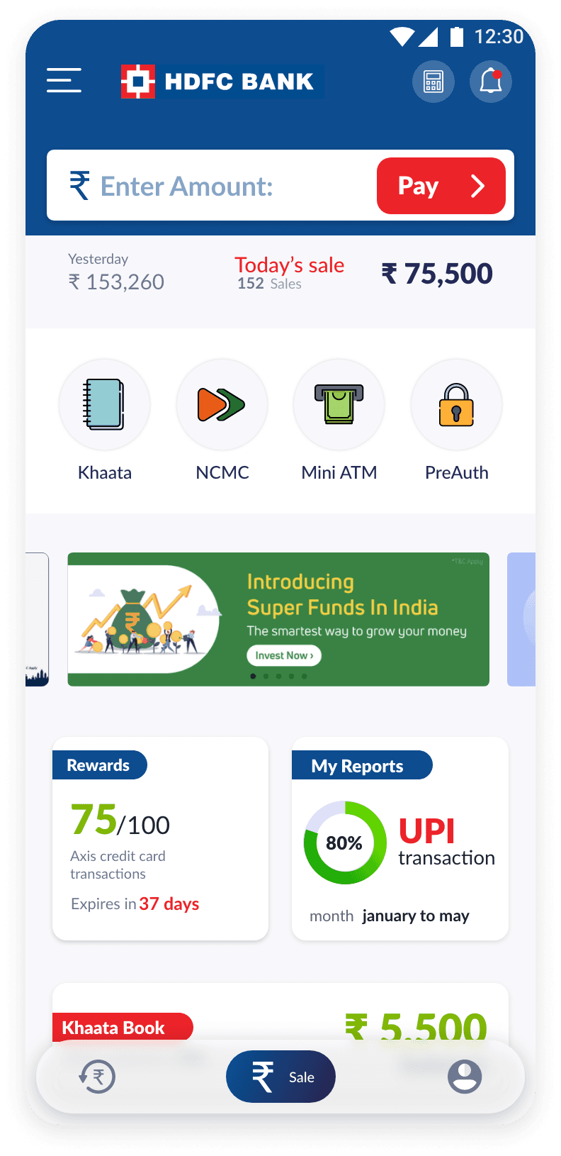
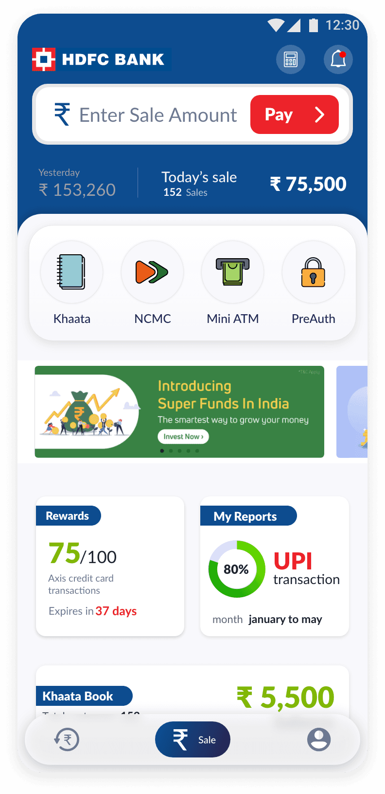
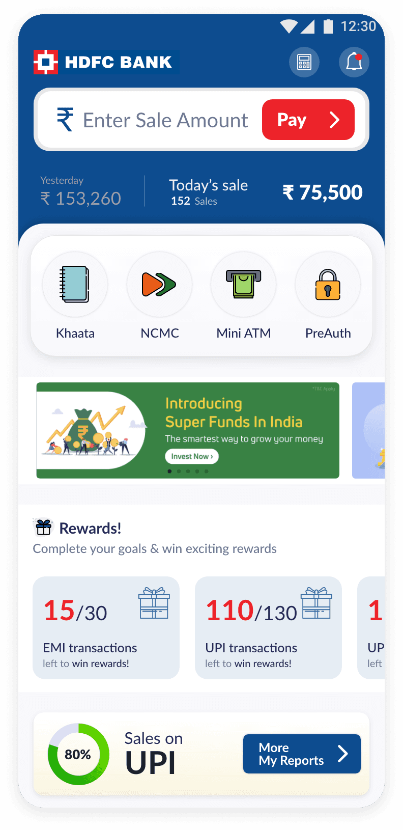
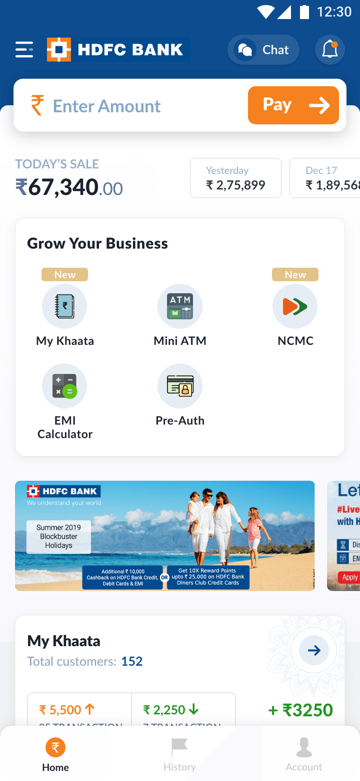
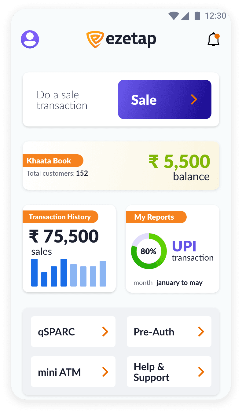
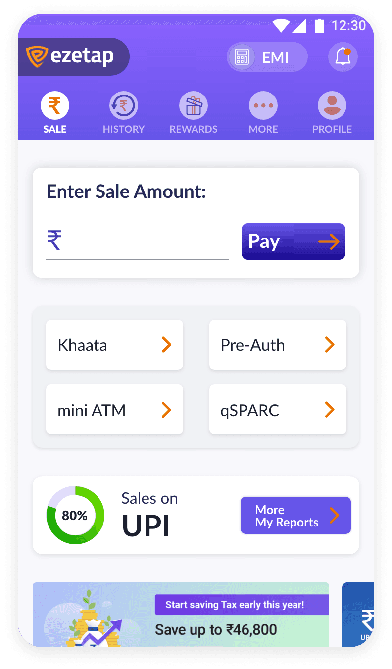
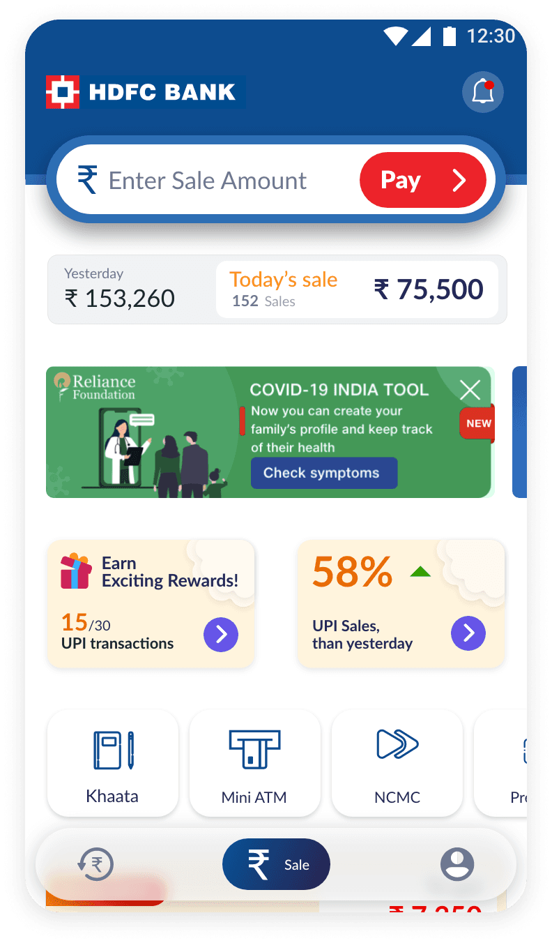
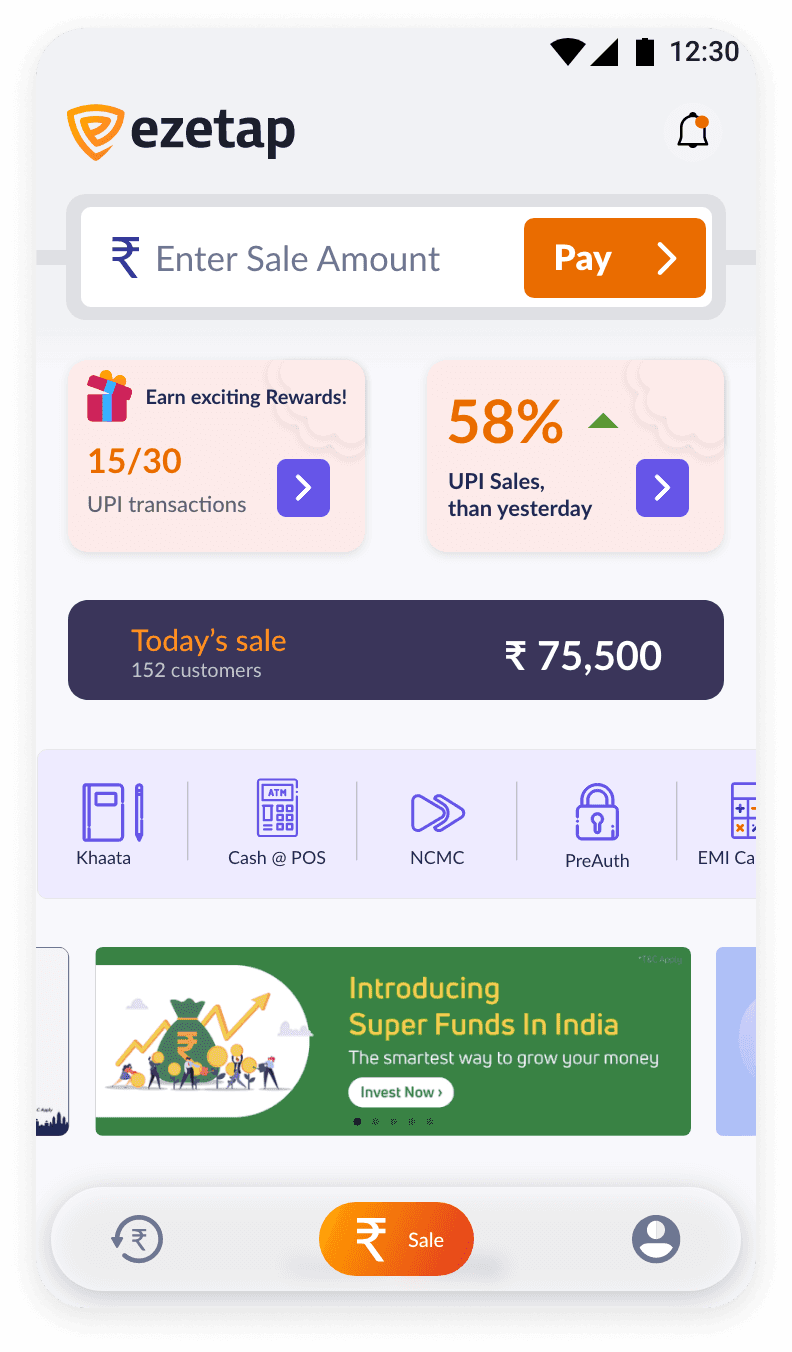
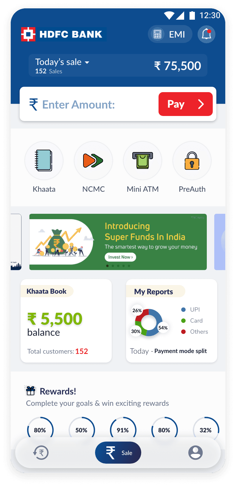
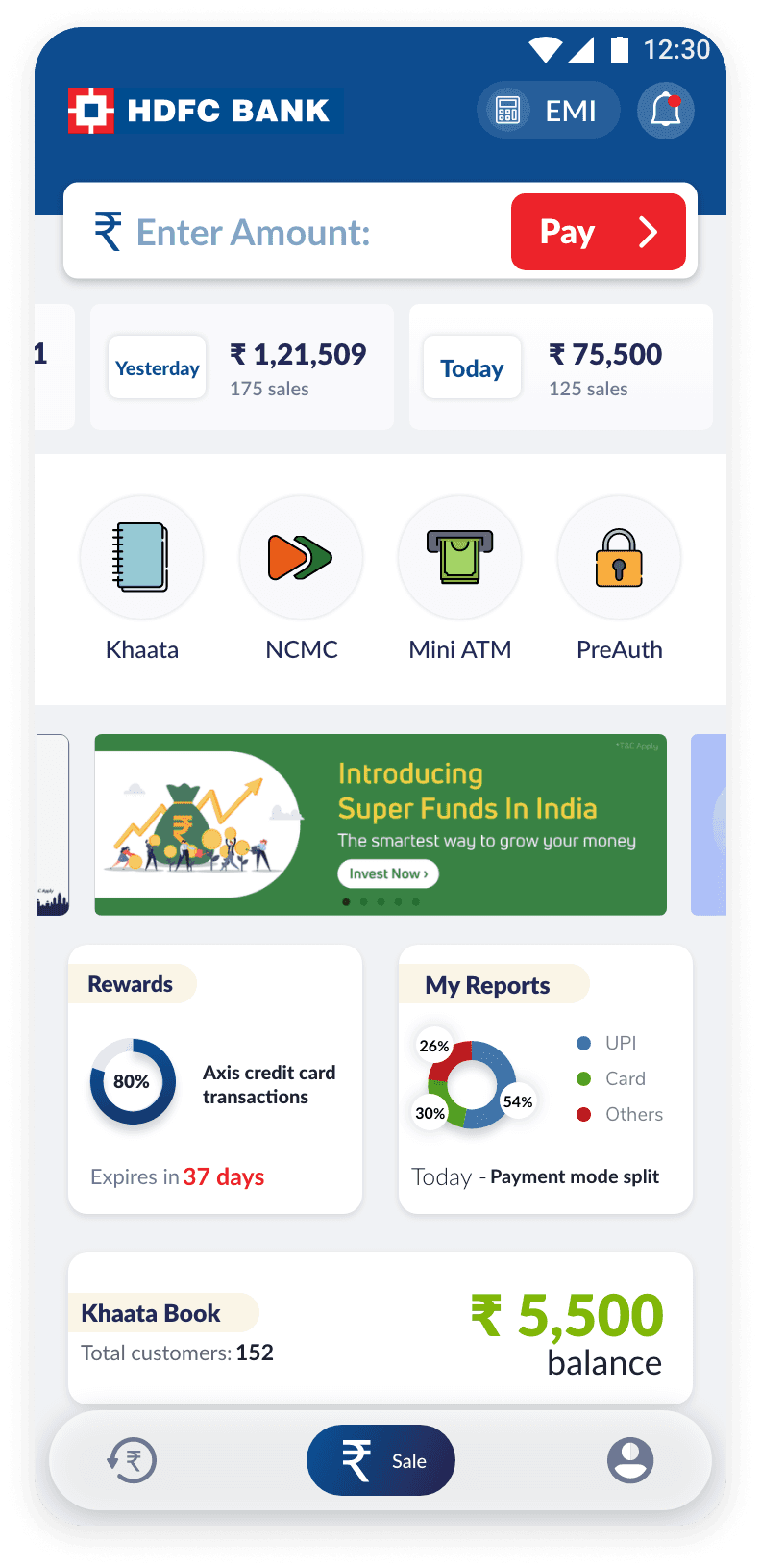
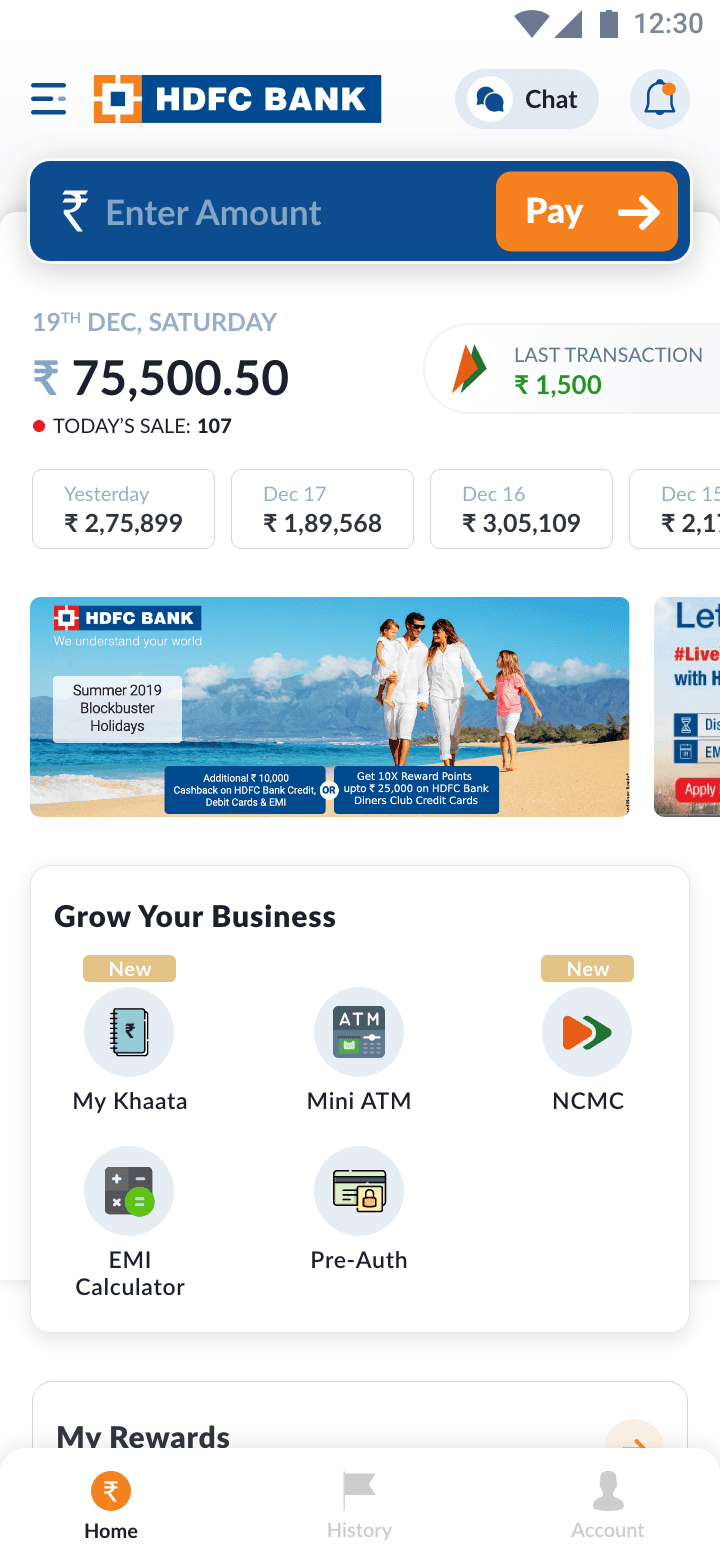
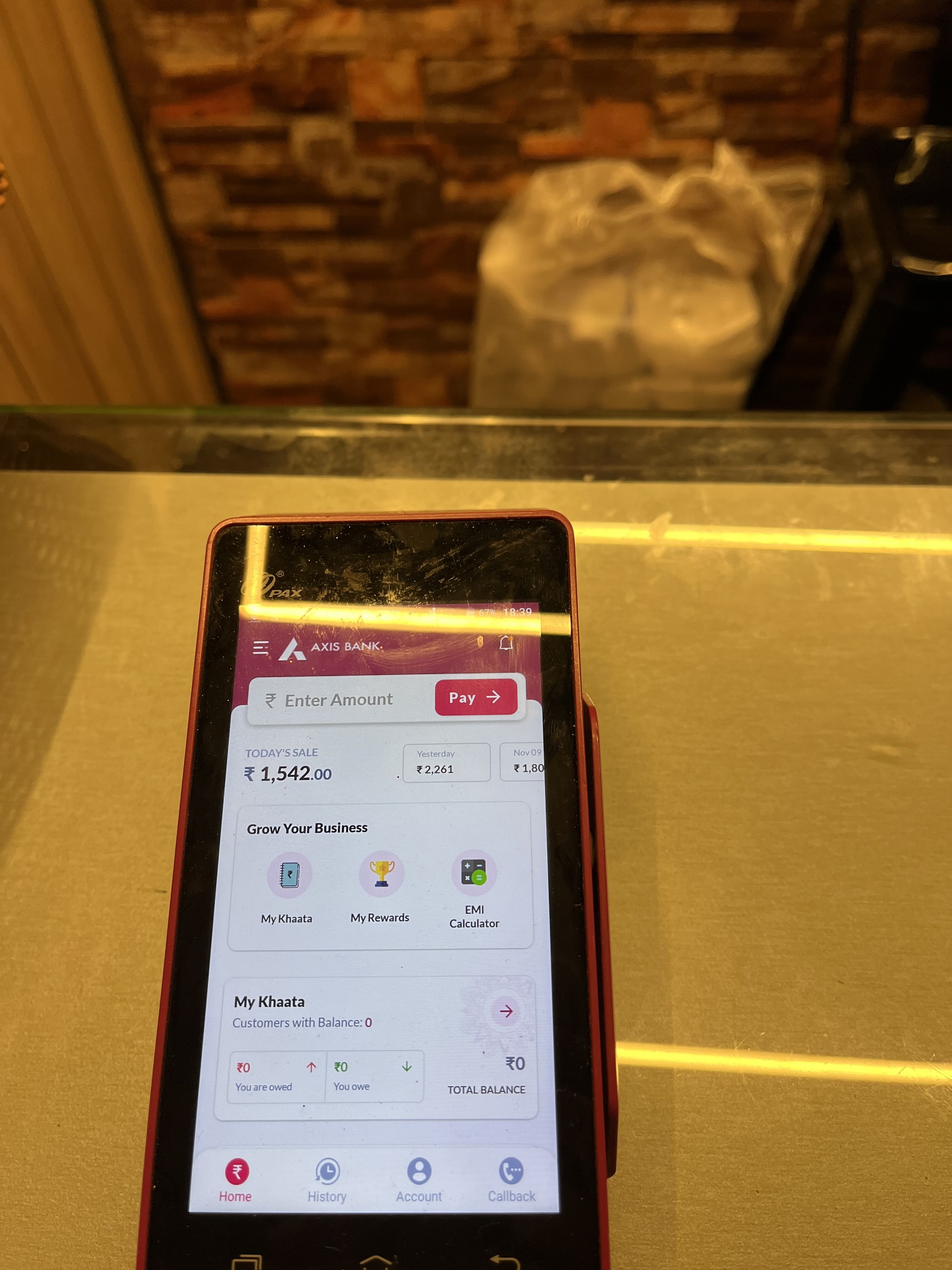
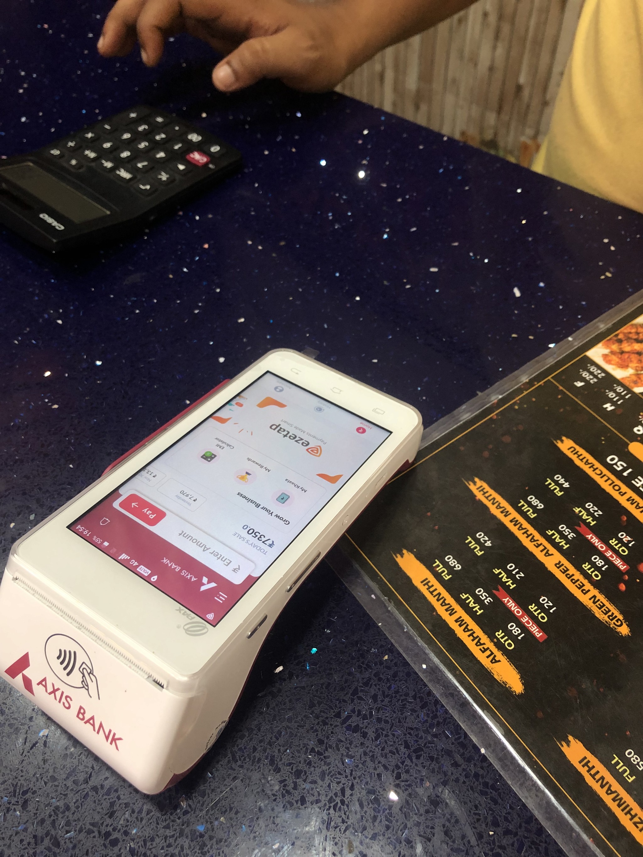
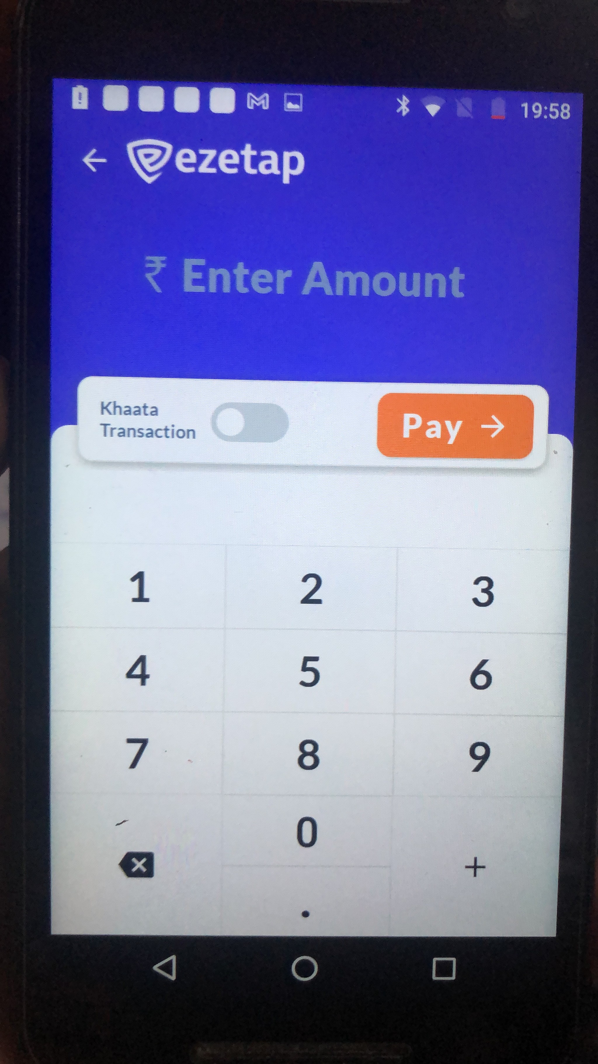
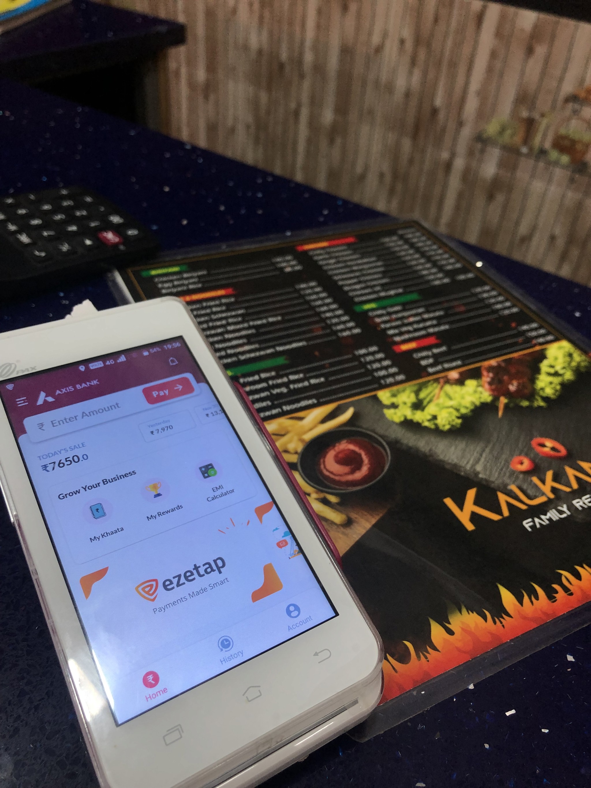
Home Screen Redesign
The Home Screen of the mPOS app serves two primary purposes: facilitating sale transactions and providing access to other features. However, the redesign process faced specific challenges that required careful consideration and thoughtful solutions.
Balancing Functionality and Innovation
Home Screen Redesign
The Home Screen of the mPOS app serves two primary purposes: facilitating sale transactions and providing access to other features. However, the redesign process faced specific challenges that required careful consideration and thoughtful solutions.
The home screen presented unique challenges that required innovative solutions!
Home / Problem 1
Striking the
Right Balance
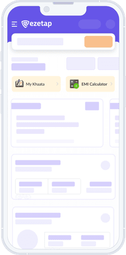
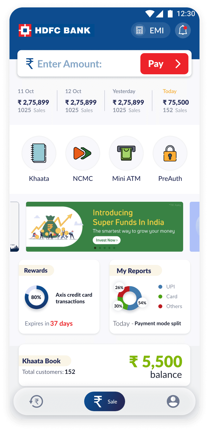
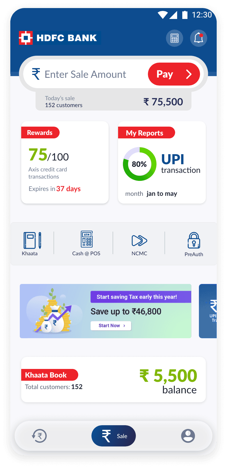
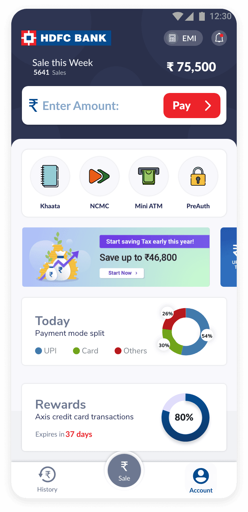
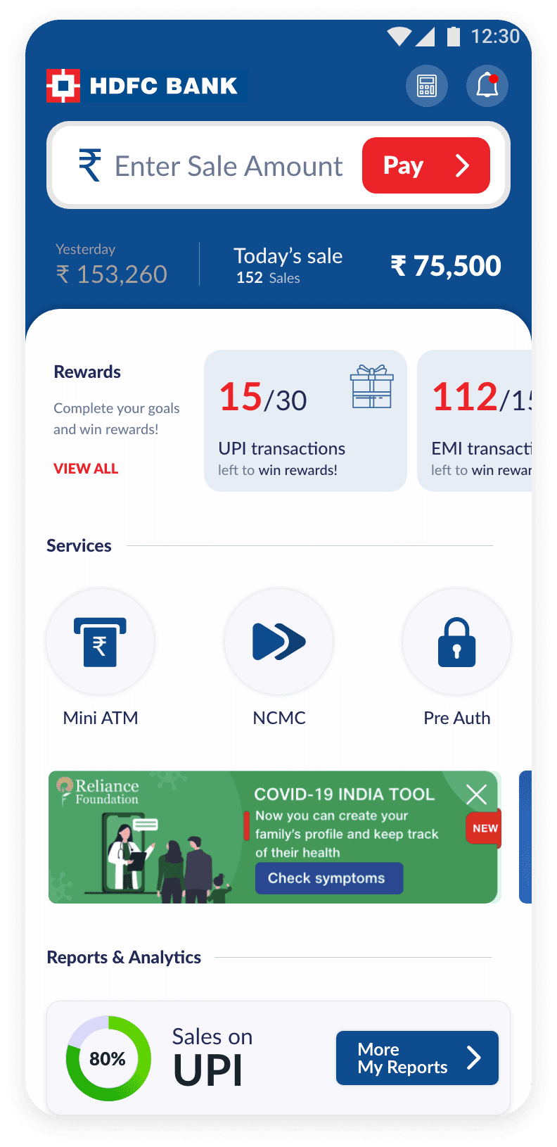
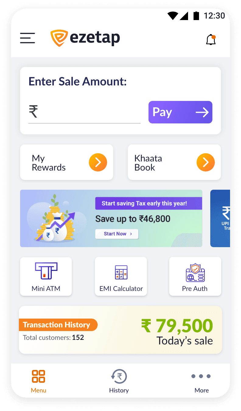
The previous Home Screen design had a singular focus on sales transactions, overshadowing other vital features.
This imbalance limited opportunities for innovation and hindered the integration of new functionalities.
Home / Problem 1
Solution
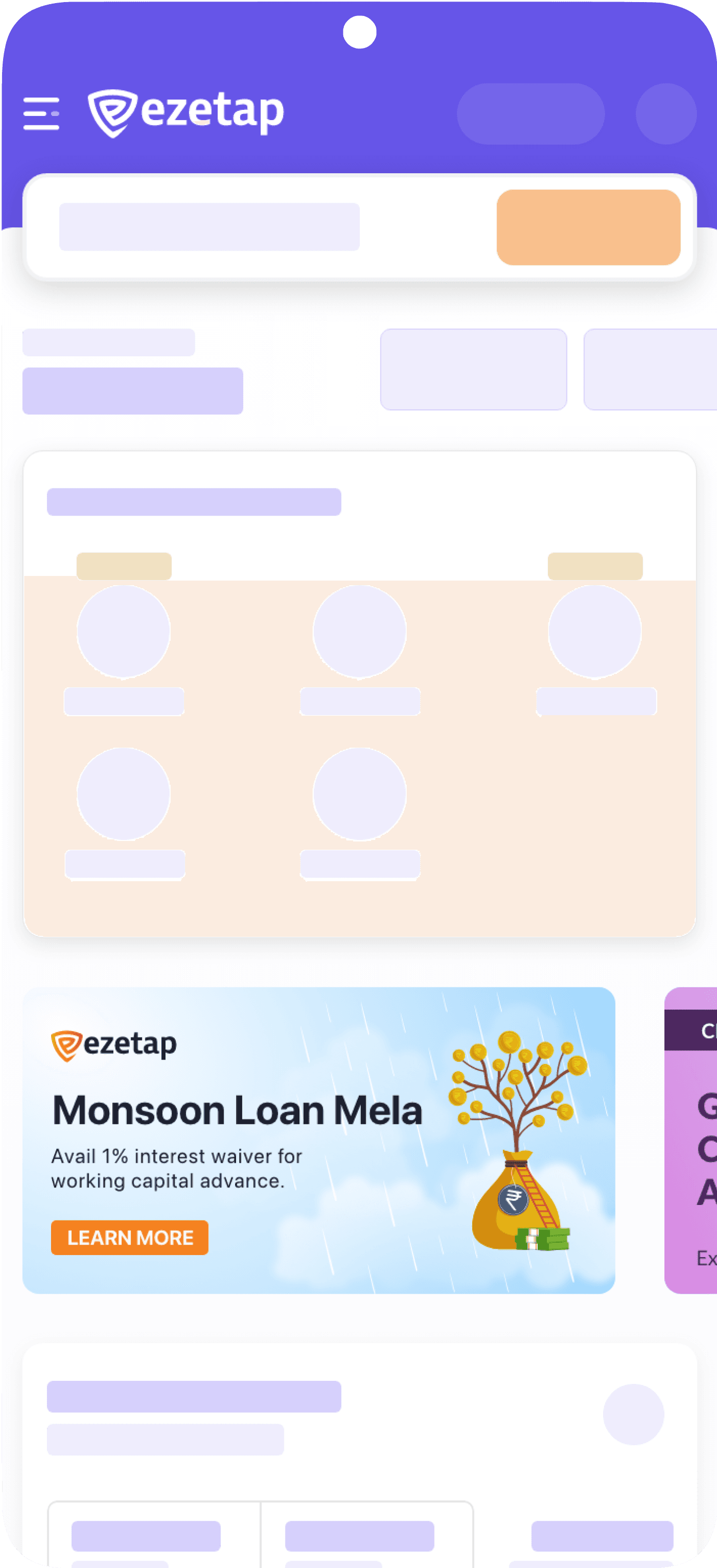
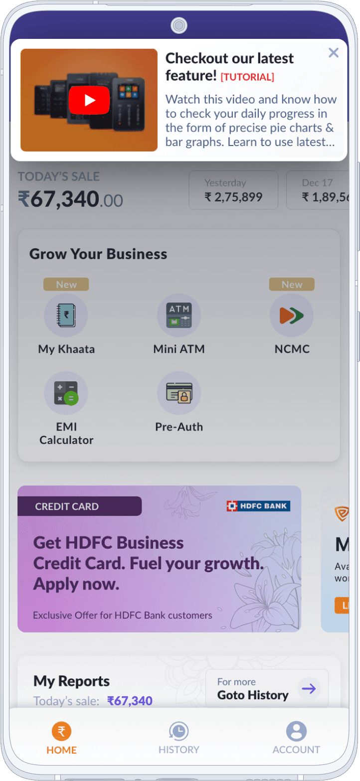
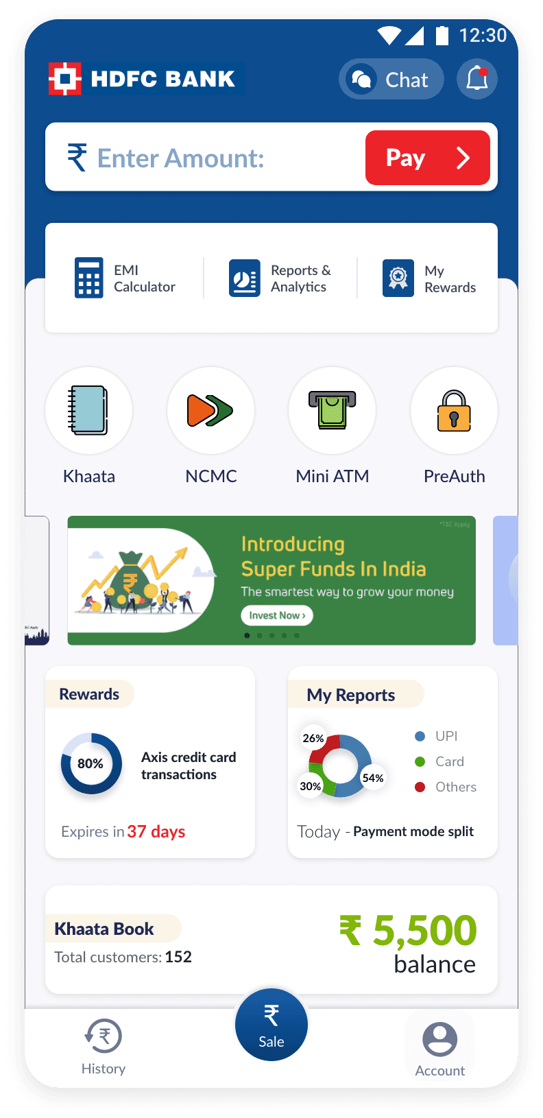
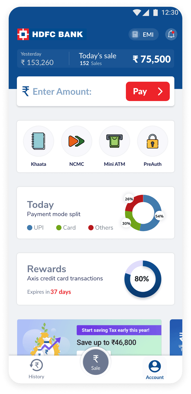
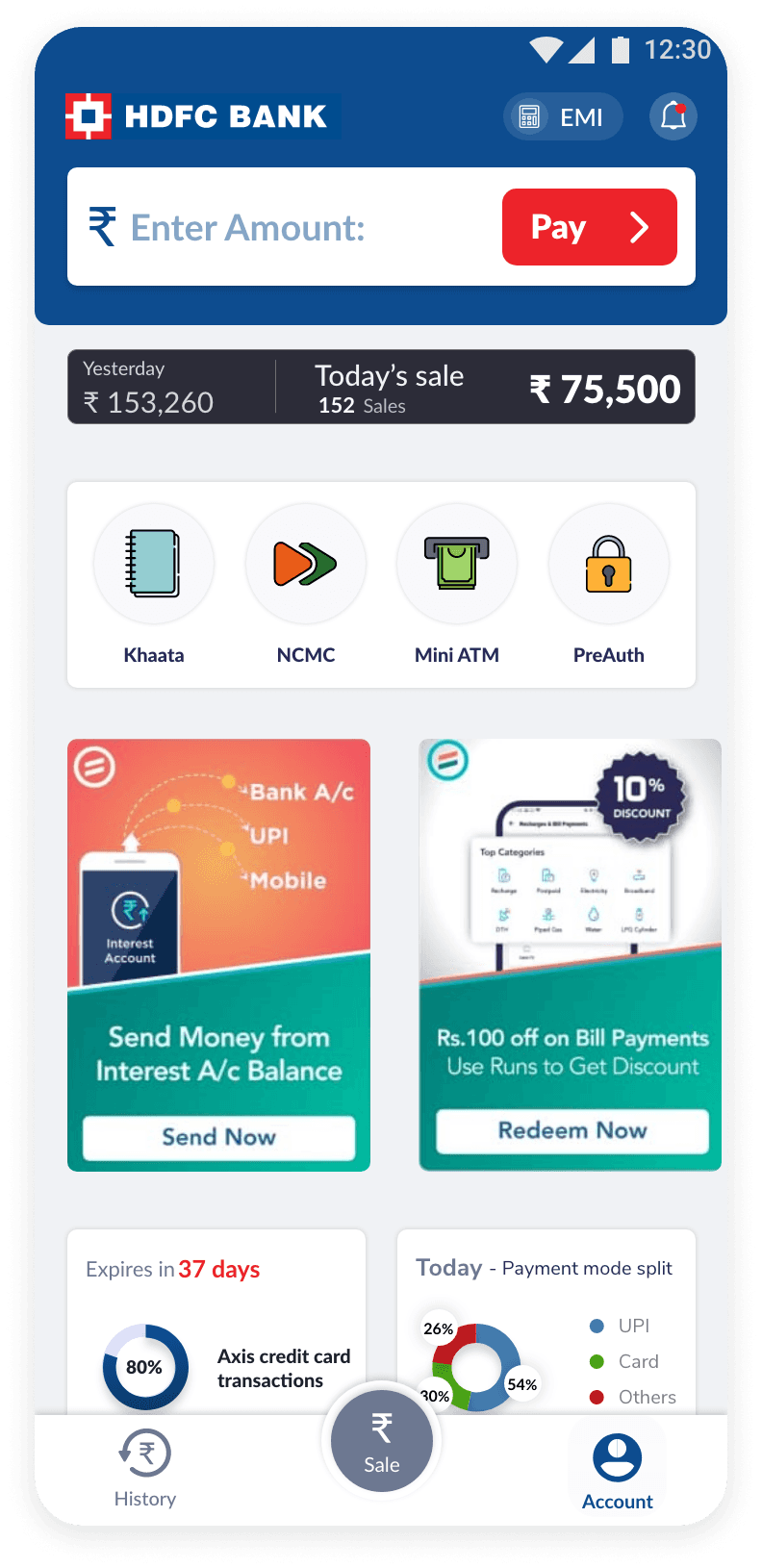
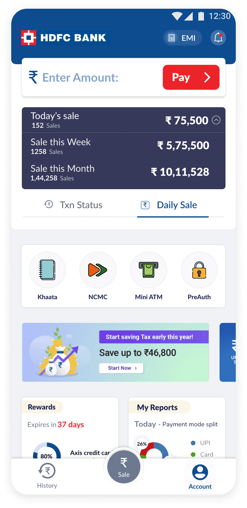
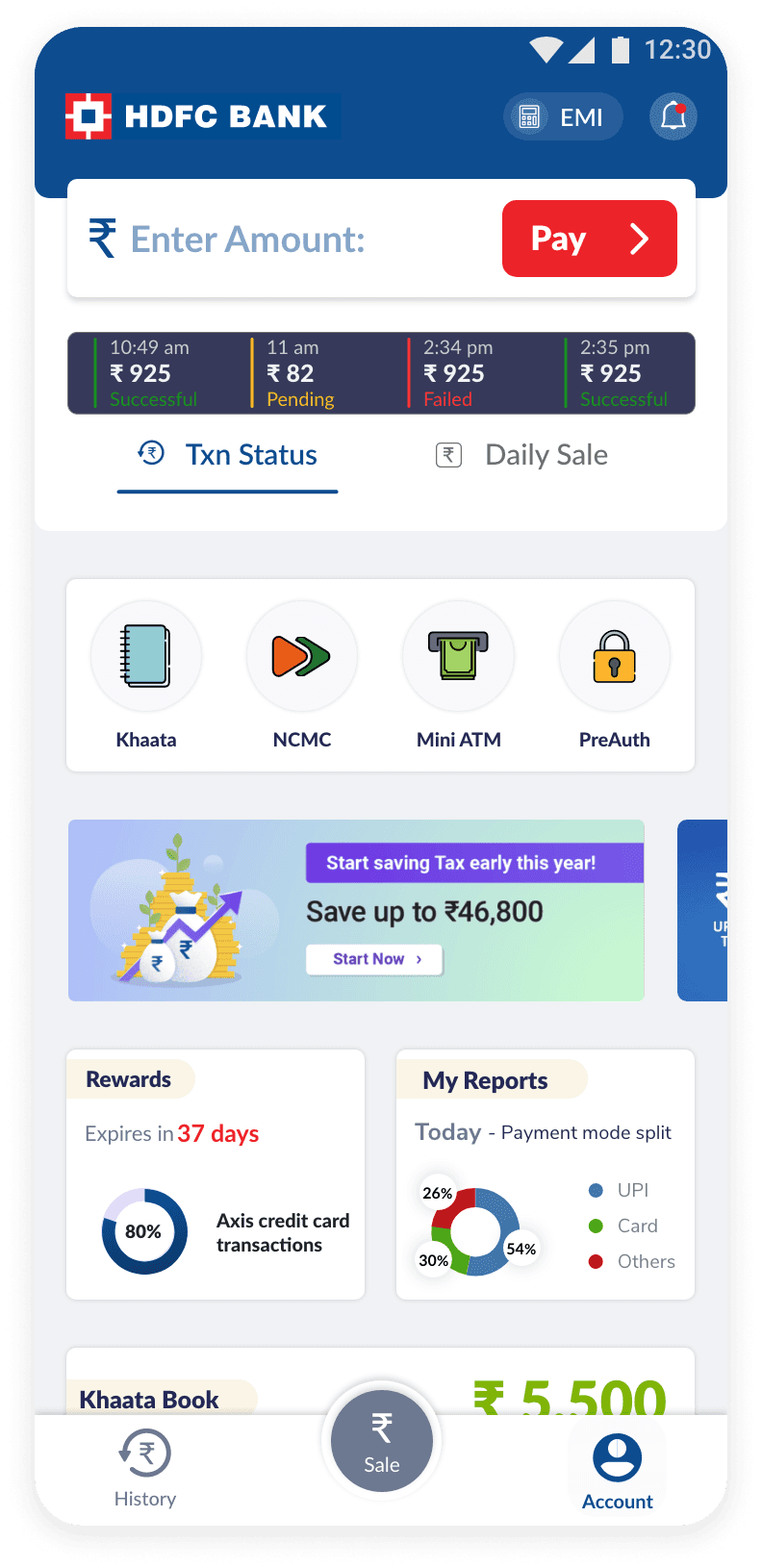
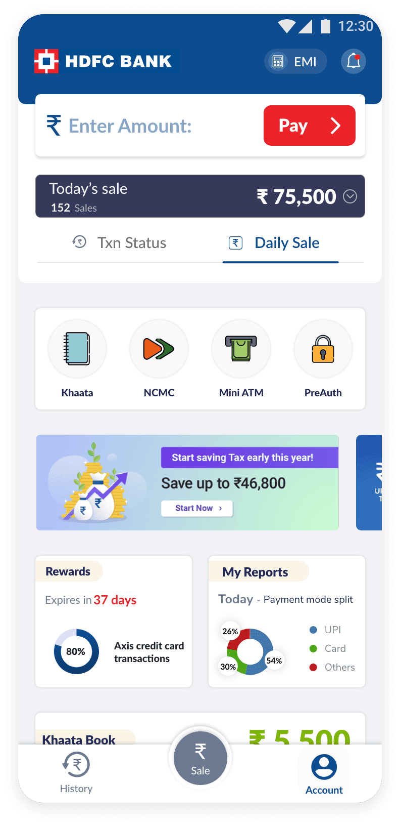
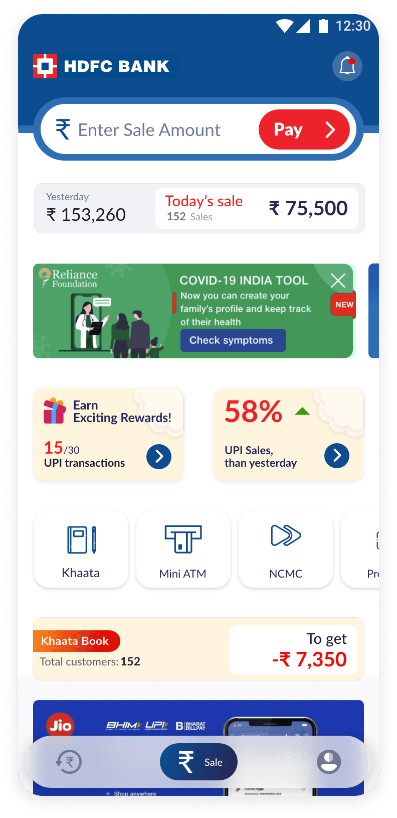
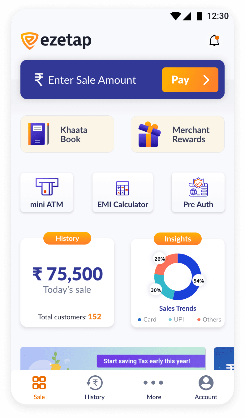
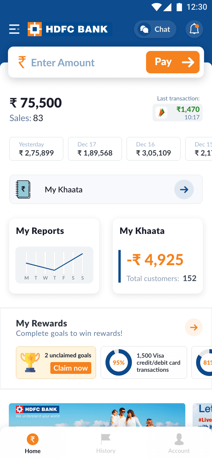
To address this issue, we've transformed the Home Screen into a live dashboard.
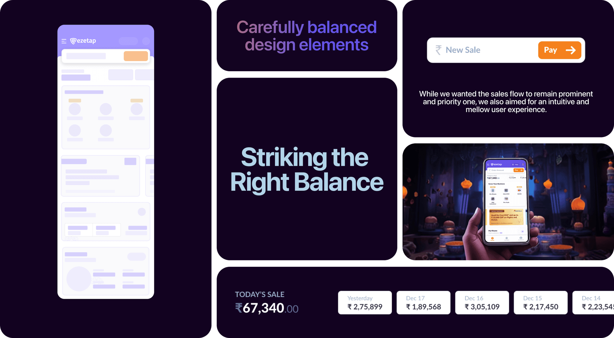
This strategic redesign prioritised a holistic view of all features, empowering merchants with an "at a glance" experience.
Intuitive
Sales
flow
Intuitive Sales flow
While we wanted the sales flow to remain prominent and a priority one, we also aimed for an intuitive yet mellow user experience
While we wanted the sales flow to remain prominent and a priority one, we also aimed for an intuitive yet mellow user experience
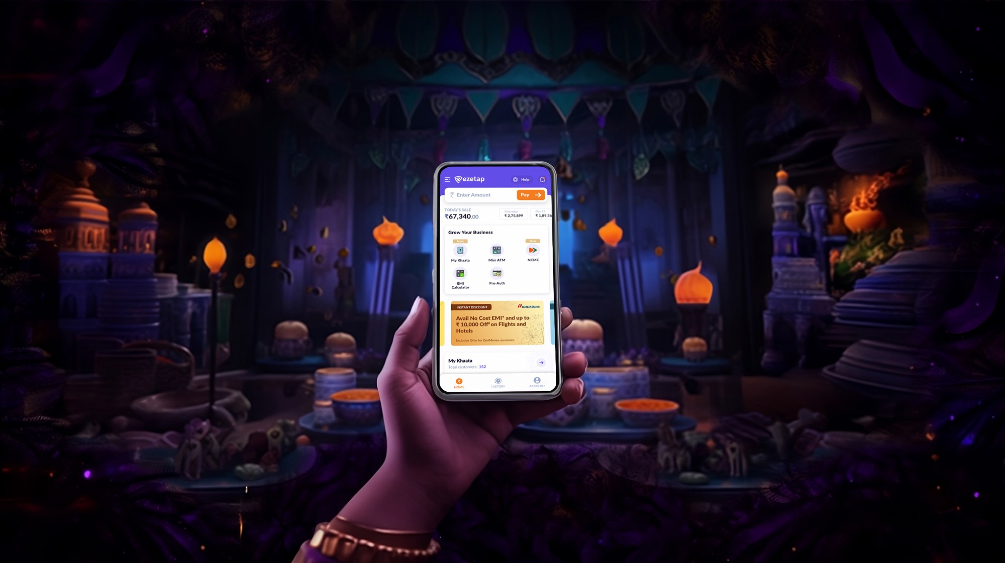
Widgets
on Home
Screen
Widgets on Home Screen
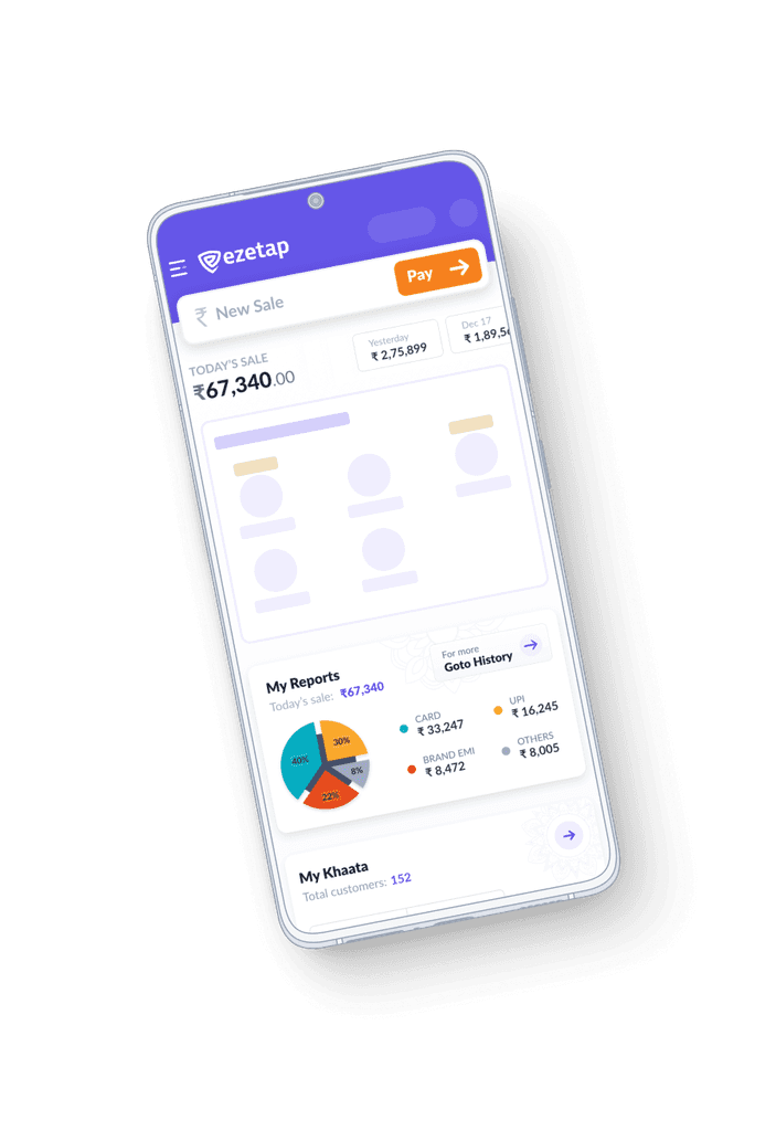
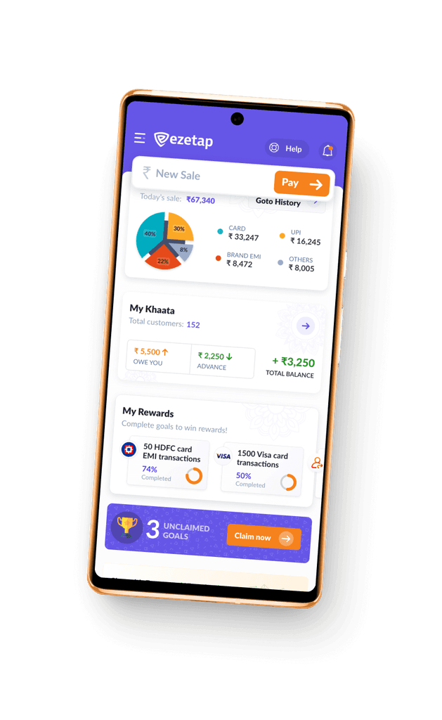
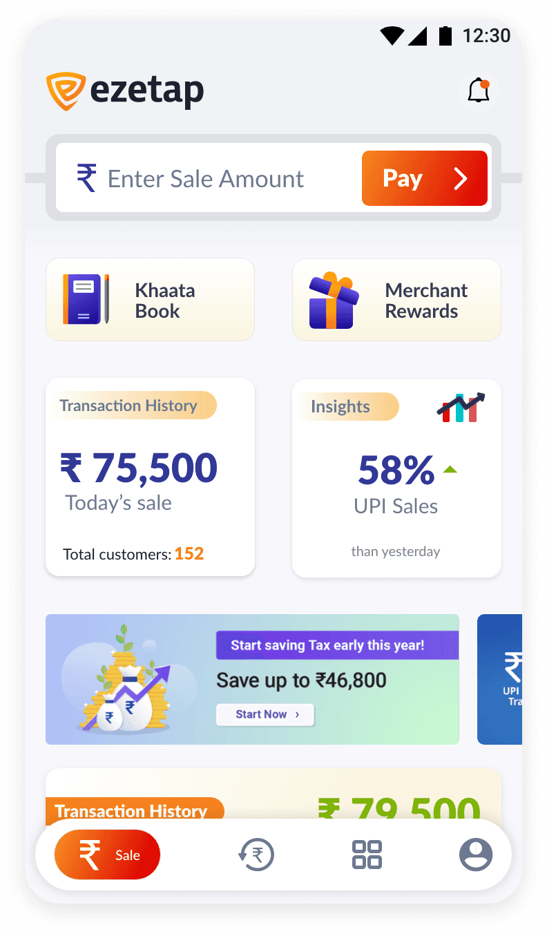
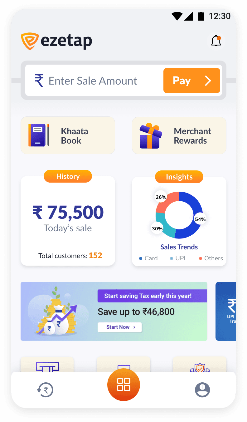
We introduced widgets that offered a snapshot of vital merchant activities and account status.
We introduced widgets that offered a snapshot of vital merchant activities and account status.
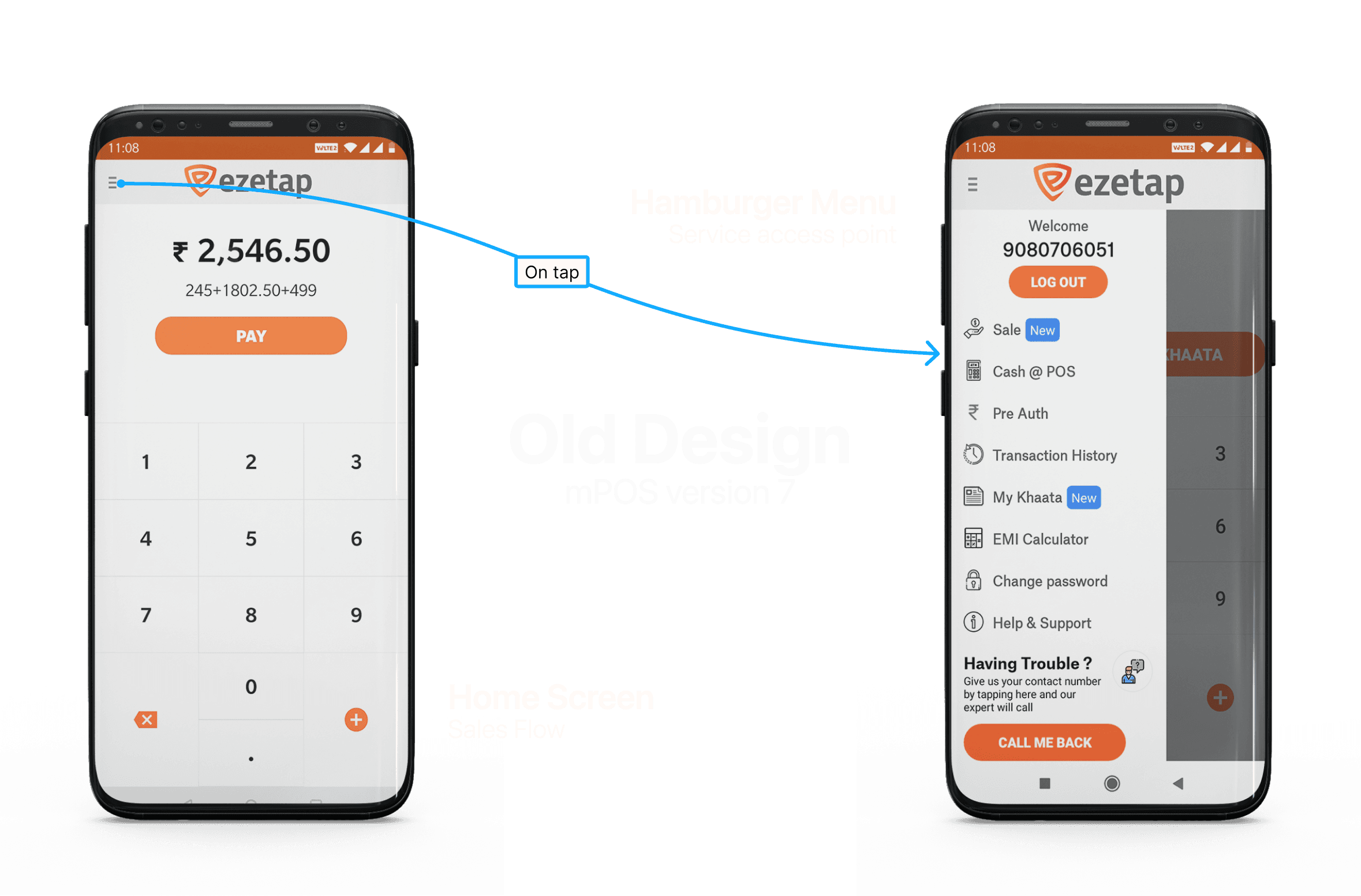
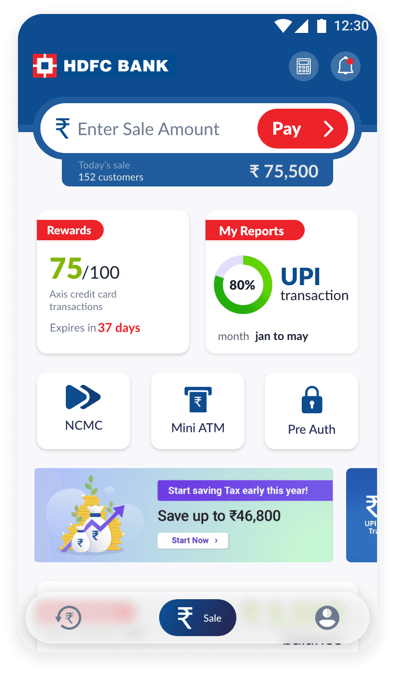
Home / Problem 2
Lack of Hierarchy & Unintuitive Information Placement
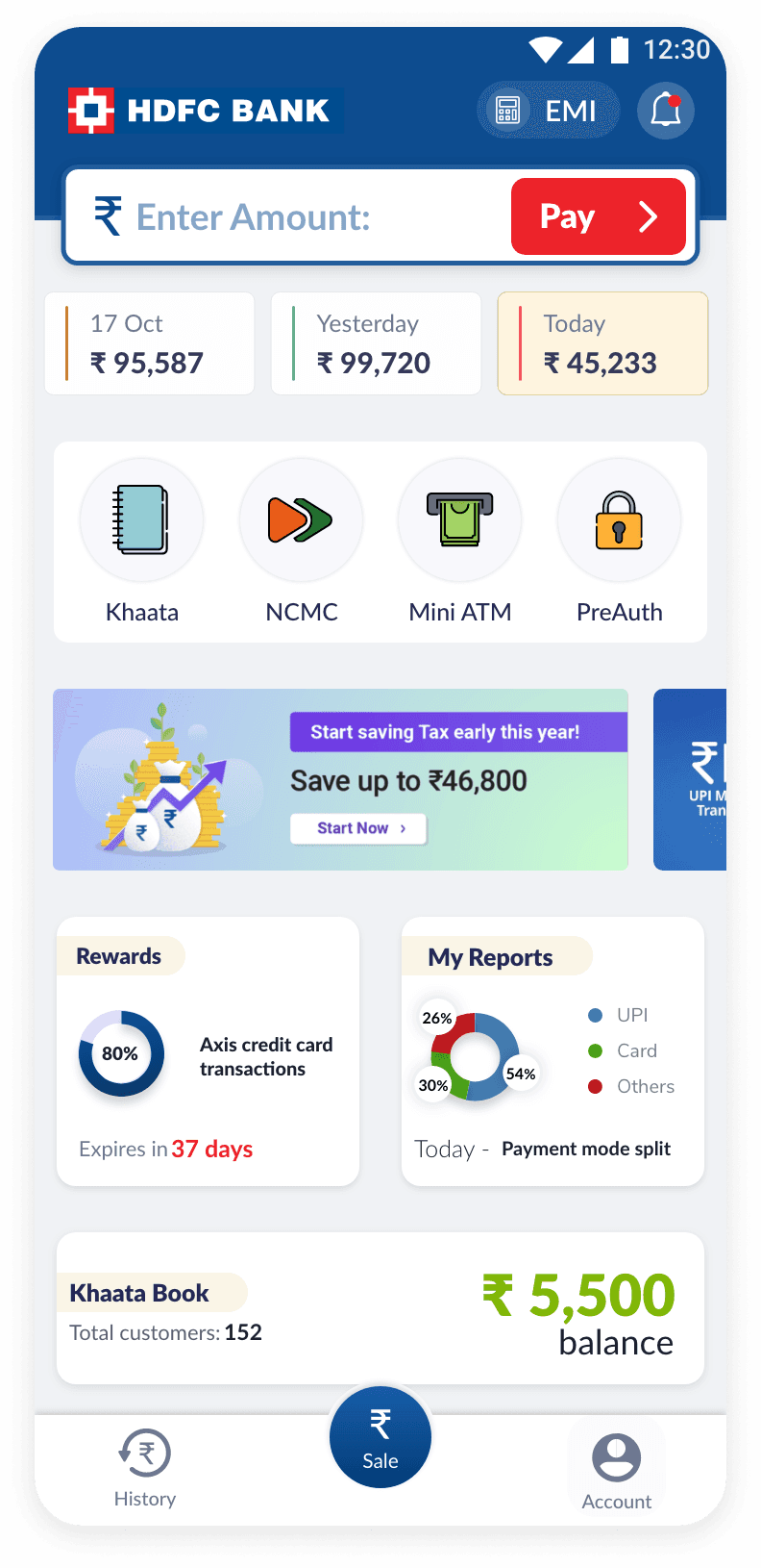
Previously, the application was hampered by its poor organization and perplexing disposition of details.
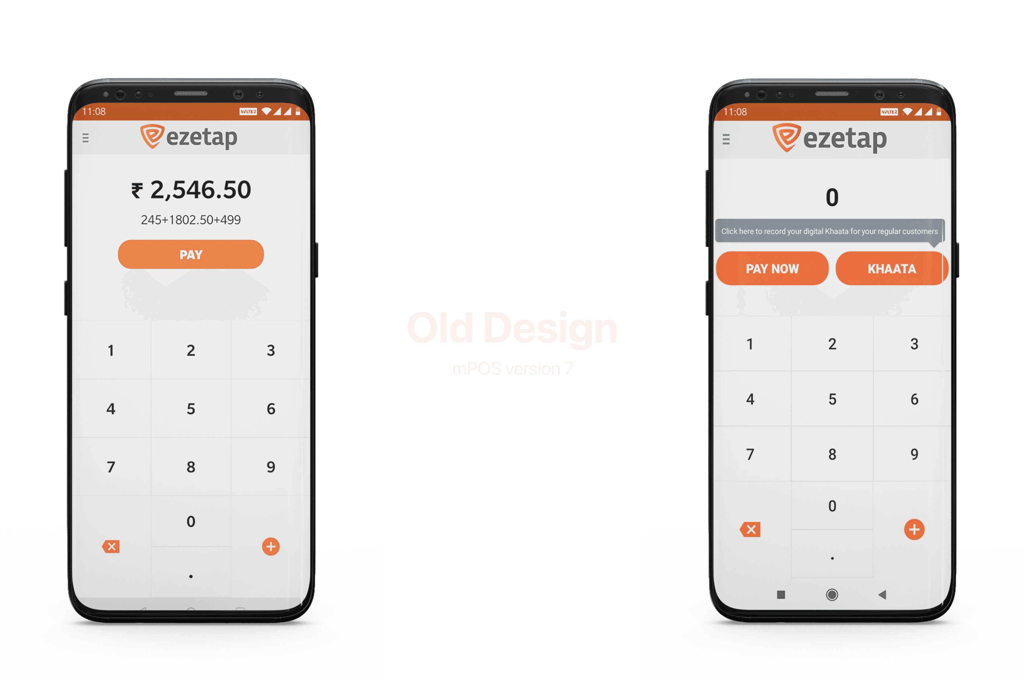
For instance, the prominence given to the Khaata (credit) feature, despite its infrequent use, led to cognitive overload and hindered user understanding.
Home / Problem 2
Solution
Clear Prioritisation & Visual Differentiation of elements based on Heuristic Analysis
By enabling users to switch between flows seamlessly and distinguishing between them visually, we enhanced user understanding and navigation.
Dynamic
Button for
Sales flow
Dynamic Button for Sales flow
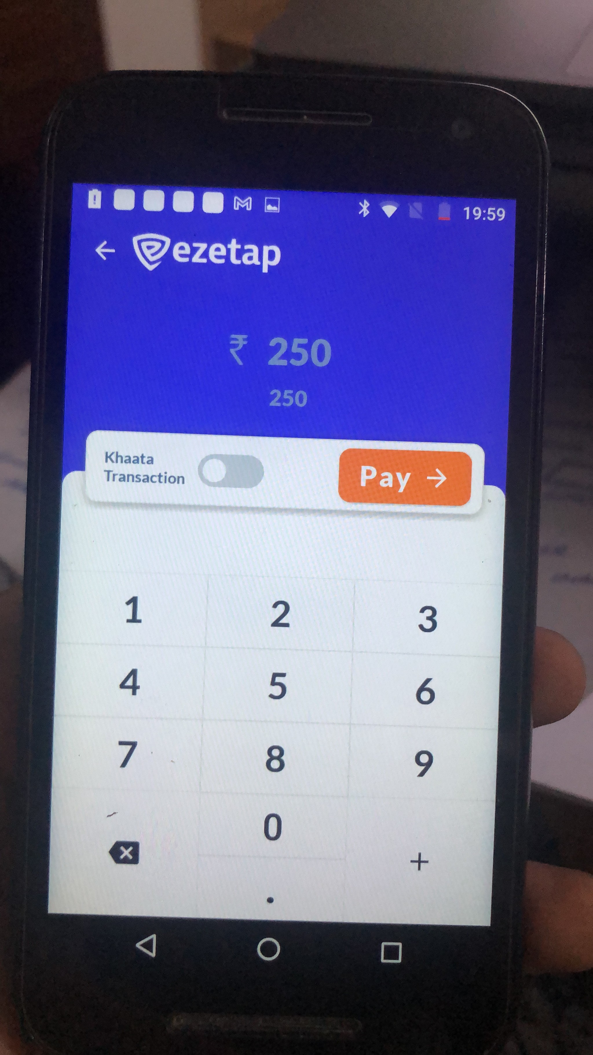
During Khaata mode activation, the button's colour and text information adapt to reflect the present choice.
During Khaata mode activation, the button's colour and text information adapt to reflect the present choice.
Home / Problem 3
Designing a Dynamic Interface for Varying Feature Sets
The SAAS model leads to variations in the available features and interfaces for each user/bank.
The mPOS functions uses a SAAS infrastructure, incorporating a broad scope of capabilities and additional valued solutions and facilities, tailored for assorted banks/non-banking financial companies and traders.
Home / Problem 3
Solution
Through numerous revisions and evaluations, we crafted an adaptive UI that highlights relevant functionalities without sacrificing user engagement.
Through numerous revisions and evaluations, we crafted an adaptive UI that highlights relevant functionalities without sacrificing user engagement.
Variants of activated services section
Based on number of services is active, the button's colour, font style, container colour, title etc changes based on predefined variants.
Activated Services:
01
Title:
No

Activated Services:
02
Title:
No

Activated Services:
03+
Title:
Yes
By creating a modular design that dynamically adjusts based on activated features, we provided a scalable solution that caters to varying requirements.

Home / Problem 4
Other Use Cases:
P2P and Soundbox Integration
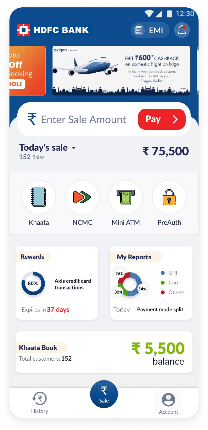
Inclusion of Push 2 Pay (P2P) and Soundbox use cases required disabling manual amount entry, necessitating a redesign of the "Amount Entry" button.
The prominent "Amount Entry" button needed to be replaced with an effective solution that maintained usability while accommodating the new functionalities.
Home / Problem 4
Solution
We tackled this challenge by repurposing the "Amount Entry" button's space to convey essential information about Push 2 Pay (P2P) and Soundbox.
Clear visuals and concise text were integrated to swiftly guide users through these functionalities.
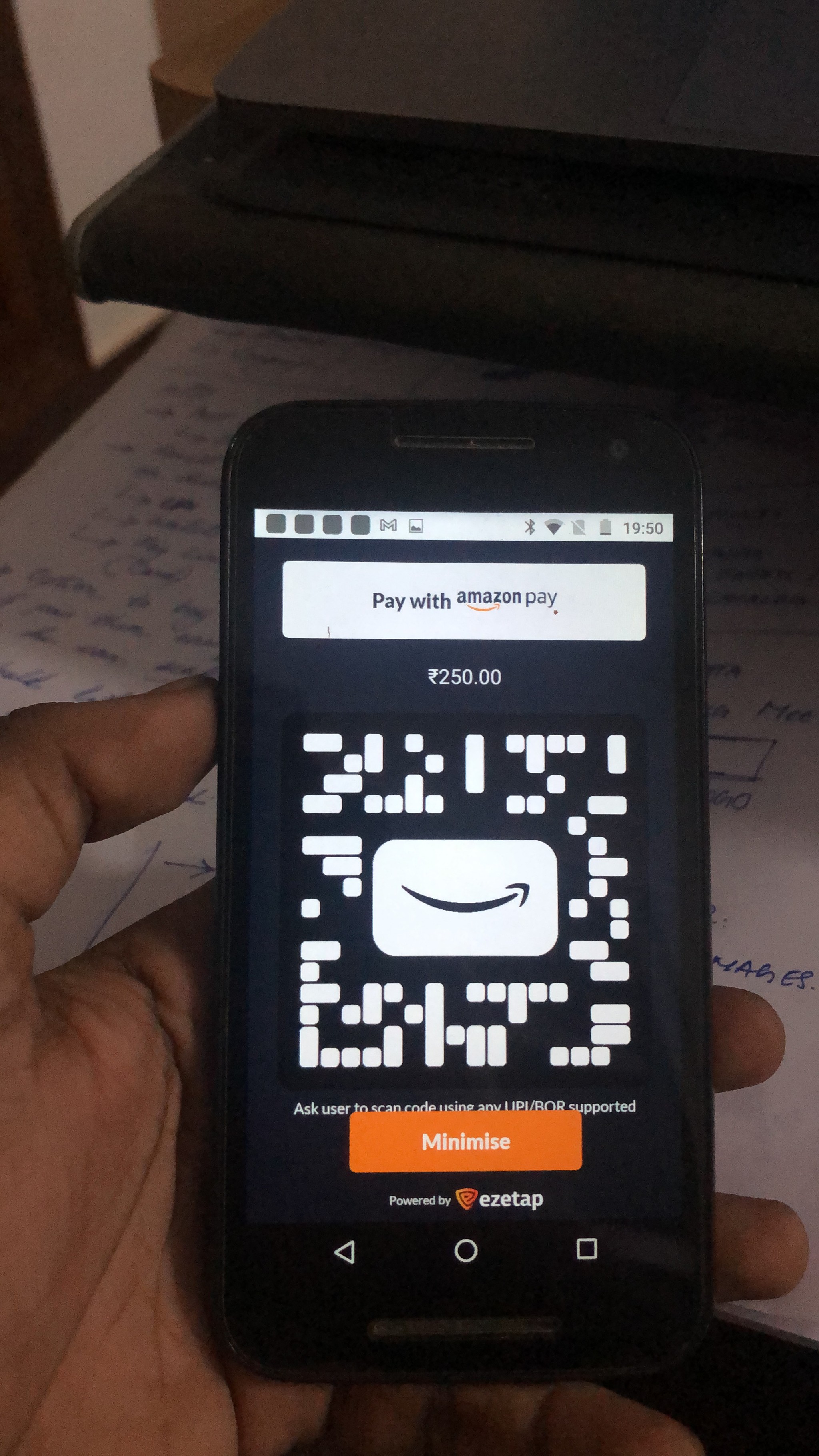
Push 2 Pay
Facilitating sophisticated payments via Ezetap POS devices from centralized Terminal POS systems.
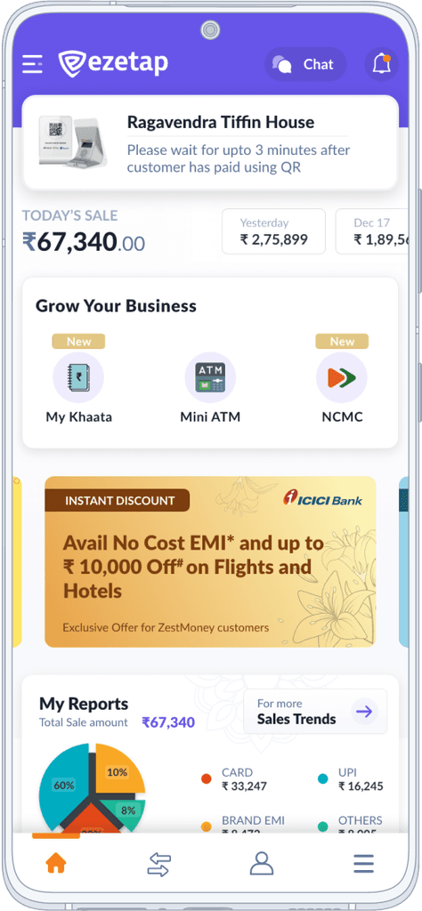
SoundBox
A unique solution, where merchants receive voice and visual alerts when a customer pays via UPI QR Code.
The updated UI effectively dealt with varying functionalities without bombarding the users.
With this approach, we made sure that the structure was ready for future enhancements and could be expanded.
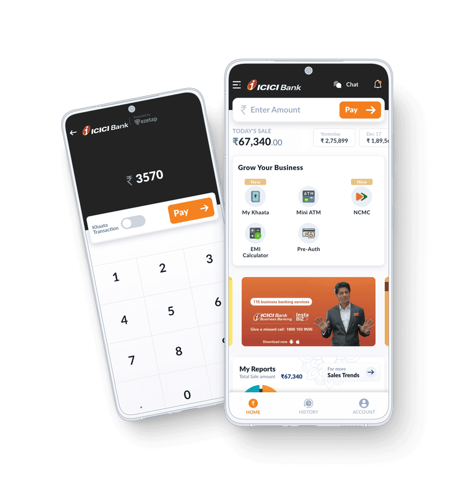
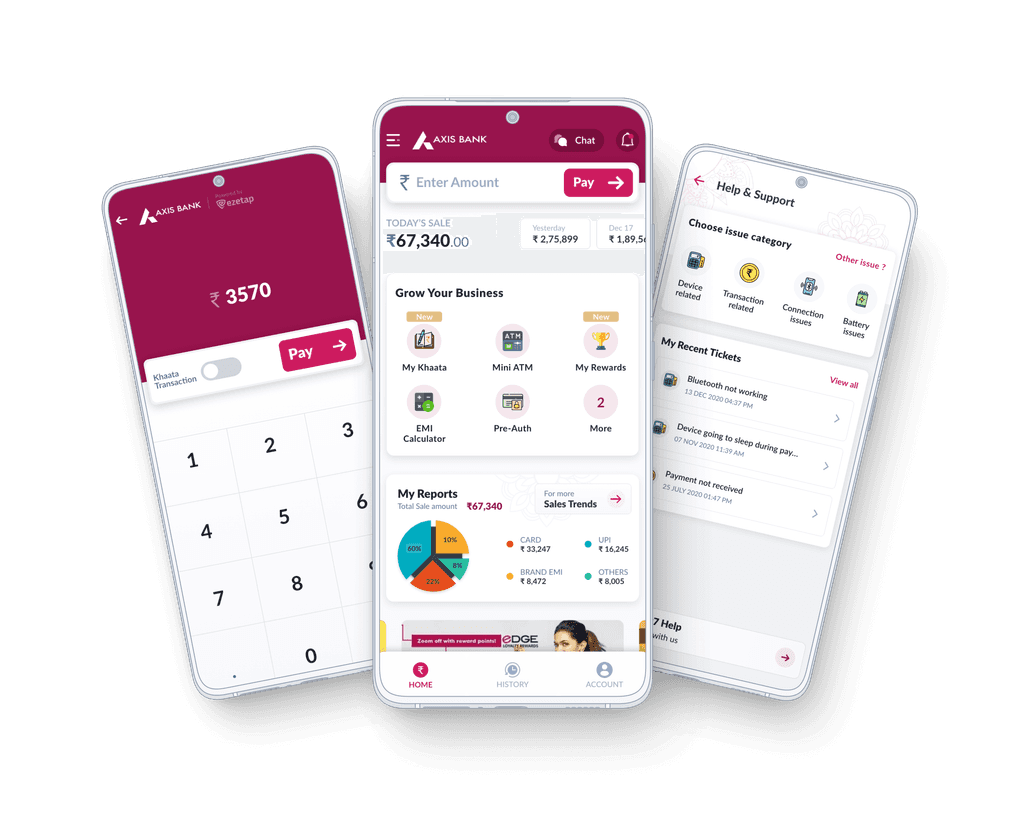
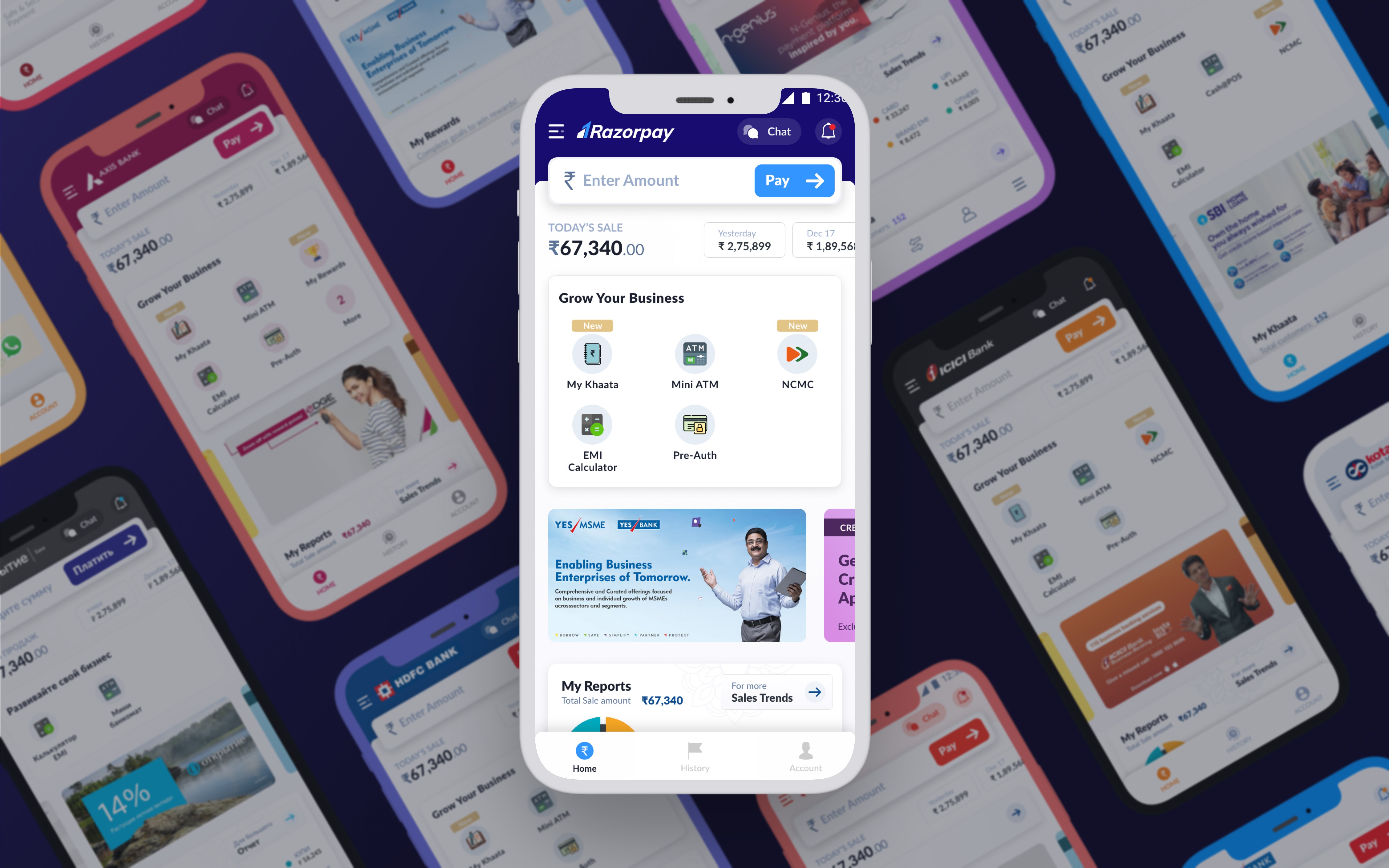
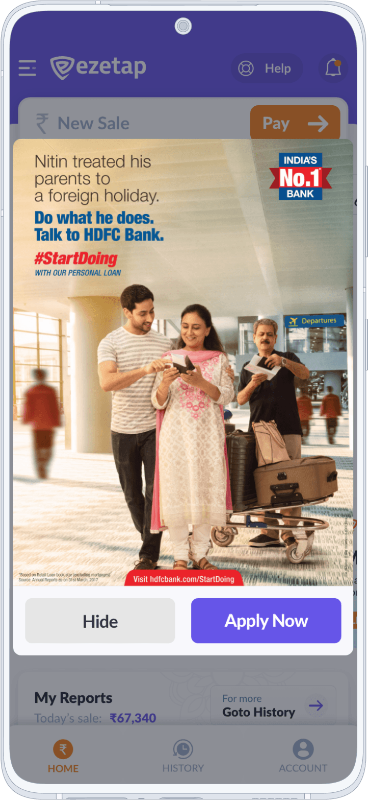
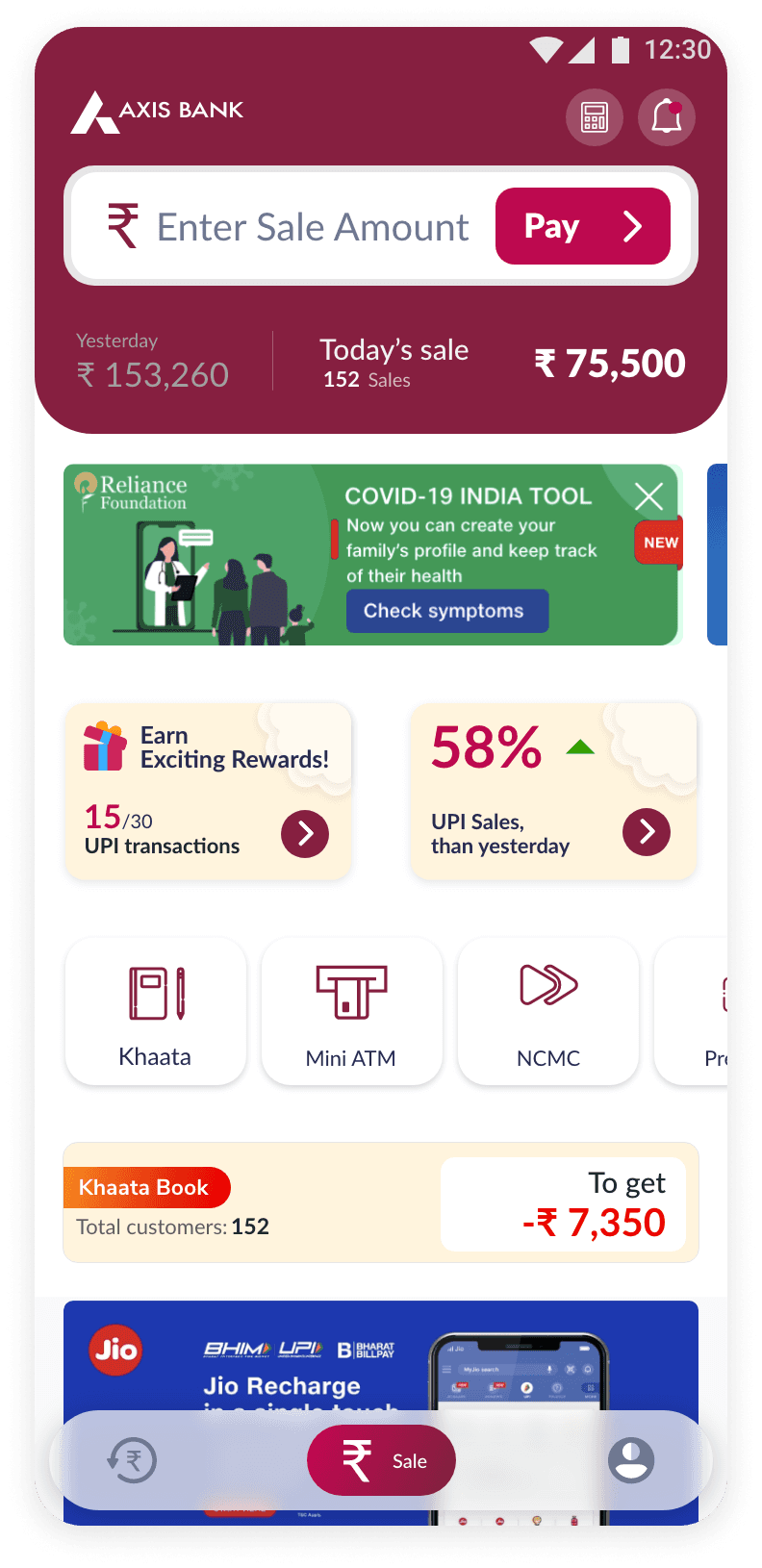
Dynamic
Bank Branding
The need to effectively communicate new offers or deals to merchants and customers prompted the creation of a dedicated Promo Section within the mPOS app.

Balancing branding elements while preserving a clean interface presented a significant challenge.
Home / Problem 4
Solution
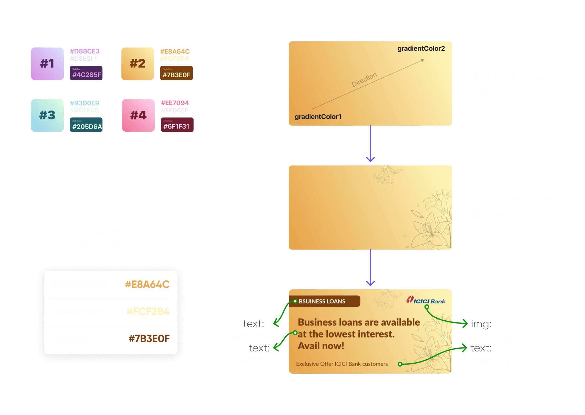
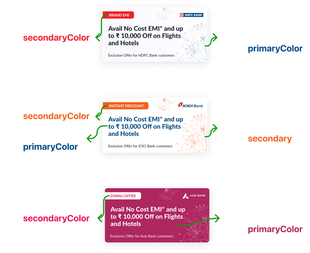
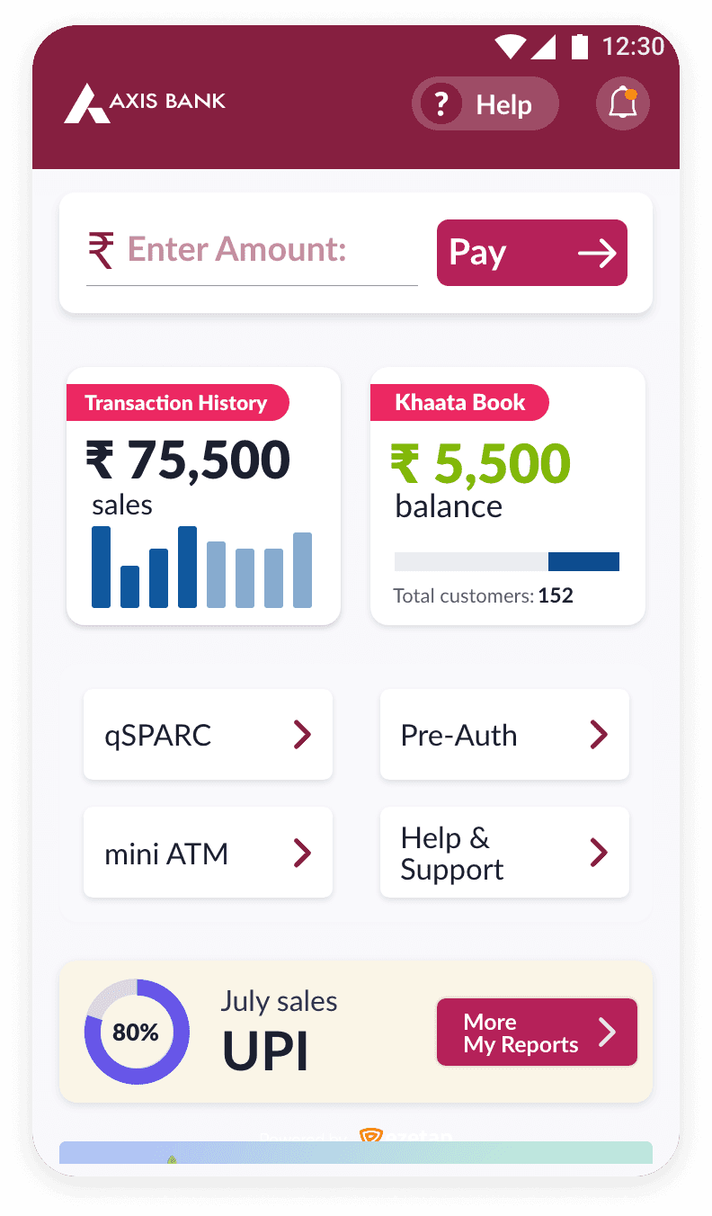
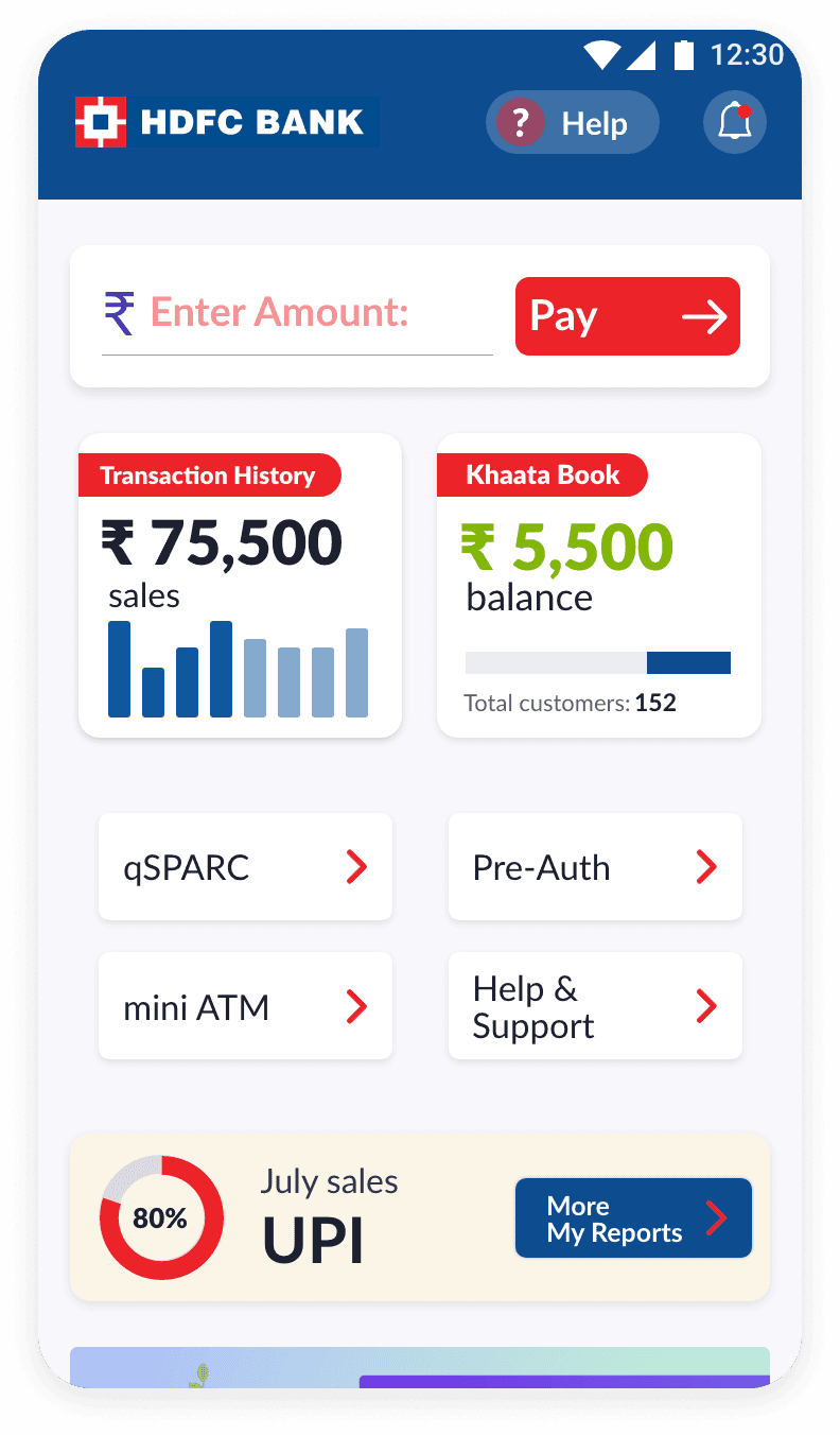
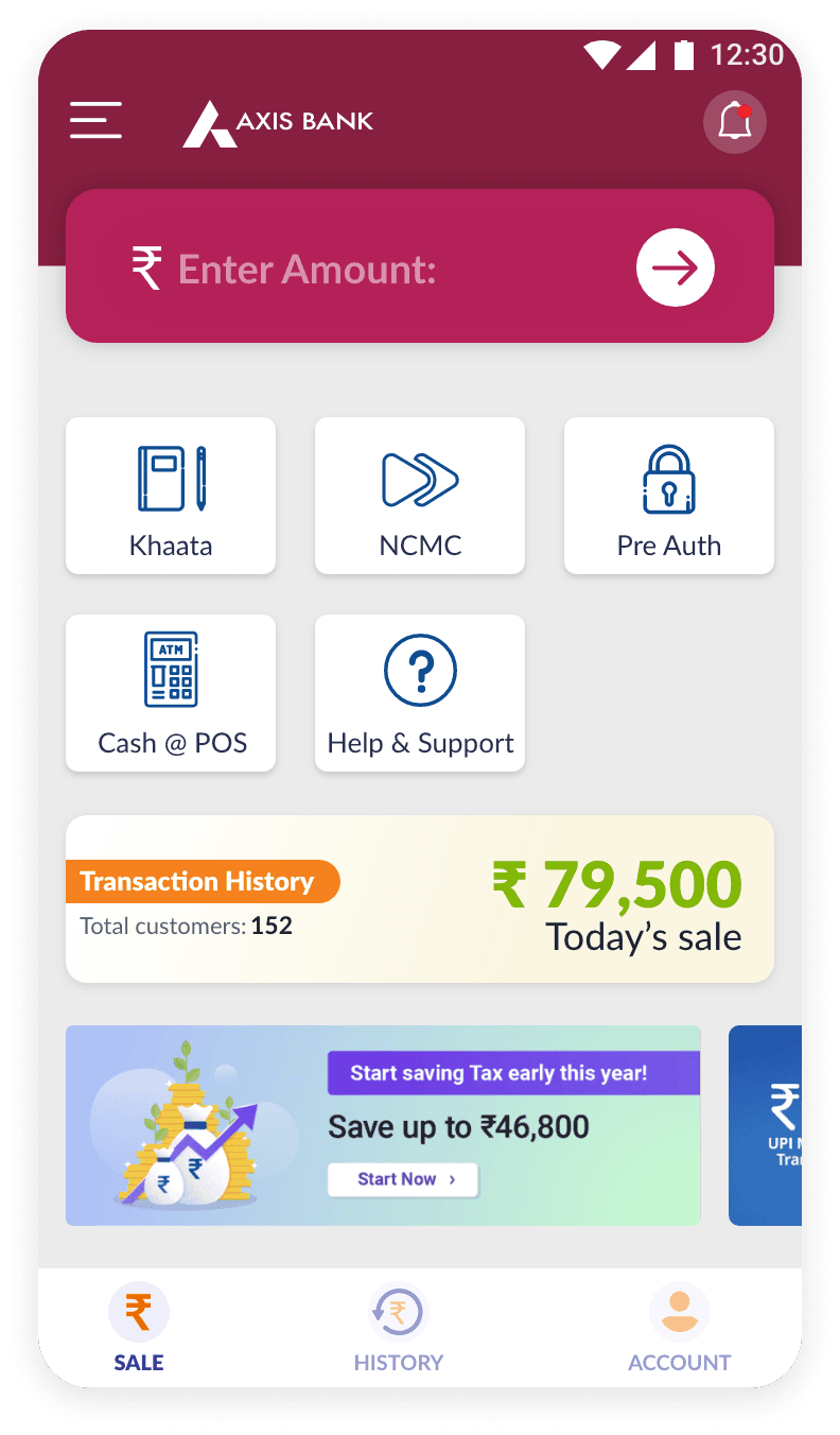
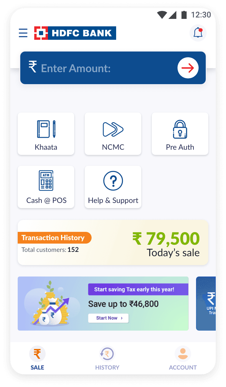
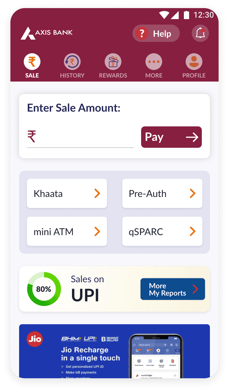
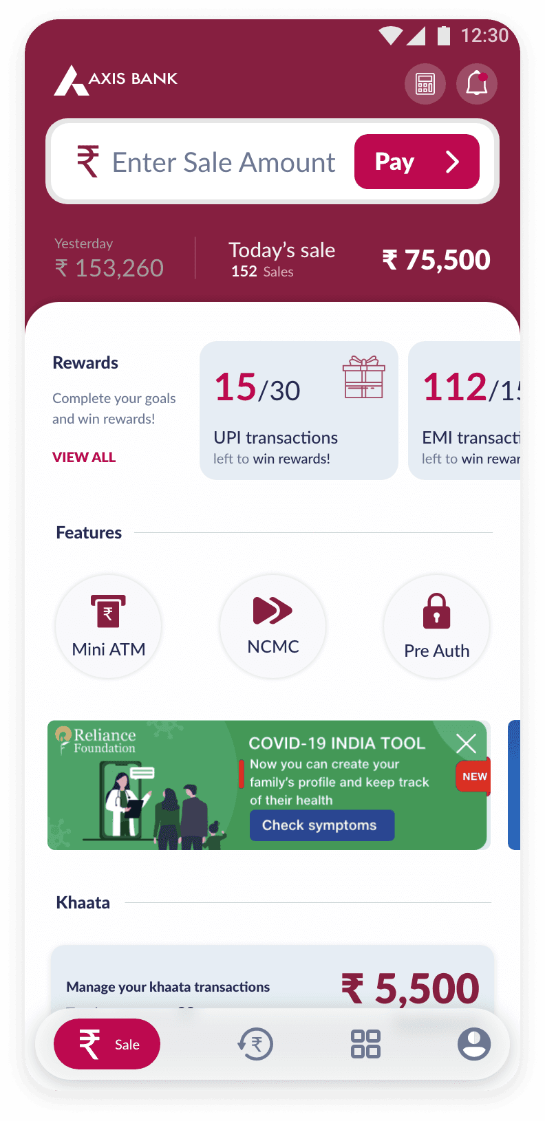
Through a detailed analysis, we identified primary and secondary colors unique to each bank's identity. This insight guided our approach to strategically assign colors across the app's interface.
Bank
Primary
Secondary
HDFC Bank
ICICI Bank
Kotak Bank
Yes Bank
Network International
SBI Payments
Axis Bank
IDFC First Bank
#004C8F
#004A7F
#003874
#0062A8
#003366
#292075
#AE275F
#9D1D27
#ED232A
#F5821F
#ED1C24
#D71920
#FF6666
#00B5EF
#EB1165
#BD7061
New Fields for Customization
To accommodate bank-specific branding, we introduced new fields. These offered precise control over the app's appearance for each bank.

Primary Color
#0D4A86
Secondary Color
#F37E20
Home Titlebar Color
#232323
Home Titlebar Theme
dark
Primary Color
#0D4A86
Secondary Color
#F37E20
Home Titlebar Color
#232323
Home Titlebar Theme
dark
Specific fields like titlebarColor and titlebarTheme were created to assign colors to non-home screen title bars.
This allowed for a dark themed bank identity representation on the home screen while maintaining a lighter theme on others.
Minimal Fields, Maximum Impact
To accommodate bank-specific branding, we introduced new fields. These offered precise control over the app's appearance for each bank.
Primary Color
#AE275F
Secondary Color
#EB1165
Titlebar Color
#FFFFFF
Titlebar Theme
light
Home Titlebar Color
#AE275F
Home Titlebar Theme
dark
Primary Color
#AE275F
Secondary Color
#EB1165
Titlebar Color
#FFFFFF
Titlebar Theme
light
Home Titlebar Color
#AE275F
Home Titlebar Theme
dark
Unified Design, Customized Branding
The solution impeccably assimilated unique banking aesthetics, preserving design simplicity.
Now, banking institutions can align their branding with the application's interface, bolstering the Software as a Service model and providing a uniformed, customised experience to each banks brand identity.
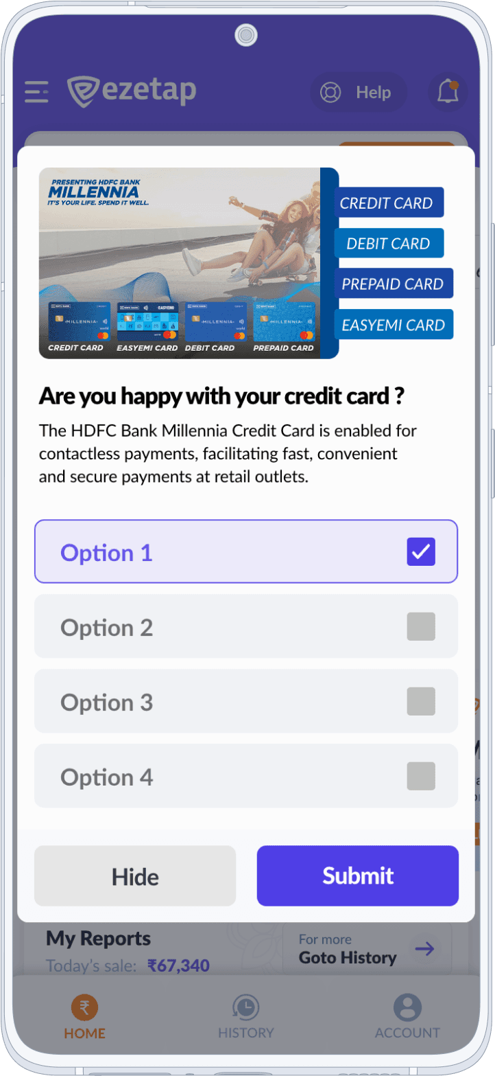
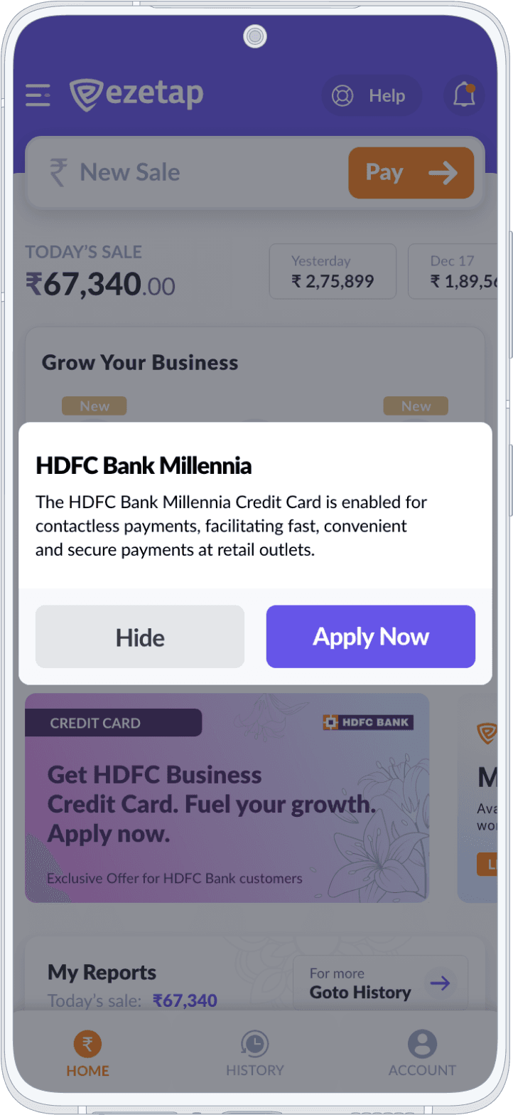
Crafting Compelling Promo Experiences
Crafting Compelling Promo Experiences
Engagement
Hub
A crucial addition to the mPOS app was the Promo Section, which aimed to effectively communicate new offers and deals to merchants and customers.

Promo /Problem
Text-Based Promo Challenges
Text-based promos presented challenges in terms of creating visually appealing and engaging formats, especially for last-minute requirements.
The absence of this feature in the previous version prompted us to develop a solution from scratch. Scalability for different promo templates and ease-of-setup were also key concerns.

Solution
JSON-based
Template Generator
A JSON-based template generator was introduced to enable promo configuration. Banks/NBFCs could easily add text or image promos to the configurations for display on the main screen.
Created a JSON-based template generator allowing banks to configure promos easily.
Promo Card
Template - Text1
Template Text-1 comprises sets of card styles/themes, with the cards generated receiving the style applied in the chronological order of the theme sheet.
Promo Card
Template - Text2
Template Text-2 uses bank branding parameters to render the cards, providing an easy way to create a bank-branded promo effortlessly.
The Engagement hub, consisting of a potent Promo creator, IAM and Alert Centre, emerged as a fundamental part of the application.
It served as an efficient method to captivate users with specials, bargains, and incentives, progressively amplifying the app's worth to both traders and financial institutions.
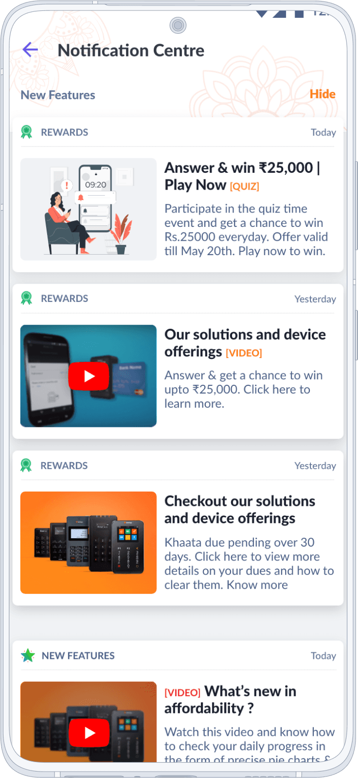
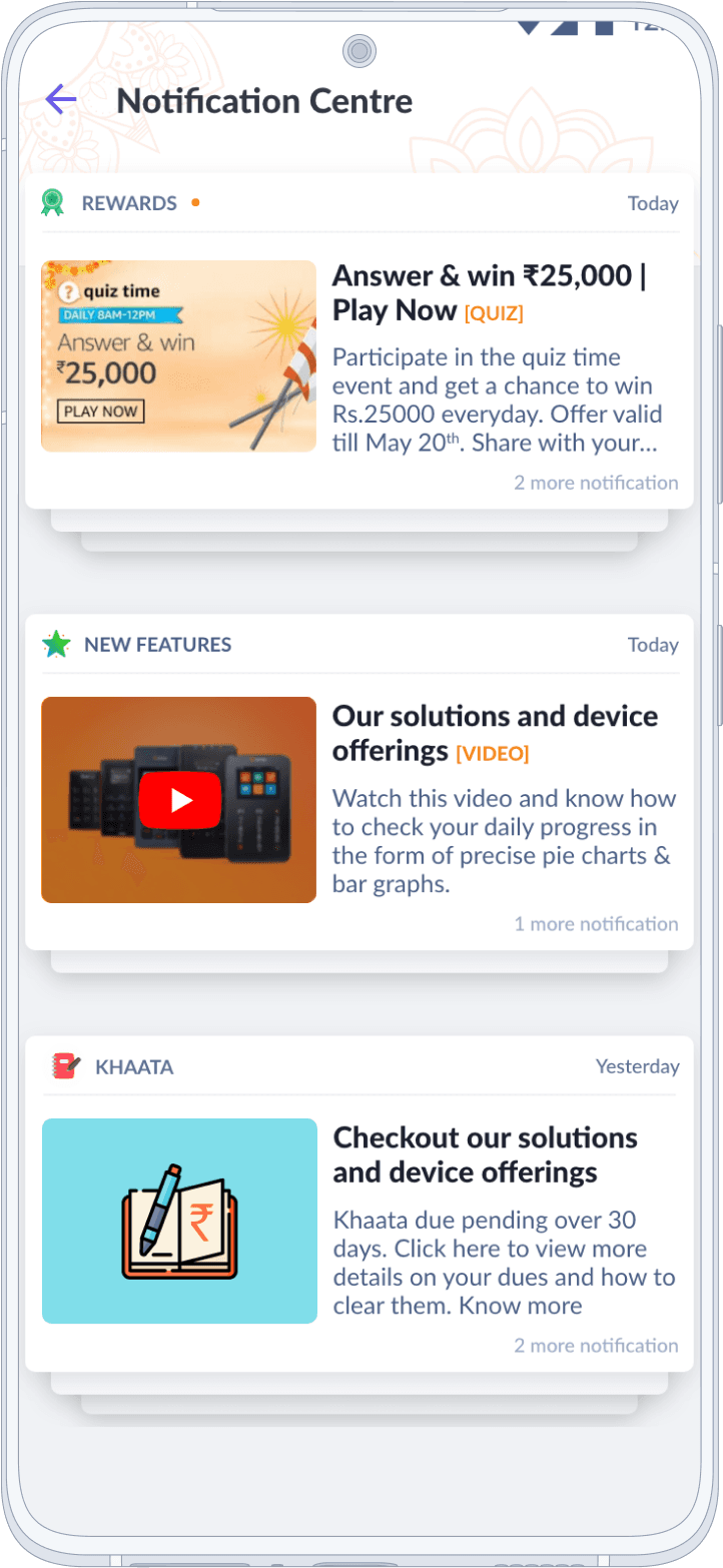
Engagement Hub
Notification Centre
Where merchants receive alerts, triggers, and updates about critical information. Whether it's about their Khaata, rewards, or new features, merchants can effortlessly stay informed and make well-informed decisions.
Engagement Hub
Notification Centre
Where merchants receive alerts, triggers, and updates about critical information. Whether it's about their Khaata, rewards, or new features, merchants can effortlessly stay informed and make well-informed decisions.
Engagement Hub
In-App Messaging
Establishing direct communication between merchants and providers through personalized messages and offers
Engagement Hub
In-App Messaging
Establishing direct communication between merchants and providers through personalized messages and offers
Enhancing UX and Support Efficiency
Enhancing UX and Support Efficiency
Account
& Settings
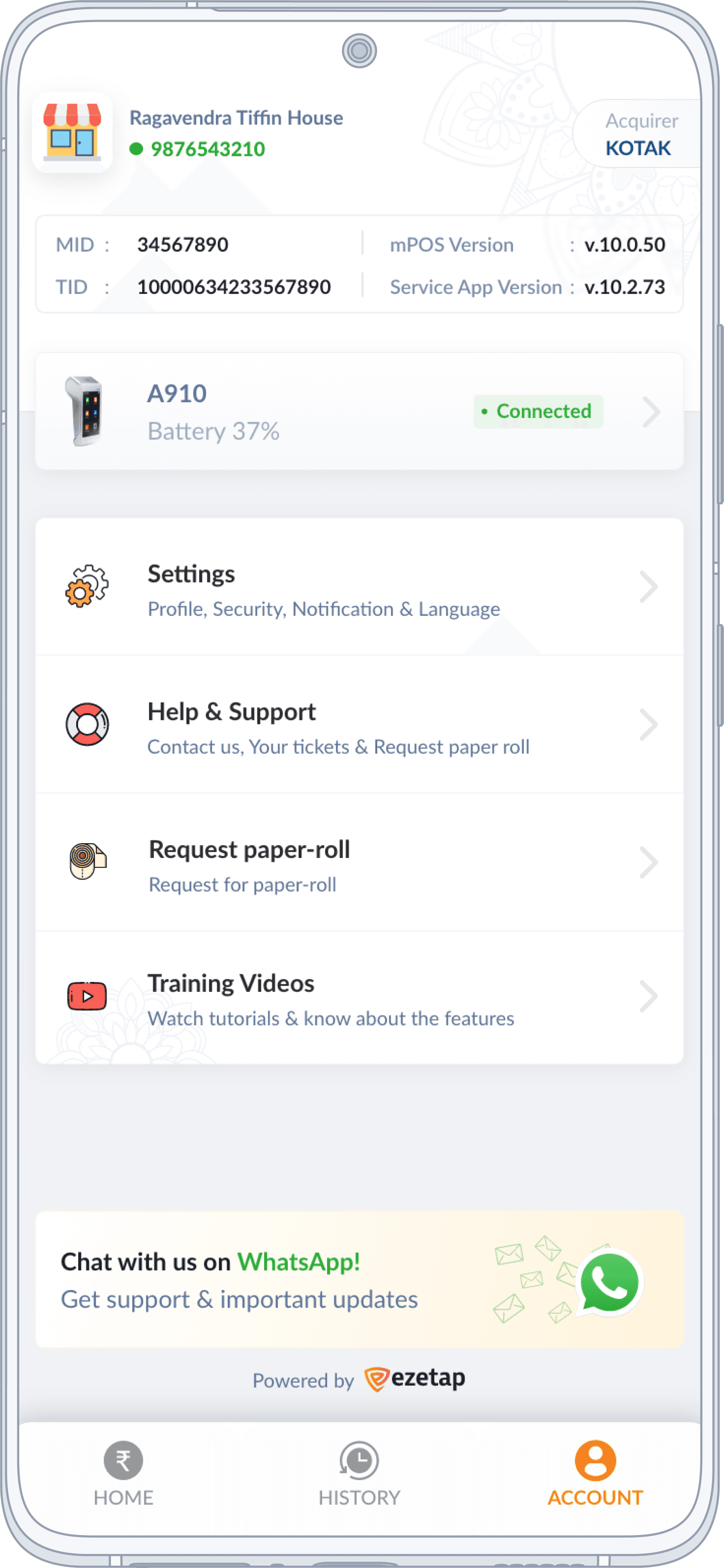
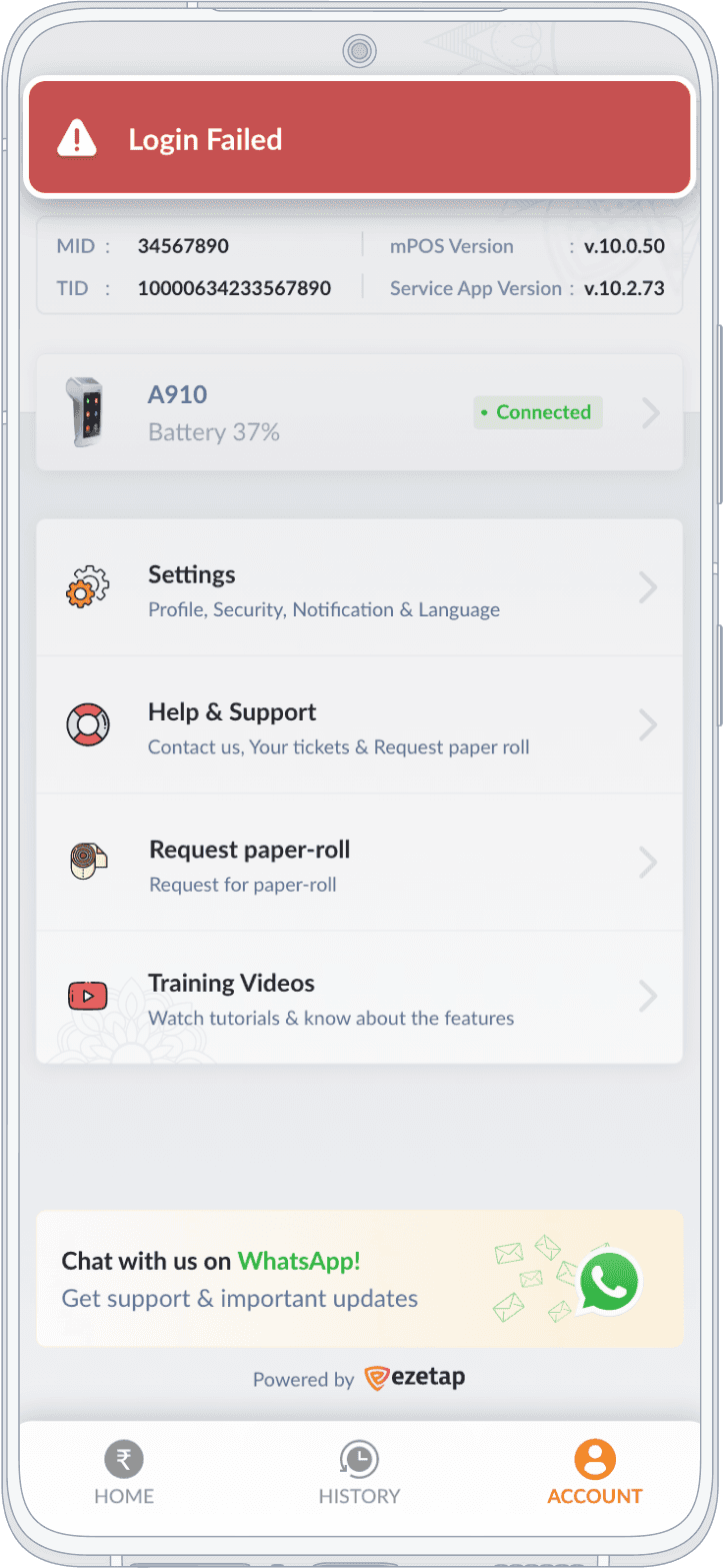
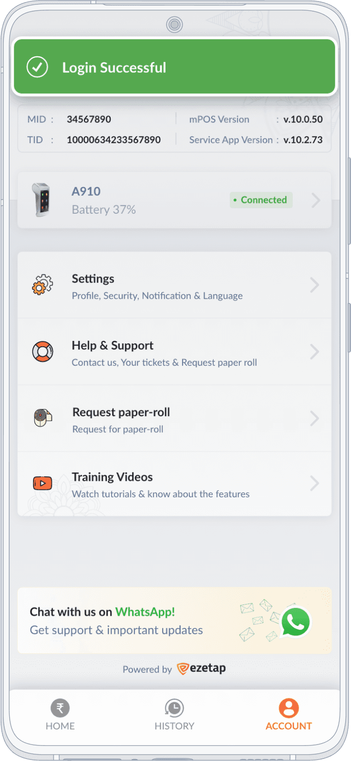
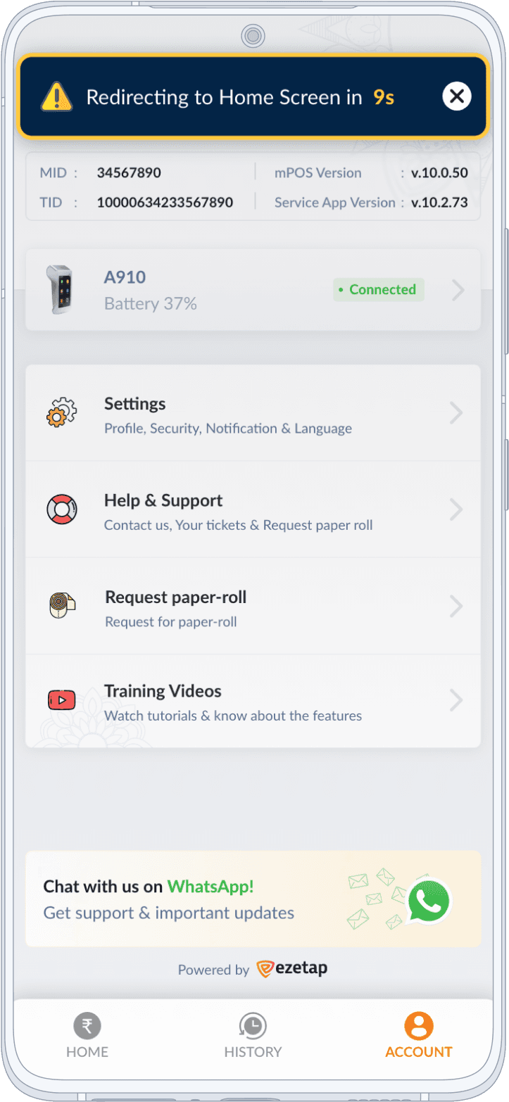
The Account section of the mPOS-X Framework revamp focuses on improving merchant and device details presentation, enhancing user self-diagnosis, and facilitating efficient support.

Account /Problem
Disorganized Merchant & Device Details
Support calls from merchants regarding device-related issues were common, requiring essential info like device & account details.
The previous app lacked structured presentation of these details, leading to confusion.
Solution
By studying various requirements from all departments and user feedback, we solved the problem by having a heuristic analysis considering following:
"At a Glance"
Experience
+
Segmentation &
Prioritization
+
Detailed Device
Diagnostics
Account
Details Segmentation
Important static details like MID, TID, and app versions were displayed directly on the Account screen.
Account
Details Segmentation
Important static details like MID, TID, and app versions were displayed directly on the Account screen.
Device Status
Detailed Device Diagnostics
The diagnostic screen’s design incorporated large icons and colour-coded indicators for clear status visibility.
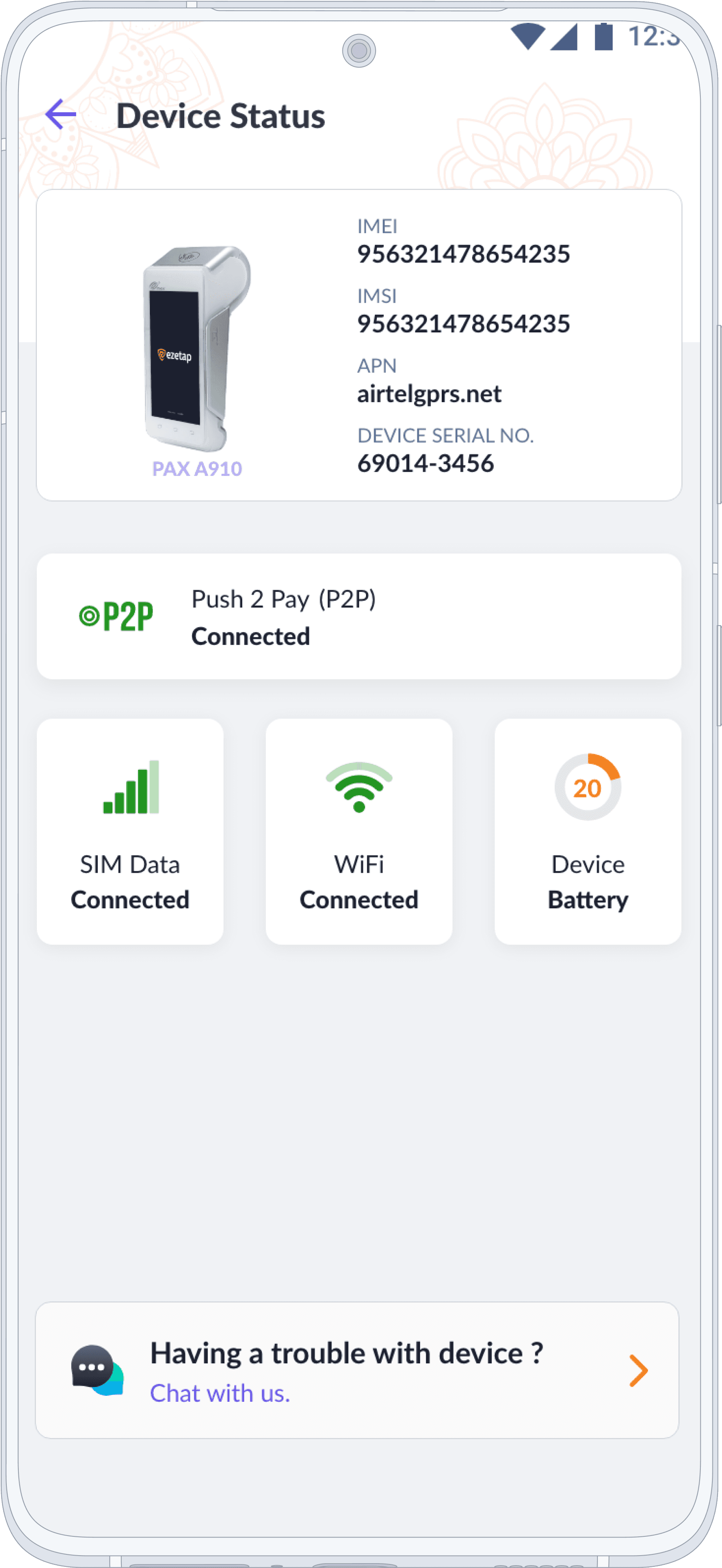
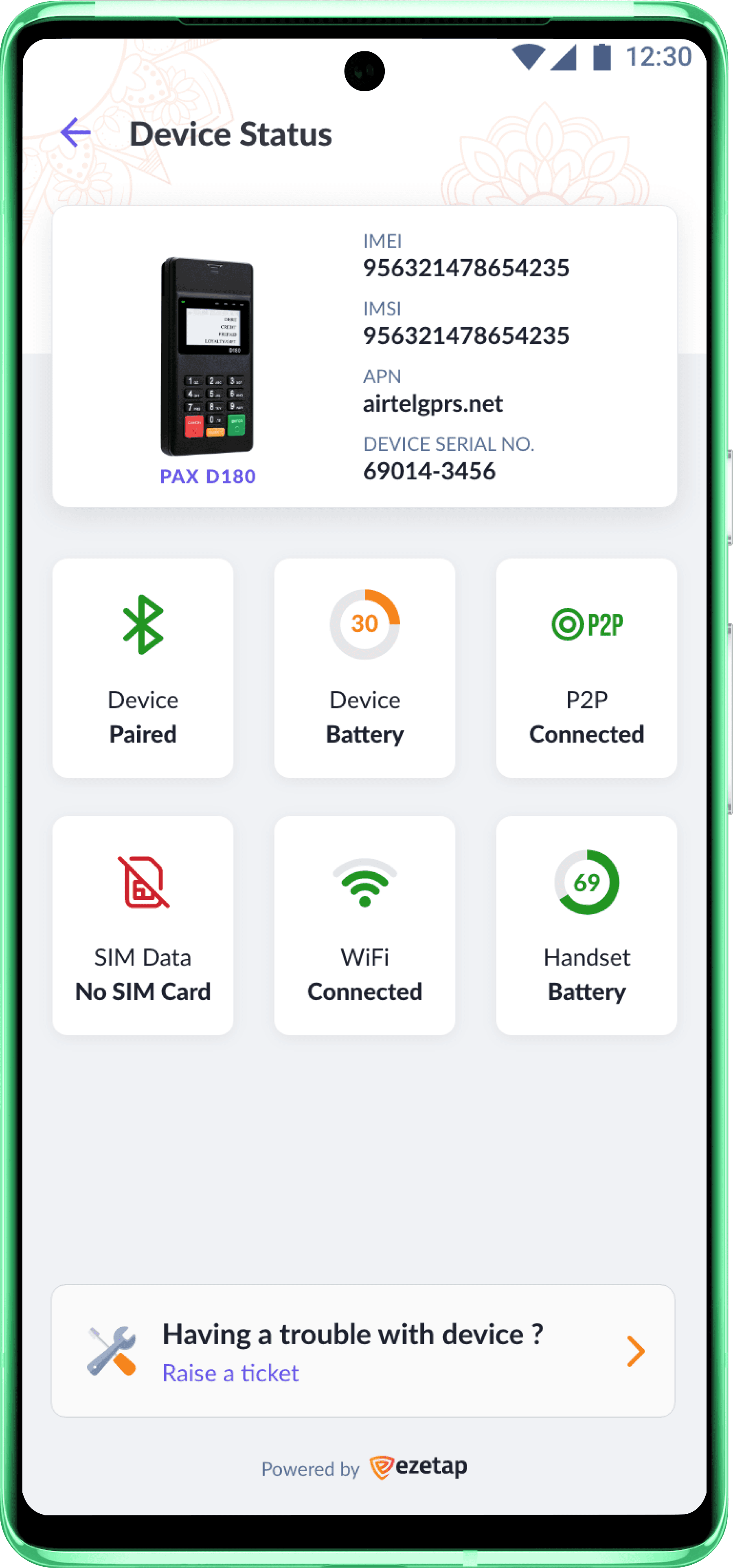
Device Status
Detailed Device Diagnostics
The diagnostic screen’s design incorporated large icons and colour-coded indicators for clear status visibility.
Help & Support
Customer Care
The help and support section encompasses logging support tickets and requesting callbacks.
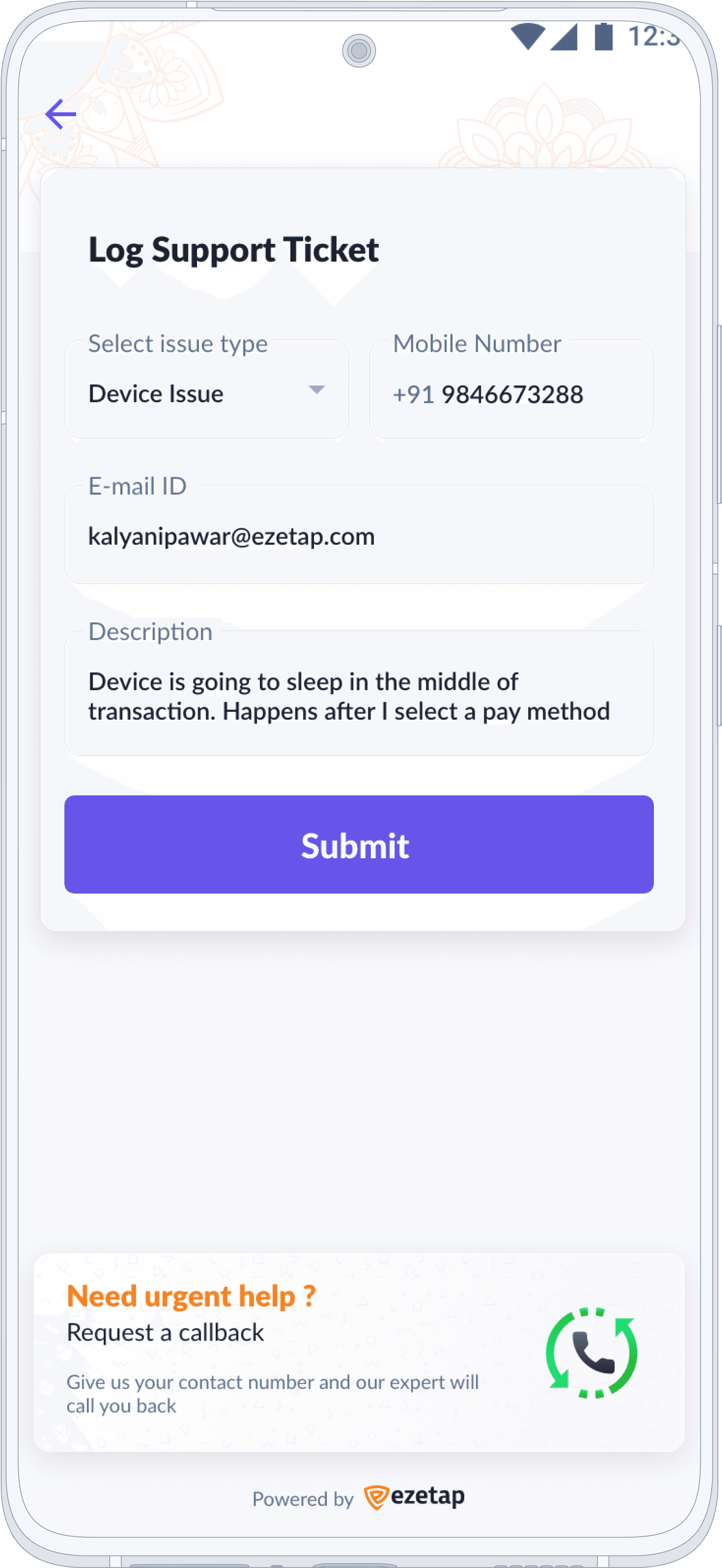

Help & Support
Customer Care
The help and support section encompasses logging support tickets and requesting callbacks.
Simplified for Diverse Payments
Simplified for Diverse Payments
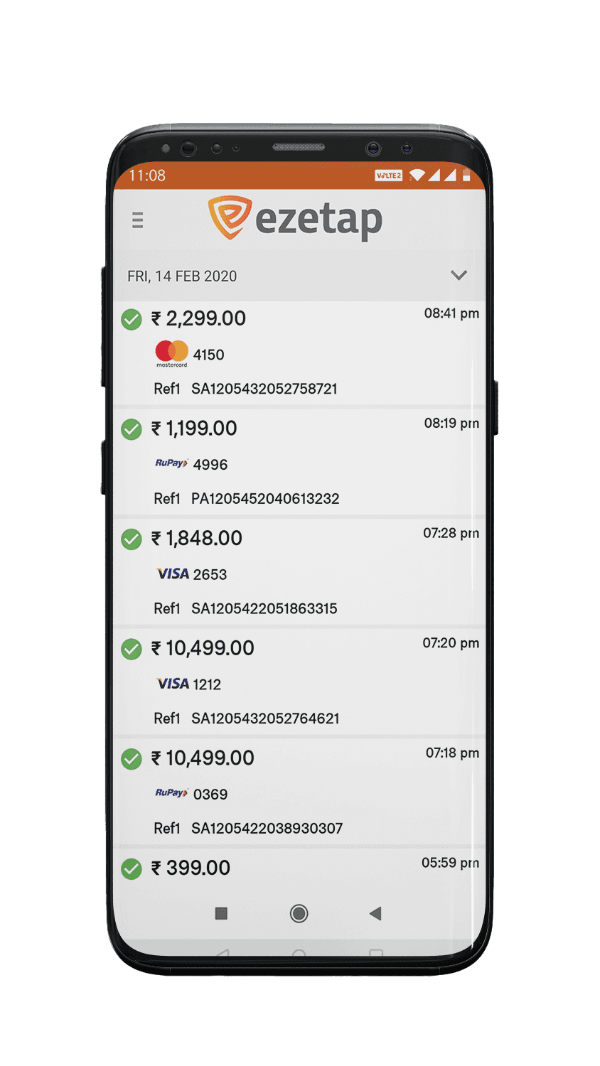
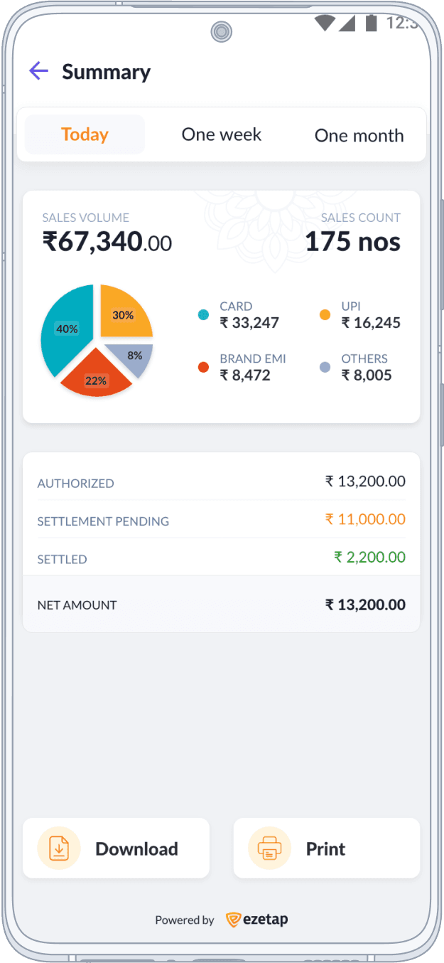
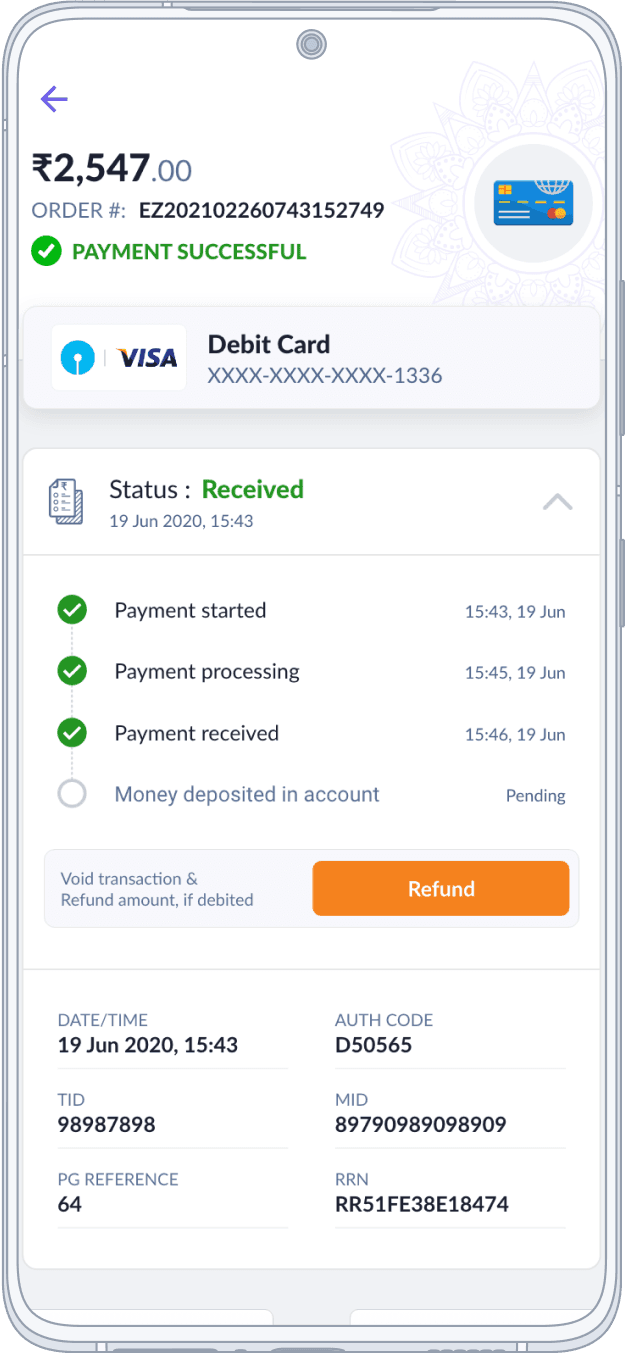
Transaction History
In redesigning the Transaction History section, we tackled the challenge of presenting diverse payment methods cohesively.

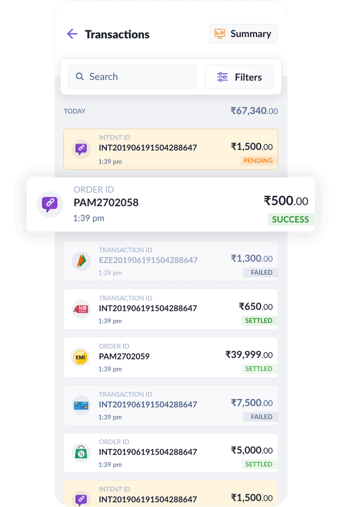
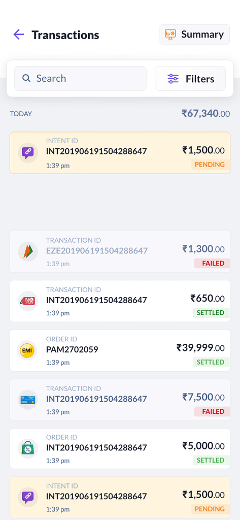

Enhanced Transaction History for Diverse Payments
This redesign significantly contributes to providing a streamlined and efficient payment experience for merchants.
An integrated design, logical groupings, and comprehensive transaction insights were the resolution.
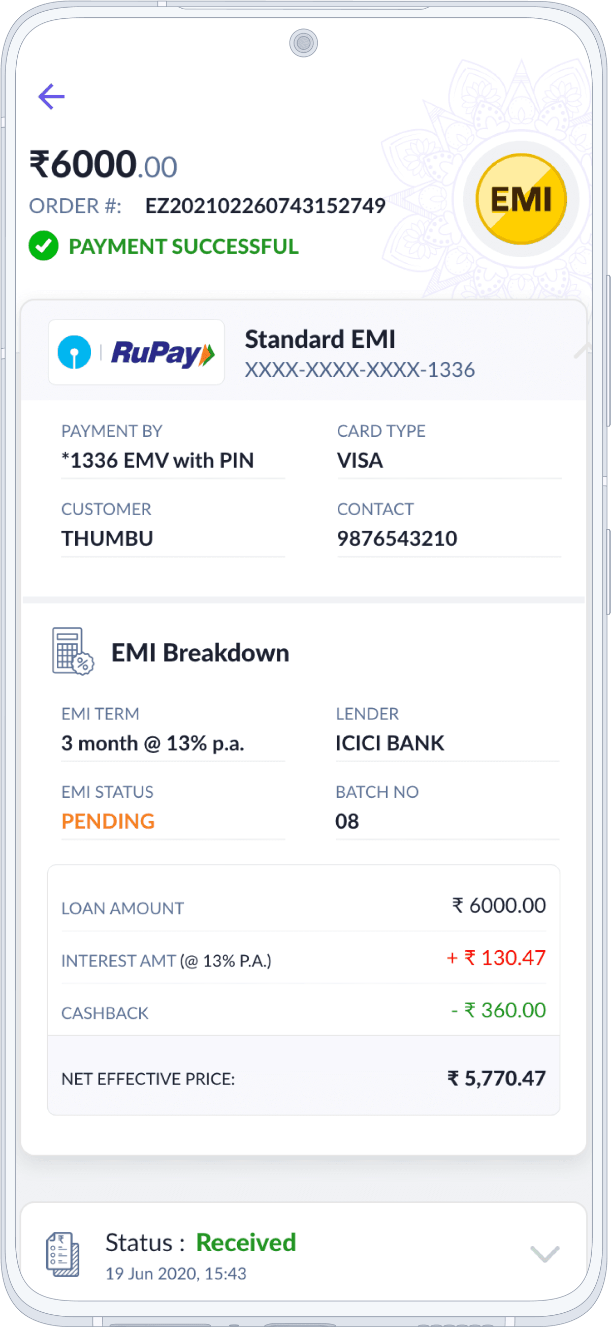
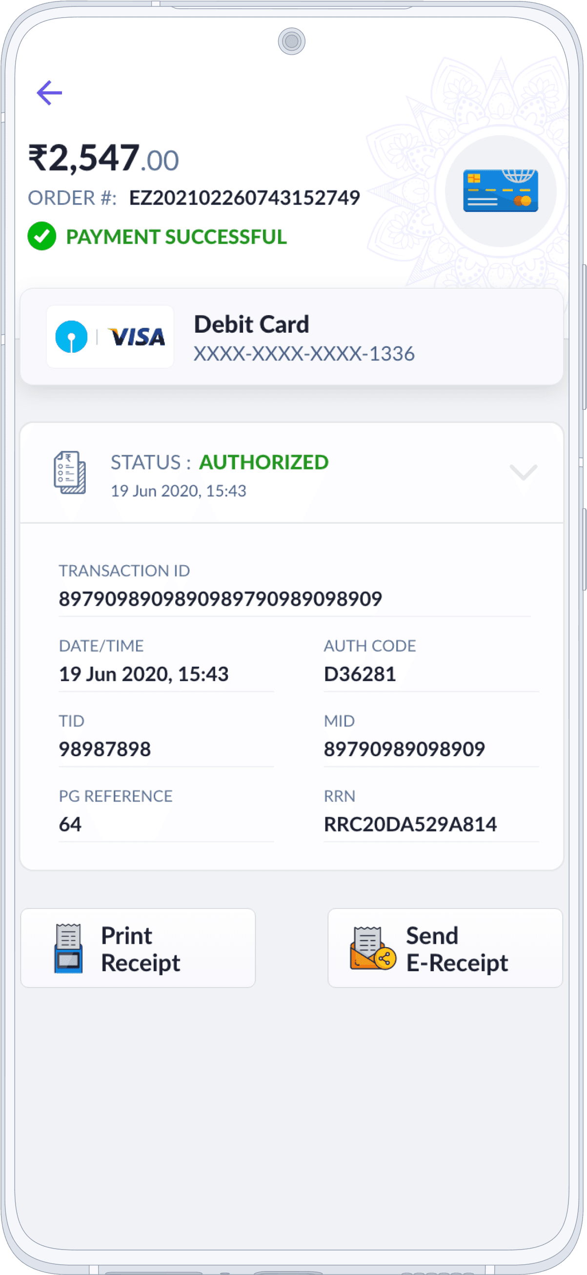
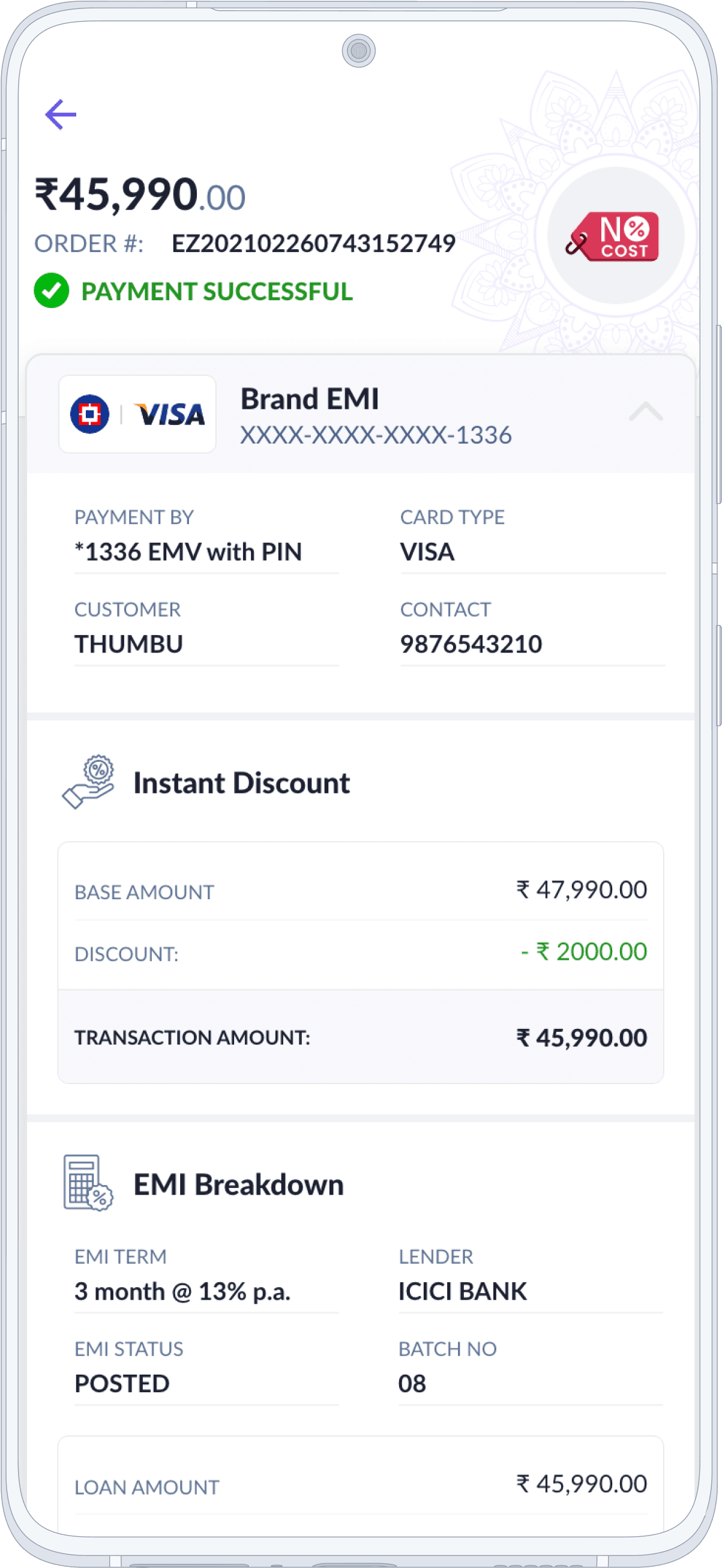
Clients can now seamlessly understand their financial activities, whether it's Credit Cards, Wallets, EMIs, Payment Links, or UPI
History
Transaction View
The revamped Transaction History section offers a user-friendly experience tailored to diverse payment methods.
History
Transaction View
The revamped Transaction History section offers a user-friendly experience tailored to diverse payment methods.

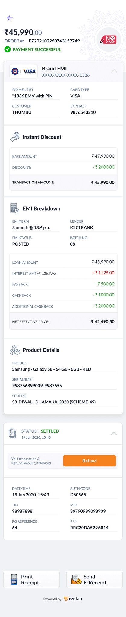
No Cost EMI - Expanded
The revamped Transaction History section offers a user-friendly experience tailored to diverse payment methods.
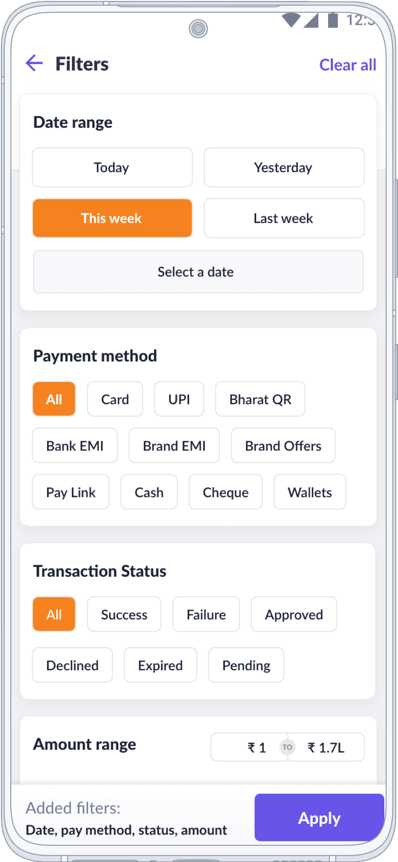
History
Filters & Summary
With advanced filters, a summary overview, and a detailed transaction view, users can effortlessly track and access their transaction data.
History
Filters & Summary
With advanced filters, a summary overview, and a detailed transaction view, users can effortlessly track and access their transaction data.
Payment SDK Case Study
Click here for a detailed case study of Omni-Channel Payment acceptance solution.
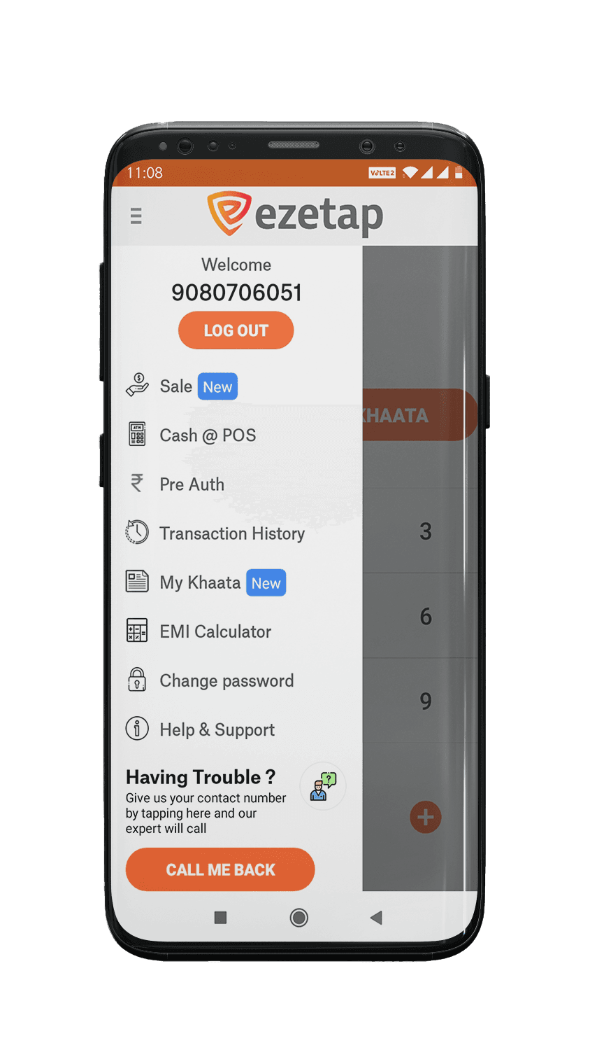
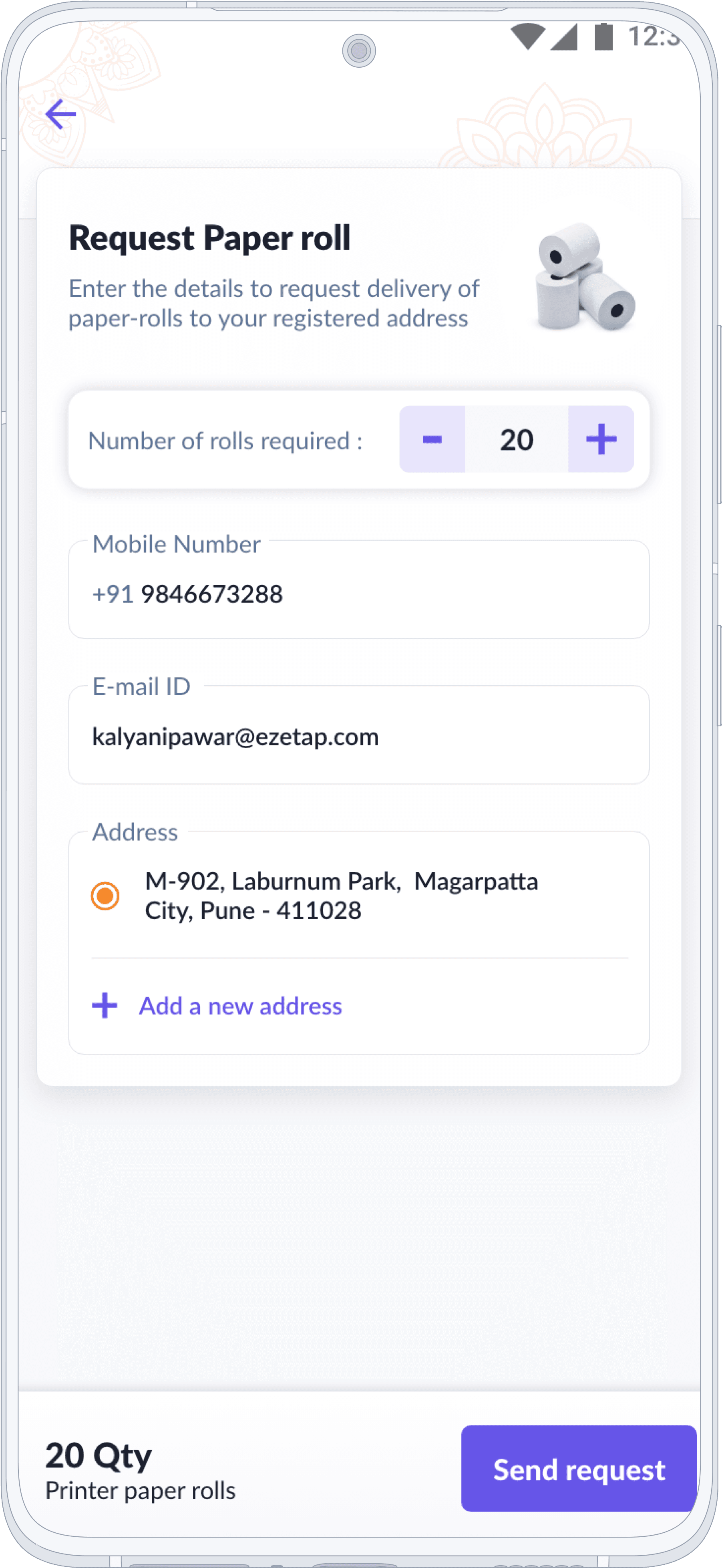
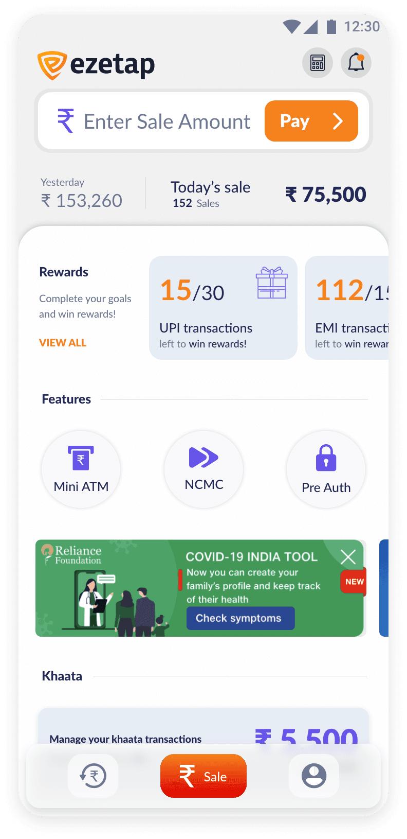
Value Added Features and Misc Screens
Other Sections
This application contains numerous interfaces. It also offers diverse functionalities and bonus offerings. Incorporating them in this case study could result in excessive length.
Various other product features and screens that exists in the app
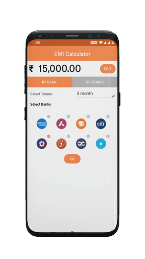
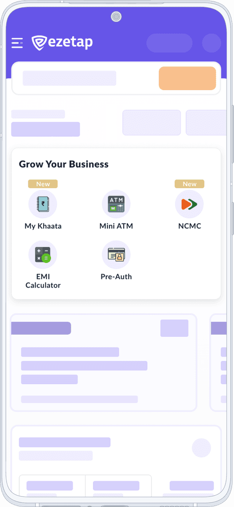
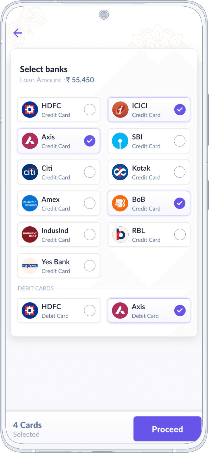
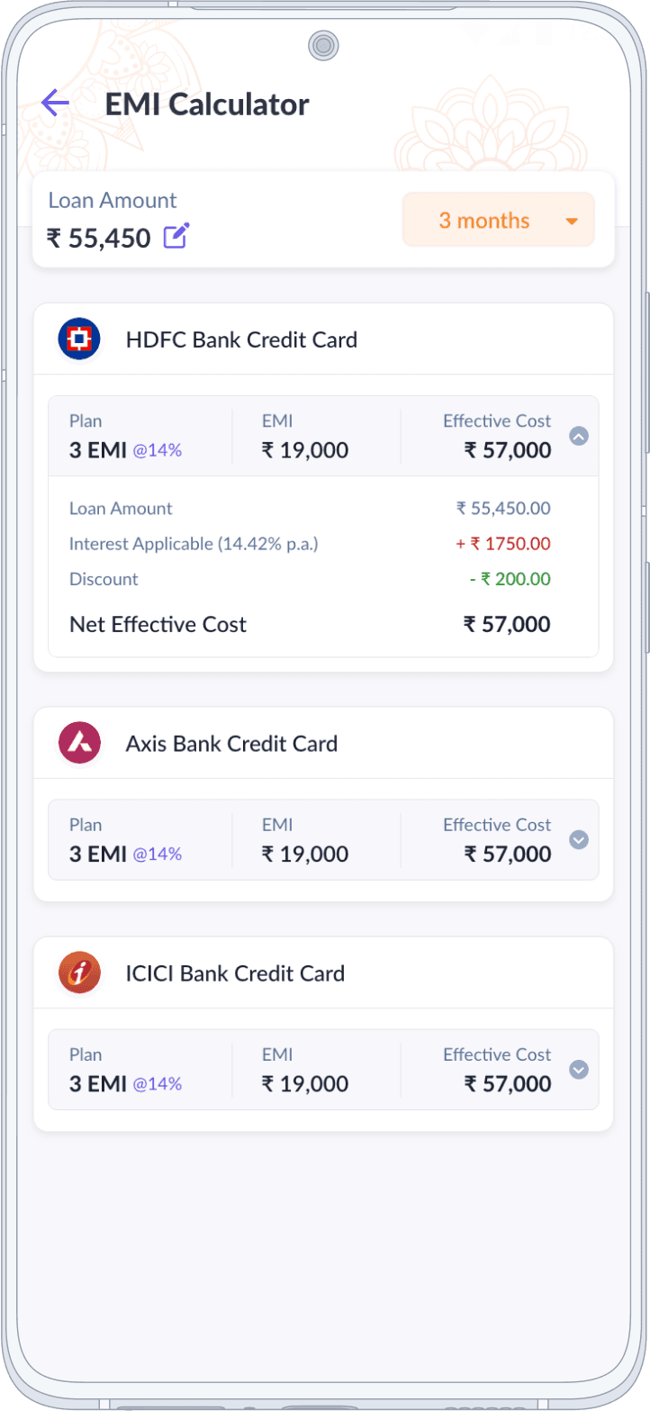
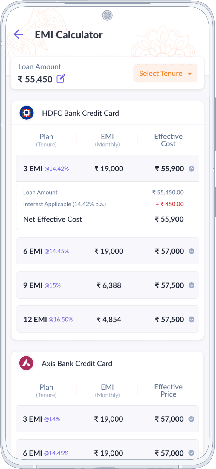
EMI Calculator
Simplifying complex financial calculations, aiding informed decision-making for purchases involving installments.
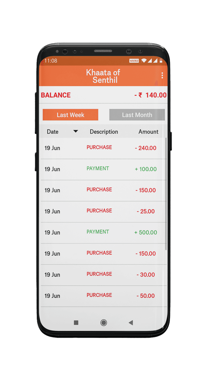
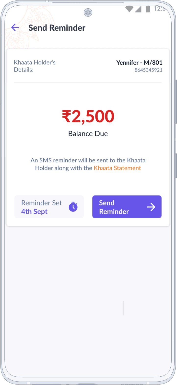
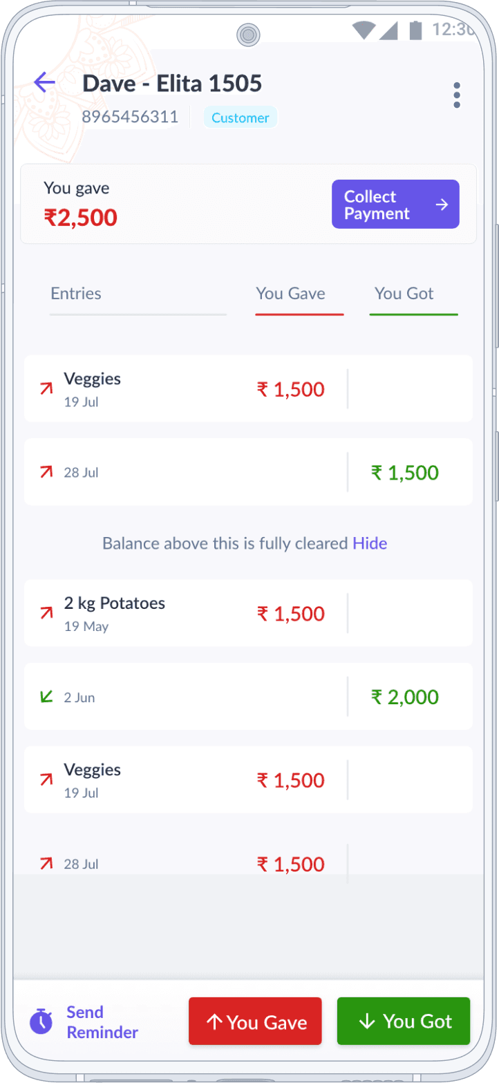
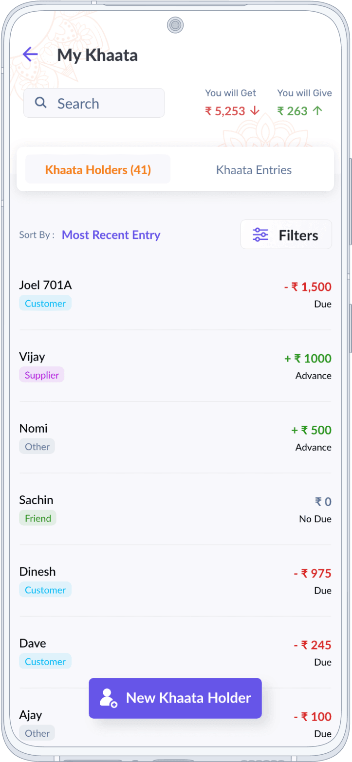
My Khaata
Digitizing the traditional Indian ledger system, allowing SME merchants to provide short-term, interest-free credit to loyal customers.
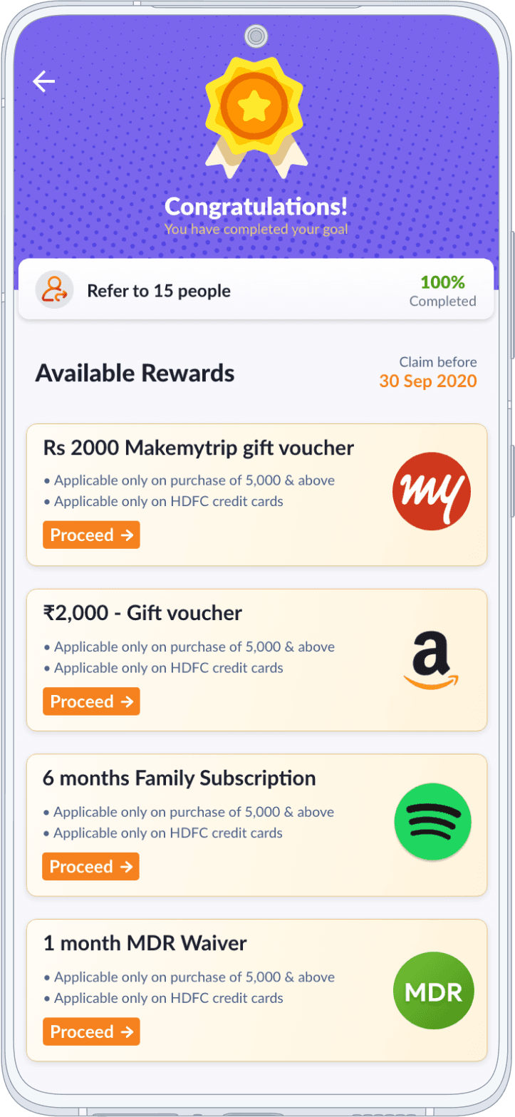
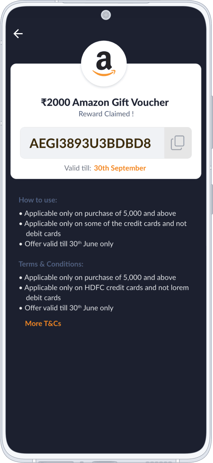
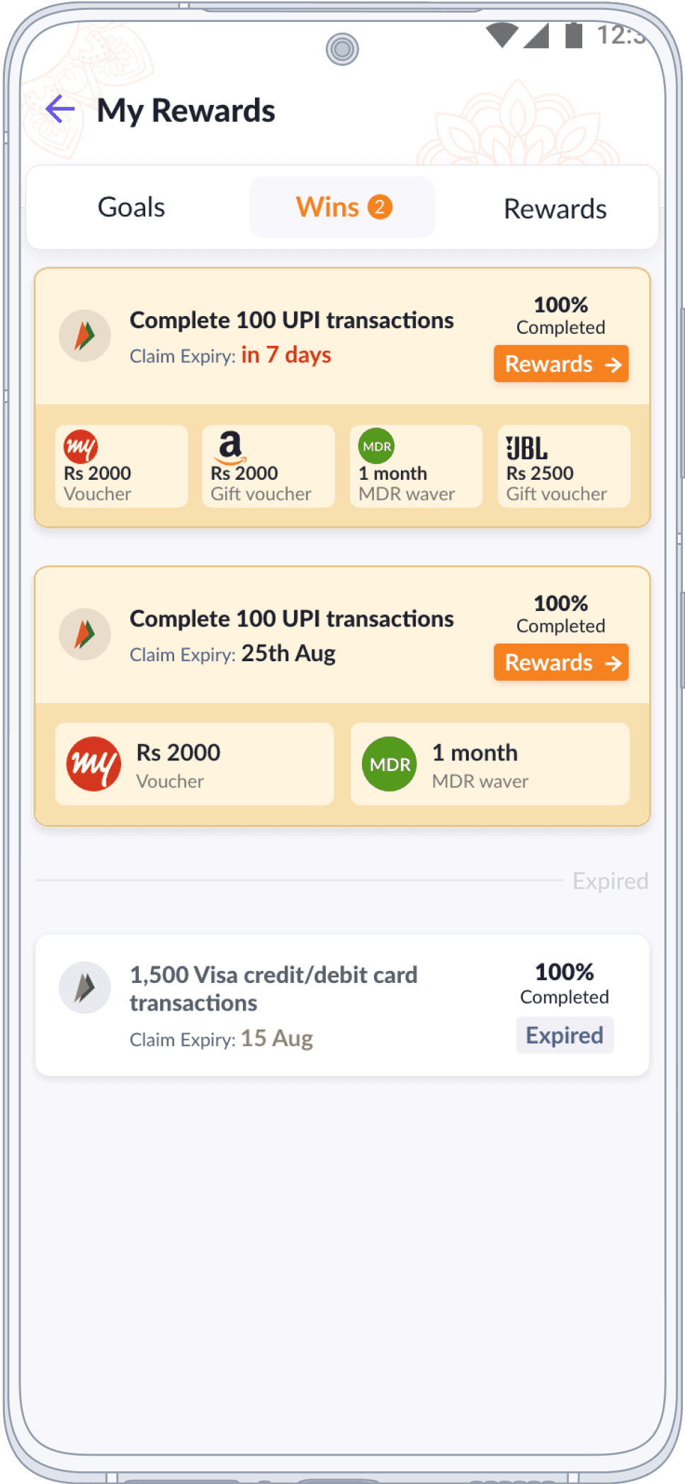
Merchant Rewards
Recognizing and incentivizing SME merchants for achieving partner bank or enterprise goals.
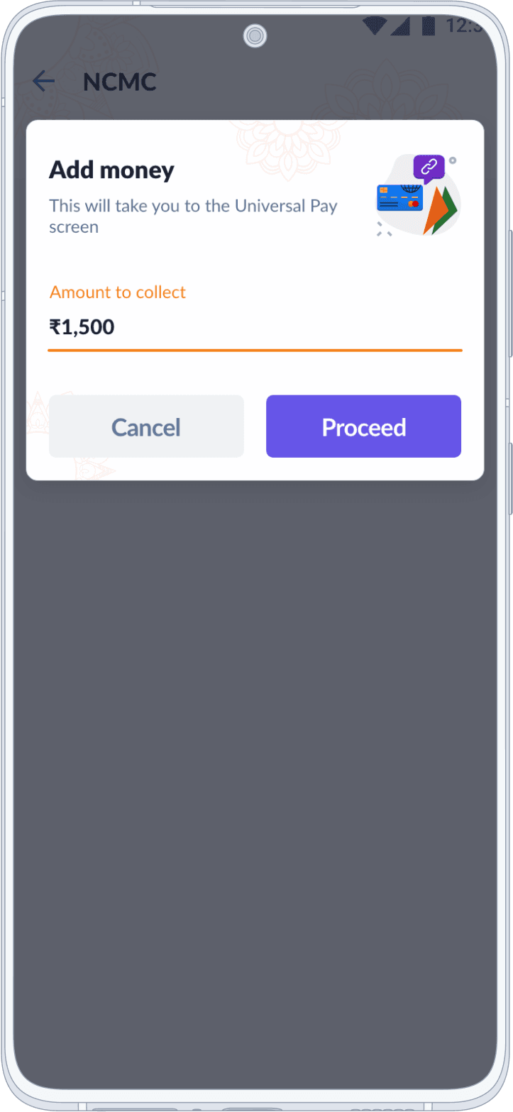
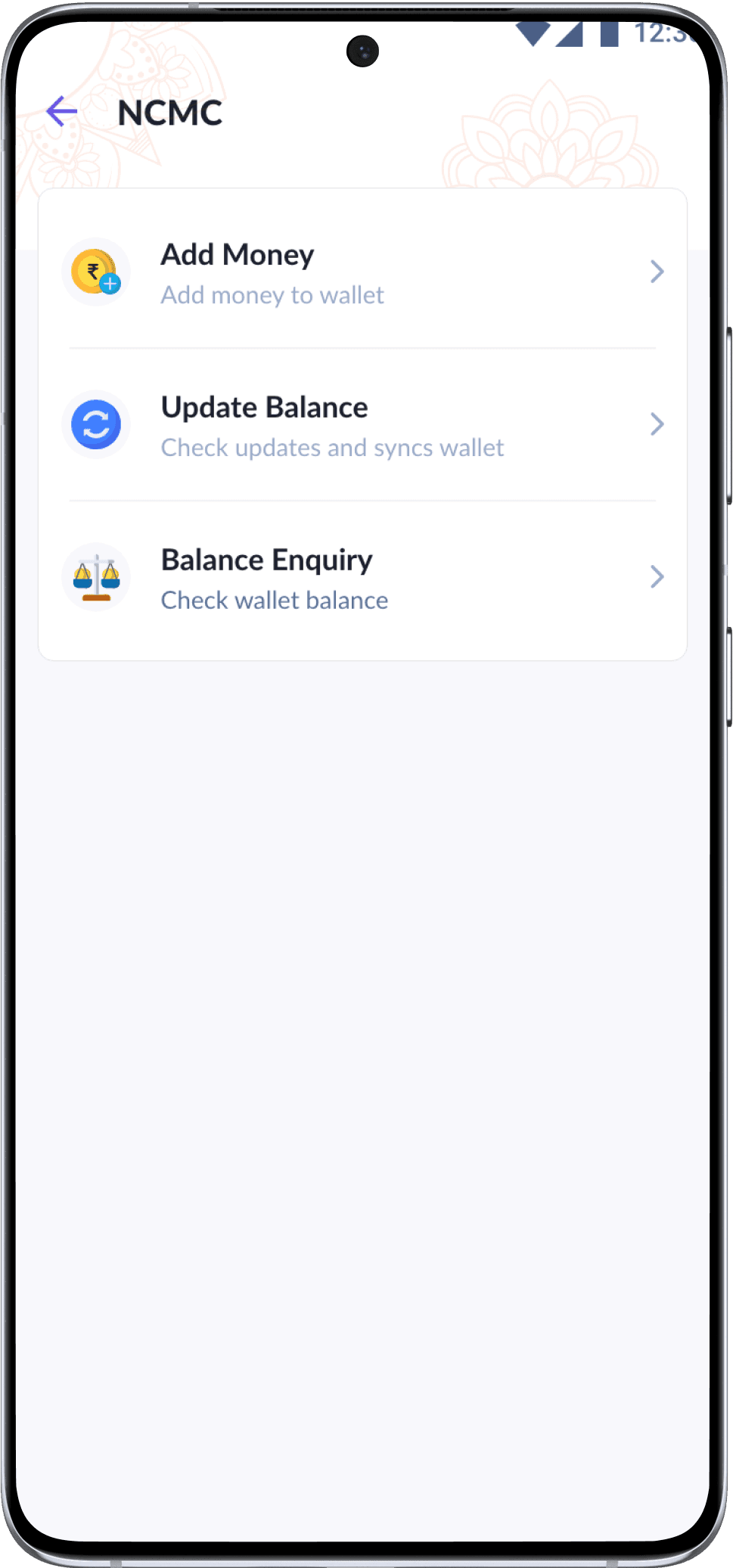
NCMC | qSPARC
Recharging Rupay qSPARC Debit Cards at compatible NCMC POS terminals, contributing to a unified payment ecosystem.
Alerts
Heuristic based color system for critical app level alerts
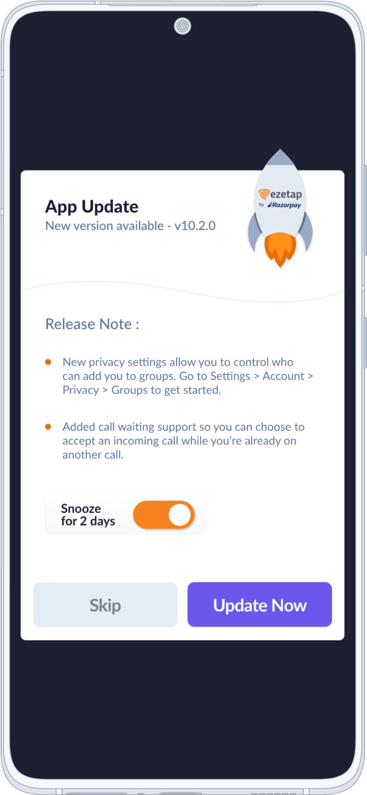
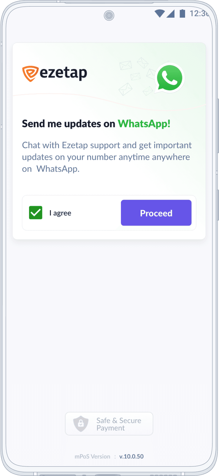
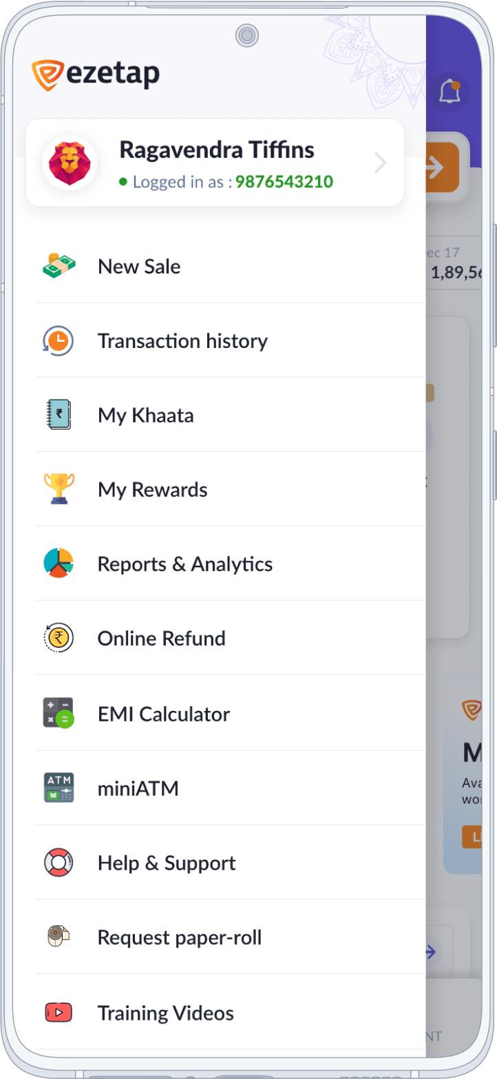
Other Screens
App Update, Side Menu and Consent for WhatsApp are essential components enhancing the app’s functionality and user experience.
More than 1000+
Iterations
100+ layout iterations just on home screen alone
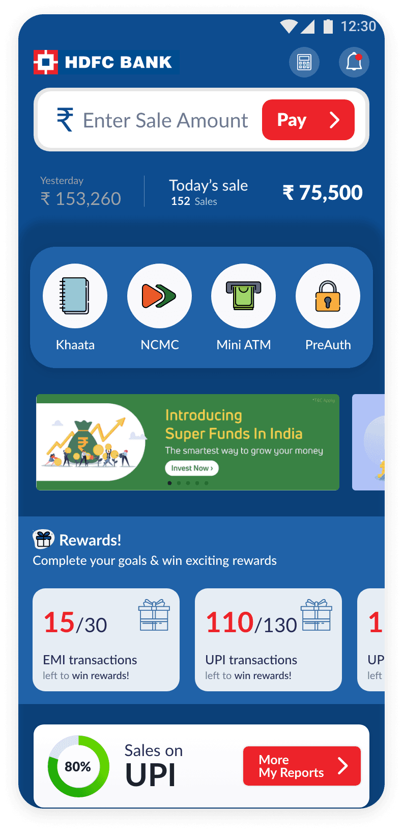
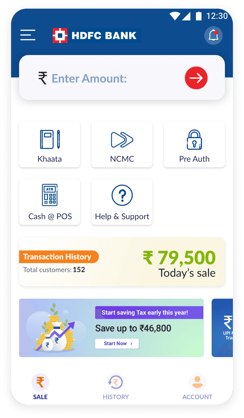
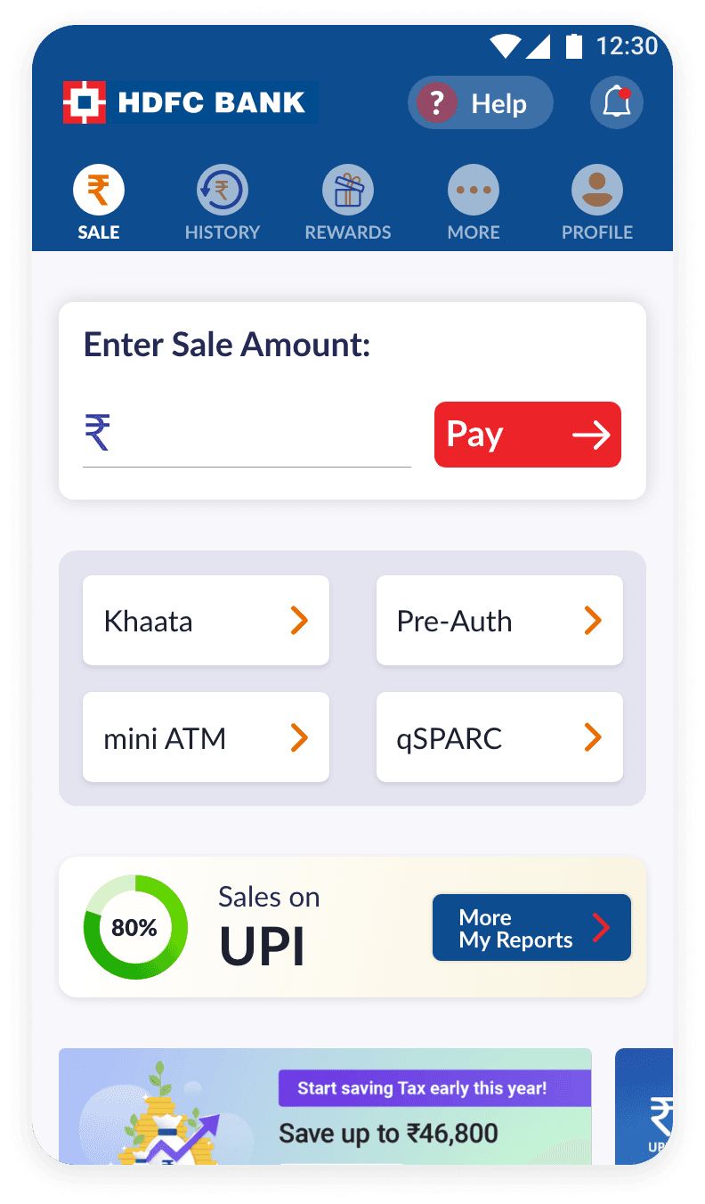

In HDFC Branding
Prototype
XD Prototype of the App branded in HDFC Branding Colours
What followed after the release!
Outcomes
The launch of our update resonated positively, drawing in fresh users and satisfying associated banks with an improved user experience and visual appeal.


End-users appreciated enhanced productivity in their routine duties, with smooth operations and accessibility to assorted functions and analytical tools.
Banks saw increased user engagement and opportunities for in-app promotions. This success paved the way for further enhancements in subsequent releases.
The redesigned user interface and experience have garnered universal praise from the end-users, associate banks, and corporations, affirming the significant influence our contribution has had in the field of fintech solutions.
End of Case Study End
Thank you!
Please open Case Studies on Desktop
UX Designer
Design Manager
Motion GFX Animator
No Code Developer
UX Designer
Design Manager
Motion GFX Animator
No Code Developer
UX Designer
Design Manager
Motion GFX Animator
No Code Developer
UX Designer
Design Manager
Motion GFX Animator
No Code Developer
Crafted with ❤️ & Pixel Alchemy

©️ 2025 Sachin Thumbarathy. All rights reserved.